
Designers’ choice of color for UI has a great impact on the overall aesthetic and functionality of a site. Color selection is complex and plays an important role in design. There is a lot to color theory. Changing the hue or saturation of a color can change the mood and behavior of the user. It takes less than 90 seconds for users to make a subconscious judgment about a product and more often than not, that assessment is made based on color alone.
To create a good design, designers should be able to employ colors effectively. To explore this topic further, we will take a look at the color wheel. Understanding colors and how they relate to one another is an important expertise that designers can master and offer to their clients.
Make your way through this article to learn more about how different hues, chromas, values, saturation, and tones affect the way we perceive colors. We will also talk about how to create the most effective color palette for your upcoming projects.
Understanding Color Theory
Color Wheel

The color wheel shows you different colors and their relationship with each other. The above wheel is based on the RYB model. The color circle is built around primary, secondary, and tertiary colors. Primary colors are formed by the combination 3 pigment colors that can’t be formed by the combination of anything whereas secondary and tertiary colors are created by combining primary and secondary respectively.
This schematic way of representing colors was developed by Sir Issac Newton and has since then undergone many transformations. The color wheel still remains one of the best ways to depict colors and see different color combinations.
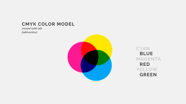
Color Models
There are two kinds of color models – Additive and Subtractive. The additive color model is used for digital screens while the subtractive color model is based on tangible colors like paint, dyes, and ink. Additive color model aka RGB system is built on primary colors of the spectrum and you are able to combine different colors to create a wide spectrum of colors. Subtractive model, on the other hand, is limited. It is best to convert your files into CMYK format to ensure consistency of colors before printing your final design.
Color Harmony
Color harmony refers to the organization of colors in an orderly and pleasing fashion. When colors are arranged or organized in the right way, viewers feel a sense of calmness and when there is disharmony in design evokes a feeling of chaos and disgust. To be able to arrange colors effectively, designers have to understand different color schemes and how they influence a web application.
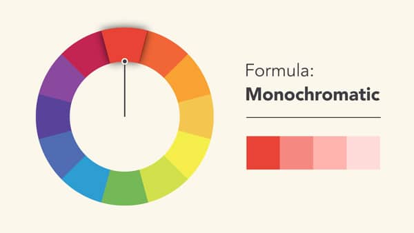
Monochromatic
Monochromatic color schemes are based on a single color with various tones and shades of it. Its easier to create a harmonious design when working with a monochromatic color palette because of its limited color choices.
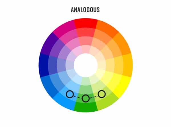
Analogous
Analogous colors are colors that are found right next to each other on the wheel. When using an analogous color palette, designers must be wary of the lack of contrast in their designs. To add contrast, it is better to choose an accent color that will support the overall color scheme of the design.
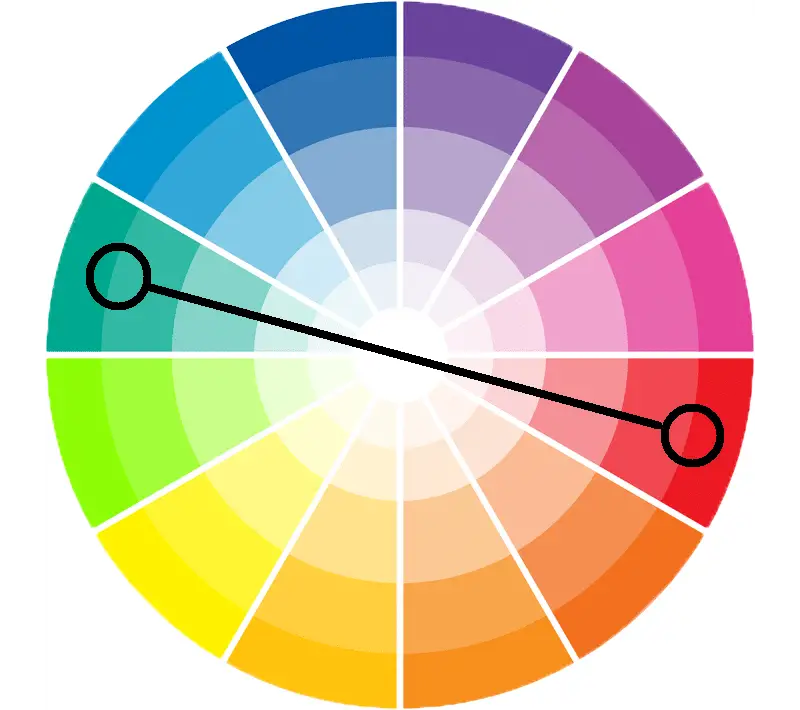
Complementary
Complementary colors lie on the opposite sides of the color wheel. These high contrast combinations create an eye-catching look but must be handled with care. It is better to use them in smaller sections of the design especially the areas where you would want an element in your design to stand out.
Split Complementary
This color scheme is similar to the previous one. It chooses a base color and two adjacent colors as its complement. This minimizes the harness of the contrast and is ideal for beginners.

The Triad Color Scheme
The Triad color scheme refers to three colors in the color wheel that are equidistant from each other. This palette opens up the possibility of using more colors in your design and can be helpful when the design calls for more than two colors. To create a harmonious design, it always helps to work on your color balance. It is recommended to use one dominant color and the other two be accent colors.

Tetradic/Double Complementary
This color scheme is for more experienced designers. The colors when connected forms a rectangle within the color wheel. The color balance has to be perfect to be able to pull off this scheme in a design. It is difficult to harmonize this design but when done right can be beautiful.

Creating a Color Scheme
Once you have gained a better understanding of the color wheel and color schemes. You should be able to create your own color palette. When creating a custom palette, it is important to understand how different colors interact with each other. You don’t need to necessarily follow a pre-defined set of rules to create one, but you do have to know the relationship between the colors in your palette. Color palettes do grow and evolve as you build your design but you have to start with a scheme that fits the brand first. Another way to create a palette is to use a photograph. There are many online tools to help you extract colors from an image, Adobe Kuler being one of my personal favorites.
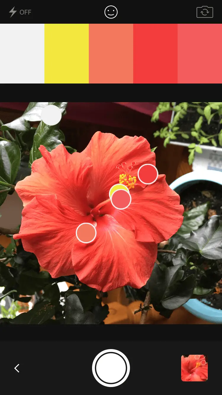
All you have to do is to upload an image and use Kuler to extract specific colors from the photograph. Once you have the colors you need, you can play with the saturation, value, tints, and shade to create a scheme that works for your project. This can easily be exported to Photoshop and Illustrator using your creative cloud subscription.
Understanding Color Theory Summary
Color theory is a science and art in itself. Designers dedicate their entire careers to this field of design and there are a lot of unexplored areas within this field. We hope that this article helps you understand the basics of color theory and inform your future design choices.

Section about Colour models – The terms that are missing that explain the difference between the rgb and cmyk colour models, in addition to “additive” and “subtractive” are TRANSMISSIVE and REFLECTIVE light. I would also caveat the last comment about converting to CMYK, by saying that is true so long as you use the correct and appropriate conversion tables for the print process you will be using, otherwise, unexpected results can occur.