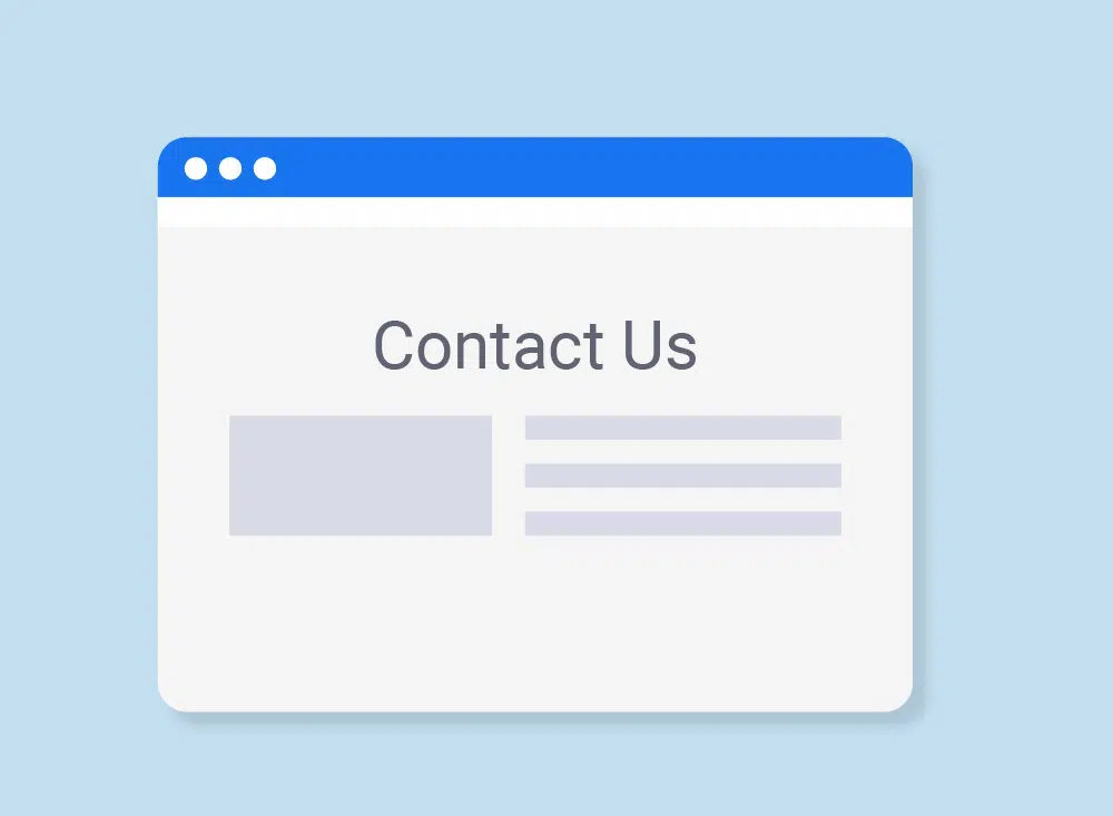
In the past, websites were designed in a fixed format with minimal design elements, a “contact us” page and links to internal pages of the website. Even today, we use a different design, add animations, bold graphics and more. However, the “contact us” page still remains an essential part of a website’s architecture. There is a reason for still going for a “contact us” page: A well-designed contact page allows people to ask and solve their queries without actively looking for the answers on the website. This feature significantly improves the user experience of your website. However, designing an effective “contact us” page can be challenging and may require some time. Some people just use the old trial and error method along with analytics tools to determine what works the best. Tools like Crazy Egg enable you to visualize the user behavior on your website. Usually, Saas companies demonstrate the best practices in terms of designing contact us pages, since it is extremely important to capture a potential saas customer. Here are 10 essential features your contact us page must have to deliver a rich experience to your visitors:
1. Make it easy for customers to find the page: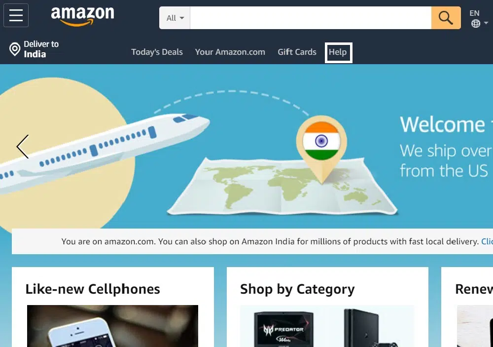
Most websites include customer support (knowledge and help base) options on their contact us age and link the page in the header or footer. There are many applications on a website. Some are placed in the header while others are placed in the footer. People usually find it difficult to decide where to place the link for the contact page. The header is more visually prominent, so your link will have more exposure if you place it there. However, usability studies suggest that footer link is easily found as people expect it to be there. You should make this decision based on the size of your homepage, the importance of other applications and also see if there is a place available for the link. Wherever you choose to place the link, make sure it is recognizable to your customers and ensure it is easy to locate. So, don’t make people search for your contact page, stick to a standard location.
2. Use normal language:
Thought contact us page names differ from website to website, there are 3 widely used terms like “support” (e.g., HubSpot, Basecamp, and Zapier), “help” (Eg: WordPress.com and Help Scout) and “Contact Us” (Eg: Slack, Campaign Monitor, and Hootsuite). Squarespace uses all the bases, using “help & support” and “contact us”. While Mixpanel links their support page, however, they use “documentation” as the navigation link. Salesforce and Freshbooks both display a phone number in the header navigation prominently and make it clickable to direct their users to contact page. This way, they are making it clear they want their users to call them. You can even add a phrase that is not much similar to other links in the navigation bar. For example, using both “help” and “contact” on different pages adds a decision point that may frustrate some people who need to talk to support.
3. Humanize your contact page:
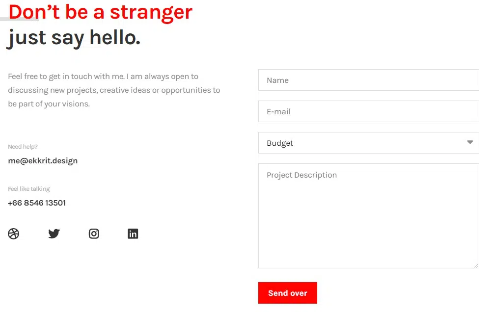
Customers that are looking for assistance are often frustrated and stressed, and if they can only communicate with you using emails and text chats. This way, they might feel ignored or unimportant. Research shows that human brains are tuned to recognize faces, and also human faces tend to create more cooperative behaviour. Zapier, Campaign Monitor, and Help Scout all feature pictures of their real customer support agents on their contact pages. You can even use illustrations to make your contact page look more fun. Showing that there are real people on the other side of the chat makes them feel confident to ask for help and also more likely to be polite and relaxed in their interactions. So it’s a good idea to include faces on your contact page and improve customer interactions. This is a good way to level up your support
4. Design the page according to the situation:
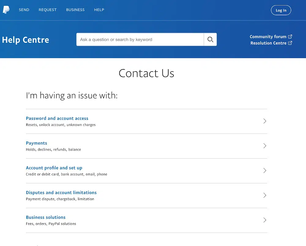
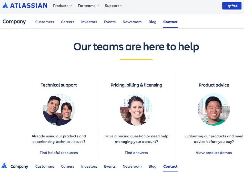
There is no standard design for a contact page, as every customer requires help with something different, and so the information will change accordingly. To solve this problem, websites use “adaptive” contact us pages that address unique customer requests. Zapier has a contact page that asks the visitor to categorize their issue, and then select one out of the several different forms that ask for more detail. You can follow a more time-based model that during a live service displays an alert and allows people to browse more details. Also, depending on the time people visit your website, they will see photos and names of the customer support team working in those hours. Logged-in customers will get phone number so that they can contact the customer support any time. You can even allow customers to select urgency of the issue so that smaller teams can prioritize their requests. So, an adaptive contact page saves time and effort of your customers.
5. Integrate your contact options:
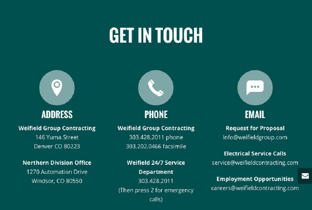
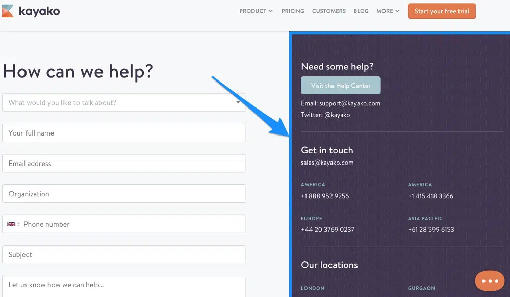
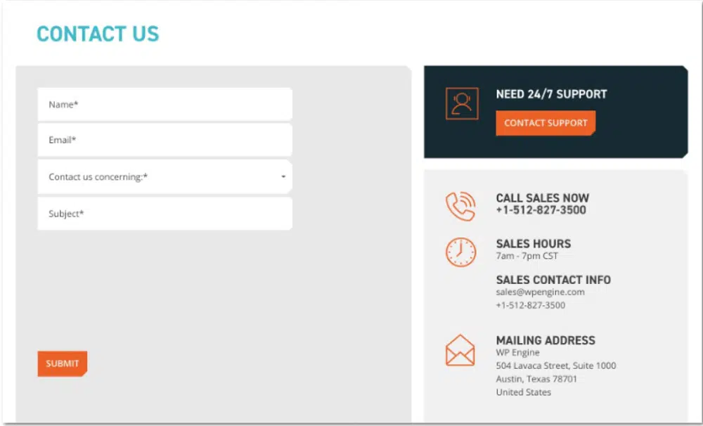
It’s best to integrate all your contact choices in one location. Whether your customers need updates on current issues, make a press contact, or need technical help, it will be available on one page. While some websites differentiate between active support and self-service knowledge bases, at minimum. Cross-linking your contact choices helps people find their way to a solution more easily. Most of the pages are linked to documentation and FAQs from their contact us pages. Basecamp, Hootsuite and HubSpot all have a social support channel as one of their options. You can consider adding links to your customer service forum, training options and pre-recorded videos. You should not confuse your customers with multiple options. You should use your contact page as the main hub of all the support platforms and not just an email. This way, people can choose any option they feel is comfortable for them.
6. Create designs that direct people to specific channels:

The best support option for every customer depends on what their question is, who they are, and what the website can offer to help them. For example, a customer who just needs to reset their password will get better help by reading an instruction document than by waiting for hours for an email reply with the same information. Your support team can add much more value if they help customers by explaining a new feature to them than giving them instructions about where the password rest is. A practical design will help customers direct to appropriate channel to effectively help and thus saving the time of your support team for bigger issues. However, you shouldn’t enforce your order, take it as a type of guidance to help customers effectively. So, it’s good to design a community forum that can help confused customers by directing them to learn resources and documentation. You should make a smart contact page to influence where and how people go for support.
7. Create a structure for your incoming questions:
An excellent contact page has a fine line between making the customer and the support team work hard or saving them both the time. Standard replies before a conversation is a valuable customer support metric for your support team. But if the questions are not accurate enough to understand the exact issue of the customer, the standard replies take a hit. Most interactions boil down to a basic question of customer service team wanting to know the account details. So, it is better to create a structure that identifies the exact issue of your customers and directs them to the appropriate support team. For example, you should send prospects to the sales team, job applicants to the HR team and product queries to customer support. You should show appropriate support options and FAQs so that visitors can simply narrow down your options according to what you choose to describe your question. The right amount of structure in your contact page can save time and effort of your customers and your support team.
8. Set expected response time:
Waiting for the response is the hardest part. Unless you provide real-time support, giving an approximate idea of how long your customer should expect to get a response is good to build their confidence in your support team. You can add your office hours and even list the current time of your office so that people know how long they have to wait for a reply. You can even add phrases telling your office schedule. However, it is better to suggest an approximate time and not exact time so that you don’t have to build pressure on your support team. Also, if a customer is told that it may take a day to get a response, a customer may try to solve their query using FAQs and find a solution on their own. Alternatively, if a customer knows the waiting time, they can move forward with other tasks as they know that the answer is on the way. So, giving them a timeframe is necessary on your contact us page.
9. Add fields to your contact page:
Providing customer support with tools and account history can allow them to provide a better service. If a customer tells you their login id, you can forward it to your support team and give them the access to see their internal data and tools to help them serve more quickly. You should also inform your reporting. Letting customers self categorize their queries by issue type, product area or their preferences allowing your team to get great insight. Knowing what your main support issues are and where your product team should focus is a great way to improve your company. For some types of support, like prompting customers to attach a screenshot or file along with the query, can shorten the conversation. Adding a attach file, image or any document button in the chat support is a great way to provide a helpful service effectively. So, you should consider adding fields and tools to your contact us page.
10. Add a feedback option:
Allowing customers to tell you about their experience is very valuable. One of the top customer support skills is the capability to really listen and read their customer’s experiences. When allowing email support, this can be a difficult task. So, understanding the emotions of your customers allows you to connect and identify their problems effectively. Letting customers share their thoughts is a great indicator for your support team to approach and handle their response and even let upset customers vent out their emotions. Hence it’s good to ask their emotions so that they feel valued as a customer. When you ask a question, your users expect that you would do something useful with that information and so you should be ready to deliver it to them. So allowing your customer to share their feeling will help you provide better service to them and also make them feel valued as a customer.
Designing a contact page doesn’t have to be a copy of another website. What works for them may not work for you and your customers. So, while designing a contact page for your website, you first think about how you can direct your customers to the appropriate channels. You should also consider the quality of support you want to provide to your customer on different channels. You should even think of a way to set customer expectations and build confidence before they talk to you, making them feel calm and relaxed. Furthermore, you should send out a clear message of the way you want to communicate with your customers, whether its call, email or chat, make the option prominent. Other than the mode of communication, your goal should be to shorten the conversation with your customers, saving their and your time. That’s the reason you should consider organizing all standard queries in FAQs. Deciding a position for placing a contact link is very important as it will determine how many people will select and visit your contact page.
