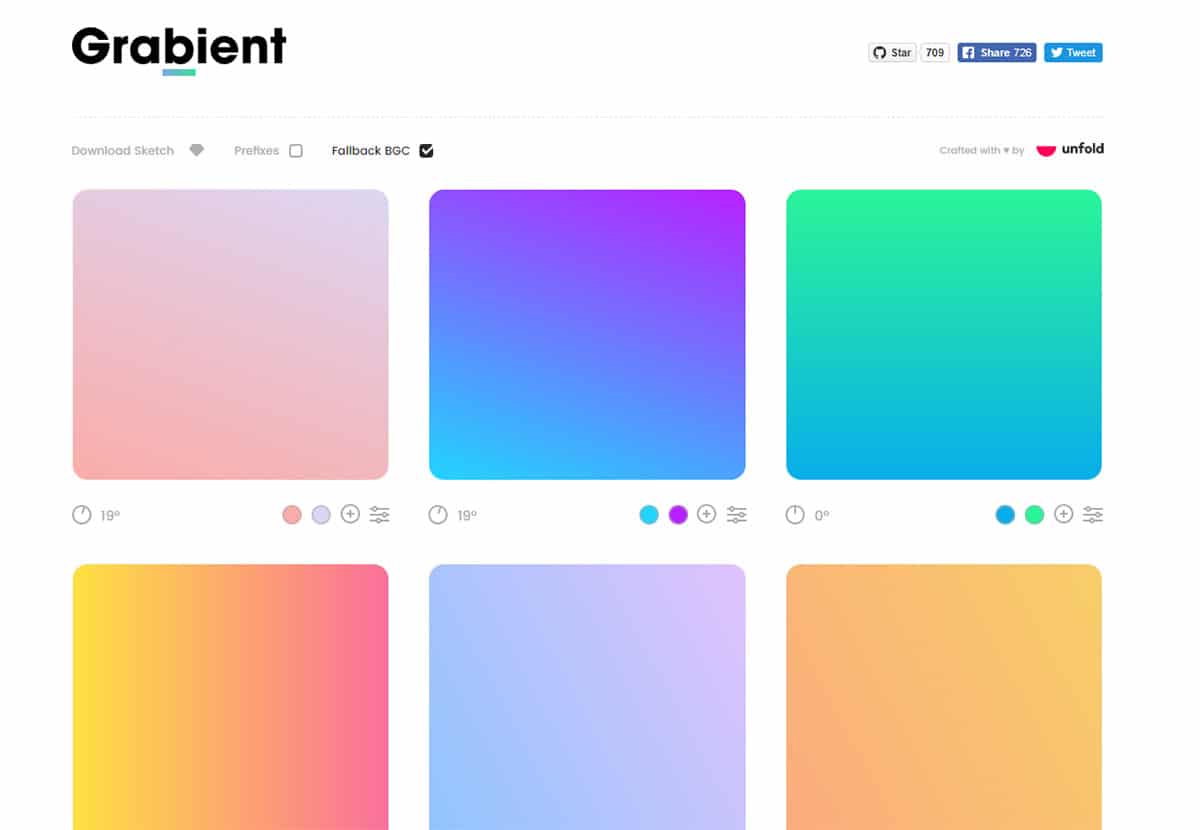
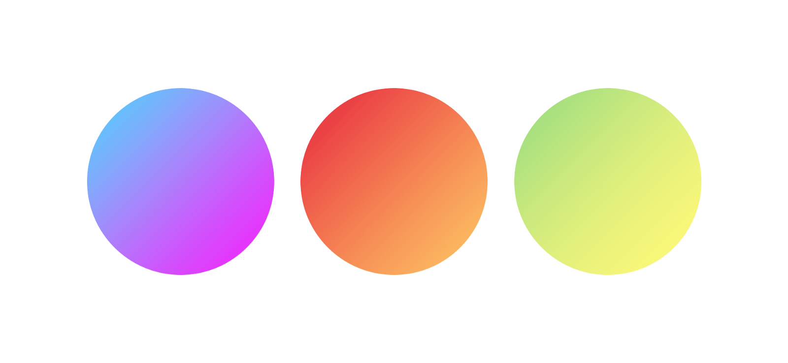
Gradients are a result of blending different colors. These color transitions can add depth to designs that otherwise would seem to look flat. Flat colors are limited and don’t produce the same effect as gradients can. By mixing colors, designers are able to create a color that is unique and refreshing. This scheme can be used to set the tone of a website and elevate the mood of their designs. Gradients can be created by mixing colors from the opposite sides of the spectrum or simply by choosing analogous or monochromatic colors, says the team at 7ninjas.com, a software development company that also specializes in digital product design. These color schemes can be used to create a focal point on a composition. Either way, the result is a color combination that looks and feels different. These eye-catching and vibrant color transitions can help elevate any design.
For designers who use gradients on a regular basis, it helps to know the basic principles which make a gradient usable. Make your way through this article to find out how designers create unique color transitions to help add depth to an otherwise flat design. Please note that these do’s and don’ts are collected from designers that have spent countless hours blending colors, so give yourself some time to master these techniques.
Color Arrangement
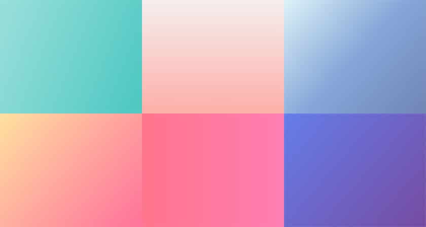
If you are looking to create a soft palette, it is best to stick to two or three neutral tones for a smoother gradient. Whereas a fun, funky design would require you mix bold colors and add few extra colors and color stops. Whatever arrangement you choose, understanding the purpose of your design will help you create a harmonious palette that can set the right tone to an otherwise dull design.
Here are a few key points to consider when blending colors.
- Stick to two or three colors to create a smooth gradient
- Try not to overload the gradient tab with more than 3 colors.
- Use less than 3 color stops at a given time
- Pay attention to the color transitions
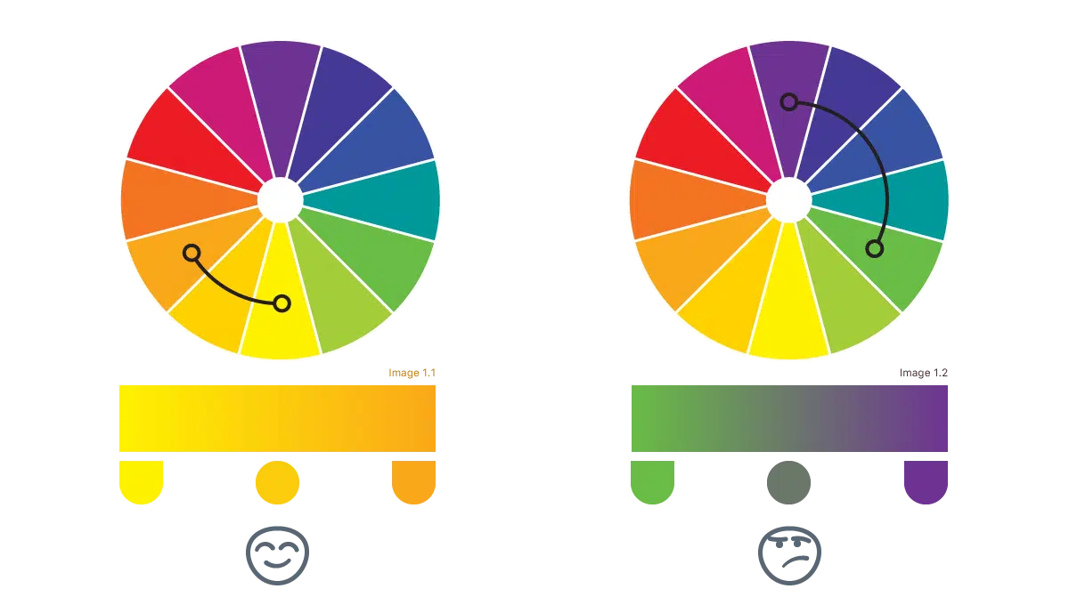
Designing Gradients with Complementary Colors
When designing gradients, It is advised to work with colors that work well together. So when working with complementary colors, it would help to learn a bit about color theory. Blending complementary colors can create a pleasant contrast. But more often than not, when creating these color transitions, designers often use only two color stops which leads to an unpleasant grey area in the center of the canvas. This can create a sense of disharmony and make the gradient unpleasant for an eye. You can fix this issue by using a color stop from the color wheel. Here are a few points to consider when working with complementary colors.
- Work with colors that create a pleasant contrast.
- Use more than three colors to avoid the greyish area in the center.
- Add a color stop by choosing a color from the color wheel.
Natural Light Gradient
When designing natural light gradients, it is best to stick to an analogous color palette. Choose the main color and shift towards a lighter color to create a transition. To achieve this result, you can choose the main color and then change the color to a lighter shade or towards lighter yellow hue to create a natural light effect. Make sure to keep the color difference small otherwise it might end up looking disturbing or unnatural.
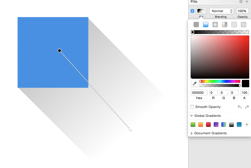
Things to consider when designing a 3 stop gradient
When designing a monotone or a smooth solid color gradient to the transparent color gradient, make sure to choose the same color for both endpoints – and the transition phase color at the midpoint can be set to 50% opacity.
Using gradients to guide the users through an interface
Gradients can be used to control the user flow in an app or a website. Users eye tends to gravitate towards brighter colors on the screen. So by placing them in specific ways can create a sense of movement within the screen.
Choosing Colors for a gradient
When choosing colors, make sure to pick colors that are close to each other for a smoother gradient. If you end up going for colors that are in the opposite side of the spectrum, they often end up canceling each other’s brightness. Another tip to keep in mind when designing gradients is that bright colors often is more noticeable than the neutral/dark tones. So use brighter tones where you want the users to see and dark transitions to create a sense of shape or a shadow.
Gradient Placement
For gradients to be effective, they have to be placed correctly within a canvas or a screen. Gradients usually have a strong presence, so use your good judgment when using them in your design.
Gradients for Illustrations and logos
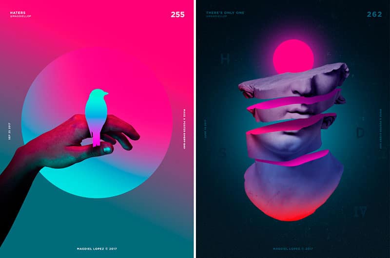
You have to be careful when using gradients in illustrations. Line work and gradient overlays don’t go together. They often end up looking out of place and doesn’t create a harmonious overlay. However, using them in the filled or isometric illustration can give it a 3D look and feel.
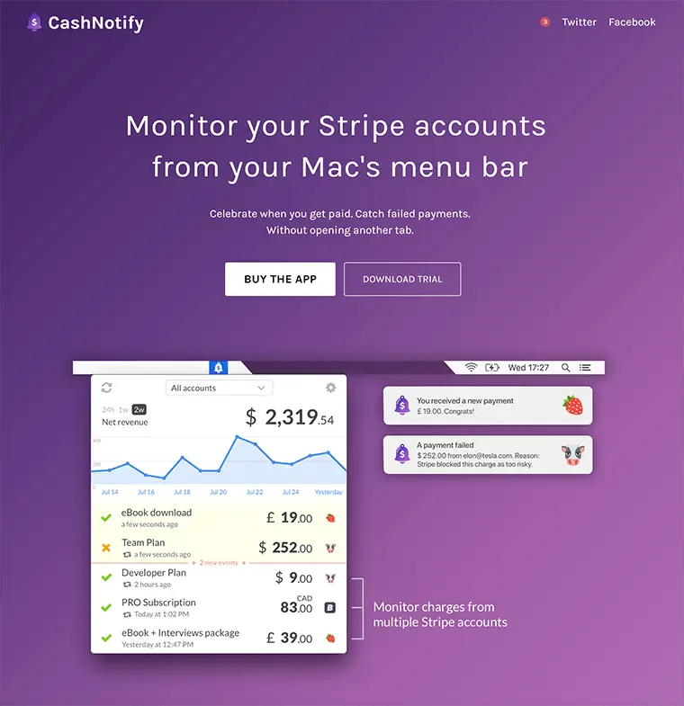
When using gradients for B2C or B2B brands, make sure to choose colors that represent the brand. The gradient has to represent the brand’s values and work across different platforms and devices
We hope that this little guide helps you on your journey to using and designing better gradients. The tips gathered here are a collection of tried and tested ideas from different designers in the industry. If you think we have missed an important trick or an idea, please write to us and we will be happy to share it here.