
Personal logo design is one of the most refreshing and comfortable tasks that you would ever face as a graphic designer. A personal logo design is the logo of your very own brand – which means the expectation, as well as pressure, are both very high. Many people believe that designing a logo is no science, but that is not the case.
If you believe that just drawing a shape, coloring it, and writing the brand’s name beneath is going to solve your case, then you are wrong. Personal logo design is much more than that. It concerns all kinds of measurements, theories, and conceptual developments that translate onto pen and paper, and once finalized, onto a digital medium. It is a huge process that requires a massive commitment and a strong vision as to how you finally want to see your logo.
When it comes to logo design, there are a lot of dos and don’ts. However, instead of getting into that side of personal logo design, we would tackle some easy tips and tricks that can get you a guaranteed result. Whether you are a beginner, a professional, or an amateur graphic designer, you can use these tips and tricks to design yourself a gorgeous logo. However, at all times, you must keep in mind the purpose and the concept of your logo design. Do not forget that it is a representation of you and your aesthetic as well, and plan accordingly.
Amidst all these technical rules, do not forget to have fun! Go crazy as designing a personal logo is probably the freest you could ever feel like a graphic designer.
1. Simply Gorgeous:

Simple objects are always easier to remember than complicated designs. People still recall more straightforward logos and relate them to the brand, compared to congested, colorful, and haphazardly done designs. Take, for example, the logo of Nike. It is minimal and so well done, that just a glance at it can recall every aspect of the brand. The color is a great choice too, which suits the brand and portrays a dynamic sports brand.
Another excellent example of minimalism is the logo of M.A.C. Cosmetics. Simply M.A.C., written in a sans elongated serif font, the brand’s identity is white on black. Almost all products and packaging come in a black casing with the logo written in white/silver. This is an excellent example of a textual logo wherein no other information is required to be given.
2. Color Choice:
Mostly, the color choice depends on the brand image that you are willing to portray. The choice of colors should ideally be kept to a minimal of 3-4 hues or shades which perfectly go with each other. However, since it is a personal logo, you can experiment with as many colors as you wish to.
The choice of colors is usually based on the audience your brand is trying to tap into. Let us further discuss on the M.A.C. Logo. If the brand were for a younger audience, a choice of feminine colors would appeal more. However, it is a luxury beauty brand, and the color black perfectly suits the identity of the brand, while making it look super classy. The colors of your logo can also reveal a lot of information about your brand. For example, if you own an organic vegetable brand. All you can do is incorporate a green color in your final logo design – one can easily relate to green and organics.
3. No Clichés:
Much like the world of fashion, trends in logo design are continuously evolving as well. What was a significant logo design element in the early 2010s might not still be accepted in 2020. A positive pathway to go about this is to study the history of logo design and the various trends that have been prevalent in the field.
Sometimes, you can get influence by these earlier logos, and that could substantially affect your designs. As a consequence, you might end up creating cliché designs that have been overdone in the past. To avoid this, make sure that you start with a fresh mind and research all the existing logos of the same service or product. That way, you know that you’re standing out rather than fitting in.
4. Symmetry is a Key:
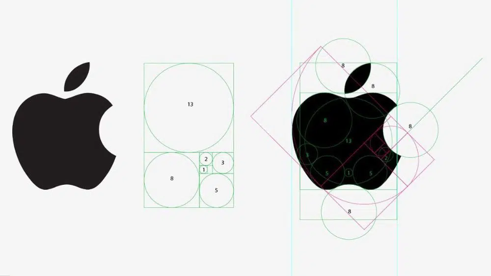
One of the most effective keys to logo design is symmetry and proportion. It is always an added benefit if your logo encases certain symmetry that balances out the entire plan. Especially when it comes to logos with a minimal design style, symmetry plays a vital role as every stroke or shape is visible.
Take, for example, the logo of Apple. In the image, you can see the symmetry that the logo follows. The lines encasing the logo make sure of a circulative proportion that rights the curves of the leaf, the bite, and the apple’s curvature.
5. Tell a Story:
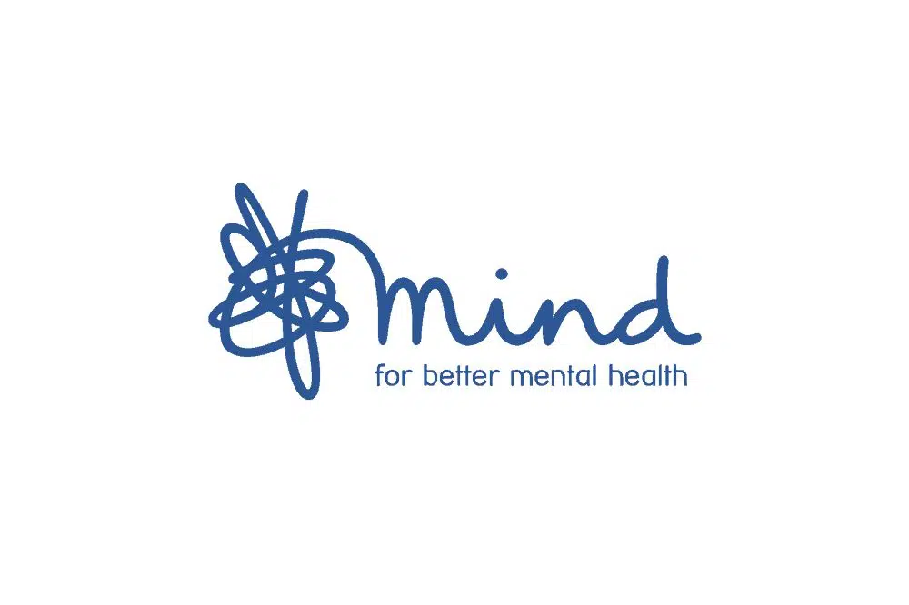
For ages, logos have always seemed to be more effective when there is a message hidden within them. Viewers love to decode and relate to logos because they engage the audience and generate a certain amount of curiosity. Most of the time, the hidden message is direct; other times, it indirect and yet relatable.
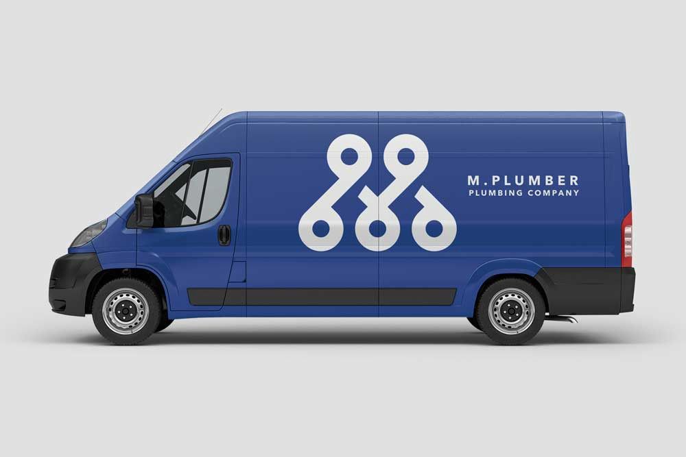
For example, in the given image, the logo is a representation of mental health. The logo decodes as – cluttered and confused mindset can be solved via this particular brand. It is an indirect message. However, the logo is captivating and unique. It is simply done in a single color, and the choice of fonts, and the strokes, tell a story.
6. Brand Name:
It is a common observation that logos that include the brand’s name have a higher recall value. While designing your logo, make sure that you include your brand name, name, surname, nickname, or any entity that can relate to you quickly. You can also choose to keep it simple by directly designing a logo out of the name like Pepsi, Facebook, or Instagram.
Higher recall value ensures that your design is worth being remembered. Hence, people look forward to deciphering your designs. Sometimes, you can also change the strokes and colors within the name to make it looks more artistic, yet simple.
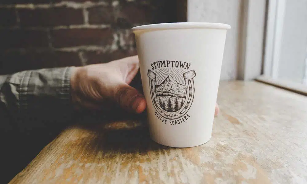
7. Brand Heritage:
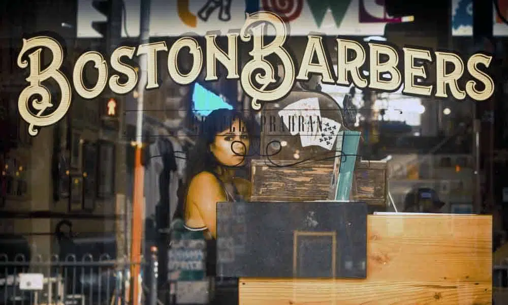
Often, you might get bored of designing a particular way. Take this image; for example, it showcases a very retro kind of font. Mind you, ‘vintage branding’ is currently a trending topic in the style of graphic design. You can always download an old font style and customize it to make a difference. Custom-made fonts are all the rage right now too.
Take, for example, the logo of Coca Cola. It has not been tampered with since the 1990s, and yet it remains a classic brand logo of all time. This is because designers and audiences, respect the heritage of the brand and the design of the logo.
8. Handmade Wonders:
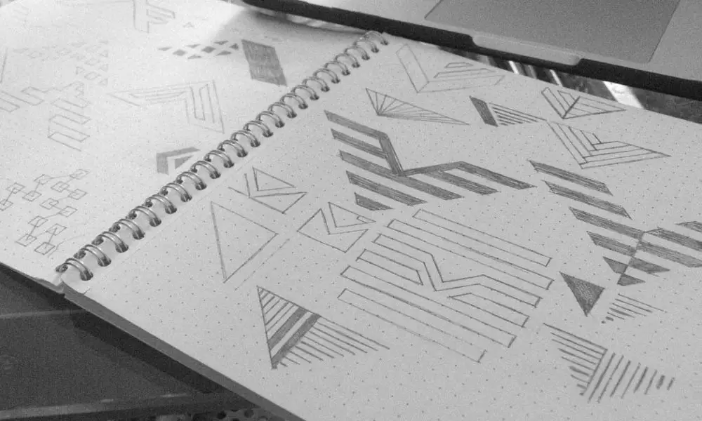
Handmade illustrations have time and again proven to be more flexible than the world of digital media. It is always an added benefit when you can take out your pen and paper and begin designing on the go. Much like this spontaneous quality, handmade drawings can also add a personal touch to your design. Not only can it be a rendered drawing directly from your head, but it can also be a copy of what cannot be achieved by digital media.
You can always convert your handmade drawings into digital files once you have finalized on a design. But making multiple iterations on paper brings a specific flow to your thoughts too. It is quick, fuss-free, and easy to handle as well.
9. Stay Young!
As challenging as it might sound, logos should always have an evergreen tone in them. If you look at a logo from the 90s, you would still love the design even now. Elements of design, such as black and white combined cubes and simpler shapes, have always been evergreen. Stay affirmative that you do not go overboard with the use of these elements and keep it as simple as possible – and yet, make a difference that can last long.
You should always make it a point to note down your concepts and refine them. This did not only help you build on them, but also make sure that you can derive inspiration from them later on. This is how the journey towards an evergreen logo begins.
10. Take an Opinion:
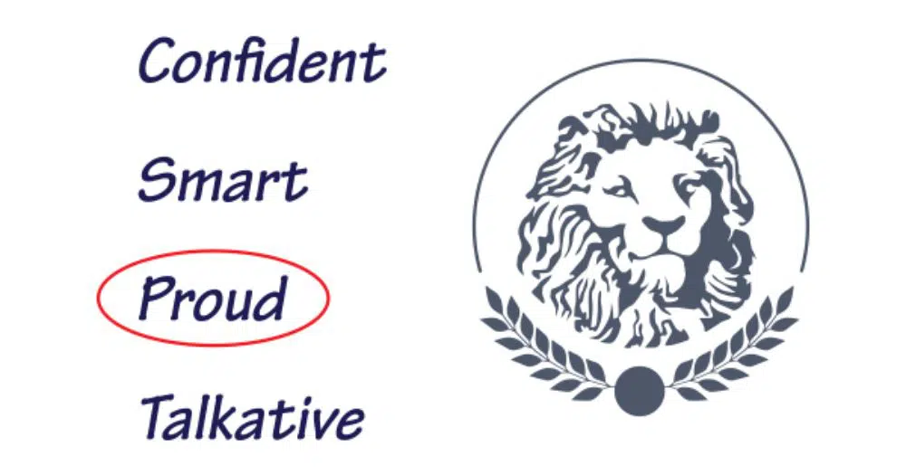
It isn’t always an easy task to analyze yourself to design a logo. In times like these, you can always take an opinion from your close friends and relatives. Ask them about a few of your qualities. When you are trying to visualize yourself, it is always an added benefit to take help through other peoples’ opinions.
You can ask all your close friends and relatives to make a list of words describing you. Then you can take out the words that pop out the most and represent it through a graphical language. You can also use this aspect to sell your brand to clients and gather projects using this U.S.P.
11. Make it YOU!

Another great graphical and creative way to go about this exercise could also take inspiration from your physical appearance. You can use a graphic or a sketch of yourself to make things more exciting and reinforce your identity.
In case you do not wish to incorporate your features, you can pick one or two differentiating ones and base your logo on that. For example, men usually have glasses and/or beard. So these can be highlighted. It could also be your statement elements – like maybe a tie with a clip or the camera tattoo that inspired you to start your business. It could be anything that makes a personal statement about you.
12. Be You:
No matter what you finally decide as your medium or concept, make sure that your logo is an exact copy of yourself – just graphically. Go crazy with the choice of colors or even the motifs and graphics that you finalize – just keep in mind a few tips and tricks named above. You can gather inspiration from your brand’s concepts, old pictures, events, art pieces, and many things that could hold value to your brand or service.
In the end, make sure that your passion and perseverance help you design a logo that is not only true to your roots but also builds the roots of your brand. Do not exaggerate forms unnecessarily, but at the same time – do what you think suits the brand.
CONCLUSION
These are the few essential tips and tricks that you can keep in mind while designing a personal logo. Most of these are also valid for professional graphic designers who work on customer’s projects. But the most important thing to remember is how you can always amp up words according to your style. The most distinguishing factor of a designer is his unique style – it can be acquired or in-built. But how you make use of it is what makes you stand out.
Make sure that your personal logo design is not only brand-oriented but also speaks volumes about you. It should be all the things that you could note down about yourself on a sheet of paper. However, do not clobber your designs with extra and irrelevant information that can be done without. Ideally, not more than 2-3 concepts should be incorporated within the design that speaks about you. If you think you have the potential, set up a trend on your own instead of following old directions.
These rules and tips do not have to be followed word to word while designing your personal logo, but can surely help volumes if kept in mind while doing so!

The most important thing for a logo is the font. So in my opinion the font should always be important. Anyway, Great blog.
Appreciate from Free-Fonts-Vault.