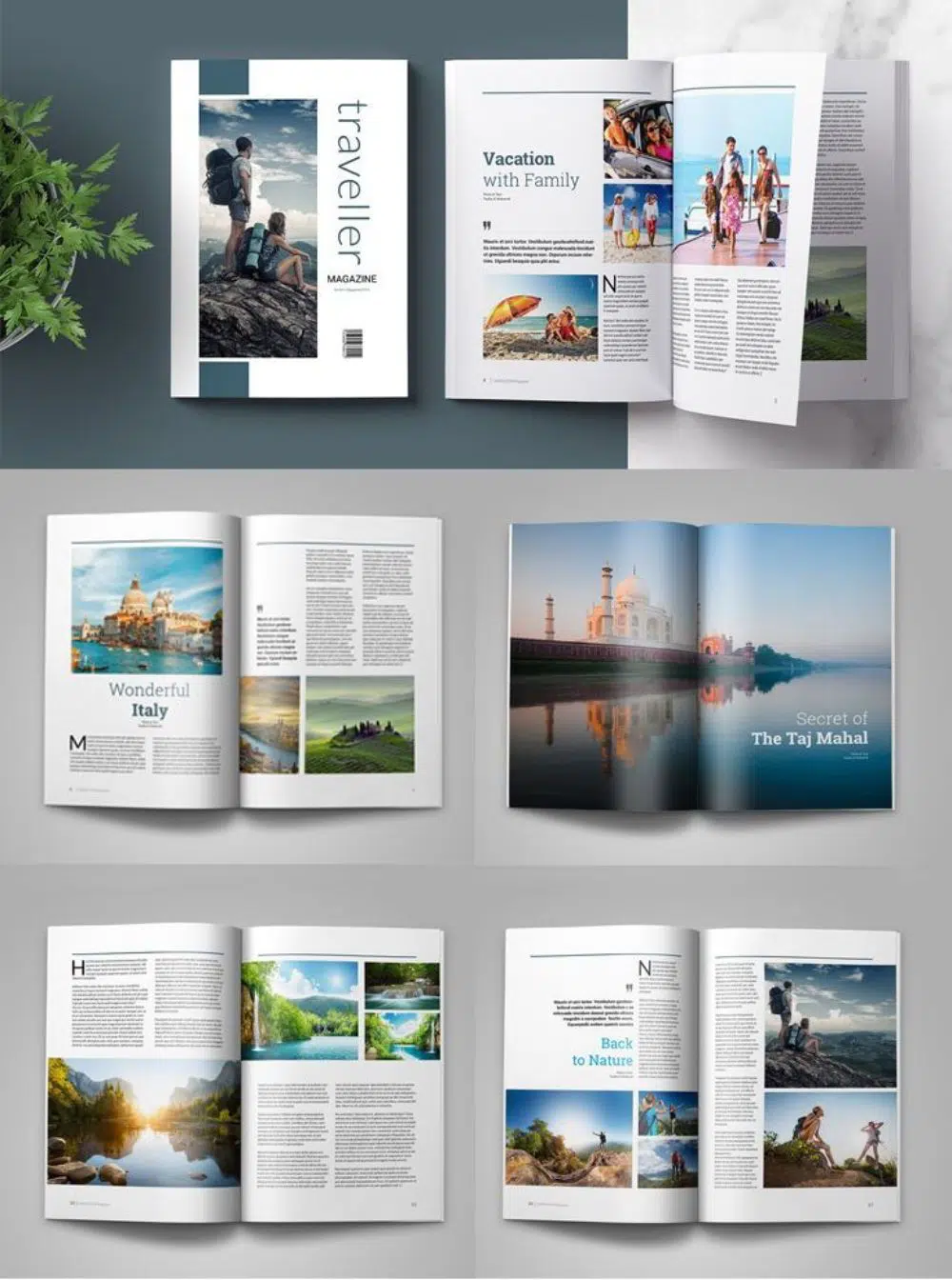
Magazine Design is one of the most common uses of print media. It is still used religiously through all the different kinds of professions, career options as well as lifestyles. It is a crowded market – just 2 years ago, there were about 7000 magazines in circulation all over the United States. So if you are launching your piece of publication and making it a regular thing, you must take a look at your competitors first.
When it comes to publications, compelling design and management of resources are the two main aspects you need to worry about. Design plays a vital role in luring more readers and buyers, whereas management of resources and data to put it down in a chronological format forms the content inside the magazine. Hence, keeping a close eye on both of these parameters will ensure that you at least reach the required audience.
Experts, as well as researchers, have studied the inference that about 94% of the impressions are design-driven. If your magazine’s design is active, it will most definitely stand out in a crowd of 1000 others. That is where the role of InDesign comes in. InDesign is an Adobe software, specially designed to create extraordinary publications from front cover to the back. It is easily understandable as well as very flexible with the cross-platform use throughout other Adobe software.
One can quickly learn to use InDesign via tutorials and blogs. However, what is more important is to understand how to design effective magazine layouts. We shall be covering a few such topics which can quickly help you create remarkable magazines!
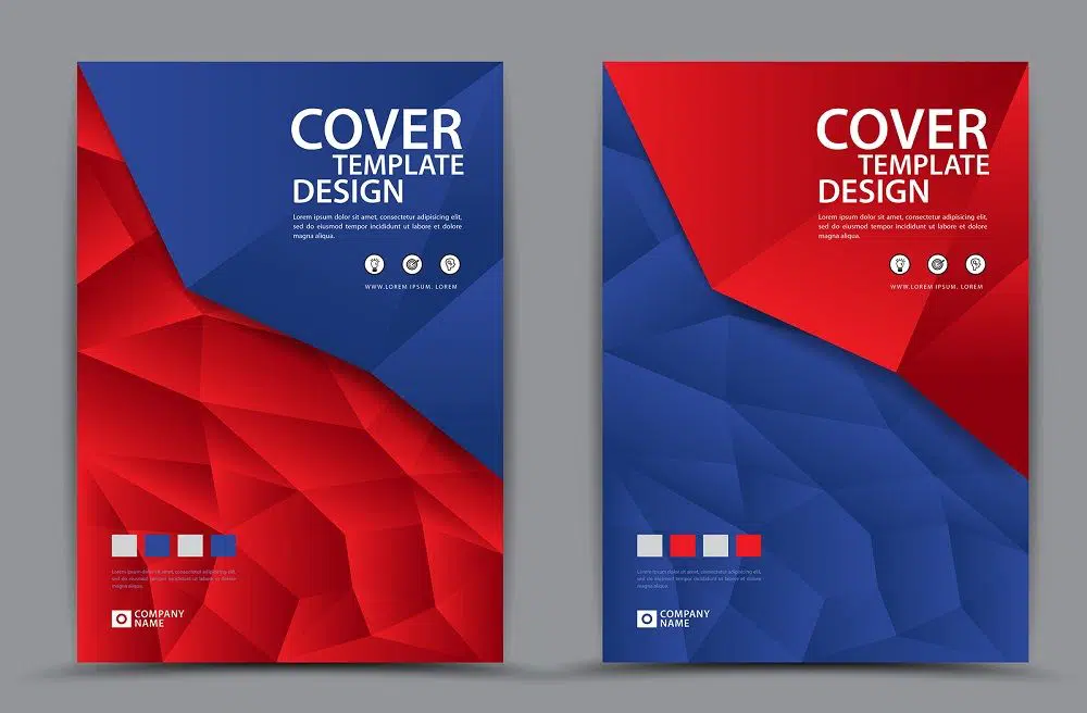
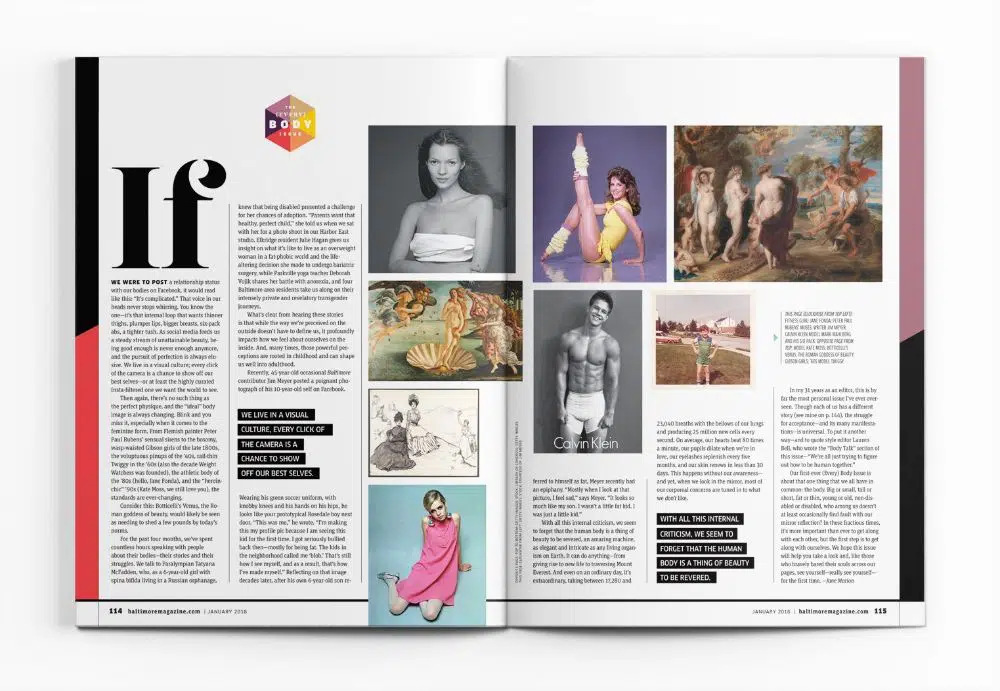
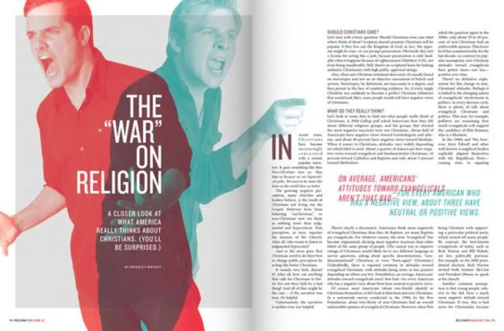
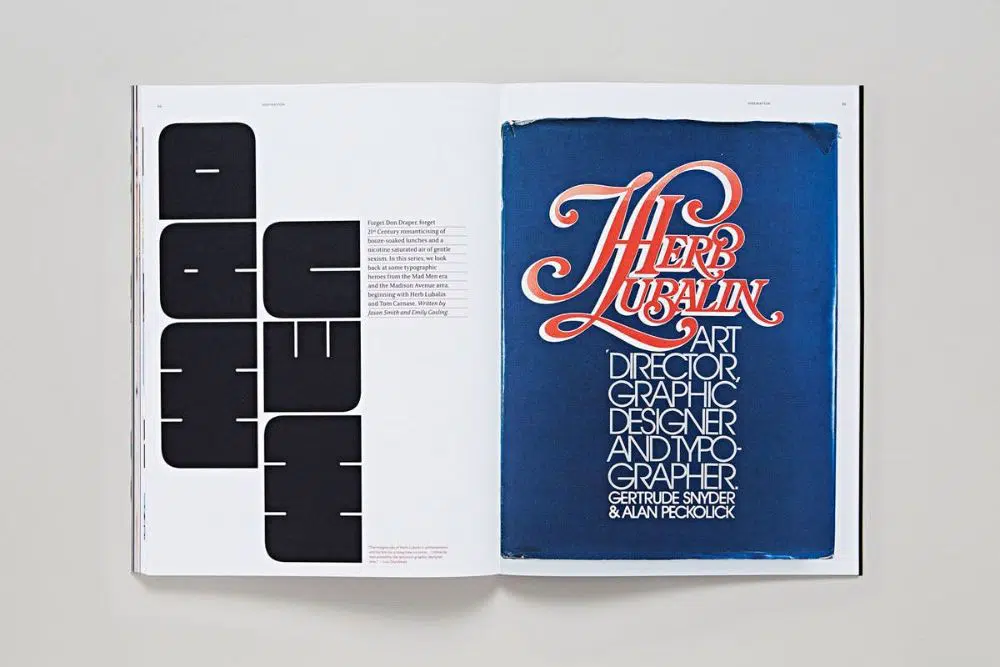
1. Cover! Cover! Cover!
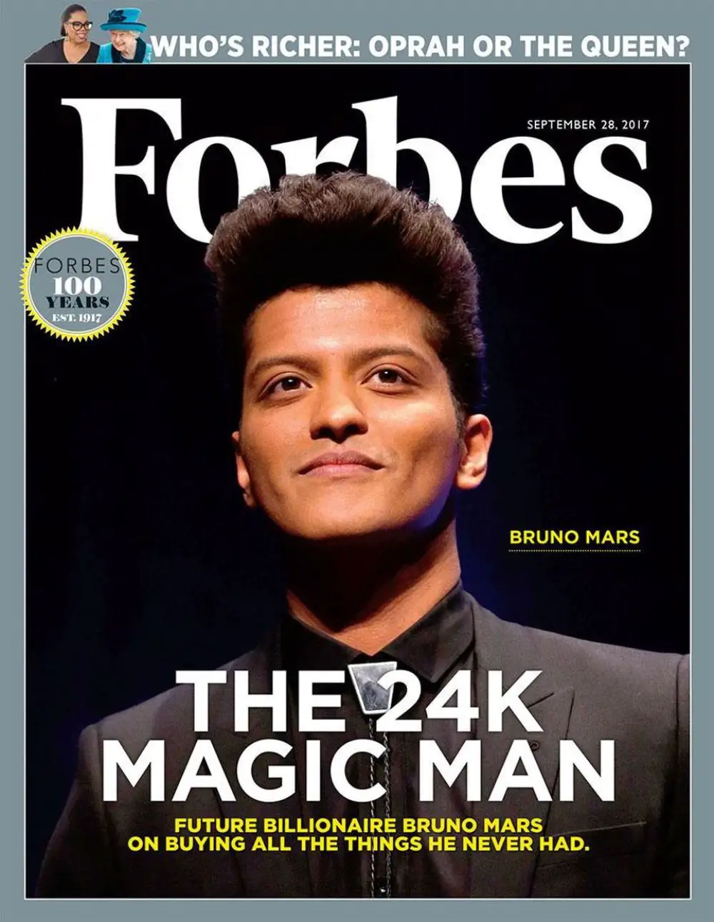
It is said that one must not judge a book by its cover. However, when it comes to magazines that is pretty much what everybody must do, including us. InDesign gives you a variety of tools to create super fun grids that can then be filled with images and text. Typography can also be induced within the app, and all in all, it is all straightforward to nail. One must understand that for the magazine to stand out, the use of bright and brash colors is not essential. An understated cover, and yet stylish shall always call for more attention than tacky work. Majority covers follow a similar hierarchy: The main heading, a subheading – usually focuses on a particular story and several smaller sub-headings – which are usually just highlights of the content inside.
This particular format makes sure that equal attention is drawn towards content as well as design. It aims at sparking curiosity that will make people pick up and open the magazine. Hence, it is essential to spot a balance between text and visual imagery, along with colors. And make sure everything is organized and well-edited.
2. Contents Page:
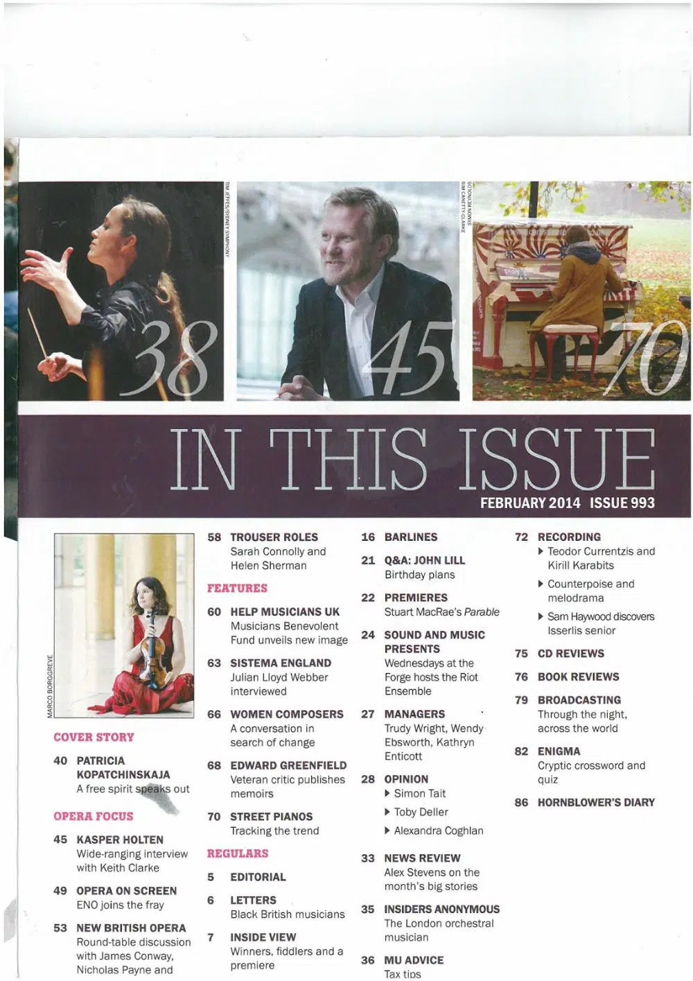
After the Cover page, the next most relevant page is the Contents’ Section (Index). It is usually the first or second page after you open the magazine, and contains an extensive list of all the topics/chapters/articles along with page numbers and a tiny little description.
In case you have much content in your magazine, packing it all up on a single page becomes a tedious job. In such cases, you can also split it into two or even three pages. However, make sure that the layout is balanced in terms of colors as well as white/negative spaces.
Most of the time, the content page has a very standard grid format. However, you can explore the creative side a bit in terms of layouting to avoid a stagnant visual language. You can also highlight the more remarkable stories to give a glimpse within the first look. You must, at all times, ensure that you follow the visual language via colors, fonts as well as graphics throughout the magazine – right from the front cover to the last word on the back cover.
3. Bleeds and Margins:
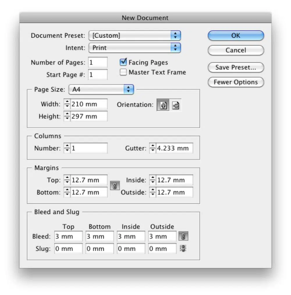
As the name suggests, a margin is a border around the page from where you can begin typing the text. A bleed, however, is the other area that goes into cutting beyond the margin while in print. In other words, a bleed is an area that is trimmed after printing.
When it comes to magazine design, potentially every page can have a different layout. This enables the fact that ignoring a bleed/margin can result in a horrible print. Usually, the printer gives you a measurement for bleed, but for your convenience, the overall value is between 1?8 inch or 3 mm.
InDesign allows you to set the bleeds and margins suiting your designs. You can select the settings in the document set-up box just when you are about to begin.
4. Color Choice:
As easy as it might sound, the selection of a color scheme is undoubtedly a difficult tasks when it comes to magazine design. Colors are a sure-fire way for your magazine to stand out from all others. Different genres of magazines can focus on different color schemes. For example, black, pink and red with accents of gold could be a good scheme for Fashion magazines. But a yellow, green and black scheme would fit the fitness magazine genre perfectly well. You must keep in mind that sometimes even a single color can stand out and make the page look incredibly classy.
Use of colors in the background and as substantial visual breaks must only be to enhance the content. Too much color can also spoil the layout miserably.
5. Infographics:
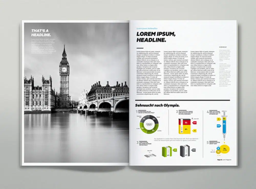
It is given that text and images buildup significant parts of a magazine. However, additional infographics, along with text and images, can prove to be a good experiment.
Most of the layouts usually have a big block of text alongside an image. However, a page or maybe even a spread that could break this pattern using an infographic could turn out to be an eye-catcher for the readers.
Slightly underrated, infographics are a great way of displaying complicated information in a somewhat graphical manner, as opposed to textual. They make ideas and concepts look more straightforward and more comfortable to absorb, and also come in a whole array of styles!
6. Paragraph and Character Styles:
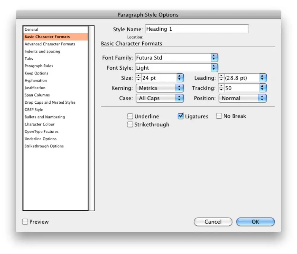
InDesign provides a super-cool time-saving feature, that is the paragraph and character style. You can create custom paragraph styles with fonts, font colors, font sizes, and more using this feature and apply it on whichever pages you wish. This particular pane is available in the work area, but in case it’s hidden for some reason, you can open it with – Command/Control+F11.
A character style is more specific to words or phrases in a paragraph, as opposed to the entire paragraph itself. InDesign also lets you embed a character style within a paragraph, following which you can define variables and apply them to certain words.
Both these features are essential when it comes to magazine design ascertains chunks of text need to be in a different style. And yet, follow the synergy of the rest of the magazine.
7. Which Black Is Right?

When it comes to magazines or any publication design, the main effort can only be seen once the prints ready. And what could be more disappointing than finding a faded grey for black!
A rich black is made up of all the CMYK colors (example: 60,40,40,100). While a rich black is perfect for large areas of blacks like logos and background, it is excellent for the use of outdoor posters and flyers. It does not fade into a dull grey. However, the body text must usually be in process black, which is 100%K only as it avoids trapping issues. For the same reason, a registration black that is 100% CMYK can never be used for body text or thin lines as well.
8. Make Use of White Space:
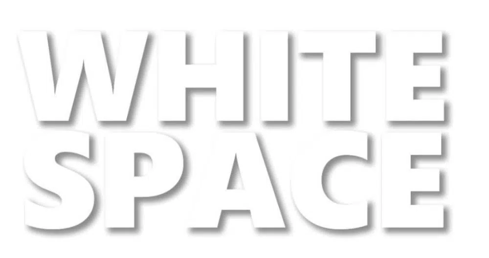
While the content consisting of text, images and graphics is the most important thing on a page, it still needs space to breathe. You must ensure considerable amounts of white space in your design to avoid your page from looking tacky and overdone.
The font sizes and colors must never be too heavy on the eye, or else it defeats the purpose of a stylish and straightforward design. Remember that less is always more!
For this very reason, InDesign provides a feature called the Frames. You can create blank grids with the use of the Type tool and Rectangular Frame tool to create placeholders to insert text and images respectively once you are satisfied with the design. You can ensure ample white spaces while designing the grid itself, to avoid later confusions and overdoing of things.
9. Pull Quotes:
Just as the magazine cover gives a gist of what all is coming within the magazine, pull quotes are little insights into the articles further inside.
In more accessible terms, a pull quote is a sentence or line taken directly from an article which is highlighted with different font style to create emphasis. Sometimes, an entire page or spread can be dedicated to a well-designed and laid out pull quote if it holds that kind of importance and relevance. Such a spread is called a visual break, and just as the name suggests, it is a break from big chunks of texts and images.
Pull quotes can pique the interest of readers and metaphorically suck them into the articles straightaway. The design of a pull quote is the most important thing, which is why it is worth putting an extra effort into.
10. Master Pages:
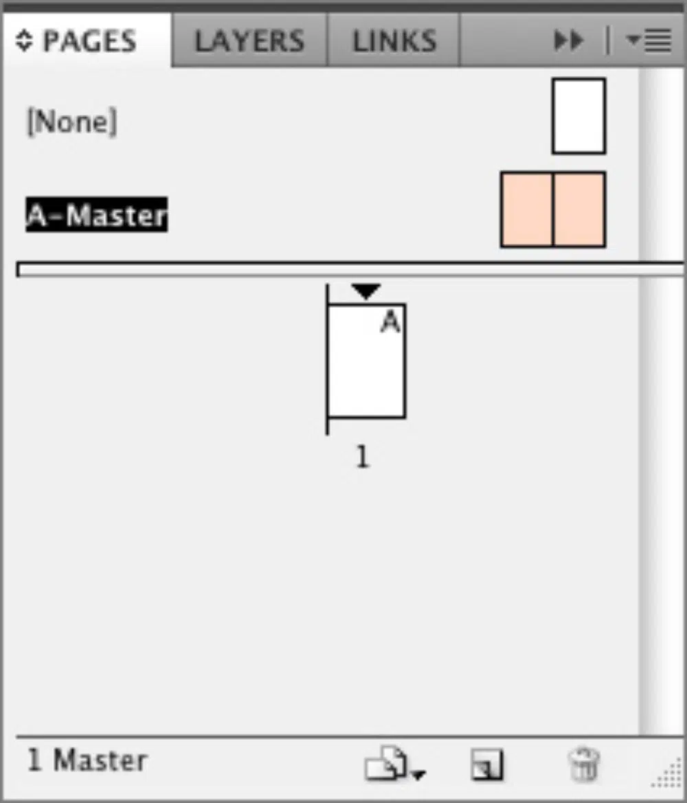
As the name suggests, a master page is a customized layout that can easily be applied to several different pages at once. All the elements that are placed on the master page are not editable once applied to the page. However, you can make suitable changes by going into the Master Page sections. It is a useful feature when it comes to page numbers, grids and guides as well as individual graphic elements. To set it up, open the Pages section and double-click on the “A-Master’.
You can customize this spread with whatever details you wish to add: guides, page numbers, text boxes, image frames and more. To apply this new master page to the pages, you can simply drag it from the Master Page section onto the pages you desire to apply it on.
11. Create a Beautiful Type:
Choosing the perfect font for your spread is essential, but so is making sure that you lay it out entirely. Often, we miss out on more straightforward features such as alignment and kerning. But one must ensure that all these things are entirely taken care of. Even if the text in one of the columns is slightly misplaced or out of line, it spoils the visual language of your magazine and makes it look unprofessional. Also, while you’re at it, make sure you do not crowd too much text in a small space. Just remember that readability is also essential.
12. Consistency Is the Key:
Though this might sound philosophical, consistent design can only bind your entire magazine as one. Everything, right from the page numbering to the typography as well as background colors and fonts, must follow the same style. This powerful feature is what will give your magazine is an authentic identity, and obviously, it creates a visual comfort for the readers too.
Precisely this is the task where the character and paragraph styles, the master pages from InDesign as well as colors come in play – to bind the whole magazine together.
These were the 12 tips to make the best magazine layouts in Adobe InDesign. Hopefully, these things can be kept in mind while designing your very own magazine layouts on InDesign. It is a super-fun software, and very easy to use. However, do not forget that less is always more, and that, InDesign lets you experiment with it all!
