
Branding is an essential part of any marketing mix. A brand is creating an identity for your range of products. By giving your products a brand name and a brand image, you give certain characteristics, definition, guidance, and path for the business to grow. It represents the emotional gut feeling a business wants the customer to feel when they interact with their products or services. Previously, branding used to be related to just a visual look or logos. However, with the progressive market, branding has become much more than that. There are many aspects of branding, and one such aspect is how a business can create the perfect brand illustration for their brand.
Illustrations are something that earlier seemed to hold aesthetic and visual value. They were only looked like an element that would enhance the look and feel of a product. While they still hold this value, they have also started getting attention as a core element in branding. There have been various developments in Brand Illustration over the year, in both relevance and process.
Below are the few considerations to be kept in mind, for Brand Illustrations 101- Creating the perfect Illustration for your brand:
1. Get to know the brand:
Though this might seem obvious, it is the first and foremost essential practice before starting Brand Illustration. If the designer is unsure or unaware of what the brand stands for, they would not be able to create a relevant brand illustration that would be perceived by the audience or have any impact. When it comes to an understanding of the brand, designers have to have a more holistic approach rather than just understanding its visual identity.
Any brand comes with a vision, a mission, the promise to the customers, and their target audience. Good practices for getting this down is not to be shy and ask relevant questions to your client that would help you enhance your knowledge on the needed illustrations. Moreover, reading about ongoing trends, searching the web is also an excellent method to go about the same.
2. Don’t rush the Brand Illustration project:

If you are planning on delivering a Brand Illustration that stands out for the brand and is closest to its brand image and characteristics, you can’t compromise on the time taken for the project. Finding folds and shortcuts would significantly reduce the efficiency of your brand illustration. Initially, you need to invest much time referring to various images. Refer to other illustrator’s work, old and new photos, children’s books, art forms, magazines and even nature for inspiration. Ideally, it is a good practice to keep a sketch record of all inferences that you drew from any source of inspiration. This sketch doesn’t need to be detailed and intrinsic, it would help more as reference material later on, and hence a quick sketch at this point would suffice. Choose quantity over quality for this initial step.
3. Understand the type and purpose of Brand Illustration:

To better understand what the requirement of the client is, it is essential to understand the relevance and context of the Illustration they need. There are various kinds of illustrations and various spaces where the illustrations can be used. Other important considerations for a brand illustration can be if they need to use for print, packaging, or in larger formats. Is there any dimension constraint that the Illustration needs to fit in, and if the Illustration needs to remain legible in super small size as well.
Some of the different kind of illustrations you should be aware of is Woodcutting Illustration, Pencil Illustration, Charcoal, Pen and Ink and Water Illustration. All of these are traditional illustration techniques. Apart from these some of the modern art illustrations are Freehand Digital and Vector Graphic Illustrations.
4. Make a distinct Brand Illustration that is yet flexible:

Any illustration you make should have a distinctive style that becomes synonymous to the brand’s style. This would make it unique. The Illustration should be effective enough to evoke emotions in the viewers, hence making it memorable. Any image the designer creates would be bundled with other design elements such as text, photography or any other design elements. The challenge and the mark of a true designer are that none of the elements overpowers the other one and the message the brand wants to put forth remains the hero of the entire project.
5. Create a guide and list of features a range of Brand Illustration should have:

Creating a range of illustrations for a brand can be challenging. When a designer creates multiple illustrations for a single brand, it is very important to note that all the designs need to be uniformed and have a sense of connection from one illustration to the other. Keeping this synergy between the illustrations can be challenging.
Hence a good practice to overcome this difficulty is to make a set of rules for the project in hand. These set of rules can be the most basic ones or catered explicitly according to the brand’s visual identity. Some of such rules or guidelines a designer can use are, choosing only one style of coloring, having recurring shapes in all of the designs, choosing one perspective style of drawing, or limiting the color palette to single or two colors.
6. Importance of color in Brand Illustration:

Colors are one of the strongest visual elements for any branding solution. Viewers often first perceive the color schematic of any brand, or logo, or any element before they can register other elements such as typography, logos, shapes, icons and more. The top brand logos have managed to associate a color with their brand successfully over the years. If you think about Starbucks, you can recall the exact shade of green used in the logo, similarly with McDonalds’ red and yellow color palate. Hence the brand illustration needs to make the best use of the color schemes the brand has to offer. The Illustration would benefit significantly if it infers the color schematic of the brand logo, as it would reinforce the brand values.
7. Try sticking to vector format:

This is not a compulsion; also you shouldn’t try forcing your projects into vector format if not needed. However, if the Brand Illustration project fits the vision and if the raster graphics don’t contribute significantly, stick to vector format. The reason behind this is that vector format editing is faster. The image can be resized easily as there is no pixelation effect in a vector image. The colors are also more flexible, and the spaces these files take are significantly lesser. Also, designers who aren’t best in drawing skills can easily add new assets as the system continues to evolve.
8. Create a Brand Illustration environment if needed:
This might sound a little extra, but if you really want to deliver a perfectly designed Brand Illustration for the brand you’re working for, you would only benefit from this practice. Many times, the brand illustration brief from the client can be vague, or the brand identity could be a little sparse, the website can be a little confusing as well. These challenges could act as an obstacle for creating a meaningful brand illustration system. Hence before you start the process, it is ideal to be bold and ask more questions to the brand about the project. This isn’t asking for ideas, but an attempt to better understand the project before starting work on it.
Whatever words, phrases or thoughts, you find essential put them together roughly and try creating a world where all these elements complement each other. This would help you visualize the brand’s story. If this process is carried out thoroughly and consistently, you would be able to create a large number of illustrations, all efficient to the brand’s image.
9. Ensure a character doesn’t overpower the brand:

An overpowered character illustration can accidentally become a mascot for the brand. While Mascots aren’t harmful, they tend to overshadow other parts of a brand’s mood and message. Hence it acts counterproductive and often confusing. However, this is not to say that you shouldn’t add characteristics to your characters, just ensure that the various brand illustration you make for the project has a sense of balance and work in unity for enhancing the brand and its value.
10. Decide the tone of voice for the Brand Illustration:
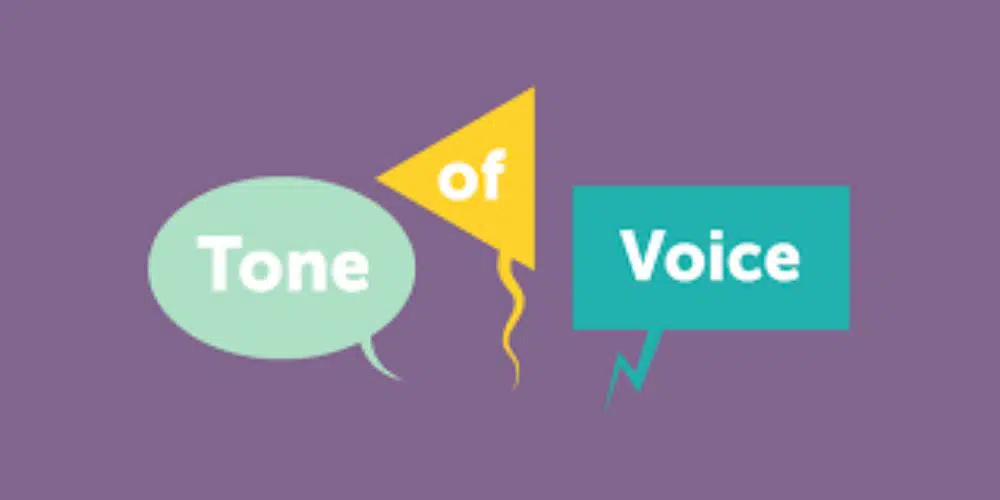
The tone of voice needs to be consistent throughout the branding efforts for any brand. Chances are the brand has already decided on the tone of voice, and it is reflected in all their business stationery as well. For such cases, it is ideal for sticking to the brand’s tone of voice and have an essence of it in the brand illustration design process as well. Especially cases where the brand needs to put particular emphasis on a brand’s personality and enhance the story-telling experience.
11. Make use of metaphors in the Brand Illustration:

Metaphors are known to be one of the figures of speech where a word or a phrase is associated and related to an object or an action which is not applicable or possible. They are especially a significant element to use for Brand Illustration. The main objective of using brand illustration is to simplify the complex ideas to a better to understand the campaign. Metaphors would also help the designer amplify the ideas. Moreover, relate them with a context that is familiar and easier to grasp. Naturally, people understand the problem better well they can relate it situations they know. Hence the core of the brand message must be kept simple and limited to one thought. If the designer uses too many icons or a messy background, it overcomplicates the Illustration. Hence use minimal but effective elements in brand illustration.
12. Make use of Grid for the Brand Illustration:
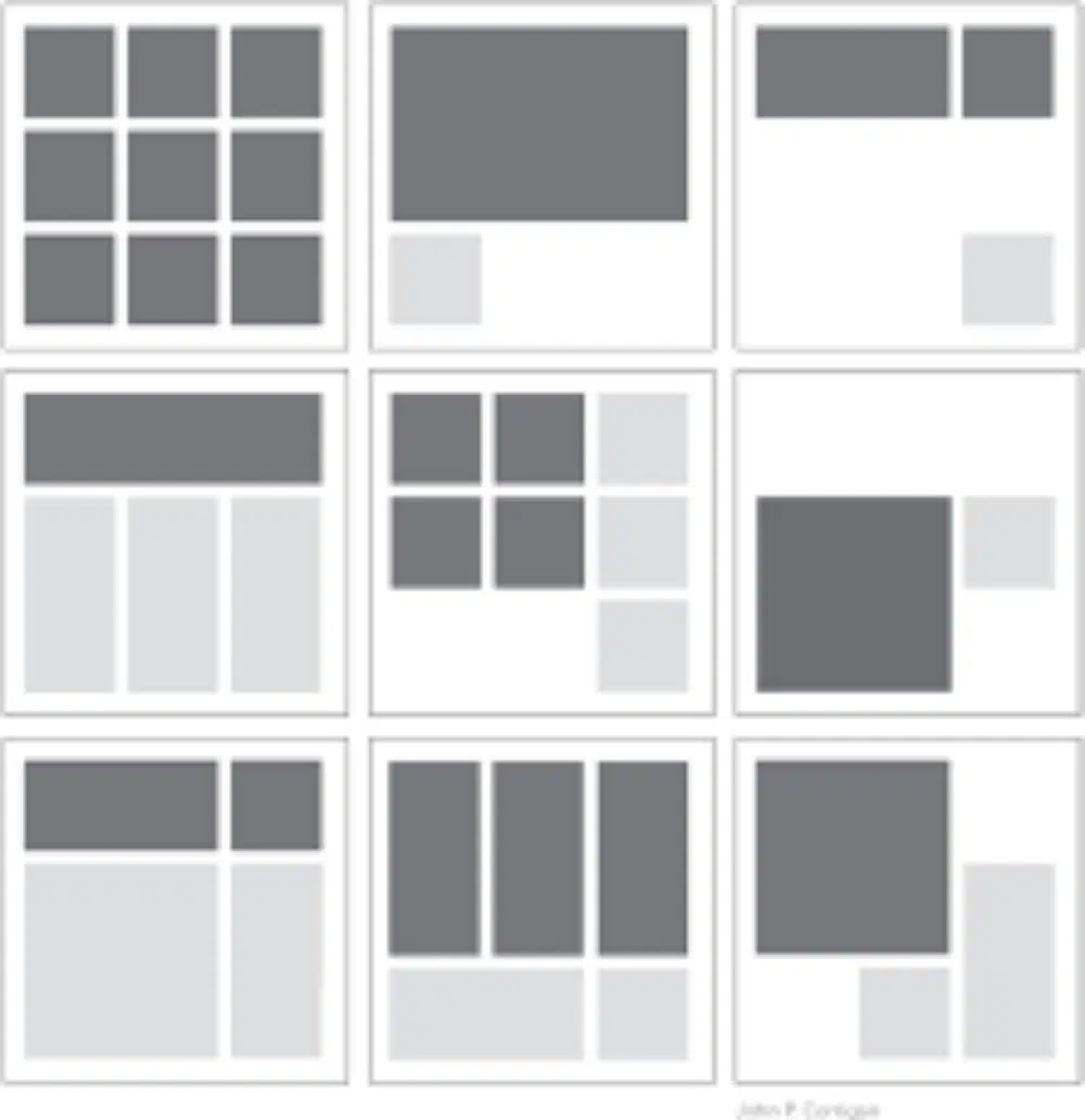
Making use of the grid system is a good practice for creating a Brand Illustration. It is an ideal rule that helps decide the flow in all artistic fields, be it photography or illustrations. The grid system allows the designer to have a sense of control and direction of the Illustration they are creating. Also, this helps create a modern design style in your illustrations. Grids also allow and help the designer remove any vagueness from the design.
13. Cultural considerations and monitoring shapes and complexity:
When you illustrate for a business that is close to its cultural values, it is essential that you take important cultural considerations into account. Suppose you create a design that has overly complex shapes or colors. These could be offensive to the cultural values of the brand you’re working with, it would have a negative impact on the brand’s identity. Not only the brand would not gain from this activity, but it would also affect their persona negatively. Hence as a Brand Illustrator, it is your responsibility to ensure you study the culture well to know what shapes and what colors to avoid in your Brand Illustrations. This wouldn’t only save you from going against the cultural norms, but also understand them better, and maybe use it to your advantage by including them in the Illustration if it adds value.
14. Don’t depend on trends:
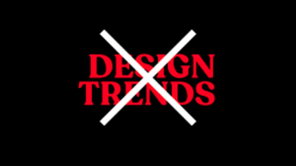
This is very important. When you are dealing with a brand illustration, they are looking for an illustration that would be relevant to the market for a better shelf life than that of a trend. Trends come and go rapidly and always bring uncertainty. It is important to have references from the current trends. However, it is also essential that your brand illustration isn’t entirely dependent on the trend. Make sure the design has timeless elements or minimalism as minimalism tends to look and feel good irrespective of the changing design trends. Hence, while trends are right to take inspiration from, you should not depend on them for creating the brand illustration for your customer.
These were the 14 important considerations of Brand Illustration. Keep these in mind while creating a brand illustration for your client or your brand. Make sure the brand illustration is true to the brand’s identity and is an effort towards promoting the brand, and not overpower it.
