For any design project, a designer needs to put in their creativity to the test. The client always has some guidelines and clarity as to what they want; however, to bring that to life, designers need to use their understanding to a certain extent. The design of a brand logo has to communicate the vision and mission of the brand. The logo can be a typography logo, minimalistic logo, or even a retro-style logo. The key is to ensure that the logo is relevant to the niche of your brand and depicts it in the best light possible. Most of the logos, however, require a certain portion of content. The text reinforces the brand’s name or justifies the logo design. Hence, it is vital to select the right font for your logo carefully.
Choosing the right font for your logo is crucial for its aesthetical value as well as increasing its relevance. A wrongly selected font can change the perception of the brand among your target audience. Effective typography ensures that the brand logo stays relevant to the brand’s niche. Different fonts have different advantages, and making use of the right font can appeal to your niche. It can also give a brand competitive edge over other brands that don’t plan on their logo as much. Below are certain tips that would help you find the best font for your logo –
1. Understanding font characteristics:
Typography is a strong design tool, often more than people realise. Different kind of fonts can communicate different attributes. They have their personalities. Many times these traits and characteristics of the fonts are unconsciously embedded in the consumer’s mind. This is why understanding each font and the associated characteristics with it become important for making a clever logo. Different fonts have different personalities, to name a few –
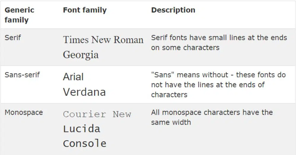
- Serif: Serif fonts are known to be classic, conservative, traditional and refined.
- Slab – Serif: Slab Serif fonts are great for vintage, masculine and rustic ambience.
- Sans -Serif: Sans -Serif fonts have a modern, clean, simple and geometric look.
- Script: Script fonts are ideal for feminine, ornate, elegant and refined writing.
- Display: Display fonts work best for effects like a typewriter, novelty, funky and unusual content.
2. Font style and weight:
After deciding on the font category that is ideal for your brand, next, you should be focused on deciding the font style and weight. Generally, most fonts have weight and style variations for enabling the user to be more creative and have more design elements to choose from.
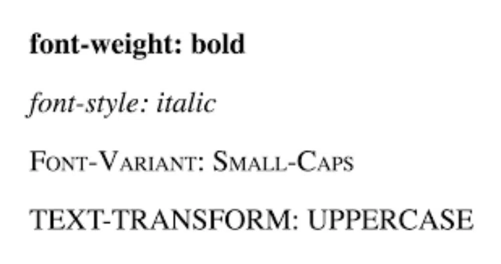
There are subtle yet effective variations in weights and style of the fonts. As far as weight is concerned, a font can be as thin as a hair strand to thick fonts. The fonts can be well spaced and tightly condensed as well. Thick fonts generally work well for short names as it makes the name of the brand look more impactful. However, choosing to use a thick font for a lengthier name might look bulky and messy. On the other hand, using a thin font would look great for billboards; however, it would barely be visible for use in business cards in smaller font sizes. Thin fonts help give the brand a delicate feel hence it is ideal to be matched with a refined logo. Heavier fonts should be used when the brand wants to mark it more assertive.
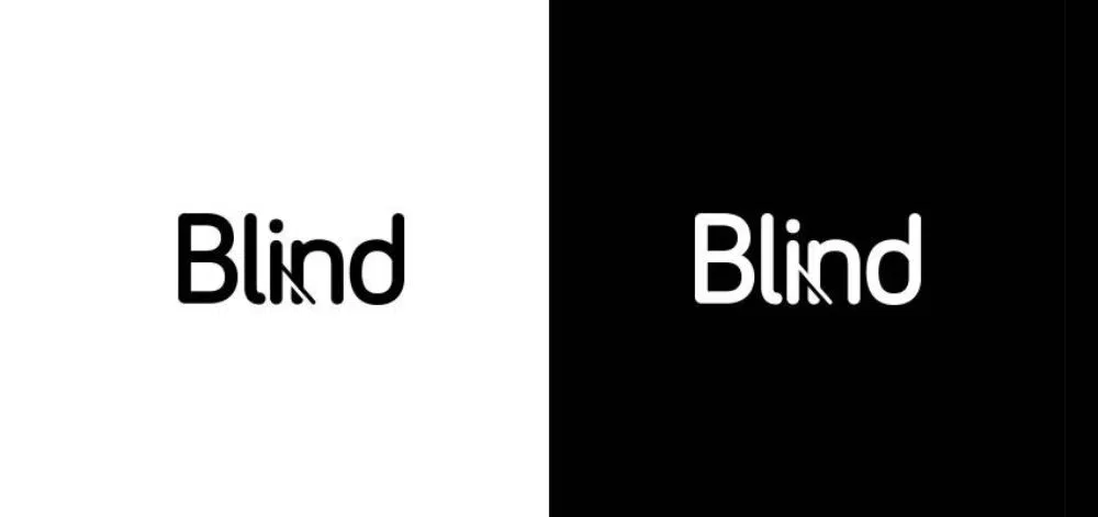
Many fonts have distinctive weight or other characteristics that make it stand out from the rest of the characters within the chosen font. Such elements create a visual interest in the logo that appeals to people. Since these characters are distinctive, it also helps the audience associate those characters with the brand in their brain subconsciously. Suppose the brand’s name is The Bread Brothers, using a font which has a distinctive ‘E’ would create visual interest as it is present in all three words at different intervals. However, while choosing the font, make sure you don’t base it in terms of a character that gets repeated too many times in your logo. Anything more than three could act as a distraction more than a visual interest point. These characters help your logo feel unique as well as avoid any pitfalls of an overlooked design rule.
3. The font should be industry-relevant:

As a designer, you have the freedom to be creative. However, you also have a responsibility to stay relevant and make the brand’s logo in compliance with the niche they are in. The font and the logo style must match the industry that the brand is targeting. A logo doesn’t only focus on the look aspect; it also emphasizes how it feels. Finding answers to questions like if your brand needs to have a logo that shows historical relevance or modern, sleek design would help you build the logo better.
It would help you keep the fonts you choose relevant to the theme of the brand. Rustic fonts are generally better suited for mechanic shops, however, would feel off if used for a software brand. Hence put yourself in the industry’s point of view before deciding the theme and appropriate font for the brand’s logo. However, while trying to choose a font that meets both all these expectations, ensure to not shift to one side of the spectrum. You need to choose a font which is easily recognisable for their niche, yet don’t feel overdone. The font shouldn’t impose the industry relevance on the users; it should be subtle and yet effective.
4. Understand how fonts can be paired:

As a basic design rule, whenever you deal with typography, it is best not to use more than three different fonts. Same goes for deciding a font for your logo. Any design composition should follow a visual hierarchy. This helps the reader scan the content with much ease, giving them a visual cue of the content that is a top priority to reducing priority.
Font pairing should be done carefully. Hence, when we talk about the logo, the text that will describe the name of the brand should be in one font. If there is a supporting tagline for the brand, it should be in the next line and another font. Generally, any brand limits its logo text to these two lines. However, if you are a company where showcasing your year of the establishment can get you more authenticity, include it in a small and clean font style. Using different weights between the fonts can help the elements be in harmony.
When selecting different fonts, there needs to be some harmony between them. Hence focus on finding the fonts that have some shared characteristics or qualities. The fonts can be from different font families; the one connecting characteristic could make them work together if appropriately justified. This would make the logo look cohesive.
For the font of the brand name using script and hand lettering fonts can be ideal. Since script and hand lettering fonts have a flowing structure, they can make more characters look fine and easy to read. Next, the supporting text or tagline has to be the clearest. It is a concise line that captures the brand’s essence. Hence for the tagline, sticking to a sans-serif or a serif font would be ideal. Doing this would help capture the attention of the customer with the cool font for the brand name. Then using the clear and concise font for the tagline would help clarify the message of the brand within no time. This would create interest. If you have an added establishment year and you are into a brewery business, it might help the customer to make a decision as well.
5. Interaction between graphical elements and fonts:

Logos are of different types. A logo can be purely based on typography; some logos are purely illustrations, graphical images, vectors or a combination of both. Hence, if your brand has a logo that makes use of any graphical elements, you need to understand how to pair your fonts with them.
There needs to be an interaction and relation between the graphical element and the chosen font. An excellent guide to ensure this is matching the line weight of your font to that of your logomark. If the logomark has a feminine and swirly feel to it, pairing it with swashes and loops of script font would look great. Another instance, if the logotype is graphical and highly detailed, it would look great with a more massive sans-serif font.
6. Use the typography as the logo:
Another alternative that is ideal for creating logos for small businesses is using wordmark logos. Here the brand would not use any graphical element in their logo. Instead, they would use the name of the brand as the logo.
This eases the process of creating brand recognition in the market. If the logo is worked well upon, by making use of excellent typography, the customer would recall your logo as well as the name of the brand easily. However, it is essential to remember what element is more important for your brand – using the logotype or logomark. A logotype is any logo that is centred on a company’s initials or name. On the other hand, the logotype is using any element that represents the brand.
7. Keep the technicalities in check:
Kerning is essential for fonts when they need to be used in a logo. Kerning is the process by which the user can adjust the space between different characters belonging to the same font. Hence this helps the text look visually pleasing and legible to read. This is particularly important for the font being visible from a distance. Generally, Sans Serif is great fonts when it comes to retaining readability when kerned out.
Using Script fonts might not be the best idea as the tail of the previous letter connects the letterforms. Hence increasing the whitespace between them could lead to the undesirable, unappealing effect. Other than this, also consider where your logo is going to be mainly used at. If it is only needed to be used online, optimise the logo for the same. Use small logos with display fonts that would look great on the web. Make sure that the logos are scalable as well. There are different display sizes. Hence your logo needs to be appealing and legible on big screens as well as small screens.
Another aspect to be kept in mind while designing logos is how it looks in different colorspaces. Your initial logo design might be in solid colors but then needed to put against a gradient background. Certain typefaces can lose character as well as readability when they are seen in white or grayscale. You want a logo that is readable and visible in different colorspaces. Hence it is important to keep checking the flexibility of your logo in the designing stages only, to avoid rework later.
Moreover, always have the appropriate licensing to the font that you download from the net. Some fonts are only free for personal use and need using the commercial license for professional use. Infringing on any font’s licensing rules might lead you to trouble for using a font that resembles other company’s font. It is always ideal for making a handmade font instead of choosing from the readily available fonts for a brand logo. The custom font gives the designer the ability to twist and turn the letterforms in a way that it truly resembles the brand and give it its characteristics. It helps create a font that stands out from the crowd.
To conclude, these were the important considerations to choose the best font for your logo. Select the font very carefully for the logo, as it becomes a part of the brand’s identity. Consider the aesthetics of the selected font as well as the feeling and vibe it sends out to the potential customer pool. It has to match the vibe of the brand’s values. The font should evoke potential customers to learn more about the brand. By making use of these seven essential tips, you can design a great logo.

Very Helpful Article! This blog is so beneficial for designing logos for any type of business and I agree with you that choosing the best font is the first step in designing attractive logos.
Keep sharing these informative posts.