Featured Image by Freepik
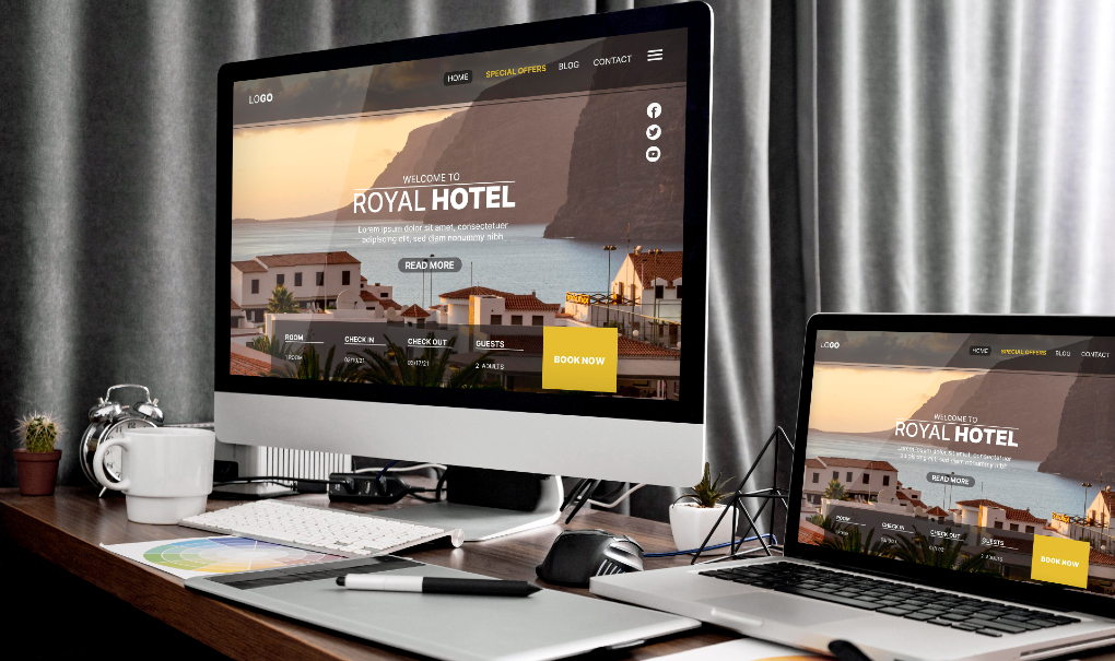
Detailed look at how to design websites that adapt to different screen sizes and devices
What is responsive web design? That is a million-dollar question that all designers must be able to answer.
Site designers and brands must keep ahead of the curve in this ever-changing digital environment, where responsive web design comes in.
Since the creation of the initial website, people have worked to make the designs more dynamic, flexible for numerous devices, and responsive to the user’s every demand and command. Designers are working hard to create responsive and modern websites.
You’ve come to the right place if you’re wondering what responsive web design is. This post will detail what makes a website responsive and how to build a website using the finest web design standards.
What is a Responsive Web Design?
The best way to address the question ‘What is responsive web design?’ is to discuss what makes any interface ‘ responsive.’ A responsive website responds rapidly to user activity and can be accessed from any device.
Web design focuses on creating websites that give consumers the best possible view and increase interactivity. Make your website responsive by including icons, photos, and graphics.
The website must also work on different devices. Whether the user wants to view it on their laptop or a smartphone, the responsive website would maintain its dynamic design to offer users a seamless browsing experience.
Building responsive websites has become essential, as more and more people browse the internet on smartphones and tablets. If you want users to easily access the information on your website, making it dynamic is the best way to do so.
Adaptive vs Responsive Web Design

When you are creating a website, you need to understand the difference between adaptive and responsive web design, and you should know what is responsive web design. Both aim to create an interactive design, but there is a slight difference between the two. Let’s take a look.
Responsive Web Design
You must be wondering what is responsive web design? Designers use flexible layouts, fluid grid systems, and vector graphics to create a responsive website. This allows the website to be viewed on any device. You must use CSS media queries to create an adaptable and dynamic web design. Responsive websites are interactive and also require maintenance.
Adaptive Web Design
On the other hand, an adaptive website is slightly different. This kind of website requires the web designer to create unique layouts and grids for any device. Whenever the user accesses the website, the server analyzes the requesting device. The server then responds with the layout that best fits the resolution and screen size.
This makes the website entirely adaptable to any standard browser. However, such websites require more resources to build and are much more challenging to maintain than responsive websites.
While both kinds of websites exist, in this article we are only going to focus on discussing what is responsive web design.
How Do You Make Your Website Responsive?

When building websites, it is essential to prioritize responsiveness. What is a responsive website? Let’s explore approaches and techniques for achieving responsiveness in web design;
1. Utilize Meta Tags for Viewport
Including the viewport tag in your HTML code can ensure your website adapts to all devices. This tag allows browsers to adjust the dimensions of web pages when accessed from different devices.
2. Implement Flexible Grid Layouts
Incorporating flexible grid layouts can add responsiveness. Using units like percentages, you can define the height and width of page elements and tables. This approach ensures all elements scale appropriately and maintain visibility across all devices.
To enhance the user experience of your website consider incorporating touch navigation. By making menu items and buttons accessible users can easily navigate through all the features.
4. Optimize the website with visuals and multimedia
To make your web pages visually appealing and engaging include images and media such as vector graphics. Incorporating media elements can make your design dynamic.
5. Incorporate CSS media queries
When designing websites, utilizing CSS rules that adapt to different device layouts is beneficial. These queries ensure your site is responsive across all devices, allowing elements and fonts to scale appropriately on any screen.
6. Regularly update the website
To maintain a website it’s crucial to regularly test its functionality across various devices. Utilizing tools can help ensure that your website remains up-to-date at all times.
By following these steps, you can create a website that adapts seamlessly to devices while maintaining its dynamic nature.
Best Practices for Building Responsive Websites

If you are wondering, ‘what is a responsive web design,’ we have you covered. There are certain best web design practices that you need to follow to make websites dynamic. Here are some recommendations you should consider;
If you want to ensure your website is responsive, then keep it simple. By keeping things uncomplicated users can easily find resources on the website.
Prioritize Content
What is responsive web design? You can make your websites responsive by highlighting important information and making the call to action easily accessible on all devices.
Design Your Website to Be Mobile-Friendly
Considering the growing trend of accessing websites via smartphones, it’s crucial to ensure that the design adapts well to all screens.
Maintain Consistency in Branding
You must keep your design consistent across your website by using the same colors, fonts and ensuring that your logo and company name are visible regardless of screen resolution.
Make Your Typography Fluid
Ensure that typography adjusts seamlessly on all devices. By utilizing CSS rules that adapt element sizes based on screen resolution and layout, you can ensure fonts and written content are easily viewable across all devices.
Incorporate User-Friendly Elements into Your Website
To make your website more responsive, add touch-friendly features. Including touch buttons and forms can enhance user engagement and encourage longer website visits. So, users will spend more time on your website and increase traffic.
Enhancing Page Loading Speed
Understanding web design also involves optimizing page loading speed. You can improve this by compressing images and minimizing scripts. This results in faster load times and quickly take users to your landing page.
Keeping Up with Current Trends
When building a responsive website, you also need to look at the latest trends in the world of web design. You can use several websites to get an update on the top web design trends of 2023. You can quickly get an inspiration from trending designs.
These are some of the ways you can make your websites responsive. Follow best practices and the latest trends to create a beautiful and dynamic website.
Conclusion
In this article, we delved into the captivating world of web design and discussed what is responsive web design. We looked at the features that make a website responsive. We also talked about the ways you can build a responsive website. Additionally, we looked at some of the best practices required for making sites dynamic.
Over time, more and more users are now accessing the internet through smart devices. This has created a need for designers to build websites that can be easily viewed on all devices. We’ve looked at the ways you can turn any website responsive so that it can be viewed on any browser.
If you are a web designer, then you must understand that building responsive websites has now become essential. Such websites not only increase user engagement, but they are also required to help you achieve your goals behind creating a website.
