Responsive design enables designers to work with multiple screen sizes. Responsive design is easy to explore when it comes to digital design.
It is, however, more difficult when it comes to working in print. Print has fixed page sizes, margins, templates and other physical constraints.
However, for digital designers, designing for desktop or mobile is limited, as more and more gadgets are invented all of the time. Wearables, tablets and multiple screen sizes have made responsive design crucial.
Let’s explore some of the principles of responsive design and how this enables designers to adapt to the ever-changing screen sizes which emerge from the marketplace.
Responsive design is not limited to mobile use
Although mobile phones or devices have a lot to do with the reasons designers emphasize responsive design.
However, responsive design is not simply limited to mobile users. Instead, it is about being able to access great web designs from almost any device.
This means that if you’re creating some cool CSS text effects for mobile and desktop, they should look good on a wide screen TV as well.
Instead of focusing on mobile phones, think about how you’d like your design to have an impact on any screen size.
You’ll want your images to give a clear message and your content to be legible on any device. This will give your site visual impact no matter how they are accessed.
Responsive design is about creating a great user experience no matter which devices users utilize to access your site.
When you use responsive design remember that it is not simply about creating different versions of your site for mobile or desktop devices.
Mobile devices are constantly evolving and come with different screen sizes. Creating a standard design for mobile would be an impossible task to achieve.
Using fluid grids in responsive design
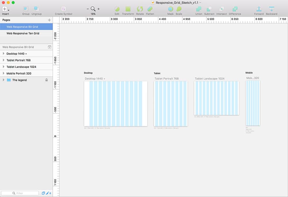
When you’re working with responsive design, the foundation revolves around making use of a fluid grid system.
Without using a fluid grid, you will have to adjust your screen each time your site loads.
This will mean zooming into your screen in certain places so that you can view aspects of your content while zooming out in other places in order to gain a full perspective.
When you design using a fluid grid, however, then each column of your grid will adjust to different devices and the various screen sizes which come with them.
If you use three columns on a website design for a desktop screen, you might find that these three columns will become cramped and squashed looking on a mobile screen.
Instead of cramping, these columns can be placed on top of each other for mobile devices. Your user will then be able to scroll the page to read your content.
The differences between responsive and adaptive design
The design comes with a great deal of terminology. You might have heard of the term ‘adaptive design’ before. It’s often used interchangeably with responsive design. However, these two principles are not the same.
The adaptive design explores defines where your design breaks down according to each different device. Each individual device is targeted using CSS.
You might have different screen resolutions for desktop screens, tablets or mobile phones. This will be incorporated into your design.
Both adaptive and responsive design add different elements into a design. The different approaches you use will depend on the content of your site.
However, when working towards designing a site, it is also important to consider that there are multiple sized screens. There is no single size for a phone, tablet or even desktop screen.
The task of adapting a design to a particular type of screen is incredibly complex. This is why designers use responsive design.
Progressive enhancement and graceful degradation
Progressive Enhancement involves putting the foundational structures into place on a website. Designers then develop the site from the foundations up.
The focus is on moving from simplicity towards a greater complexity in design. As features become available, more and more is added to the site. This approach is great from a Mobile First perspective.
Graceful Degradation moves from complexity to simplicity. A designer uses this strategy when building web pages for a range of different browsers.
Designers build the site with a range of features which can be observed in modern browsers. However, if a site is viewed by an older browser it will still be functional.
However, fewer features or different displays will be used. As a designer, it’s important to keep Positive Enhancement and Graceful Degradation in mind.
Both strive for the ability to be able to show your content to the best of your ability. This is true no matter which device is used to access your content.
The web shifts and changes all of the time and these two features assist designers to work with these changes. According to Progressive Enhancement, that means that layout is itself an enhancement.
Instead of designing in a way which mimics media queries on older browsers, you make the site simple. A single column enables viewers to scroll down and read the site.
Both outdated browsers and mobile devices will be able to view the site in this way. This site layout will be hack free.
It is also JavaScript free and therefore relies on the lowest common denominator to build a great site.
When building using progressive enhancement, it’s important to remember that browsers change and evolve all of the time. There are multiple versions of Internet Explorer, including two mobile versions.
Chrome can trick browsers into thinking it is Firefox. Android has released over 1000 different mobile devices onto the market. Using a range of different browsers to see if users can access your site is therefore unhelpful.
Instead, it is often more helpful to use a tool called Modernizr. This tool is able to feature detect. You can find out the HTML, CSS and JavaScript feature each browser has to offer.
When you design your site, ensure your user is able to use your site content regardless of the browser they are using.
The flow
The flow means that a site is designed so that all information which is shown on a small screen gets pushed down.
This prevents squashed content and makes a site easier to read. The user simply scrolls down to access further information.

If you’re used to designing with pixels, this might not make sense. However, the idea will quickly become familiar as you work with it.
Important Points when working with responsive web design
Working with a fluid grid means you will be working with percentages instead of pixels. This will keep your site clean, orderly and simple to read.
When you include images, you want your user to see the message you are trying to communicate.
Therefore it is important that images and videos should adjust or scale themselves to send the same visual message, regardless of the screens they are viewed upon.
Media Queries use CSS in order to alter visual layouts depending on screen size. This means that a site which is designed as 3 columns for one device will be a single column for another. This assists with legibility.
When designing for responsive sites, remove all surplus content. Keeping your site simple and easy to use will appeal to your viewers.
On small screens, excess content can often seem overwhelming. Keep it simple. Core content will then be easily accessible.
Responsive Navigation means that viewers will easily be able to access and find their way around your site. Not all websites require responsive navigation. However, this is very helpful for those with large menus.
Summary
The use of mobile devices to search the web is increasing rapidly. However, when websites are not optimized for mobile use, they become awkward and tricky to use.
Screen sizes can feel constraining and this has an impact on how content is perceived on screen.
There is a wide range of screen sizes which exist at present. From wearable technology to a variety of phones and tablets, multiple display sizes require an innovative approach to web design.
It is now becoming increasingly important that all websites (including design portfolio websites) are designed to adapt to a range of screen sizes.
Responsive design enables a site to adjust to a user’s device, regardless of the option they are using. Layouts adjust based on both screen size and the capabilities of a device.
