With more people surfing the web from their mobile devices, designers and developers have been trying to figure out the best way to cater to visitors on both mobile devices and computers. When internet capable phones first began gaining popularity the method was to have two separate sites, a mobile site and a “full” site. But that would limit the mobile viewers’ experience because the site would be so basic it would cause you to wonder if it was coded by chisel and stone. That was then, now everyone is jumping on the “Responsive Web Design” bandwagon and finding it to be a rather happy median.
I like sites that maintain their appearance, at least to some degree, all the way down the resolution latter. But I also understand that specific industries and target audiences come in to play. In some industries, a person may only be viewing a site from their mobile device to find that companies contact info. In those instances, it is probably best that’s what they get from your mobile sized home page as soon as it loads, you can always include links at the bottom to everything else. I would encourage you to help your clients figure out what’s best for them, and keep all monitor sizes and internet browsing devices in mind as you’re developing your next project.
Responsive web design refers to a site that is developed to degrade nicely across multiple screen sizes and resolutions, from the largest Mac display down to the minutest mobile device. It also works wonders on frame size, square or widescreen, as well as window size, as not everyone prefers their browser to be full screen. There are three key factors to developing a responsive website, flexible layouts, flexible images, and media queries. Let’s take a look at 10 excellent examples of responsive web design.
Sony
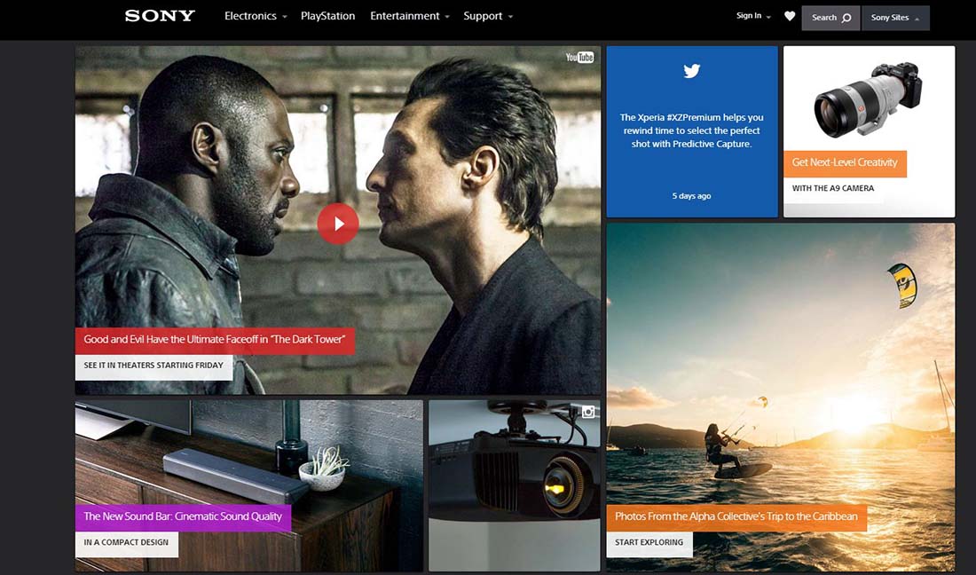
Sony is a big brand that has embraced responsive web design. You’ll notice there’s not much of a difference between the widescreen and traditional square screen versions other than everything looks a little more compact on the square screen. But if you start with it out wide and squeeze your browser window in, you’ll notice that the main image actually resizes itself to a smaller version. It resizes itself again once you get down towards mobile device width as well.
Gravitate Design

It’s no surprise that a design studio such as Gravitate Design features a responsive website design on their own site. Whether you are a freelancer or a large design studio, you always want your website to display the full extent of your design prowess and knowledge. I really like Gravitate’s site not only because it’s responsive but because it’s very clean and simple. Their color palette compliments itself nicely and they didn’t go overboard on shadowing, borders or putting all their content in boxes.
Spark Box
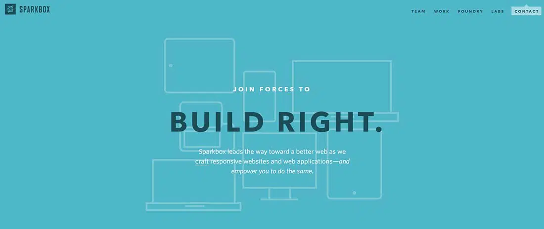
Spark Box is another web design studio that knows a good thing when they see it and doesn’t hesitate to implement it on their own site. One thing I really like about their website is how they use the width when they have it, but gracefully adjust when they don’t have it. Their little text blurb to the right of the monitor icons on the home page is a great example. It doesn’t look out of place aligned to the right in widescreen mode, nor does it look out of place centered underneath in square mode and mobile mode.
Food Sense
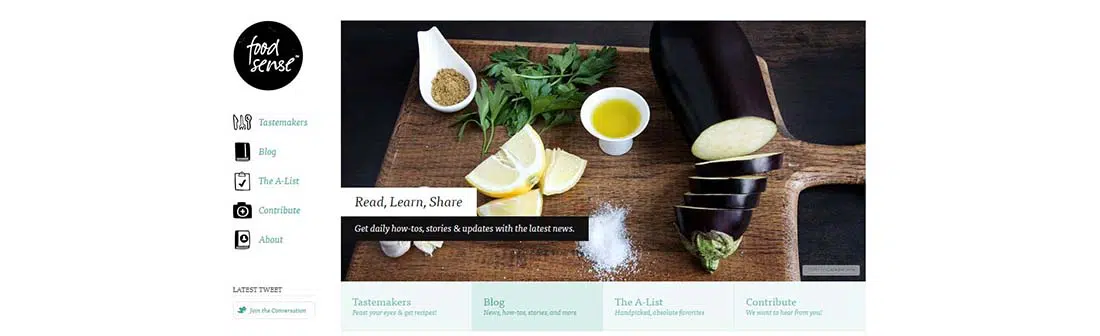
Food Sense is another great example of responsive web design. They use the width when they have it, but when they don’t they adjust without losing any of the clean look or flow to the site. The only unfortunate thing about the site is that once you leave their widescreen parameters you lose their latest tweet and Facebook plug that’s on the side column under the navigation. They still have links to both social networks in the footer, so it’s not a huge deal. But still would have been nice to see those features appear elsewhere in the skinnier designs.
Warface
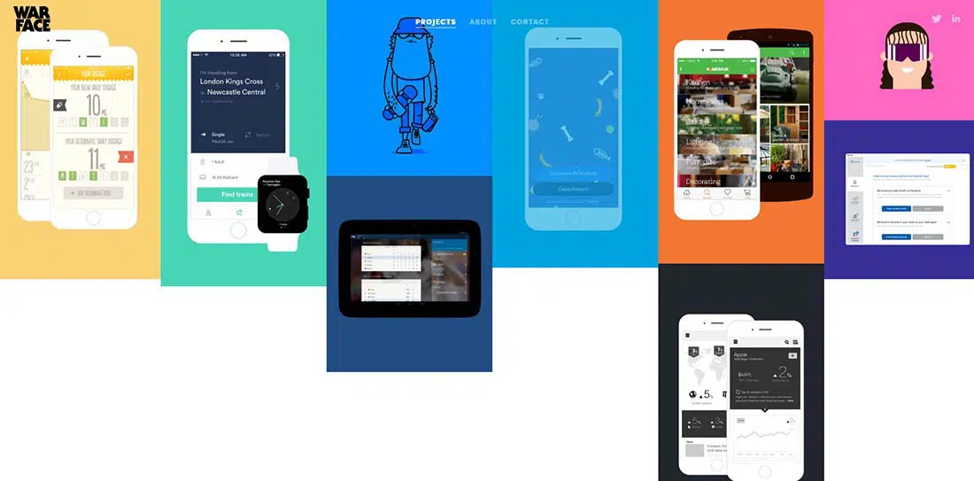
Warface is the real deal. It’s creative, extremely fluid and if you stretch and squeeze the width you’ll notice that it’s not one flat image, but in fact, several stacked on top of each other.
Clean Air Challenge
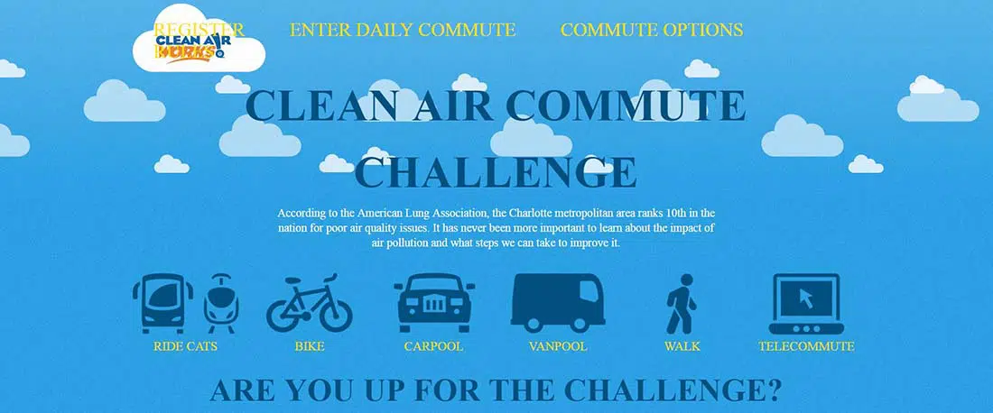
Last week I talked about sites with parallax scrolling and this Clean Air Challenge site just barely missed making my list. The site itself isn’t totally parallax scrolling, just the clouds in the background are. However, the site is an excellent example of responsive web design. Another aspect of this site that I liked was that the only images that you lose once you hit the mobile sized version of the site is the repeat of the main navigation icons that appear in the footer.
Sasquatch Music Festival
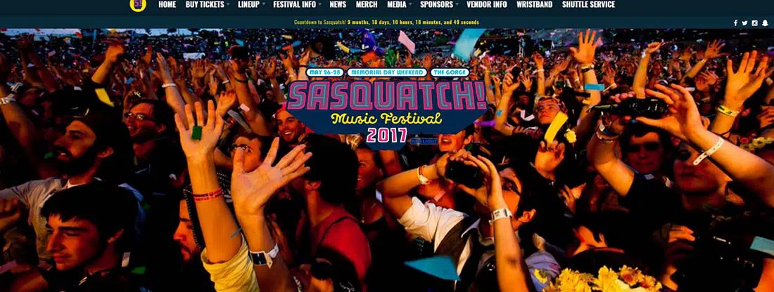
Sasquatch is an annual music festival in my neck of the woods featuring some big name artists. When I came across their site and saw that it’s as fun to look at as the bands they book are to listen to, I was quite excited. This site sticks out from a lot of the others for me because of all the colors, images, icons and overall sense of style it has to offer. A lot of the responsive websites I come across seem to be heavy on text, light on imagery, and only two or three colors throughout the site.
Andersson-Wise
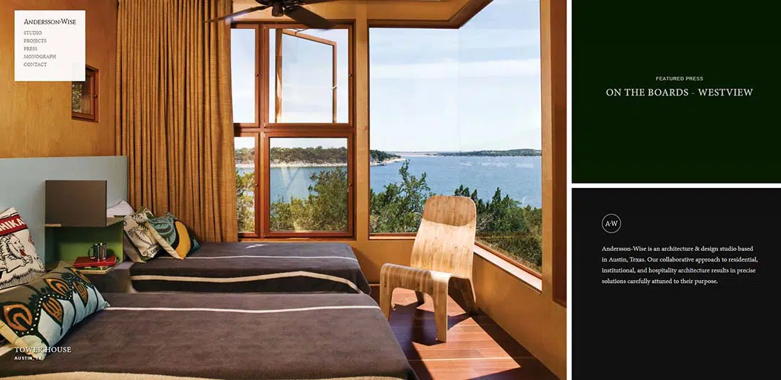
Andersson-Wise is an Austin, Texas based architect and design firm. Antialiasing jQuery scripts help this site maintain its responsiveness, regardless of how big your display is, this site will keep up. A very simple, modern, clean and classy look, perfect for an architect and design firm.
The Cacao Trail

I can only imagine that The Cacao Trail website is almost as enjoyable to navigate as the actual trail is. You lose the main image on this site as soon as you go from widescreen down to a more traditional sized monitor, which I don’t mind as the image doesn’t really do too much for me and it would certainly save you a lot of load time on a mobile device. I do like how the main navigation links enlarge once you hit the mobile sized version, it can get to be a bit of an annoyance trying to touch tiny words to navigate a site on your touch screen mobile device.
Alsacreations

Alsacreations took another interesting approach to their responsive web design. Rather than worrying about keeping all aspects and elements of their site intact between different resolutions, they simply focused on what was important and dropped the bells and whistles. From widescreen to square they dropped their image slider, then from square to mobile, they dropped all elements except their “About” blurb and their email form while including links to everything else.
Yoke
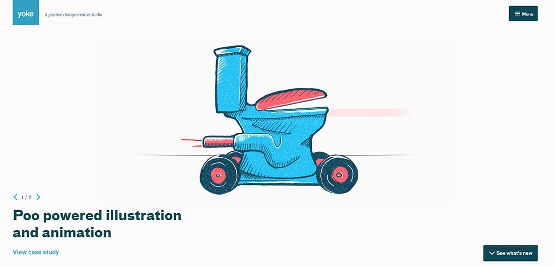
Yoke is a fluid site thanks to a bit of javascript and its WordPress platform. A well organized and structured layout keeps all of the animations and imagery from giving the site a cluttered look but keeps the site looking fun and creative.
Spigot
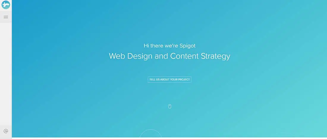
Spigot Design is yet another design firm who showcase their responsive abilities on their own website. The overall look and layout of the site is very clean, almost minimalist, but a decent amount of color and creativity provide a nice balance and accent where it’s needed.

In my personal opinion, half of these mobile versions are still entirely too busy. Some great content in here but there’s a few that still need work
Great examples of responsive web design. In some cases, the website changes completely for a different screen size… I bet it’s very hard for designers to make that happen.
These Web Design are great. Thanks for Sharing. Excellent Work Indeed.
Thanks so much for sharing. I’m browsing the web looking for full width examples.
Keep up the good work 🙂
As a web design / development company we have found that most of our new customers are requesting that their sites be responsive and we have moved in that direction in a strong way. We have even set up our website to demonstrate how a site works “responsively”.
We realize that about a 5th of the visits to any website is on a tablet, phone or other device and that if web developers don’t stay up to date they will miss customers that realize that as well. We are happy to provide responsive websites to our customers and feel that ever web design and development company should be able to provide responsive design for their customers as well! Just looking over the sites you show above should motivate others to make a move in this direction if they haven’t already!!
Responsive design works well for light-weight websites and brochure sites. Once you start to actually do transactions, eCommerce or deep content linking it fails. Big time.
Look at the Sony site on your smart phone. Basically it gives you a decent landing page. But then click on Shop Now. You’re back to a desktop website that probably has an abandon rate in the 90% range.
More sophisticated solutions from companies like Usablenet or Moovweb are much better suited to providing an optimized user experience and providing real value to the business.
Just a comment around “Alsacreations”. If they had to drop the bells & whistles like the slider & icons for the mobile size, they probably didn’t need those bells & whistles to begin with.
Lovely web design examples! Thank you for inspiration 🙂
Great collection, call me old school but i never saw a responsive site using breadcrumbs. OK, the most of them don’t need it as they do not have in depth page structure… however i kinda miss it.
Muy buenos los ejemplos. Espero nuevos posts si son todos de esta calidad 😉
I love responsive techniks, nice example
any clue as to where to place ads in a responsive design layout? Your examples are great but they contain no ads 🙁
It’s very good est example of responsive design
Really interesting article! Responsive design continues to get a lot of attention. Thank you so much for this fine piece of quality content. Stay blessed
Best example of responsive design I’ve seen to date.
Hey that is a good post & a good set of conversations too. Keep sharing, that is good…
Where can we find some useful info about the coding that makes this responsive approach possible?
Designers are creating some incredible looking websites compared to a couple of years ago. Looks fantastic! Thanks for the post.
http://www.css-tricks.com/ should definitely be added to this list!
Is a good innovation this..in the future I hope to make a good sites without flash o
similar things. Thanks for examples.
Alsacreation est top, ils font pas des bouquins pour rien 😉
This site is very convenient for us and also very much user friendly.
I believe you have done a good job by posting such informative article. It has been seen that responsive web design is a concept of developing a website design that helps the lay out to get changed according to the user’s computer screen resolution. Thanks for sharing it.