The use of mobile devices such as iPad, iPhone, and other smartphones has increased a lot in the last few years and this represents the main reason why responsive web design started to gain more importance in web design.
These days, making your website responsive is a MUST! With so many mobile devices out there, you’ll be missing a lot of visitors if you won’t modify your website and make it responsive too. If you are a beginner web designer or just want to improve your skills, these best responsive web design tutorials will teach you how to develop a responsive website that can easily adapt its layout and design to fit in any device resolution.
These useful responsive web design tutorials will help you better understand this concept and design more complex websites.
Full Screen Responsive/Animated Landing Page – HTML5 & CSS3 Tutorial
Learn how to make a full screen responsive animated landing page with this video tutorial. Making a full-screen landing page responsive can be really tricky and give a lot of headaches but after watching this tutorial you will not think that anymore. This tutorial comes in really handy and will improve your coding skills. At the end, you’ll have the responsive full-screen page you have been trying to make. Try it out and watch how your skills rapidly improve.
Full Screen Landing Page – Responsive HTML5/CSS3 Tutorial
This is a really nice tutorial that will help you a lot, especially if you found the previous tutorial helpful and you want to learn more. You definitely enjoy this one. This video tutorial will teach you how to make a full-screen landing page. Check it, improve your skills and learn some new techniques with this HTML/CSS3 tutorial.
Responsive Web Design – The Viewport
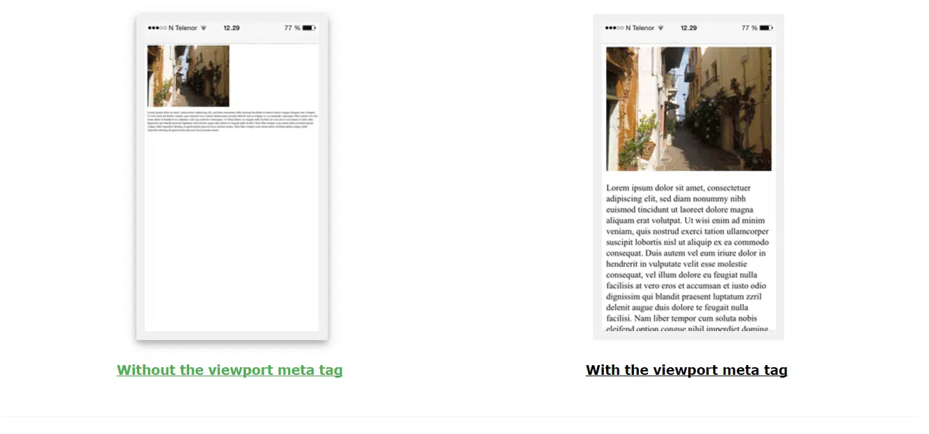
Viewports are very important in designing a responsive web page. They are practically the user’s visible area of your site. Initially, sites were designed to fit a computer screen but now that we have started using tablets and phones on a daily basis, we have to rethink the way we code and design, so that our website looks great on any device possible. So feel free to have a look at this tutorial to find out how easy it is to work with the viewport and learn how to set it out so it can size its content to offer a better user experience. Learn how to set your viewport using this method introduced by HTML5 to let web designers take control over it through the <meta> tag.
Responsive Web Design
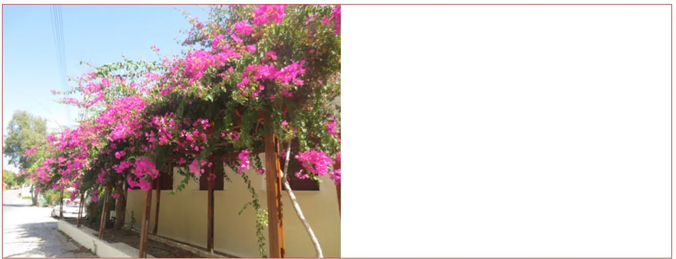
This responsive web design guide gives you a different approach to responsive design and teaches you how to understand responsiveness using a nice, easy to understand visual guide. In this tutorial will consider a design example, a simple page built for a hypothetical magazine. This simple page uses a two column layout which you will want to make it look good on any device and browser. The columns were built on a fluid grid with just a few images peppered throughout.
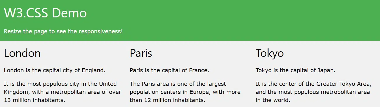
Responsive Web Design – Grid-View
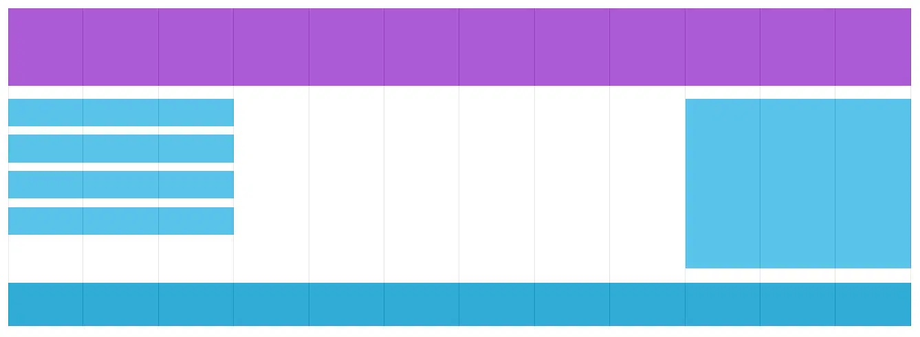
The next part of these series of tutorials is about Grid-Views. Find out what they are and why they are so important, learn to build a responsive grid layout and place your content wisely. This tutorial will take you through each step of the way but do not forget to take a look at the rest of the tutorials from this set to learn more tricks and tips. At the end of the tutorial, you will notice that the webpage in the example still doesn’t look good when you resize the browser so make sure to take a look at the next chapter in which you will learn how to fix the problem.
Responsive Web Design – Images
Now that you have learned about viewports and grid-views lets take a look at this tutorial which will teach you how to easily make your images look good on any device. You will learn some cool stuff about the max-width property, background images and how to display different images on different devices. Problems, like using the width property, using the max-width property, adding images to the web page, background images or picking and using different images for different devices, will no longer be a problem for you. You will even learn how to use the <picture> element. HTML5 has introduced the <picture> element, which lets you define more than one image. All these useful things will let you create an awesome responsive website in the future!
Responsive Web Design – Media Queries

If you were wondering what Media Queries are and how they work, then you might want to take a closer look at this tutorial about them. Media Query is a simple CSS technique uses the @media rule to include a block of CSS properties only if a certain condition is true. It is as simple as that, but why stop there and not find out more. Have a look at this tutorial to improve your skills and to continue your set of responsive web tutorials. After finishing this tutorial, you will know how to add a breakpoint in your coding process and how to always design having smaller devices in mind.
Responsive Web Design – Frameworks
This tutorial will give you an insight on what frameworks are and some good examples for you to use in your projects. This tutorial comes in really handy if you are trying to learn how to use W3.CSS, Bootstrap and failing. If you will take a closer look at this tutorial you’ll notice that for each of the two frameworks they have links to much more detailed tutorials. All in all, this tutorial will help you create a responsive style sheet.
What Exactly are Media Queries?
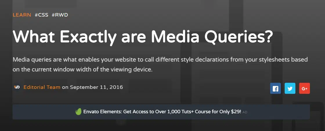
This tutorial is a detailed example in regards of Media Queries. Find out more about how they work and how to use them to resize your stylesheet’s current width into the width of the viewing device. This tutorial is quite useful, especially thanks to all the tips and tricks it will teach you. You can read this tutorial whether you are a beginner or an RWD expert because you will be taking an extended look at its backbone, the Media Queries. If you are not familiar with the media attribute, no worries. They are used to separate different media types. Commonly used types are print, speech, projection, braille, and all. Despite the usefulness of each media type, for RWD our focus shall be geared toward the screen type.
Responsive Email Design
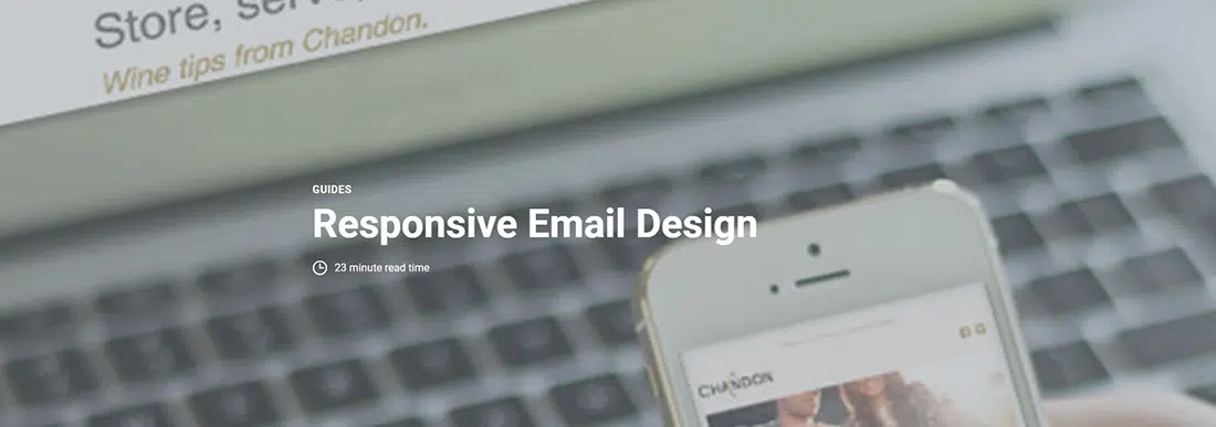
Ever heard of responsive email design? If not, then you must have definitely had at least once a horrible experience with reading a newsletter email on your smartphone. Newsletters look really well in your inbox but can be really difficult to read on a smaller device and this is why Campaign Monitor has come up with this impressive guide about the principles of designing for mobile as well as the fundamentals of designing and building mobile-friendly emails. Throughout this tutorial, you’ll learn its benefits, some cool tips, and techniques. Find out why you should optimize your emails for mobile and tablets learn some design techniques along the way.
Adaptive layouts with media queries
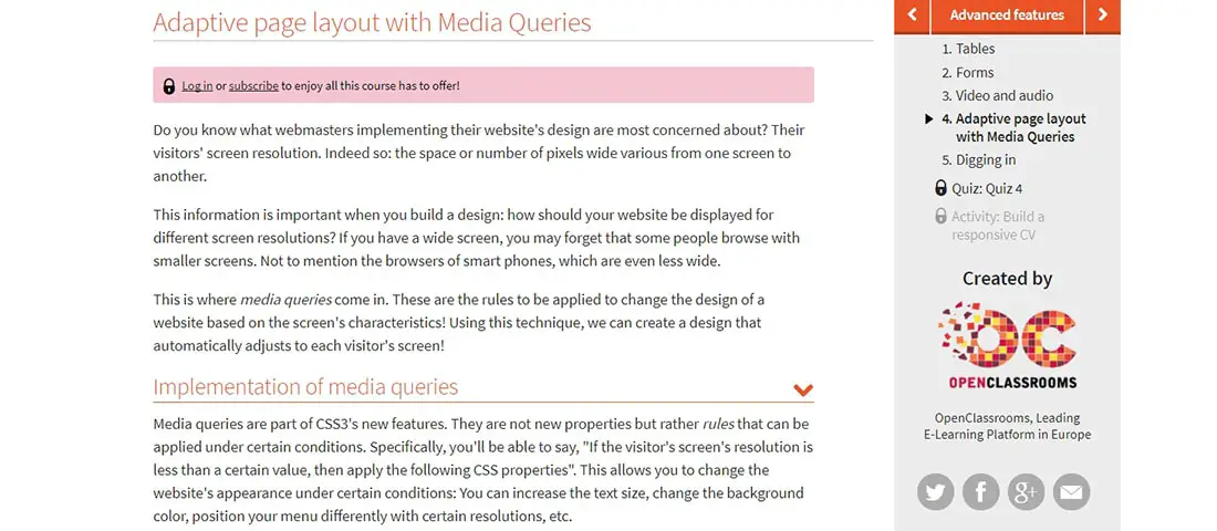
In this complex tutorial, you will learn how to use adaptive layouts with media queries which affects browser dimensions (width, height, and aspect ratio), device dimensions (device-width, device-heigh, and device-aspect-ratio), browser orientation, and much more. The visitor’s screen resolution is what web designers are most concerned about. This mainly focuses on the space or number of pixels that vary from one screen to another. Knowing all those details about spaces or pixels is important and it will help you understand how your website will be displayed on different screens. Media Queries and this tutorial will help you understand the basic steps of responsive design.

Thats all very well and good! But it dont make no difference, cos in the end it boils down to browser design. It will only change for the good when, browser designers stop fighting for world dominaton of the web and start claborating on design standards only then will you have true cross compatiblity that dont break the web, html5 as a point in question!!!
I remember back in the 90’s when all web designers had to worry about was making sure their website rendered correctly in both Netscape and IE. A lot sure has changed since then. I have designed most of my sites to be iPhone friendly, but they look nothing like this. Thanks for sharing these references, they are going to be very useful for me.
Real useful information
We’ve been experimenting with responsive layouts here at sent concepts