Typographers have been playing with typographic puzzle pieces for a long time now. They have a lot of eccentric and entertaining options at their disposal. Let us start by looking at different typographic options and typographers approach to creating a typeface. Read on if you are interested in learning different type styles, their qualities, and type transformations.
This article doesn’t give you a tutorial on typography basics like kerning, spacing, rhythm etc. Instead, it focuses on the many practical techniques to help evolve your typographic style. Each section showcases the work of a typographic designer with the project description and imagery. It includes the work of some of the master designers in the field.
Champion Gothic
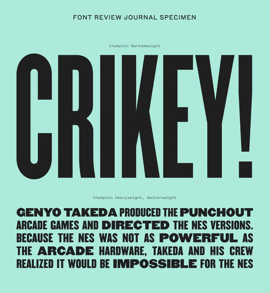
This typeface is derived from a wood type. It has a 90’s feel to it and is able to stand on its own. Many of the weights are direct translations from the wood typefaces. Champion is not a typeface you should use if want your design to look prim and proper. As it is derived from a wood typeface, the look and feel of it is more naturalistic. Use it only if you want your design to look hand-crafted and be ready to embrace all of its imperfections.
Apercu
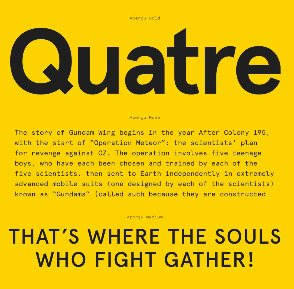
Apercu is a grotesque sans-serif typeface that gained immense popularity in 2010. It exhibits facets of geometric and grotesque characteristics. This typeface looks great when paired with bright colors and illustrations. Despite its malnourished appearance, it works across a variety of display situations. It is a low contrast typeface but has some character to it.
Maelstrom
Maelstrom is designed by Kris Sowersby. It is a reverse stress typeface, with thick strokes and delicate hairline in the middle. The extreme thick to thin contrast sets it apart and widely used in punk/brutalist aesthetics.
Ogg
Ogg has thin hairlines and swells out into wide brackets. It is a difficult typeface to ignore. Its calligraphic script gives it a formal presentation and is able to stand alongside with its aggressive and bolder counterparts. It looks good when paired with illustrations and is usually used in poster designs to editorial work.
Vulf Mono
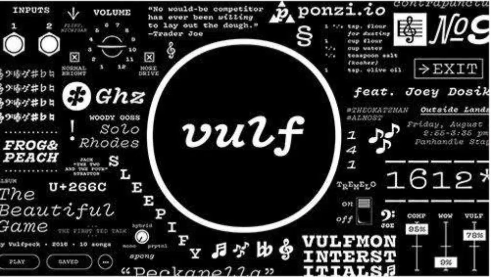
It exhibits humanistic qualities and exudes charm and playfulness. The edges are concave and have thick bracketed serifs. Vulf mono can be used in micro copy despite its thick bracketed ends. These playful letterforms are well suited for motion graphics and animations.
Melany Lane
Designed by Ryan Martinson, this is a flexible script typeface. It is textured and brushy in form. It can be used to dramatically change the tone of a text. It comes with a massive number of alternatives and can be easily used to create a bespoke design.
Casey
Casey has a strong, confident and an interesting style. It has thick curvy strokes and evokes a sporty and retro feel. It would be the perfect choice for a diner aesthetic or on a baseball poster. Casey comes in 3 weights- classic, bold and Ultra with bold being the most flexible.
GT Cinetype
This typeface is derived from the design of a machine that burned subtitles into a film. The result is a grainy and textured typeface with straight edges that doesn’t conform to a traditional design system. This letterform is great for designs that don’t have to look polished. It has its own qualities that make it an ideal choice for designs that carry a strong aesthetic point of view.
Euclid
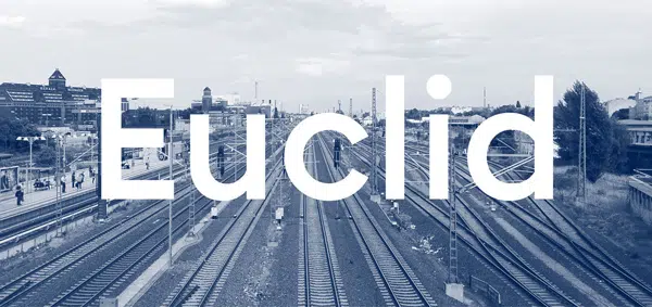
Euclid is constructed to be a mix between ultra geometric and minimalistic in design. It is made by Swiss Typefaces Design Team and is sold through their website.
Tiempos
This script is perfect for body copy with its short cap height and ascenders and descenders allowing for tighter line spacing. It can also be used for headlines and offers great flexibility in letter design. Tiempos recently collaborated with national geographic to create their own version called Tiempos Fine, which offers elegant cut for extra crispness.
GRAPHIK
Inspired by mid-century modernism Christian Schwartz created these typefaces in 2009. It comes in 9 varying widths and offers a great deal of flexibility in communication. Simplistic in form, it works great for editorial design, corporate branding, video and broadcast design, websites, apps, and user interfaces.
Akkurat
Akkurat is a sans serif font type that is quite popular among print designers. Its simplicity and clean curvatures make it an ideal choice for web projects. It is designed by Laurenz Brunner.
Adelle
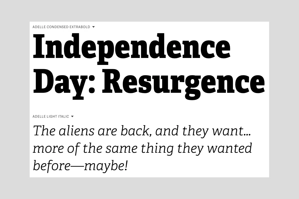
This slab serif font is used extensively in editorial design. Because of its versatility and flexibility, it is used in a wide range of web projects.
Konop

This is a gothic, monospaced gothic typeface that is completely square. It is again derived from a wood type and can be paired with contrasting fonts. It is designed by Mark Simonson.
GT Haptik
GT Haptik is designed by Reto Moser and Tobias Rechsteiner. It is a geometric grotesque typeface with an interesting twist. The upper case letters and numbers can be read blindfolded. It comes in 21 distinct styles and 7 different weights.
Brandon Grotesque
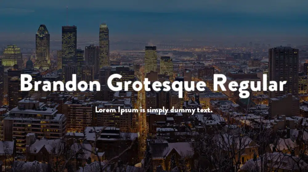
Its sharp angles and geometric form offer a great deal of clarity, 7 styles and legibility. It is designed by Hannes von Döhren.
Alright Sans

As its name suggests, this typeface is an unpretentious and modern typeface that works very across different media. It has a shorter than normal cap height and a large x-height. This makes it a great choice for all your web projects.
