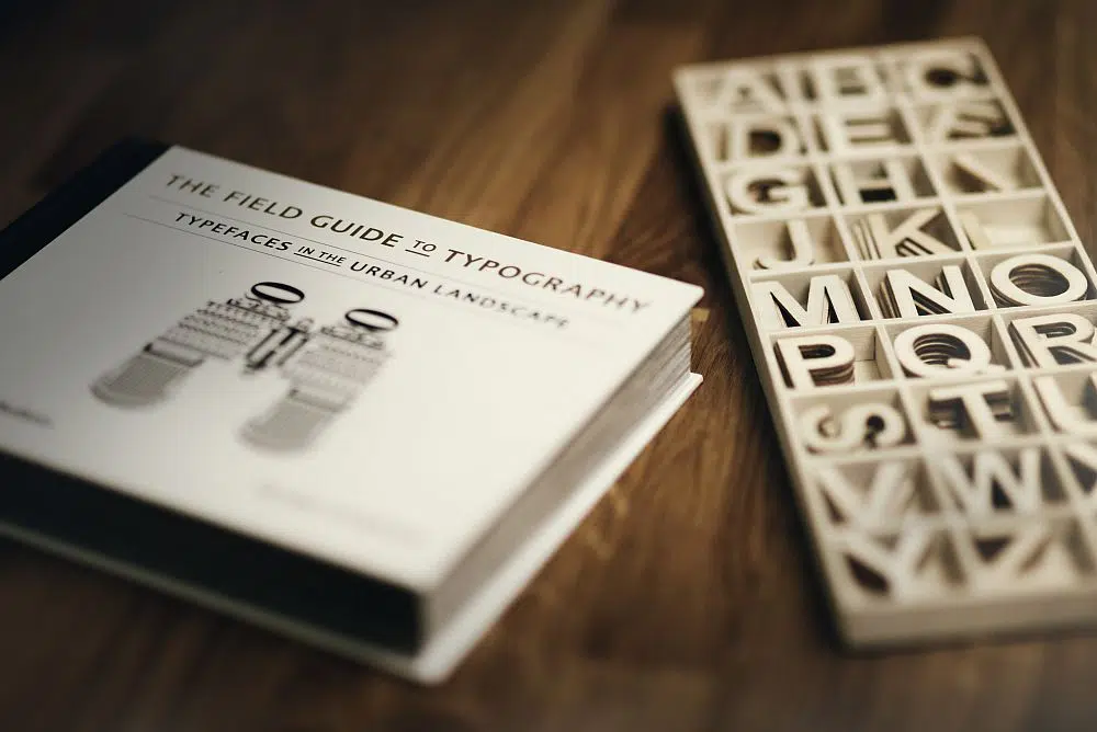
Graphic designers understand that typography is more than just simple text. In a digital age, the way you convey your messages needs to account for what you say in addition to how you say it. In order to stand out or stay consistent, you can’t overlook the significance of choosing a font that truly represents your brand and connects with your consumers.
It can be easy to overthink as a graphic designer. As you’re looking to be creative, inventive and unique, you can pull away from the true purpose of the graphic you are creating – to communicate an idea.
Looking back on the history of graphic design, especially in logos, you’ll find that brands are starting to understand the importance of creating a logo with purpose and intent, rather than simply a unique design. Many modern brands are tapping into the modern consumer and adjusting their font use to account for modern design best practices and user engagement. Other brands take a more traditional approach to font use.
While it makes sense to maintain a consistent image for your brand, at some point these more traditional brands will need to revamp their image in order to grow their audiences. What is your brand doing with its font that could be holding it back and what can graphic designers learn from poor typography to create logos and designs that connect with online users?
What constitutes a bad font?
Overuse – You don’t want to be part of a trend or, worse yet, late to a trend. Your brand shouldn’t convey a message of being typical and, therefore, replaceable. Who you are, the services you provide and products you offer, are unique.
Choosing an overused font for your graphics/logo can take away from the impact of your message. If you’re not the most popular brand utilizing a certain font, users could be distracted from your message by associating the font you use, with another brand.
Utilizing extremely popular/typical fonts like Arial, Times New Roman or Calibri is not only a common choice, but a thoughtless choice as well. If your brand feels as though the font that comes standard with the most popular word processors is most representative of your brand, you need to rethink your messaging. Users want something more animated and interesting than the standard.
Misuse – The modern consumer is an informed consumer. Utilizing a font that is inauthentic to your brand or industry will be noticed by potential customers. Take the time to find a font that truly represents your brand or your purpose for a logo or graphic.
Antiquated – Just as you wouldn’t build a website that looks like it was built in 1999, you shouldn’t maintain a logo that was originally designed in the 1800s. Modern consumers have a standard for what they expect in a font. Fonts that are creative, engaging, legible and sharp, will pop to potential customers.
More basic or overly intricate designs will equally put off online visitors. Your brand will come off as out of touch or less than. Invest in your business, invest in the experience of your customers by updating your brand’s font use.
Illegible – The quickest way to sabotage your message is to utilize a font that is illegible or hard to read. This is especially relevant in our fast-paced culture, where consumers don’t have time to closely dissect a logo, advertisement or graphic.
Often this occurs when brands get too creative and start to create a font that is unique and interesting. However, creativity does not supersede the message of a graphic. Another example of illegible fonts are “fancy”, scrawling fonts such as cursives.
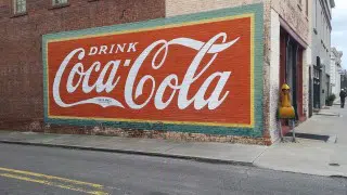
Type Font – Spencerian Script
Coca Cola utilizes the font, Spencerian Script, for their logo. This font was popular from 1850 to 1925. Coca Cola has used this same font since its inception in 1886. While this ensures brand recognition throughout time, there is something to be said about Spencerian Script’s popularity ending nearly a century ago. How many other popular brands can be seen using cursive fonts? Further, this particular logo is swooping, bulky and inconsistent. With how popular Coca-Cola is among soda brands, they are going to have to consider modernizing their brand. Spencerian Script is certainly not a timeless font.
![]()
Type Font – Univers Extended
Univers extended is a simple and clean font. Certainly nothing to scoff at, however, is the simplicity enough to convey the breadth and popularity of one of the world’s largest marketplaces? A subtle lowercase font accompanied by soft and playful colors, does not represent a dynamic technology that allows its users to buy or sell any product in the world. In order to compete with amazon or other emerging selling platforms, eBay should consider a more advanced and bold identity.
![]()
Type Font – Helvetica
Typical, uninspiring and bulky – all adjectives that accurately describe the JCPenney logo. A great example of using a popular and typical font leading to a very underwhelming logo. This type font doesn’t educate consumers as to what JCP is. The logo being connected makes it tight and lengthy. Altogether, this is a poor font choice, with zero creativity put in to compensate for the drab font choice by JCPenney.

Type Font – Unidentified/Custom
The scrawling font that General Electric has featured in its logo since 1895 is, well, a bit antiquated. As a brand that is supposed to represent innovation and technological advancement, having the same type font in their logo for over a century is frankly, inauthentic. In addition to utilizing an ancient font that misrepresents its brand, GE’s logo is unclear. Its combination of a lowercase g and uppercase E combine to what truly looks like an uppercase H at a quick glance. As GE moves towards continuing to innovate upon multiple industries, it should consider innovating upon its own identity into something sharper, more modern and creative.
![]()
Type Font – Segoe 2012
Sharp, clear, modern and yet bland and uninspiring. The Microsoft font again falls short of representing a company that has had a profound impact on the world of software technology. A fairly basic font, accompanied by basic colors and virtually no design leads to a logo lacking in flash or sophistication. While Microsoft didn’t completely miss the mark with a fairly clean and simple logo, it’s a great example of all of the little details that factor into your message that you send with your font choice.
When choosing your next font, remember to factor in what’s true to the brand, what’s expected from the user, what’s standard to the industry and what’s already been done. This is the best way to create a unique and impactful design.

The only one I would change would be JC Penney’s.
This is a very subjective article. I disagree in 4 of the 5 cases
Would you change the logo of Coca Cola. I would not… 😉