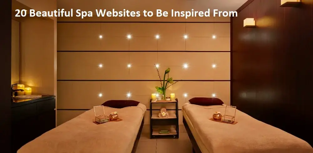
Whether you have to complete a project or were hired to build a salon and spa website, by looking at these spa websites, you will have enough inspiration to get started. Most spa websites have an accent of pink color to attract women. Another common feature is using a girl model on their welcome page. Spa websites are usually clean and organized. The designers of such sites always have the aesthetics in mind while ideating. Also, designers know the importance of displaying things related to nature on their website. So you will notice plants, stones, herbs, and more on every spa website. Here are 20 beautiful spa websites to inspire you to design a beautiful and functional spa website:
1. Madison Spa Resort:
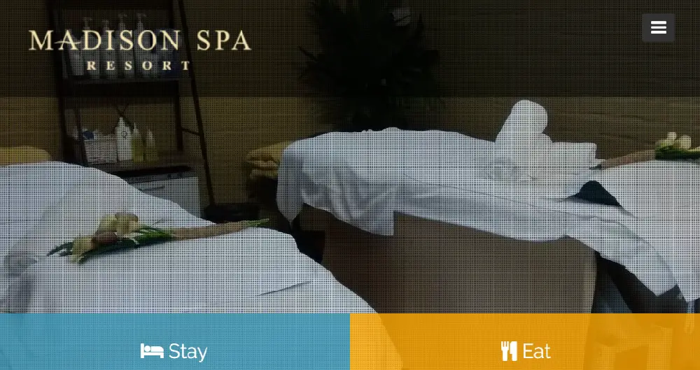
Madison Spa resort has a great website with a useful navigation bar. They have used double navigation on their site allowing users to have plenty of options. All their services are in the bottom navigation whereas all the general actions are on the top navigation bar. The welcome page has a slideshow of original photography showing the interior and exterior of their spa resort. On the top right corner the call to action is placed in the right manner, making it accessible to the users. You can find all the contact information in the footer of the homepage.
2. Spavia Day Spa:
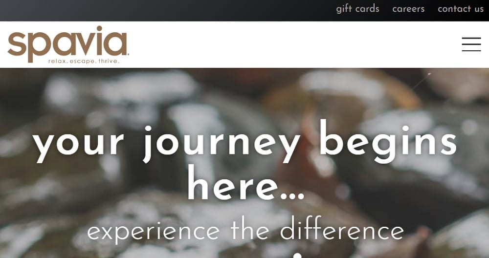
Spavia day spa is a luxurious spa that provides various services. The welcome page of their website has a strong quote with the changing background images of water and stones. They have used slightly different typography in their navigation bar, and that adds on to the look of the website. As the user goes down the home page, you will come across various services and a brief detail about each one. As far as the color theme of the website is concerned, they have used brown and white to give the site a more natural look.
3. The Mynd Spa and Salon:
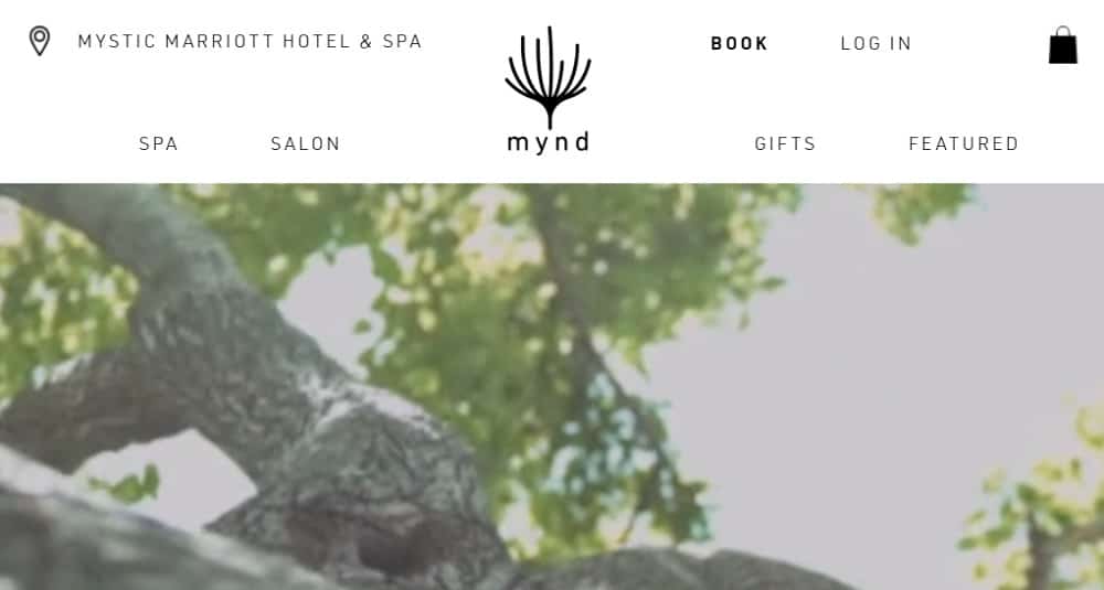
The Mynd spa and salon has a very prompt website because when the user first enters the site, they suggest them to subscribe to their newsletter. They have used a black and white welcome video on their home that connects humans with nature. The CTA is placed on the center of the homepage to grab visitor’s attention. The navigation bar is minimalistic, and the theme of the website is classic (black and white). Along with spa services, they have also advertised their salon services on their homepage to provide a brief introduction.
4. Haven Spa NYC:
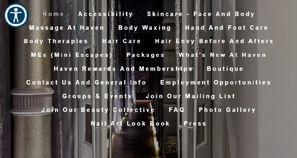
Haven spa has a trendy and unique website. They have placed their navigation bar on the left of the screen, allowing the background image to display on the full screen. The users can easily find more details about their services and contact information as they scroll over. Upon selection of the topic, you will get more detailed information about each service. The site doesn’t have many distractions, so the user only focuses on searching for services. The theme of the website is dark along with stylish typography.
5. Woodhouse Spas:
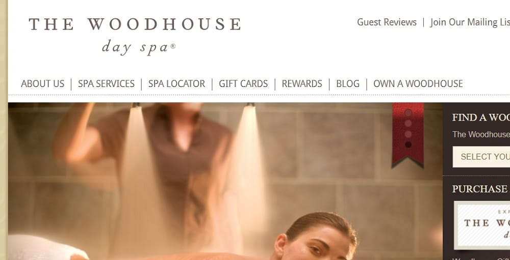
The Woodhouse day spa has a busy website with lots of information. They have used a slideshow of their photos along with a picture depicting their achievements. Just like some other websites, they have used double navigation for separating their contact information with their spa’s other details. They have placed their CTA of the right side of their welcome page along with an option to lookup their working locations. They have used different shades of brown on their website along with the base color of white.
6. Breezed Spa & Boutique:
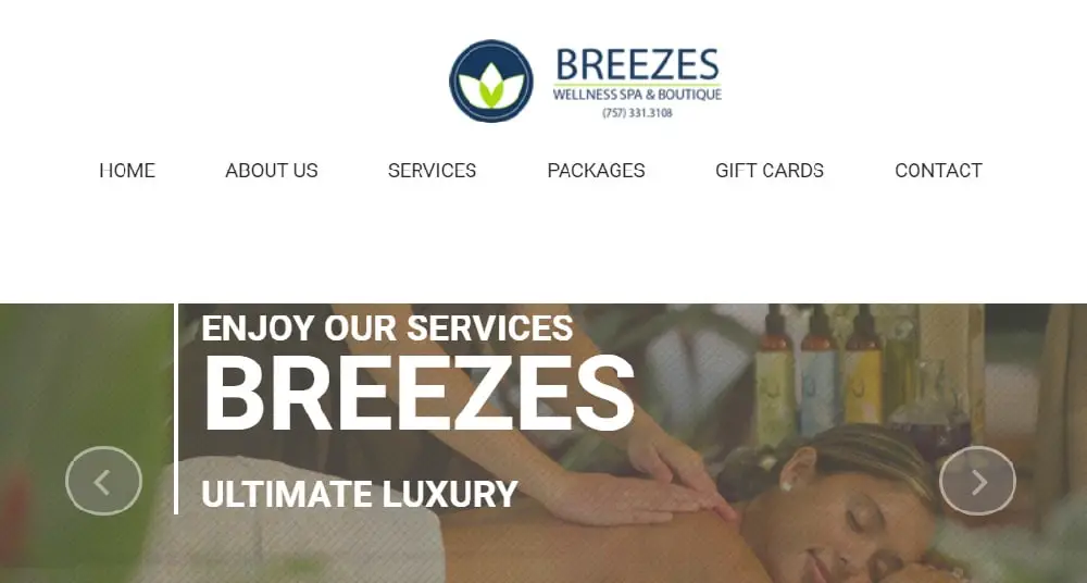
Breezed Spa and boutique has a luxurious feel to their website. The photos used in their slideshow on their welcome page depicts that they use natural products for their services. They have a minimalistic navigation bar with all the necessary options to explore the website. As you scroll through their website, you will get more information about their services in detail. You can also find packages with rates given which is an excellent way to help users decide what suits their budget. In the footer of the website, you can find more about their contact information, working hours, and newsletter subscriptions.
7. The Spa:
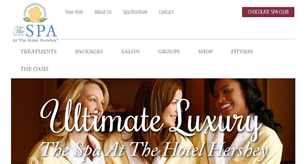
The Spa has a simple yet classy website that has a welcome image of a model in robes with their branding. The CTA is placed in the middle so that visitors don’t miss it. Along with this, you will also see pop-ups for signing up for their newsletter. They have used a double navigation bar that is useful, but the contrast of the colors does not highlight it. With a minimalistic design, they have not overloaded with information. You can find all contact details as you scroll through the homepage.
8. Bella Spa:
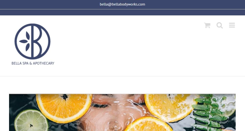
Bella spa has an elegant website with minimum design elements. They have put their logo first on the header followed by a navigation bar. The design of the site is different from other websites in the same niche. The CTA’s are placed all over the homepage, and you will find them once you scroll on it. The website looks incomplete in terms of designing and information. However, the site is mobile responsive allowing users to access it from their phones.
9. The Skin & Body Spa:
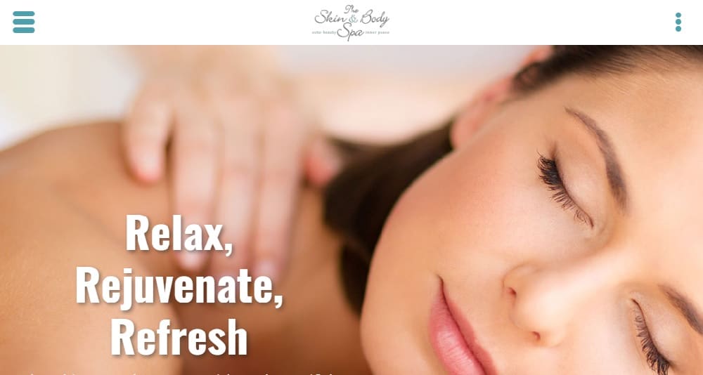
The skin and body spa has a bright website, along with graphics in the background. The contact information is present in the header itself, encouraging visitors to call or visit them. They have also highlighted “Free Consultation” along with contact details. Other CTAs are placed on the welcome image and emphasized using contrasting colors. They have used mint, and white color on their website, making the site look different. They also have a video on their homepage, helping users visualize their services well.
10. Milk + Honey Spa:
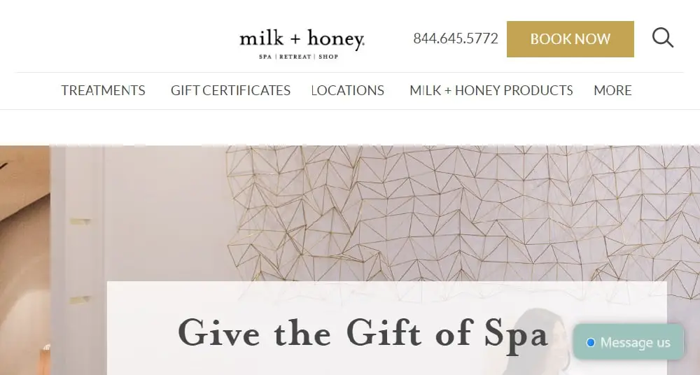
Milk + Honey Spa has a luxurious feel to its website. The original photography of their place and the products they use allow users to trust their services. Just like any other website, they have a simple navigation bar in the header. The homepage has lots of photos of their place, making the website look aesthetically pleasing. They also have blogs on their websites, helping visitors engage with their site. You can find all the contact information is given in the footer of the website.
11. Oasis Day Spa:
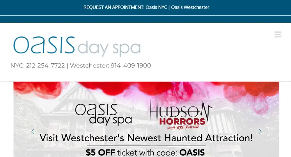
Oasis day spa has a commercial look to their website. They used the most common colors (blue and white) on their website. The contact details of different locations are given on the top right corner of the website. They have displayed all their upcoming events and services ad a slideshow on their welcome page. They have plenty of options for users to explore their website. You can find a form for their newsletter at the bottom of the homepage. You can find all their CTAs just after the welcome images.
12. Hand and Stone:
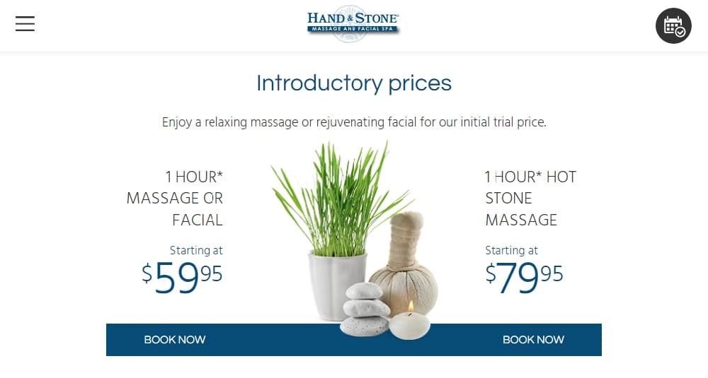
Hand and stone massage & facial Spa has a cluttered website with lots of information. They have used icons to display their services on the header along with their contact details. The site has two navigation bars for separating their spa services with other services. They have demonstrated their leading service on the welcome image itself along with rates allowing visitors to make quick decisions. The website is not built correctly, and hence, the quote on the homepage is partially hidden.
13. Rescue Spa:
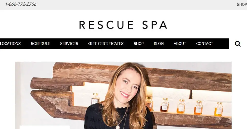
Rescue spa has a very modern, fresh, yet minimalistic website. They have used Polaroid sized photos on the site, making it more attractive. They have used original photography all around the website. They have displayed all their achievements on their homepage, building trust in their services. You can find all the contact information and newsletter subscription form in the footer. They have highlighted their navigation bar so that users can explore on their website. The site is aesthetically pleasing for the visitors.
14. Me Spa:
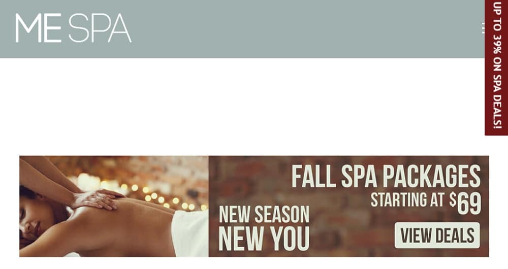
Me spa has very smartly placed a pop-up advertisement with their special offers on the screen as soon as users enter their website. Along with this, you will also find a CTA on the top of the website. They have used three lines for placing a navigation bar saving space for more important things on the site. As you scroll through the site, you will find a brief introduction to their various services. They have provided all the information in the footer of the website.
15. Olympic Spa:
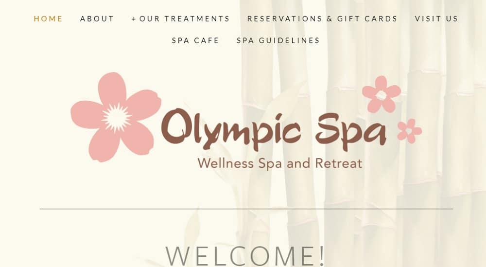
Olympic spa has a floral background with pink as its accent color. They do not have any welcome image on their website. They have only mentioned their contact details on their website without using any graphics or photographs. The site is simple and doesn’t contain much information on the homepage. However, they have a navigation bar, but it is not highlighted correctly. Also, the CTA is not placed or emphasized correctly. They haven’t done much work in terms of website design.
16. Guerlain Spa:
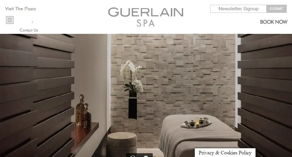
Guerlin spa displays a pop-up newsletter subscription when you first enter the website. The site looks luxurious with original photographs of the place. They have placed their call-to-action button on the top right corner of the website. They have nicely mentioned their yelp page on the top left corner so that users can see reviews about them and make an informed decision. They have not highlighted their navigation bar, so visitors are not attracted to explore more. They also don’t have much on their homepage.
17. Spa Utopia:
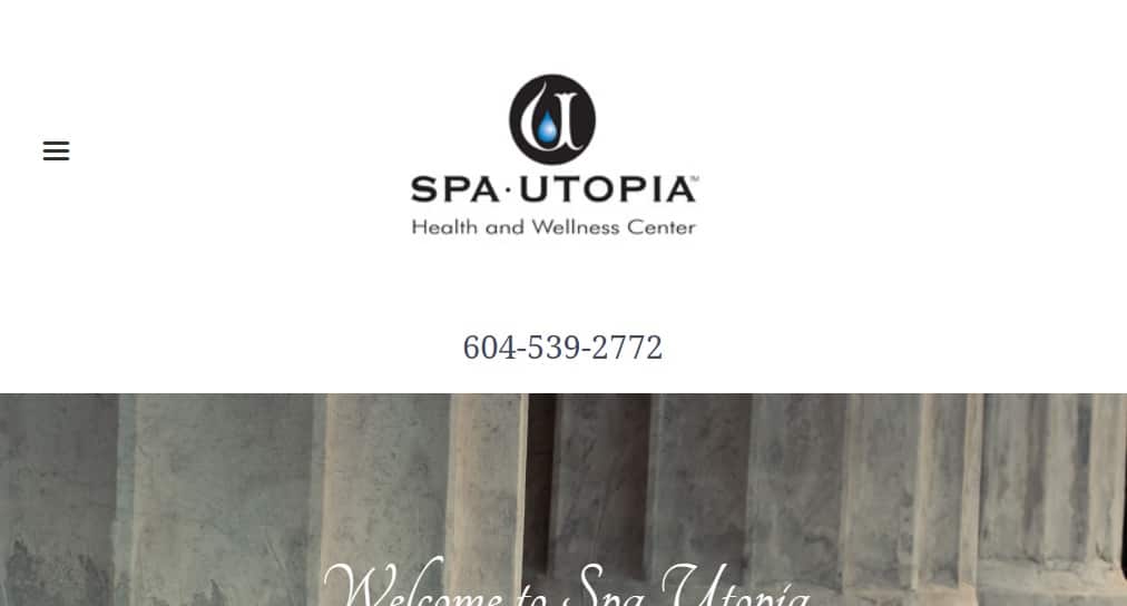
Spa Utopia has an excellent website displaying original photography on the welcome page. They have a great navigation bar with options that have a list preview. They have mentioned their phone number on the top left corner, encouraging people to call them. The site consists of a stylish font paired with simple sans font balancing the look. They have mentioned brands and products they use on the homepage itself to build the trust of their customers. They have also displayed their locations is an attractive manner using photos.
18. Beach Plum Spa:
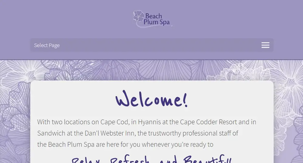
Beach plum spa has a unique website. They have used shades of lavender on their website to make it look relaxing. The call-to-action button is placed right in the middle of the navigation bar so that users don’t miss it. They have also used various icons on their homepage to depict different services. Unlike most of the spa websites, they have included customer reviews on their homepage. As you scroll through the homepage, you will come across many services offered by them highlight with different bright colors.
19. Massage Envy:
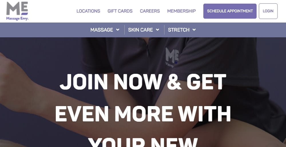
Massage envy has a standard color scheme on its website. They have just used one font on their entire website but its highlighted well with contrasting colors. They have used double navigation on their website, one for the necessary details and the other for the services they offer. The CTA button is placed on the top right corner of the site allowing visitors to click on it. They have used original photography to depict their services that will enable visitors to connect with the website.
20. Bella Santé:

Bella Santé had double navigation separated with their logo. The top one is for options like gift cards, booking a service, search, login, and cart preview, while the other one has everything related to spa services. The homepage has a minimalistic design with several CTAs all over the page. There is a blog page on their website which keeps their visitors engaged. They have a video on their homepage showing one of their services which attract most people. In the footer of the homepage, they have shown all their past achievements which help people trust the brand.
So, while designing a spa website, the primary thing to remember is the color scheme you choose. Most spa websites use earthy, pastels, and green tones to create a calm and pleasant environment. Along with the color scheme, it is also good to have a well-organized website that’s aesthetically pleasing. Apart from the design elements, you should also make sure that your site is mobile-responsive and does not take much time to load.

It was really very helpful to know about the different sites. Thank you so much for sharing such an informative content.
Great List