Every type of business/service needs a website in today’s world. Law Firms are no exceptions to this Golden Rule. A Law Firm needs to be able to convey its mission and values as accurately as possible. Moreover, they should also be able to create a personality that is close to their work ethics and style. Doing so attracts potential leads to the use of their services, as having a good law firm website acts as proof of authenticity.
Here are 20 Perfect Law Firm Website Designs for Attorneys and Lawyers who have decoded the perfect way to showcase their work. This list will help you design your next Law Firm Website:
1. Jaszczuk:
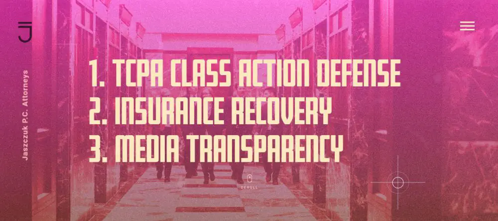
The law firm website is dynamic and full of animation effects. The Home Page highlights the different sectors the firm specialises in, at the middle with substantial attractive fonts. The company logo is on the top left corner of the page, which remains static while navigating the page. It also redirects the visitor back to the home page.
The way the website has been laid out makes it easier to navigate. Upon scrolling the mouse the first time, the page slides horizontally to the next page. After which each scroll leads to the next page vertically. This transition adds depth to the feel of the page. The punchy colour schematic with each page makes the website vibrant and pleasing to look. All pages have strong visuals with CTAs placed cleverly right below the topic. This placement helps visitors select what service they want to learn in-depth. All of this, mixed with small nifty animations and effects ensures quality engagement.
2. JLongTin Law:
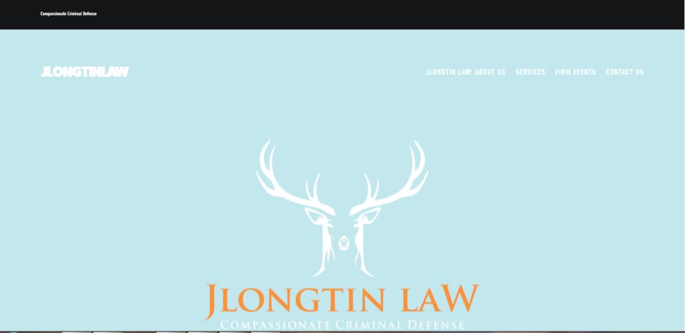
The law firm website is minimalistic and straightforward to navigate. The Home Page includes crucial elements like the brand logo with the company name in the centre. Below which, is the company’s descriptor. These two together makes their identity crystal clear by answer the: who and what of their work. The breadcrumbs offer easy navigation points for exploring the company’s services, events and contact details. Upon scrolling down the home page, comes a dedicated page that talks about who they are. While the website doesn’t have complex animations, it is easy to read and still feels visually pleasing that ensures visitor feel at ease.
Each of their services listed on the service tab follow a simple format of listing the specific name, adding a relevant image below. Their content on the topic follows it. They include their YouTube links on the same at the bottom of the page. The content assimilation and presentation is on the point and acts as a one-stop solution for any visitor.
3. Laureti Law:
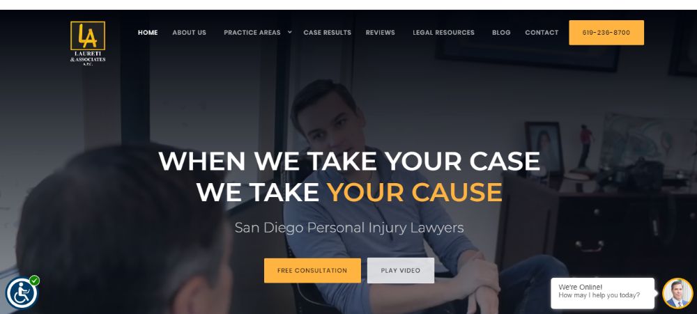
The website is one of the finest. The home page has a video that plays on loop showing the office and real-time interactions that help the visitor get familiar to the firm. There is live support feature available which is a sharp edge of other competitors. The centre of the homepage has a descriptor which is simple yet effective to establish sincerity. The various CTAs placed at the right places ensures that the visitors can’t ignore them. As we scroll down the page, the hierarchy that follows is the same as the order of the breadcrumbs present on the home page. Overall the website is very organized with tons of feature, and useful content segmentation. The testimonials at the end of the main feed help establish trust and credibility.
4. Turks Legal:
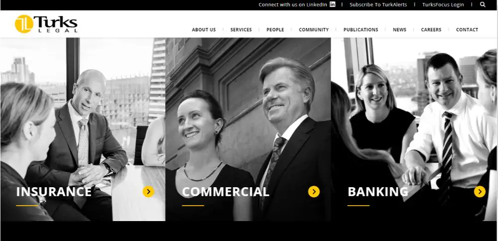
The law firm website is colour schemed as per the logo of the company. Doing this helps to reinforce their presence throughout. The home page is very spacious and segmented adequately into their areas of expertise and services they offer. There’s an easily locatable arrow mark right next to each segment to learn in-depth about that particular services. The header includes CTAs that links to their socials and subscription offers. The search bar on the extreme right makes the website easy to navigate. The breadcrumbs work efficiently and are reasonably simple to use. Their people section has an excellent layout. With accessibility features like search based on the practise group, office, job title and name, it ensures visitors have no difficulties looking for what they want.
5.Tremain Artaza PLL:
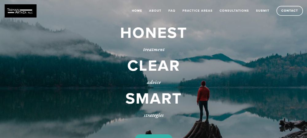
On first look, this law firm website has a straightforward and appealing homepage — the soothing visuals in the background compliment the text. The text builds instant trust and comfort for the visitor. The breadcrumbs are easy to reach and visible on the side of the page. There’s a Contact CTA placed alongside the breadcrumbs, which is distinguished by encompassing the word in a circular box. Upon scrolling the page, you can see their recognitions and awards awarded by genuine essential people. The overall approach of the page is very visitor driven, which helps to convert many visitors into customers.
6. Small Law:
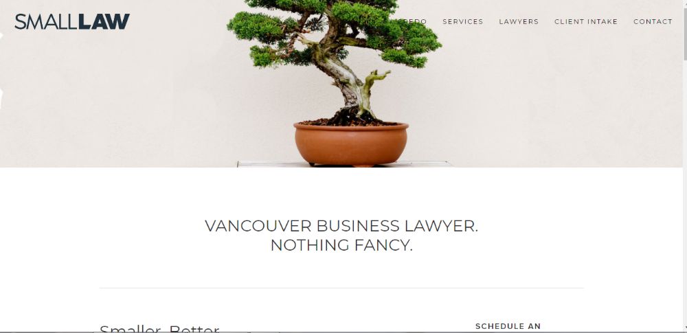
The law firm website itself is very minimalistic and simple to navigate. It is an ideal website for an individual lawyer. The home page layout has static wallpaper that complements the overall look of the page. Followed by the image, there is a brief introduction about the lawyer himself. There is a CTA placed that helps people contact the lawyer, right next to it. The best part of the website is that it has a legal advice column at the bottom of the page which talks about different services provided with the cost for the same mentioned right below. This can help visitors save time and also build trust due to the transparency provided.
7. Shumway Van:
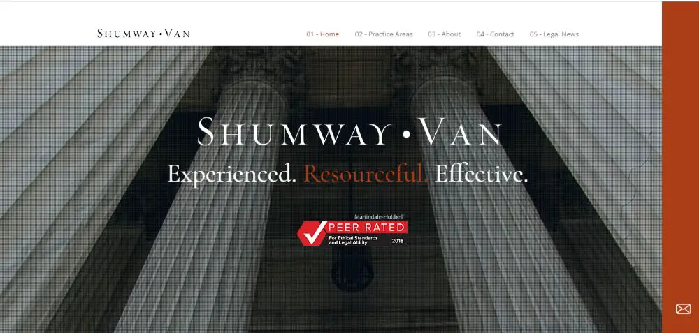
The law firm website design ensures that everything fits into the main homepage. The same is accessible through the breadcrumbs. The breadcrumbs have numbers like chapters that make it look neat and organized. The company’s name and logo are displayed in the centre; there is a neat wallpaper carousel in the background. As you move down, different information placed in different boxes gives it a very striking look. There’s a dedicated line dedicated to visible and attractive CTAs that are well placed. The plugin to Google maps to show how to reach all their offices also makes them more accessible.
8. Horea Crisan:
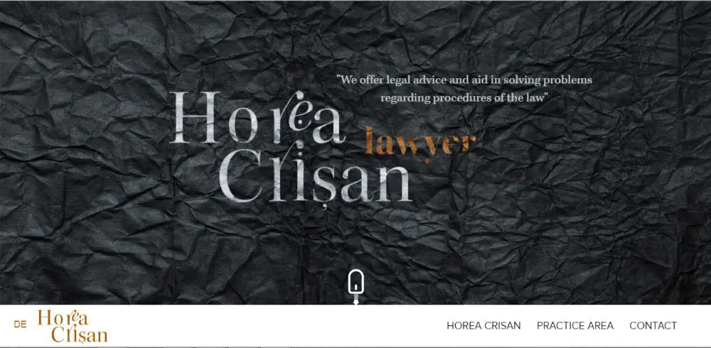
The law firm website has an attractive home page. It doesn’t have many webpages which makes it cluster free and easy to load. The website heavily depends on typography for its visual appeal. They believe in getting in touch via telephonic or mail facility, which is why they’ve stated all their fields of work but not created an in-depth link for each. Overall the website acts as a portfolio for their work and services. Also, it acts as a natural access point for visitors to get to know about them.
9. W3IP Law:
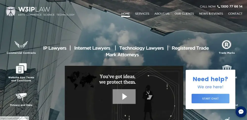
The company specialises in IP Laws, and it doesn’t shy away in showing it, on their law firm website. The design of the website is very futuristic and app like in its design. The home page has an introduction video in the centre. There is a wide range of services they offer which act as CTAs for themselves, surrounding the centre video. The Call Now button has the number in the header. This acts as a CTA that directs the visitor to their dial-pad if accessed through a smartphone. The client testimonial also has a subtle scroll transition effect that plays like a slideshow which helps build credibility also looks visually appealing.
10. Givens Givens Sparks: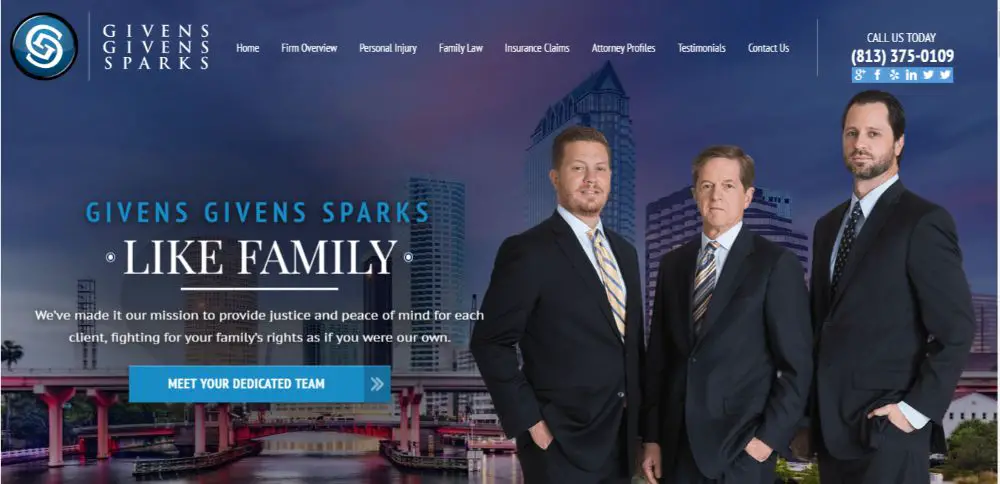
The law firm website has a colour scheme that matches their logo. There are tons of CTAs spread throughout the page with built-in support to redirect visitors to the dial pad from their smartphone. The website has a banner on the homepage which has a wallpaper carousel and CTAs placed for each service they have to offer. A section talks about ‘Our Recent Victories’ focuses on numbers and stats to gain visitor’s attention. This helps show credibility. The benefits of choosing their services are illustrated by minimalistic graphics that look appealing. The website even has a Live Chat feature which gives it an edge over most websites.
11. Idea Legal:
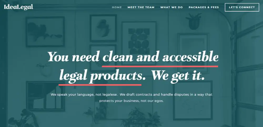
The website focuses on providing illustrations to guide the visitor to their respective query points. The visual appeal of the page is minimalistic and spaced out. The approach is to make something as heavy as Legal feel a lot friendlier and more comfortable to get around. The list of impressive clientele helps build trust with visitors. The let’s connect CTA redirects the visitor to a page which has all necessary contact information, which makes engagement very easy.
12. Venture Legal: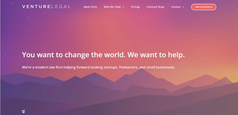
The website uses minimal but rightly placed animation effects. The text that comes up after a smooth transition talks about their services by introducing a problem and providing a solution for the same. The silhouette wallpaper of chromatic shades compliments the colour schematic of the logo. There is an easy to fill-form that helps the visitors get in touch with the lawyers. Transparent and categorized pricing make it easy for visitors to browse and learn about more.
The website has a clean look. The homepage has a wallpaper carousel that shows images from the office. The interactions shown in the pictures help build trust for the visitors. A message from the partners demonstrated in a video format that seamlessly fits into web design instead of a popup video. The website has breadcrumbs to navigate through the site.
13. Stockman ‘O’ Connor: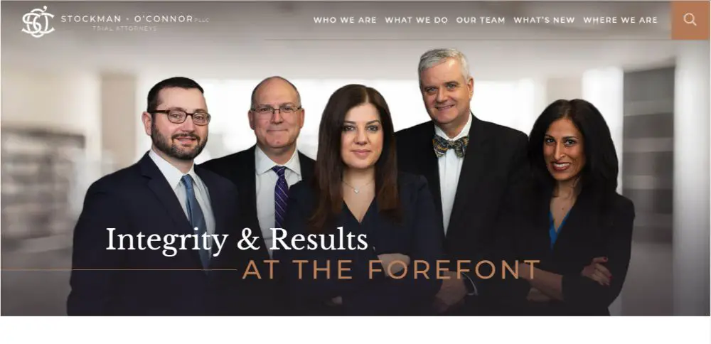
The website has a clean look. The homepage has a wallpaper carousel that shows images from the office. The interactions shown in the images help build trust for the visitors. A message from the partners is displayed in a video format that seamlessly fits into web design instead of a popup video. The website has breadcrumbs to navigate through the site.
14. Affleck and Barrison LLP: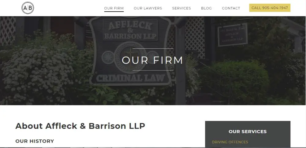
The website has a clean and bold design approach. The use of iconography makes the homepage easy to navigate. The CTA is placed strategically and openly on the homepage. The list of services is organized neatly for visitors to refer. Individual profiling of each attorney on the team helps build trust and credibility.
15. Gjel Accident Attorneys:
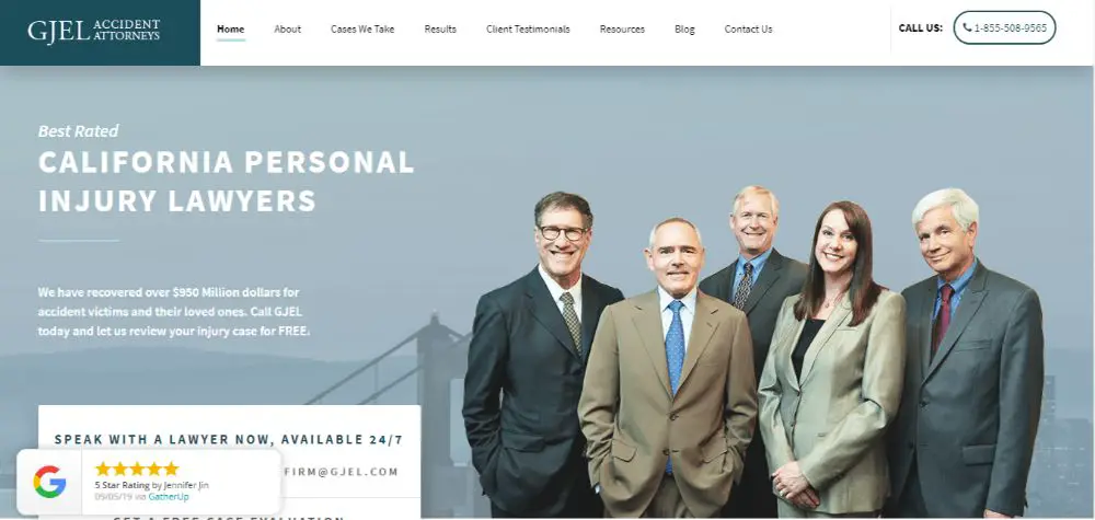
The website has a simple layout that doesn’t rely much on animations or transitions. Throughout the homepage, there are snippets of testimonials, verdicts and other types of data that helps the visitor gain trust in the business. Subtle placement of the Contact forms throughout the website ensures it doesn’t seem imposed and also catches the visitor’s attention. The use of banners and iconography make the website engaging.
16. Fasken:
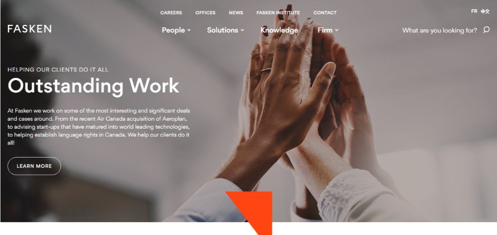
Distinct design elements are spread throughout the website. This feature ensures smooth navigation of the website. Throughout the site, there are great iconographies; the images match the colour scheme of the website, and the stats are easy to comprehend. The website has in-built support more multiple language translations that ensure more extensive accessibility. The visitor may also feel at ease and value this effort.
17. Odegard Law: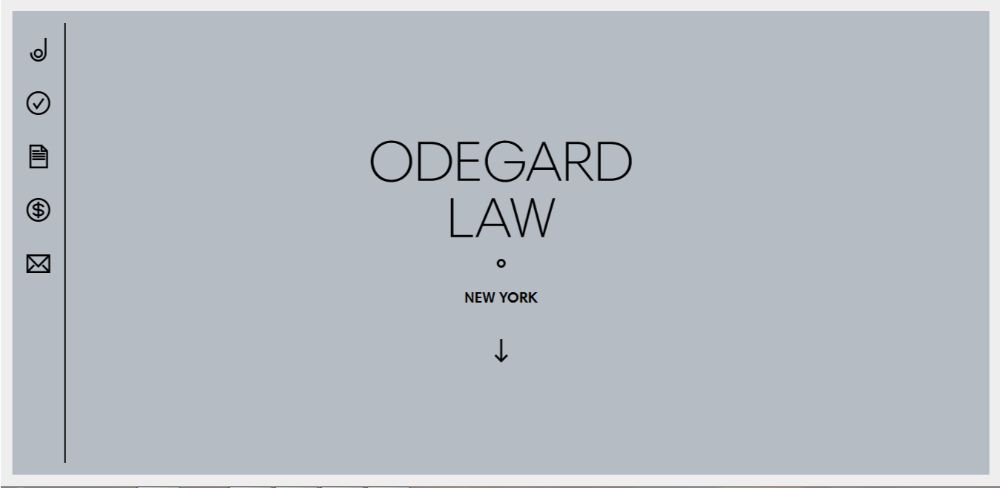
The website is very user-friendly and straightforward in its approach. The beautiful icons used throughout the website give it a joyful look. The animations used are minimal and simplistic as well that compliments the aesthetics of the website. Though there is an abundance of content spread across their website, the simple design and layout prevent it from being overwhelming.
18. Gecic Law: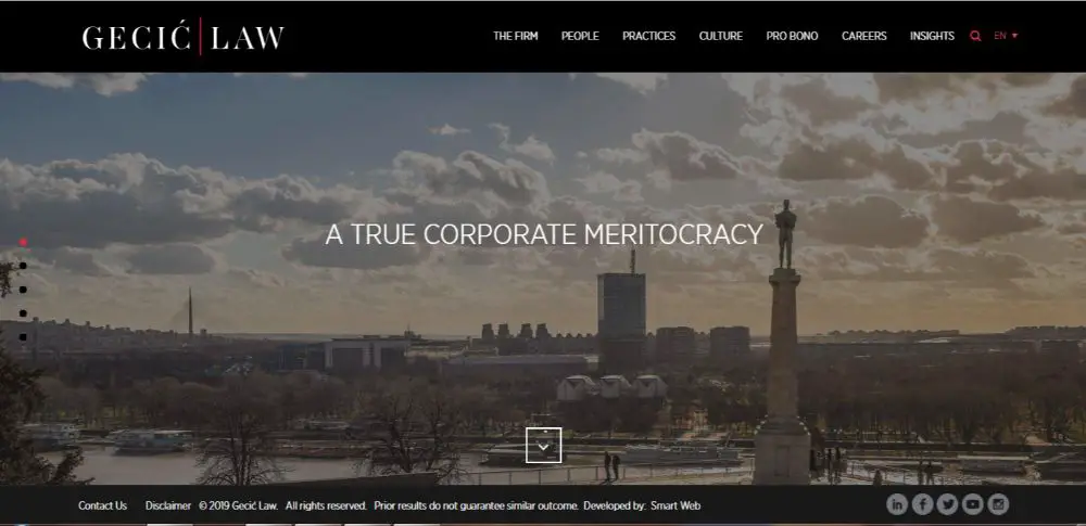
The website looks simple and minimal on the first look. However, as the visitor starts interacting with the website, they learn about the intrinsic elements hidden all over the website. There are video sliders and transitional scroll effect which draws the visitor’s attention by the element of surprise. The colour scheme of black white and red helps the website get that premium and formal aesthetic. There is a useful search icon that eases navigation and the option to translate the page in a few languages that increases reach. The social ribbon buttons are placed strategically in the footer of the website that remains static.
19. Colodny Fass: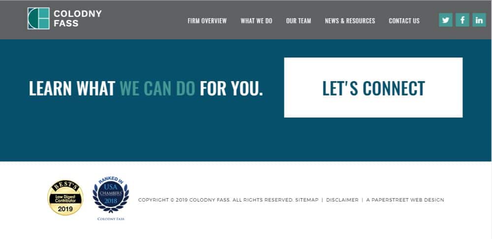
The design approach this website uses emphasizes on clickthroughs. Multiple menus spread across the website. For each of which there are many CTAs in place. The design is bold and formal in approach. The social ribbons help drive their traffic to their social media platforms where the visitors can get in-depth information about the firm’s social presence. This could help them gather a collective insight which would improve trust and credibility.
20. Ashurst: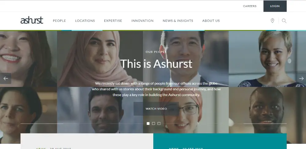
The website looks neat and clean. The homepage has a lot of exciting elements such as a live news feed which provides news snippets to catch visitor’s attention. There is a read more CTA right next to them, for people to read further on the topics. Iconography is used to demarcate their different services look, which looks visually appealing. The about us page has a timeline graphic which makes it easy to follow. There is also a feature of an interactive map that helps visitors get individual information about any office they want.
And here we end our hand-picked law firm design websites samples. You should focus on designing your website in a way that it offers a seamless user experience, which is easy to navigate and visually appealing to hold your visitor’s attention.

