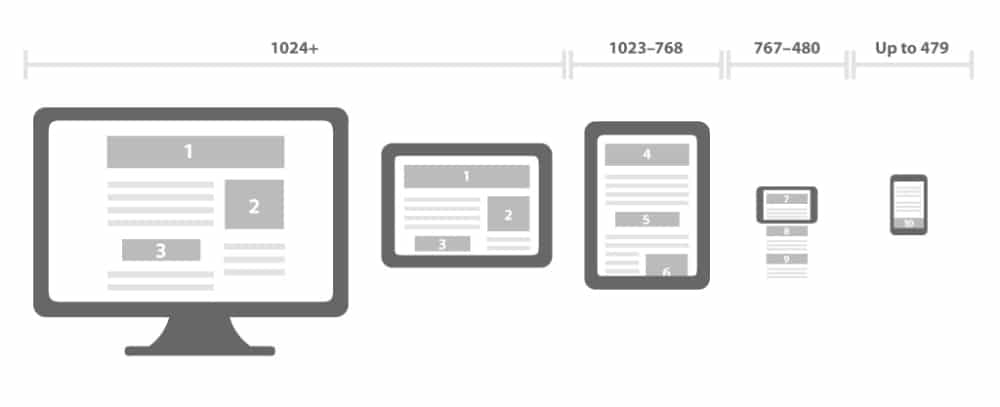
Often, designers spend numerous hours creating the perfect web page or application that works phenomenally on a desktop. But when you try to open it on a mobile phone, it becomes a frustrating and tedious task to use it.
And in this fast-paced world, where smartphones can process complex tasks quickly and efficiently, it is paramount that you make your web page/application compatible with a mobile interface.
There are a lot of downsides to having a bad design that is not compatible with mobile. Not only will it discourage people from downloading your app or access your website, but it will also cost you your company’s reputation and goodwill. Hence, you can not afford to have a web page/application that is not compatible with a mobile interface.
To help you re-evaluate your design and make it more compatible with a mobile interface, we have put together a few common mistakes that designers make, so that you can avoid them.
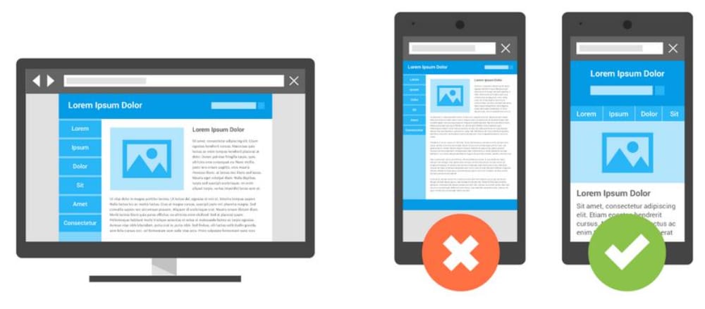
1. Setting separate URLs for mobile
While it might seem that creating a whole new URL for your mobiles will make your task hassle-free, but that is not true. Adding separate URLs for mobile applications will only cause more harm than good.
The main problem here is with the browser’s capability of redirection. When you run a URL on any browser, the script embedded in the server tries to detect whether you are browsing through a desktop or a mobile. When it detects that you are browsing through a mobile, the script will redirect you to a separate URL that is more compatible with mobiles. However, this can gravely affect your search engine placement.
Along with that, the script will also take a longer time to decide which site it should direct you towards. And that will also affect your bottom line.
Hence, it is more logical to use a responsive web design technique. It builds your web page in a way that can alter the layout of the web page using CSS3 media queries. To put it in simpler terms, this means that there is just one HTML code for the entire page regardless of which device it is accessed on, and, with the help of CSS media queries, the code can change the presentation of the web page.
There are two fundamental advantages of this is that it compiles your desktop and mobile content on just one URL, which makes it easier for Google’s algorithms to interact with the web page and can assign indexing properties to your content. Along with that, this helps Google to discover your content more easily and efficiently.
2. Setting High-density as the default
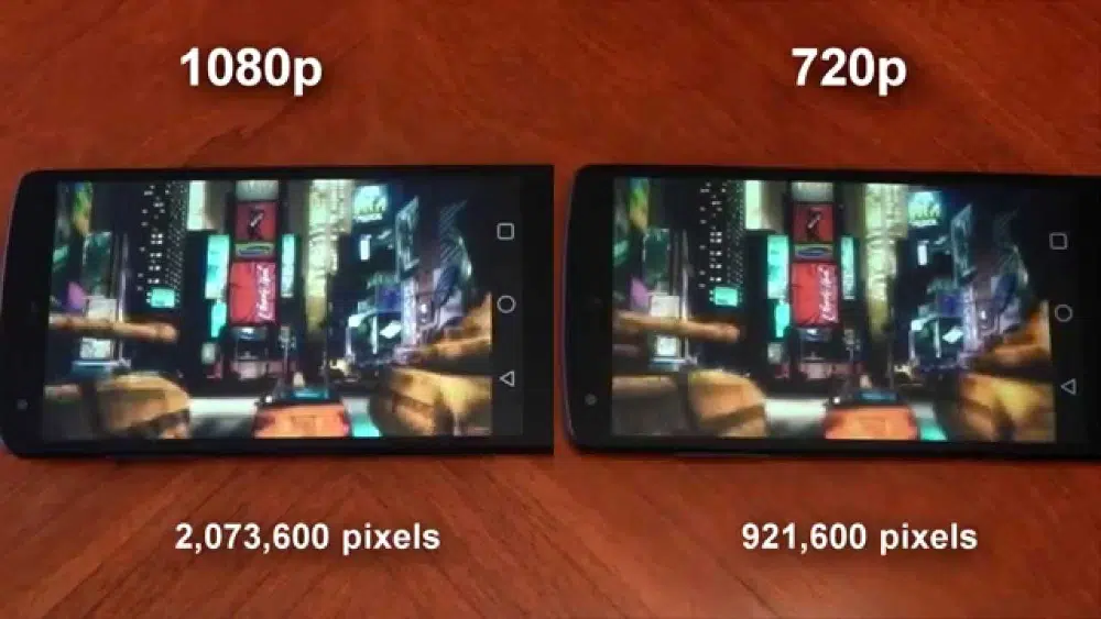
While you would want to boast about your brilliantly sharp display and provide your customers with the best quality performance. However, choosing high quality has its own downfalls
- Consumes more loading time: High-density images and graphics have a larger file size, which takes longer to load. Even with high graphics cards, laptops often crash while processing such visuals. So, what would happen to a phone? Such high resolution can hamper the functioning of a phone and degrade your customer’s experience.
- Heavier Data Usage: Even though your network plan says that you have unlimited data, they aren’t truly unlimited. There is a certain limit after which your data will be capped or reduced to a slower speed. If you make your viewers consume this much data, they will abandon your website.
- Data consumption while Roaming: Now, with all the scenarios, imagine what if your viewer is out of the country and browsing your site on roaming data? And with the astonishingly high roaming charges, you are bound to lose your customers due to that.
Hence, you should invest some time in evaluating whether your website needs high-density graphics or just a low-resolution alternative will be enough. Another helpful tip for this situation is to save an image in vector format wherever you can or use some ultra-high compression techniques which can provide lossless compression.
3. Uploading uncompressed PNGs
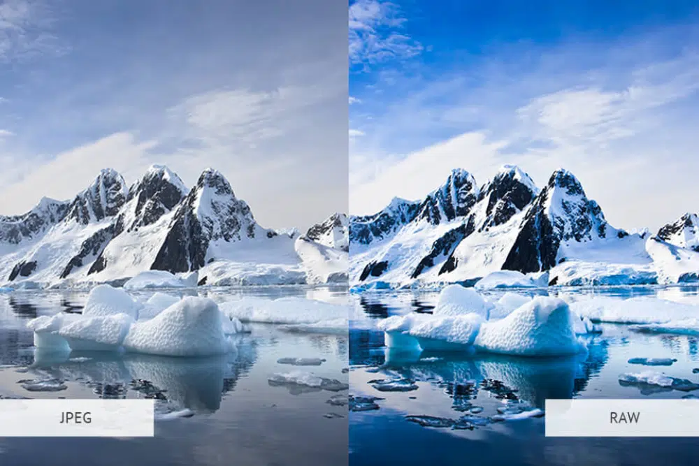
Adding on to the problem of creating high-density graphics, a lot of designers often forget to compress their PNG files while uploading an image or graphic. They just get so comfortable with directly uploading a file from Photoshop without optimizing them, which are usually in a PNG-24 format.
A picture that is rendered from Photoshop is very dense and consumes a lot of digital space. The PNG-24 format images have incredibly sharp details and ultra-fine definition which might not be necessary for your web page/ application.
To make your Photoshop-ed images usable, you need to run these images through a PNG optimization flow. First, you have to take the image through an app called ImageAlpha which will cut the image size in half without letting the quality drop.
Then, you pass it through the ImageOptim which uses a lot of techniques and other applications on the image. This will help you shave off the image size drastically.
By doing this, you will still have a high-resolution image quality on your webpage/application, without making the file too heavy. It makes the webpage easier to process and improves your user experience. Keep in mind that your viewer is here to fulfill their task and not to admire the graphics. Even a low-quality image will do for the most part.
4. Complex and confusing interfaces
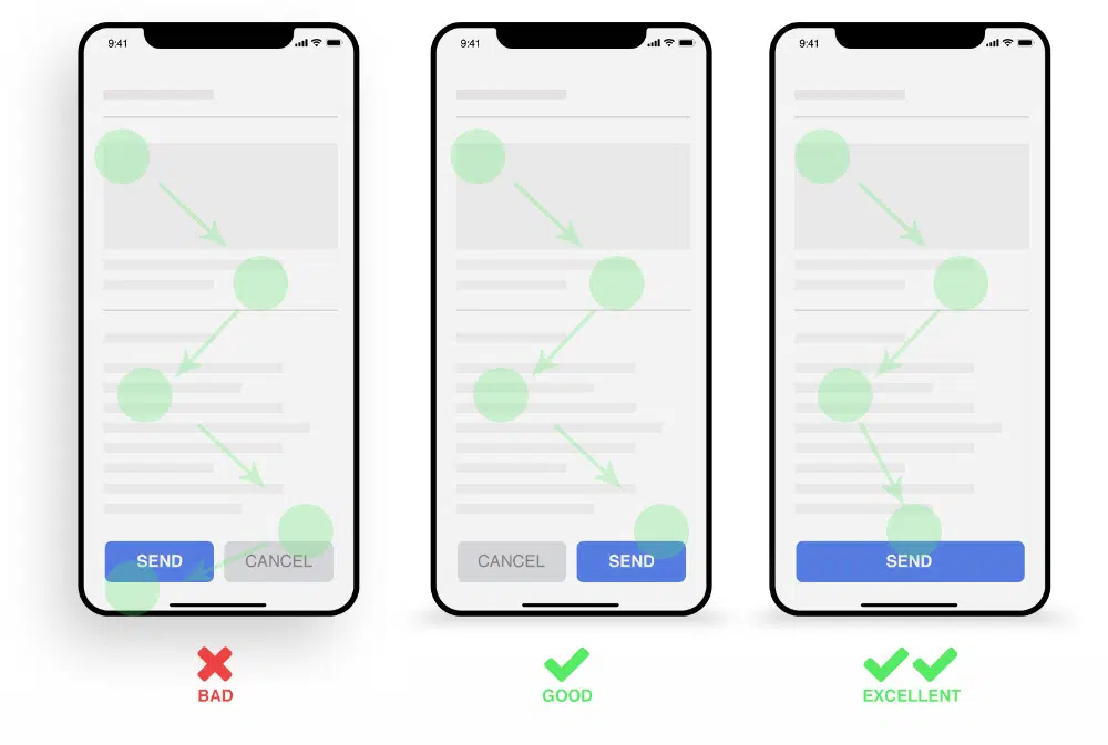
On a spree of designing the best and most attractive interface, designers often end up making their web page too complex and confusing for the user.
While designing a mobile web page, you need to understand that it will be used by all classes and age groups and you need to make sure that the web page is compatible with all of them. While some younger and more advanced users might understand your interface, there is a high possibility that the elderly will find it difficult to adapt to a complex interface.
To avoid this, it is advised that you incorporate a familiar interface, with easy to understand and icons and symbols. For example, a green button would connote either ‘yes’, ‘forward’, or ‘accepted’, while the red means ‘no’, ‘stop’, or ‘declined’.
Try to avoid incorporating symbols that are ambiguous and can’t be understood at the first glance.
Also, make sure that you don’t clutter your page with a lot of colors and fonts. There should be consistency in your design which will help your users to get used to the interface.
5. Small and incomprehensible touch targets
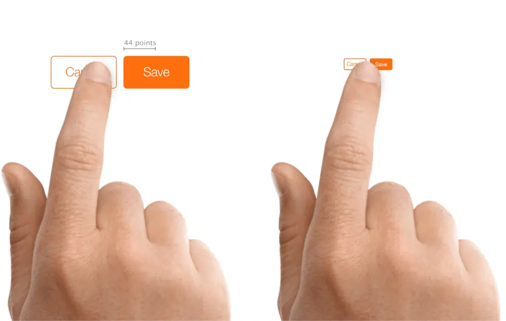
What mobile users often find irritating are the small and incomprehensible touch targets on the websites. While a mouse cursor can be easily maneuvered and the sharp end of it helps to be precise, fingers are bigger and wider than mobile cursors.
This problem arises because most designers construct the targets on pixel counts and don’t consider the screen density. While on the low end, most smartphones can have a resolution of 150dpi, whereas some high-performing smartphones can cross the 400dpi mark.
Now, if you construct a target of 44px square, that would come out as a 7.4mm square on the low-DPI screen. However, the same pixel count would generate a 2.5mm box on the higher density screen.
Hence, you should use physical dimensions to measure and construct your targets. The width of an adult finger ranges between 12mm to 20mm and the keys on your phone’s keyboard are about 5mm wide. While this is the minimum size that you should aim for, the lowest error rates can be achieved when the scale of your keys is 9mm. The ideal distance between two keys should be 2 mm, or else you put the users in danger of accidentally triggering the wrong target.
So, calculate on those bases and device the right dimensions of your target keys.
6. Abiding by the WIMP conventions
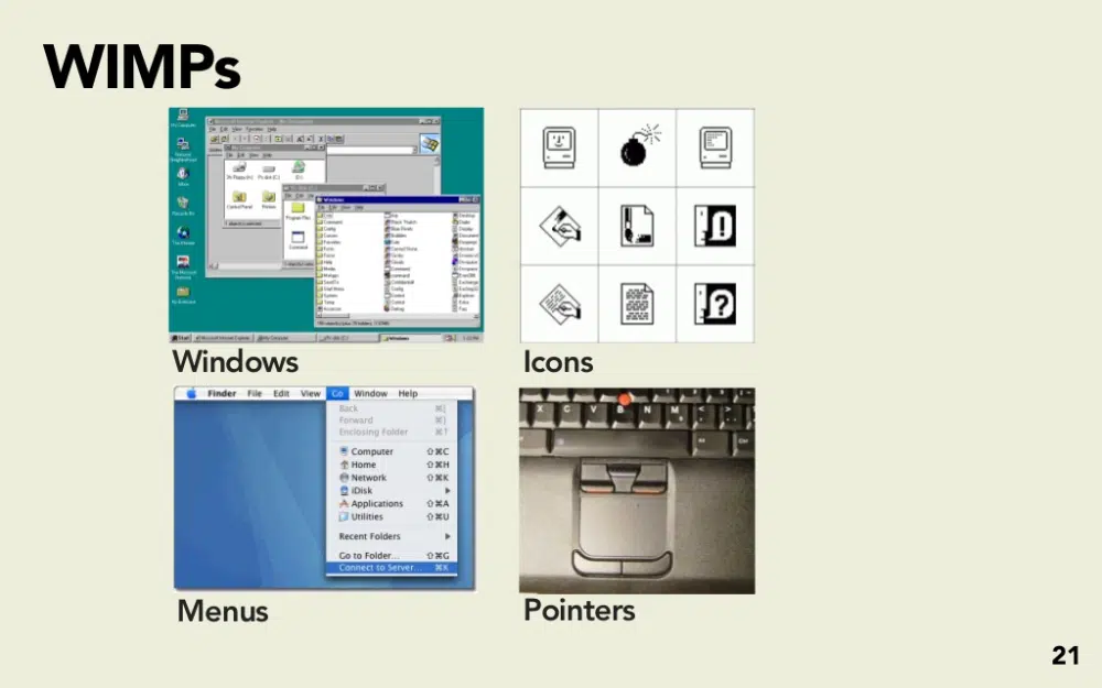
The age of new technology requires an advanced and redeveloped interface. The WIMP (Windows, Icons, Menus, Pointers) used to be the rule of thumb for the user interface in the earlier days. But, with the advent of smartphones and touch screens, this paradigm has become obsolete.
In order to adapt to the new and improved technology, you need to forgive these traditional methods and create new interfaces that can capitalize on the advantages of advanced technology.
While the format of providing multiple windows is highly beneficial for desktops, the method is very tedious when it comes to mobile phones. Instead, developers incorporate tabs function on the mobile phones which helps to keep the pages organized and sorted.
When you are using a touchscreen device, your fingers take up the role of pointers. While pointers were necessary to guide the user through the website, touchscreens have removed that need. You can just directly click on what you want. Even with the functions of a mouse, a normal click on the mouse has been substituted with a double tap on the screen.
Touchscreens have also revolutionized the method in which we navigate through a web page. The select menu pattern is a popular method that shrinks the multiple options on a menu and fits it into a compact space.
7. Bad Onboarding Experience
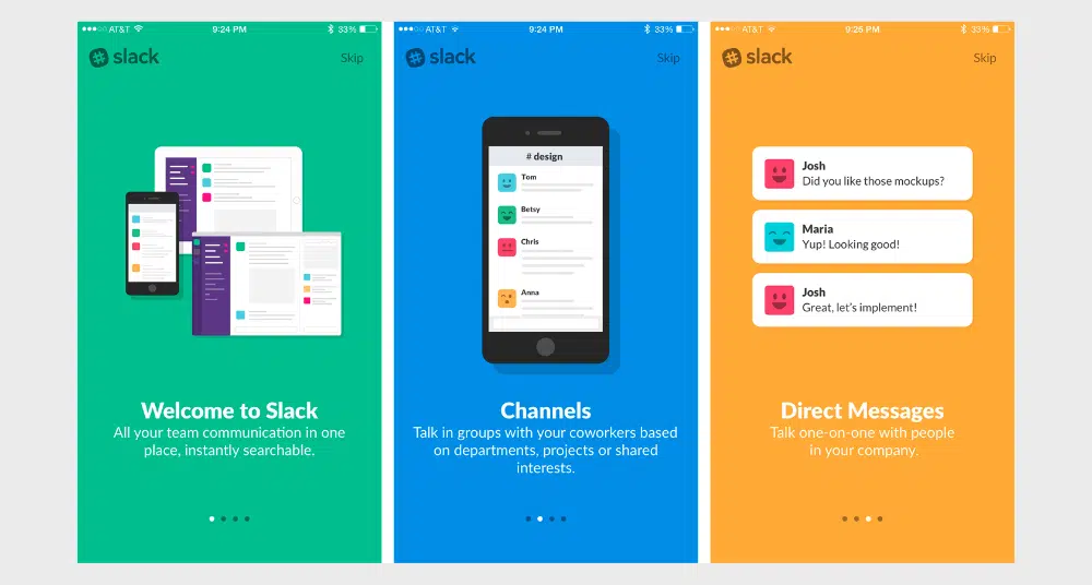
Onboarding refers to the initial interaction of the application or web page with the user. This is the phase where the user is introduced to the application/website and understands relevant hints on how its interface works. And as the saying goes, the first impression is the last impression.
In this scenario, if the user has a bad onboarding experience, then it can become the decline of your website. During the onboarding phase, the user creates a certain impression of the website and derives an opinion on whether to use it in the future or not.
Here are certain factors that might lead to a bad onboarding experience:
- Poorly designed and invasive tooltips that can confuse the viewer
- Tough and lengthy sign-up process
- Not providing an option to directly link with your Google account
- Bot generated welcome emails that can make the viewer a little apprehensive
- Not creating a clear path forward after the initial introduction
Many mobile app developers forget about these aspects and end up creating a bad onboarding interface. They don’t leave any cues or instructions on how to go about the webpage which makes them dislike it.
Hence, you need to have to construct a good onboarding experience if you want the user to continue with your website/application. Your onboarding experience should be like an usher that comfortably guides you to the end and prepares you for a great experience ahead.
It is human nature to make mistakes and no one is exempt from it. But, in order to succeed, we need to correct those mistakes and, moreover, learn from the ones made by others.
If you want to construct a good and compatible interface, run your design through numerous screening processes. Test them through various sample groups and evaluate how it performs with all demographics.
If you don’t invest enough time and effort into creating a good user experience, your customers will also not take interest in your web page/application. The only way to make your design compatible with everyone is with meticulous work and paying attention to each and every detail of the app. From its onboarding experience to the density of its file size, you need to optimize your design on all fronts to make it appealing.
