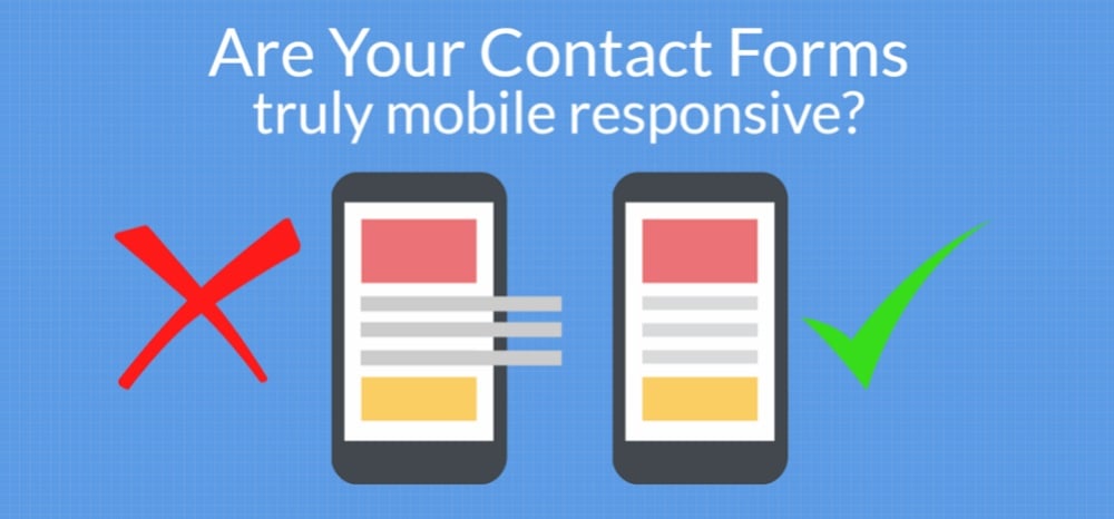
Contact forms can be very beneficial in establishing a connection with your users. Fortunately, creating contact forms for mobile friendly websites is not that difficult. Generally, you only need to keep a few fundamentals in mind to help you design contact forms for mobile-friendly websites. If you have a WordPress website, there are pre-built contact form plugins that will help you create mobile friendly contact forms.
Here are 5 tips to help you get started.
1. Eliminate extra fields:

As the number of fields in your form increase, the difficulty of the form to use on mobile devices increases. Hence, using forms on mobile websites gets complicated. No one wants to waste their time filling those long detailed forms. So, less number of fields will increase the chance of customers filling up the forms.
Only include primary fields like name, email, and the important message you want to receive to maximize the efficiency of your form. The body of the form will depend on the kind of website you have. Also, your contact form should have specific details if you are trying to gather leads.
Hence, by including fewer, more required fields, you will make it easier for your mobile users to use your contact forms. In any case, selecting each field using a touch screen can be tiresome even if it is not well-organized and well designed. Hence you should minimize the jumps mobile visitors have to make.
So, go over to your existing form section by section and look at it from a user’s perspective. This will help you get rid of all the extra unnecessary sections you have created in your contact form.
2. Create Drop-Drown lists:
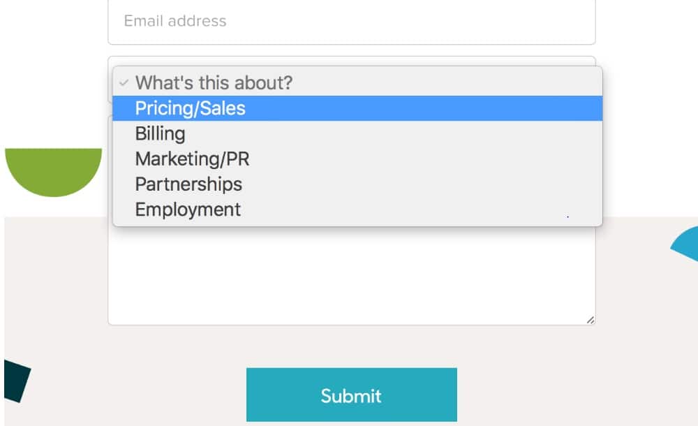
Using the touch screen and typing on a mobile phone is comfortable for most of us. However, chatting with a friend and filling a form are very different experiences. This is because typing a lot of information that doesn’t directly benefit the users can get frustrating and tedious for them. One way to solve this issue for your mobile users is to modify fields so that people have to make simple choices regarding your website’s elements.
For example, let us consider you want to make a restaurant reservation. For making a reservation, you will need to give your name, phone number, email, time, and the number of people that will be attending. You can create a form in two ways to simplify your form. First, design fields that only accept numeric inputs. Second, create a drop-down list, including all possible answers.
Here the second approach is more useful because the users do not need to type anything they just need to pick one option. So, you should look for fields that will have standard answers and create a drop drown menu. These drop-drown lists won’t work with fields like name, email, phone number but try to use them wherever possible. Also, remember to design your drop-down menu large enough for your users to select an option.
Most webmasters are aware of this tip, but it is still worth mentioning. Every form requires a submit option to confirm the choices of users and send them to the database. On a computer, clicking submit is very natural. However, on a mobile, clicking a submit button is much harder. If your users can not submit the information, they have filled; all your efforts will be wasted. Also, having a submit button that does not work looks unprofessional.
While designing a submit button, you should make the button large enough so that your mobile users can press it with ease. Also, place your button away from other elements to highlight the submit option. Another way to highlight your submit-button is to use creative typography or contrasting colors. Apart from all this, you should also consider testing your button thoroughly to make sure it is working properly before your website goes live.
4. Decrease the loading time:

Most people don’t want to deal with a slow website. So you should consider improving your website performance, especially for mobile users. With higher internet speeds, waiting for a website to load can be frustrating for your users. Also, mobile internet speeds vary a lot as compared to regular home Wi-Fi connections. You should develop a website that is highly optimized for mobile if you want to provide a rich user experience for your mobile visitors. Also, not all people will have suitable internet speed, so make sure you consider that as well while designing a website.
This tip will not only help to enhance the performance of your website but also display forms on your mobile web pages quickly. If your website takes too long to load, you will start losing leads and chances to establish connections with your users. Typically, a website should load within 2 seconds to work effectively. Once the time goes above this limit, the bounce rate will start decreasing dramatically. Hence try to keep your load time down to boost the site’s overall performance. You can also compress your images, upgrade to a better hosting plan, and pick a responsive theme optimized for speed to boost the speed of your contact form.
5. Examine the forms:
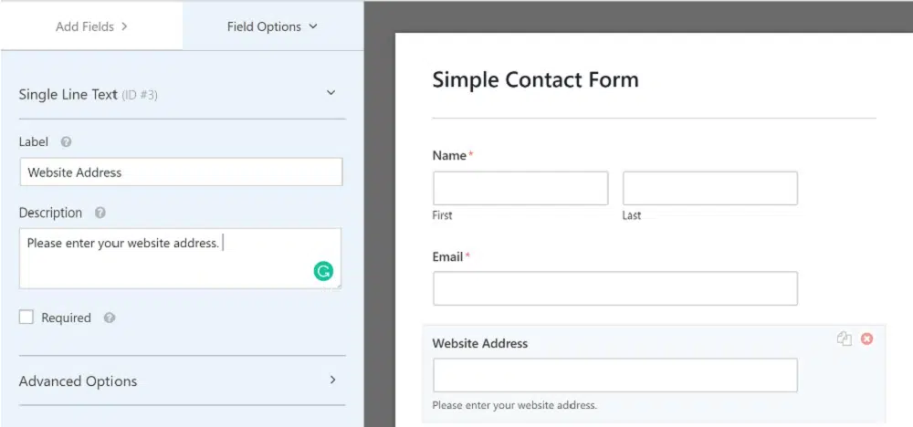
Forms that don’t work are just a waste of your effort, so make it a rule to test your forms thoroughly before publishing it. You can easily use WordPress to design specific pages to display your form and not make them live until tested thoroughly. You can choose a plugin or a theme to help you develop mobile websites.
The form that you design should be compatible with multiple devices, scale down properly, and look well organized. Also, pay extra attention to icons and text near the borders of the screen as it defines the look of your form. Finally, keep your contact form simple to avoid any structure or layout issues.
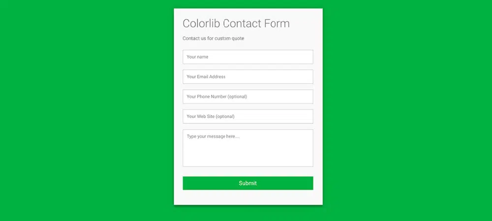
So you should keep your forms minimal to ensure they perform well on mobile devices. Also, try to reduce sections while making the most of drop-drown lists and always make sure to test your forms before publishing them. Check out these free HTML and CSS contact form templates to use on your mobile website to engage your readers and help you generate more leads.
