Website navigation best practices are one of the most overlooked aspects of website development. All developers get so occupied with ensuring fancy functionalities and pixel-perfect stock images that they forget about website navigation. Yet, website navigation is one of the most critical (UX) user experience components. As the term suggests, it helps the user easily navigate through the website. If the navigation is not done right, the user will get confused and leave the website.
The very reason why a website is created is to offer a set of information to the viewer in a nice appealing manner. Of course, people would wish to serve all the information on the home page, but that is not possible. Hence, they follow a common classification of content in the form of products/services, USPs (Unique Selling Propositions), contact details, etc. As a website developer, you want to ensure that the website user can access all the information without getting lost in some way or the other.
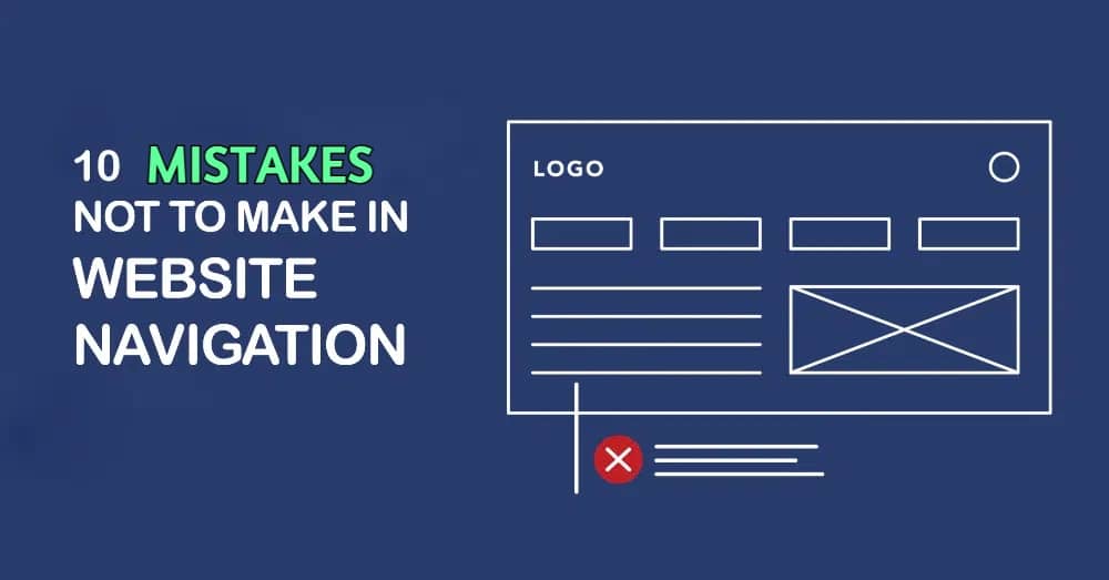
The basic rule of website user experience is to provide maximum information in minimum clicks. You have to set up gateways using which the viewer will browse through different content. This varies from website to website, but the concept remains the same. However, we have observed that many developers ignore the basics. We have collated ten mistakes that you should avoid making with website navigation.
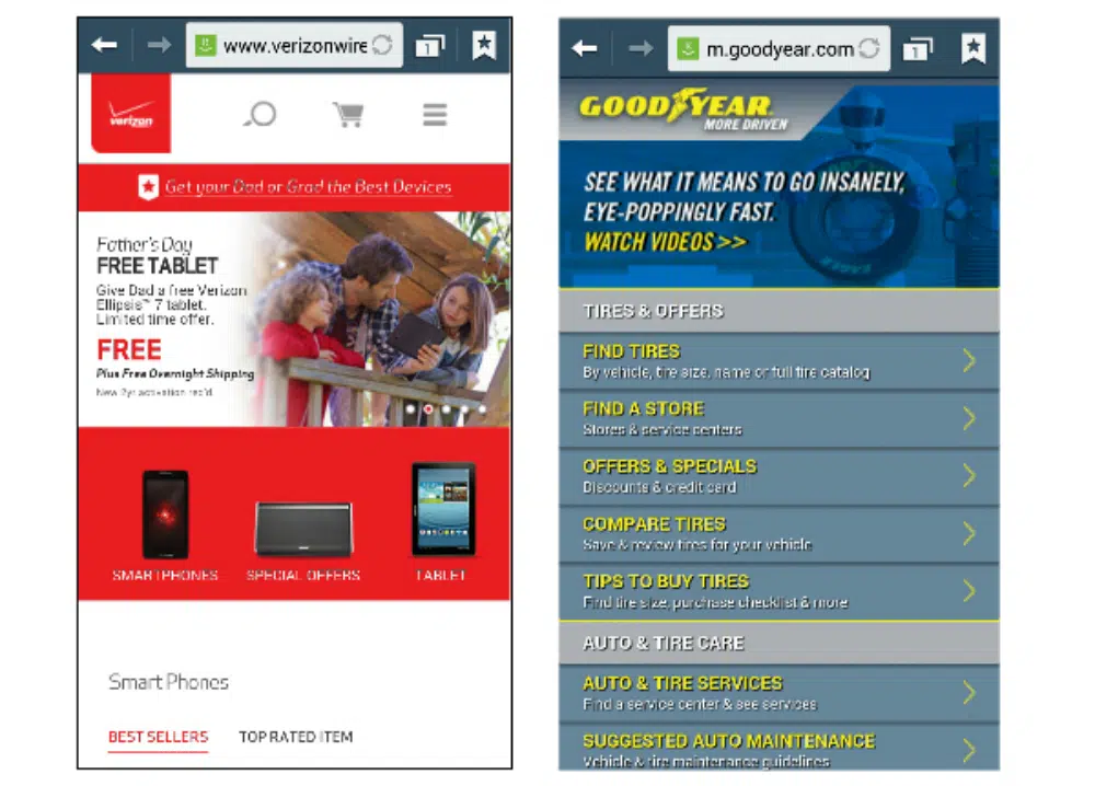
1. Providing Too Many Options in The Header Menu
In all forms of design, excess is always a problem. No wonder all designers are now gradually shifting to minimal and functional design forms. The same is the case with website design. While the content and other sections are seeing a lot of minimization, the website navigation is seeing this trend. However, certain designers get too anxious with empty space available in the menu and want to push more options there.
The website’s main header menu aims to streamline website navigation. The user will get the right direction from the menu. Ideally, it will make sense to have as many website navigation options as possible, but on a practical note, this works against the developer. The user will get overwhelmed seeing too many options. Hence it is advised not to mistake of providing too many options in the header menu. Rather break it down in a structured manner and make it comfortable for the user to move through the website.
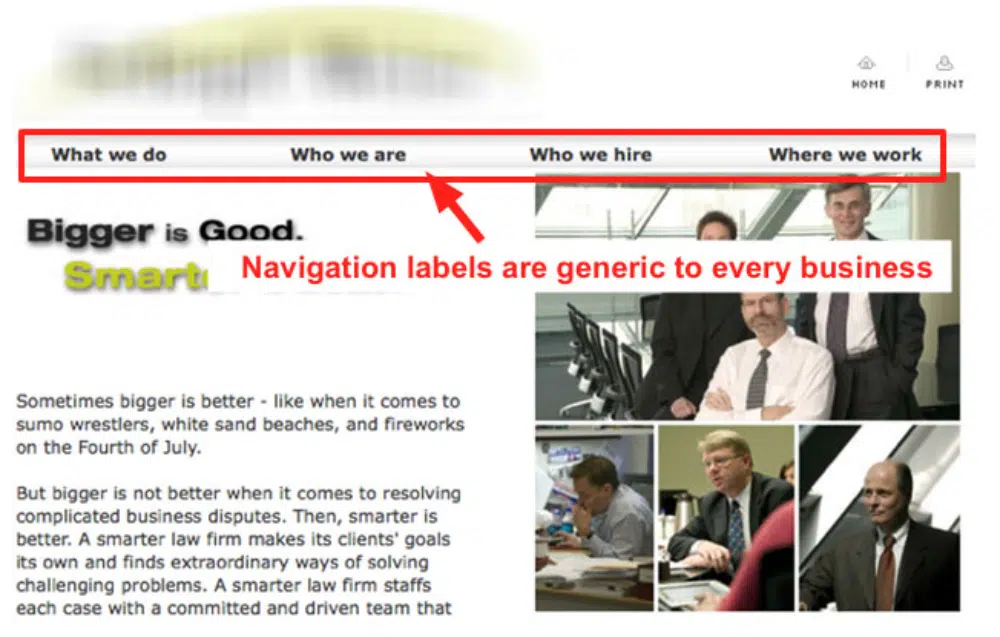
2. Breaking the Industry Norms in Naming the Pages
As a website designer, you would have visited thousands of websites. You would have observed that the header menu remains consistent in most. For example, there will be a home page, about us page, products/services, pricing, and contact us page. All these pages would have a place in the header menu, and conventional terms such as “About” or “Contact” would be used for them. This makes it easy for any user to understand what the page will be about.
However, many developers mistake naming these pages with very creative names. Breaking this industry norm makes it difficult for users to identify the pages. This may result in the user not going ahead, clicking on the pages, and leaving the website. Your website’s bounce rate will go for a toss, and so will your sales. Also, fancy terms may use more space in the header menu, making it skewed. It is advisable to stick to standard industry names for setting them up on the header menu to ensure streamlined website navigation.
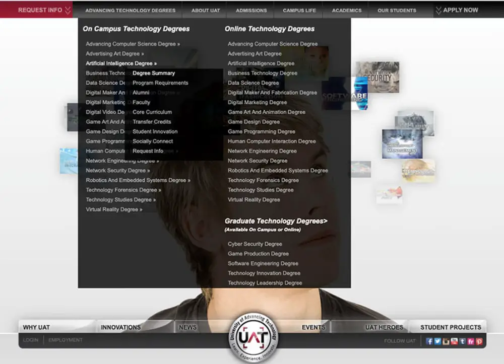
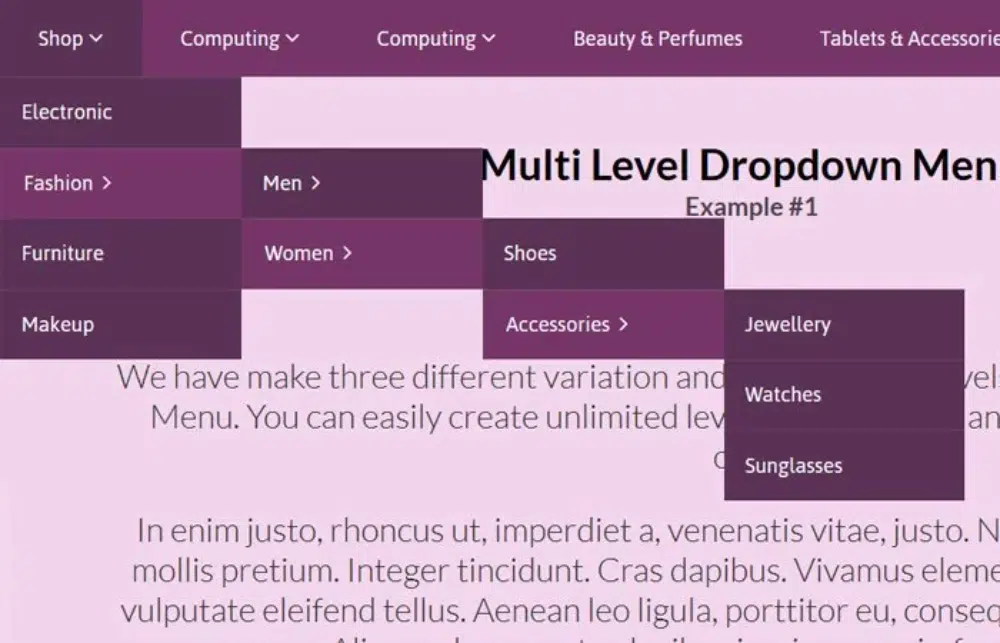
3. Over Using Drop Down Menus
Drop-down menus have come in as a boon for developers who want to provide more details on the menu. However, some developers make the big mistake of overusing drop-down menus. Websites with more than two layers of drop-down menus will cause a lot of issues in terms of website navigation and also in terms of mobile responsiveness.
For websites with many product categories or classifications, it is always tempting to provide those details in the form of drop-down menus. However, you should stick to the rule of having at the maximum only two drop-down layers. You need to understand that the user will have to move their mouse on it and open it for each layer. Sometimes the top layer will get overlaid on the bottom resulting in website navigation issues.
Today mobile compatibility has climbed to the top layer of the priority list of website developers. Hence this mistake of forgetting about mobile navigation has reduced a lot. Still, there are a few developers who do not take into consideration the mobile navigation part when designing the website. It will be a costly mistake if you forget that the website will behave differently on different websites.
The website navigation that you have planned may work flawlessly on the desktop version, but you need to check that it works well for other devices. Generally, mobile devices have hamburger menus. And not just menus; even your sections and buttons on the home page need to be easily accessible. Remember that the user will be using touchscreen devices and hence ensure that your buttons or links are big enough for the user to touch and open them. Otherwise, you will end up with really bad website navigation and a bad user experience.
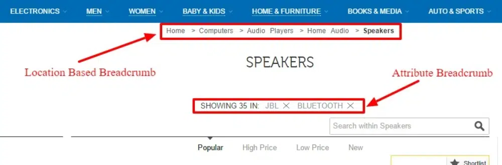
5. Not Providing A Way Back
Website navigation is always a dynamic function. Users will move deeper into the website content, and at some time, they would also want to trace back their journey. Hence it is important to provide a way out for users to navigate the reverse path. Few developers argue that they have a home option in the menu for that, but it is possible that the user may not want to go directly back to home but some page in between his website journey.
Breadcrumbs prove to be very effective in solving this issue. They provide an easy way back to the user and improve your website navigation by providing a sense of positioning to the user. If you are providing breadcrumbs or a back button, make sure it is easily accessible and not hidden in some corner of the webpage. This happens more in the case of mobile websites. Hence your website navigation plan should always feature a reverse path.
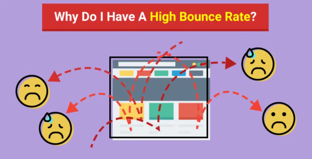
6. Having Too Many Dead Ends on the Website
Having a dead end on the website is a cardinal sin in website navigation. You can never afford to mistake of not providing users options to go to other pages. For any brand, websites have become a part of their marketing collateral. You need to make sure that the user moves around the website as much as possible and knows more about your brand’s products or services.
Today, there is cutthroat competition in SEO and digital marketing. As a result, getting more visitors to your website is getting more challenging. You cannot have website navigation where the user meets a dead end in such times. A good way to mitigate this is by offering navigation options at the end of the page, taking users to other products or services or even blogs. This way, the user will not leave the website, which will help you decrease your bounce rate.
7. Forgetting About the Sales Funnel
Setting up a sales funnel has become a norm for all brands. The advent of digital marketing has thrown up a lot of mediums for attracting sales, and websites are one of them. Websites serve the important function of being the gateway to your sales funnel. You attract users from social media, search engines, and other places and take them to your website. Over there, you showcase the best of yourself in terms of products, services, USPs, and everything. The website serves as an extended and dynamic sales pitch to convince your user.
However, some developers forget to put in the next step of the sales pitch, which is to enable conversion. Your website navigation has to ensure that once all the selling part is done, users can move ahead in the sales journey to buy the product or service. It is a good idea to sprinkle call-to-action sections at all parts of the pitch. This way anytime, the user is convinced about the brand, they can click on it and be directed to the sales page or contact us page. If this is not done, you will lose out on many potential customers.

8. Using Too Many Buttons
Have you observed that the use of buttons is on a decreasing trend? This is because buttons prove detrimental to your SEO score in more ways than you can imagine. First, they are hard to adjust in terms of mobile compatibility. They need to be scaled up and down as per the device. Also, the text inside the button is not read by the crawler resulting in further opportunity loss for SEO. Also, many developers use custom images for buttons which further loads up the website hosting provider.
Stylized texts are replacing buttons. They also stand out from the content, are readable in terms of SEO, and are easy to play with mobile responsiveness. However, many old-school developers still like to load their websites with too many buttons. Using buttons on bigger sections like the slider or header part is still acceptable, but using them across the website proves to be a turn-off for the users. Apart from SEO score and mobile compatibility, it will affect the website navigation, and the user will get confused.
9. Tempting the User for Too Long
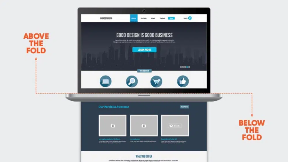
The basic purpose is to provide a certain set of information to the user who is looking for it. However, the attention span of users is continuously decreasing. If they cannot find what they are looking for quickly, then there is a good chance that they will leave the website. This is why the concept of above-the-fold and home page navigation has become so important. Even SEO experts believe in adopting a more direct and quick approach to communicating with users.
However, some developers mistake tempting the user for too long. They are not direct in communicating what the brand or website is about. Confusing the user will only lead to an increased bounce rate. Instead, you should ensure that your website navigation is planned so that the user gets the important information first with the least number of clicks. It is advisable to have the home page preview what the website is about. If you have products, then display some on the home page, or if you have knowledge articles or case studies, then better to create a section for that. This will satisfy the user’s curiosity, and they will not leave the website but browse the sections of their choice.
10. Not Putting Yourself In The User’s Shoes
Empathy is an important value not just in real life but also in digital life. As a designer, you should always put yourself in the user’s shoes and check out your design. This is true for all types of design, be it websites, print media, or product design. This approach of sitting on the other side of the table can sometimes make you realize many areas of improvement in your design. For website design, this approach can help you finetune your website in a better way.
Many designers are in a hurry to finish their projects and forget the last critical leg of the project – testing. You must test your website on different devices and browsers. You should have other people also test your website as their feedback can be valuable. Website navigation needs to be designed to keep the user at the center. You want to showcase the best of your website in the least possible time to the user. Hence whenever you are working on website navigation, think like the user, and this will help you create a better website navigation framework.
Conclusion
Untidy website navigation can prove to be very detrimental to your website’s bounce rate and even sales. The good part about website navigation is that it is not highly complicated. There are a few basics that you need to follow. But the problem happens when developers get super creative and deviate from the norms. This blog compiles ten common website navigation mistakes to avoid when designing and developing websites. By avoiding these mistakes, you can ensure that you will have smooth website navigation which will provide a positive user experience.

Thank you! above information is very usefull for many readers and you have mentioned design issues that really faced during website creation. But you have missed out some of them, which I have mentioned below check them out or If I am wrong guide me.
1. User experience (UX) and accessibility
2. Mobile responsiveness
3. Cross-browser compatibility
4. Maintaining consistency in design and branding.
5. Content organization and hierarchy
Amazing Article! I would like to thank you for the efforts you made in writing this awesome article. This article inspired me to read more. Keep it up.
Hey, this is such a great article! Thanks for sharing. Our team will be excited to read this. We are UI UX design agency in Mumbai and we regularly also express our views on UI UX and product design.
This is very usefull