Why combine images with text? Successful designers know that it doesn’t take a miracle to make their work stand out – instead, it takes to know how to combine images and text and turn them into attractive compositions.
Websites can turn into masterpieces in many different ways, the same as with any art branch. The importance of variety is even bigger in the case of web design, as there are numerous elements for website creators to come up with a beautiful solution.
The core building block and most valuable trick of design is combining images with text. Yet, doing so will not be as simple as to slap a favorite slogan on your best photo – it will take much more to impress your future clients.
The timeless combination of text and images
It doesn’t matter whether you’re designing as a social media aficionado looking for followers or in the role of a professional designer – the creative technique of bringing images and text together will be your best bet for creating attractive content.
To give you the idea, think of how transparent backgrounds influence the text’s visibility, or how certain designers use creative shapes as text holders.
A winning combination – fun text and cool images
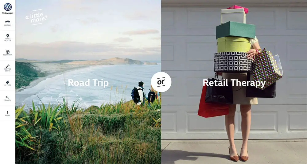
Beauty will come naturally if you use beautiful images with beautiful text. Combinations like these never left anyone indifferent, and they have helped some of the world’s biggest brands succeed.
So how does combining boxes with images and colors work? Let me explain:
Plan the composition in advance
The breaking point of modern web designs is the arrangement and proper placement of text in relation to images. Smaller text, for instance, will be hard to notice on a busy and distracting background, which will reduce both its readability and visual appeal.
Yet, you’ll only be halfway through by arranging the text – to complete the equation; you have to think where your image will appear, and how it will look. To do that successfully, plan the following things:
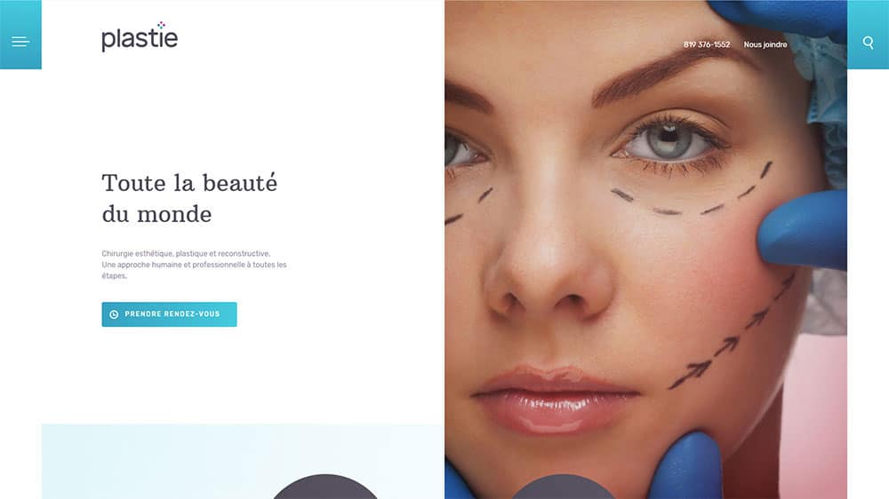
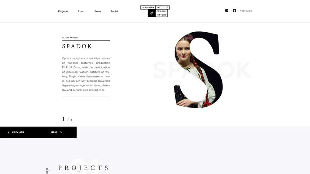
The image’s composition. While choosing the photo, make sure it provides just enough room to place a beautifully written text.
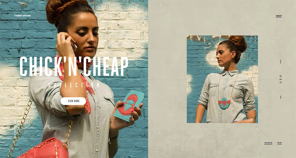
The composition of the entire text + images combination. A designer’s work does not end by simply bringing elements together. He or she has to find an effective image that will support the expected effect of the message and choose fonts that correspond to it.
The leading element should always be the element supposed to attract attention, but the possibility to align text and images in exact proportions to let them complement each other is also not a bad idea.
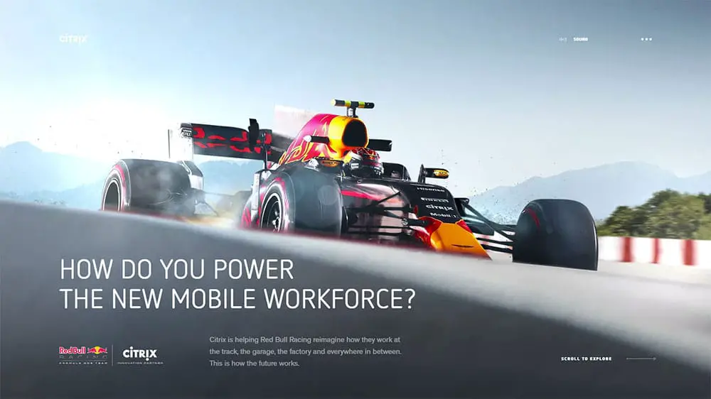
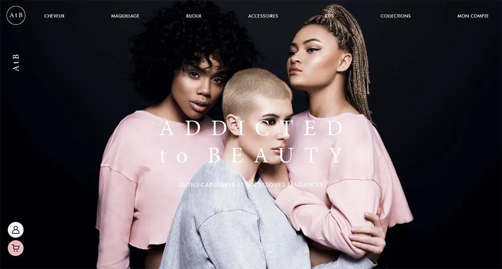
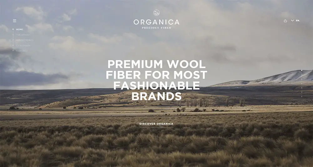
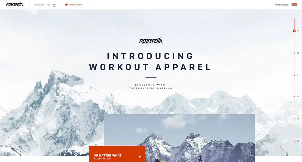
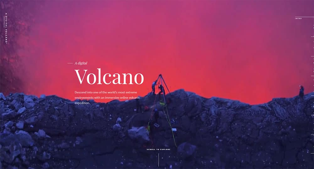
An even simpler way to achieve the same effect is to use the image as a background, and place the text on top of it. Put your creativity into action, and you will certainly come up with some great ideas!
A perfect header
Headers are a common source of discussion and dilemma. Of course, you will want visitors to be able to scroll down your website, but also enable intuitive navigation that doesn’t take time to learn.
To do so, you can introduce a fixed header that will remain on top of the screen regardless of where they’ve landed, and appear consequently on all pages to make your design more functional.
Choose your focal point
All great compositions pride themselves on a well-chosen focal point, namely any visual element that looks good enough to capture attention.
In web design, this will also be the starting point of navigation. Instead of your image + text layout, you have to give priority to some of the two elements and make that priority visible with positioning, sizing, color, and so on.
Proper balancing
Balance can make or break a good composition and can be achieved by planning carefully the importance of each element on the page.
None of them should be particularly visually heavy (especially when discussing designs that feature both images and text). Instead, you should take the minimalist road.
Making use of fun hover tricks
Interactive websites are the future of web design and for a good reason.
Each time we get feedback on our online actions, we feel more confident towards the provider, and obviously pleased to have received the attention we need.
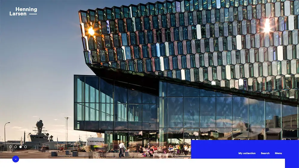
A wise choice of images
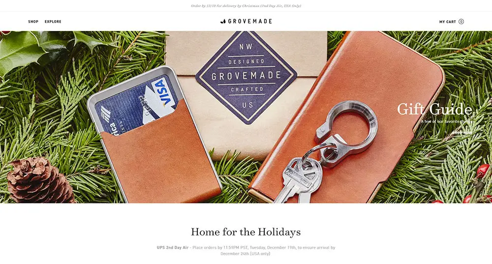
Images are more important to design projects than simply providing a backdrop space for your text or adding a beautiful accent.
Quite often, they also set the tone and context of your composition, and influence the emotions of potential viewers. Therefore, their quality must match the quality of the text, or complement it in cases where the contradiction is purposeful and desired.
This is especially important if you are creating an interior design portfolio, a photographer’s, or an architect’s.
Make the perfect landing page
The objective of landing pages is always the same: to attract the attention of random visitors and to direct it towards the important information.
For this reason, you need a well-designed, top-performing landing page with no useless details on it.
Choose the right background for your text
As we discussed before, your text should be placed in an easy-to-notice location, so that users will see it and be able to read it.
You can do this in 2 ways: Get an image that has empty space on it, or choose an image with larger empty areas, or soft and blurring focus. With a busy image in the background, the copy will be difficult (if not impossible) to read.
Professional designs are simple
The only absolute rule in web design that deserves to be called so is ‘less is more’. Minimalist websites may not be living through their best days, but professionals are still recommending them in each and every case.
Think about it – when was the last time (if ever) that you got impressed by a jam-packed website full of banners and features? Indeed, a complicated layout and time-consuming navigation won’t help you communicate the message you want.
How can you do that? Take your time, and note down all the basics. Whatis the information you simply can’t go without? Better yet, what will visitors expect from you? Answering these questions, you will make a pretty decent list of details and features that help preserve visitors’ attention. With time, you can update this list and make changes to an even cleaner design.
Also, don’t try to design cool websites just for the sake of being cool. They need to be useful as well.
Using contrast to enhance visibility
It comes without saying that color contrasts are the best tools you can use to make your text pop off the screen, especially without a defined background or a technique that would reduce the compromising effects of other elements in your project.
Colors, for instance, should be cohesive and well-coordinated. A safe way to go here is to use text colors that already appear on the background image.
It may not be the most intuitive thing you’ve ever heard, but using opposite colors is a valuable trick every designer should know. To make their pieces more dramatic, designers rely heavily on contrasts and use primarily complementary colors such as yellow and purple.
Ending thoughts
It is no secret that information is absorbed much easier with visual means, and designers use this fact to prepare impactful content. You should keep the same in mind when working on your next project, be it a presentation, a poster, infographics etc.
Design should always be balanced, and that balance depends on the relationship you’ve established between your images and your text. If you learn how to combine these properly, you will adopt the core skill of any professional designer.
