If you are a graphic designer, chances are that you are also a UI Designer. UI Design is what makes the surface plane of an app or a web page beautiful. User Interface Design is an amalgamation of visual hierarchy and graphic design. As UI Designers, you are responsible for creating a great sensory experience for the user. To be able to successfully communicate a brands message, you have to be able to form a visceral connection with the user.
UI Designers work to not only convey a brands image but also to communicate the value and functionality of the product. To be able to develop a cohesive visual structure, it is important to pay attention to these 4 basic principles of UI Design.
1. Clarity
GUI’s and any other graphical elements of an interface has to have a clear meaning. Whether you are designing a button or simply choosing a typeface for the layout, having a clearly defined goal will help you eliminate all the ambiguities associated with your design. Users should be able to interact with the interface intuitively. This often means that they are looking for an effortless experience when using the site. So usability precedes aesthetics.
When designing a UI element it is important to question your decisions every step of the way. Asking the whys’, how’s and what’s will help you explore various possibilities of an interface layout. A good designer knows this and often understand the tradeoff associated with each design decision. By understanding your user and creating a UI that is both intuitive and delightful to use, you are bound to create immersive experiences.
2. Consistency
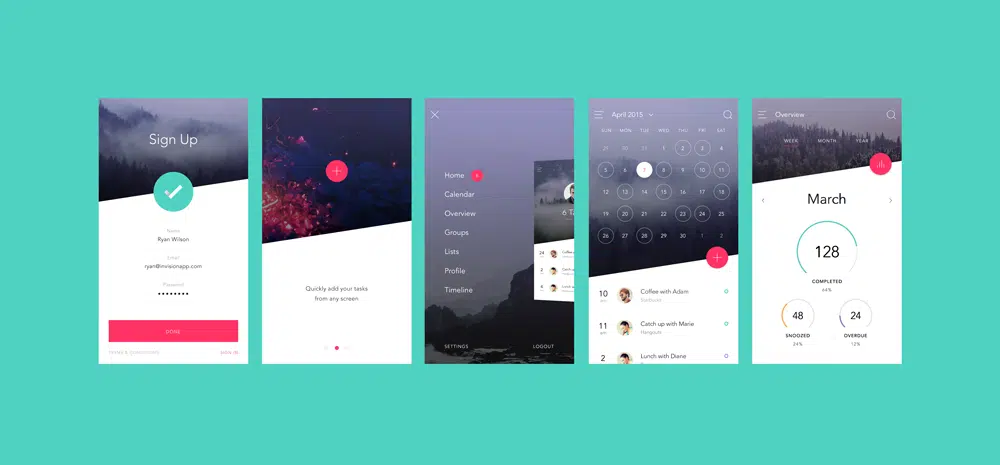
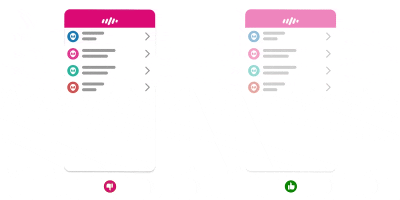
Interfaces act as an access point between the user and the digital world. They have to be designed with an understanding of the users existing behavioral patterns. UI design has evolved with time and so has the users. So having consistent visual representations that create a sense of familiarity and consistency will help create a more intangible experience for the user.
To elaborate this point, your choice of words and tone matters when it comes to creating a good user experience. Keeping the wording and the tone consistent will not only help you influence the user’s perception of the product but also will help successfully convey your brand’s message. The same thing applies to UI elements and other GUI’s. Keeping these elements consistent and using visuals that are widely understood by the users will help enhance the overall user experience.
3. Visual Hierarchy
To be able to create a sense of order to the overall design, designers have to dig deeper into understanding the intricacies of visual hierarchy and layout design. The human eye is naturally drawn to eye-catching imagery and to be able to effectively engage the user, it would make sense to order them from most to least important content. As the human eye perceives information visually, we have come to learn that several factors contribute to the overall effectiveness of a web page. Here are a few points that effect hierarchy.
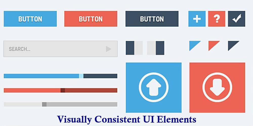
* Size: The bigger the element, the more attention it is bound to get. So by using varying sizes and using the right size to make an element stand out can be one way to grab the users attention.
* Color: Color is a strong element in UI Design. It can be used to draw the users attention and create a hierarchy that can help guide the viewer through various elements of a web page. Brighter colors get more attention than softer shades. Dark palettes come next. They can be used to make the content stand out in specific ways. The key to having an understanding of how color forms perceptions and plays with the user’s mind. For example, brighter colors would work best for CTA buttons or any other UI element that user would turn to for task-related functions. Softer and Paler shades work best as background colors. This can help bring the other UI elements and content of the website forward.
* Contrast: Having a strong contrast in UI elements will help grab users attention. This can be used to help highlight important sections of content in your design.
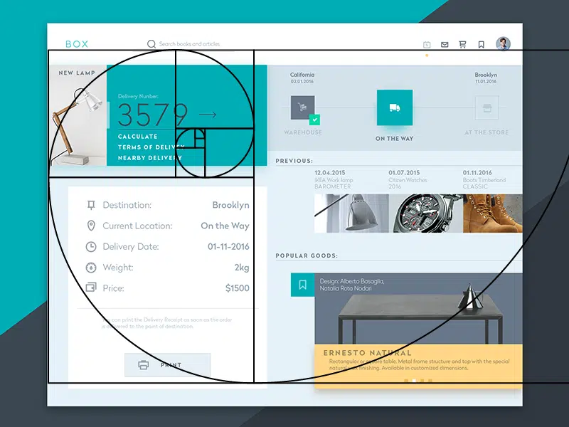
* Alignment: Placing content in specific ways can help prioritize the importance of tasks for the user. Using a combination of line weight, size, color, and contrast, designers create blocks of content to help guide the eye.
* Eye Patterns: Z and F patterns are globally recognized and recorded patterns that were established after studying the movements of the eye of a user when presented with a page. Z patterns are usually used for designs with imagery while F patterns work better for text-heavy content. Understanding them and using them effectively can help engage the user with the sections of content on the site.
4. User expectations and meaningful feedback
Good interfaces are often created to let the user be in control. As a designer, you want the user to have an intuitive and pleasant user experience while navigating through your web page. This would be mean they should have the ability to easily explore and backtrack whenever they chose to. If the user has to carefully study every action they take, then the overall site experience is not going to be as effective. Navigation should be clear and easy. By providing visual cues, you are able to guide the user through the web page. Predictability/Feedback is another important factor to consider when designing a meaningful experience. Every action that the user performs on a web page should be met with an immediate reaction. A lack of any such feedback will indicate to the user that their action has not been acknowledged.
UI Design is a rapidly growing area of design and as designers in the industry today you are responsible for creating the overall look, feel and style of a website. The goal is to create the most user-friendly, thoughtful, intuitive and meaningful experiences that guide the user through various pages of a website. Designing an interface with the above principles in mind will help you create great GUI’s that are comfortable to use and have low cognitive loads.
