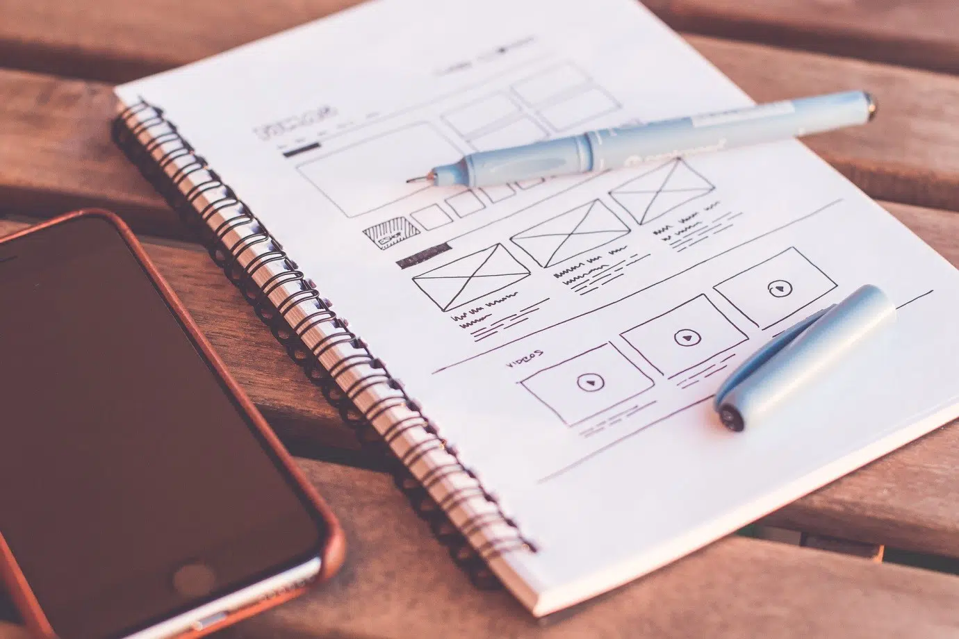
Your website is your identity. As it is essential to have an excellent professional office, it is equally important to have a well-designed, high conversion website. The website serves as our online business identity. It should serve as a one-time solution to all your user queries, who come to your website with sheer hope. The internet is full of resources that you give a good idea regarding what you exactly want for your website, irrespective of whether your business needs those features or not. If you are building an E-commerce website for your business, then, you should be clear regarding the features you want in your website before you go out and start copying the website design of your competitors. For instance, if you are planning to start a catering business, then you should have a theme related to food services and a payment option in case you are collecting the payments online. Another pre-requisite criteria for any business website is a smooth interface and a user-friendly UX/UI. There are many ways to build a website, but if you follow the 10 website building principles outlined below, then we are sure you will never face a problem. These principles are universal for all types of websites.
Below mentioned are some of the design principles that will help you create a professional website without much hassle:
1. USER IS THE KING

The primary purpose of building an online presence through a website is to attract new customers to our business. As per the survey, the attention span of the users has been decreased considerably since the last half-decade. It is reported to be 0.5 seconds in real-time. This proves that we have 0.5 seconds to market our product on the online platform. If we can create an impression in this first 0.5 seconds, then we have 90% chances of conversion. For this, we have to be ultra-sure of the experience we deliver to them. It is imperative to take care of the loading speed once the website is created. If it is missed, then the website would face a high bounce back ratio, and the entire effort behind building a website would go in vain.
2. KEEP THE CONTENT CRISP
Content is something your users come in for. The content on the website should be very clear and easy to understand. It is advisable to make the content keeping in mind the usage of a layman, who is coming to your website for the first time. A well-written content would save up a lot of your marketing cost as the users would drop in for your quality without considering any other factors. The use of words should be in such a way that it conveys your mission, vision, and purpose concisely and crisply. The attempt should be to send the meaning and your services to the users and not to confuse them with too much information. Content is essential for creating an impression in the eyes of the crawlers. The crawlers only recognize text and not graphics or any other forms of content. Therefore, to get your website in the ranking, it is very crucial to get indexed by crawlers.
3. PLAY WITH HEADING TAGS
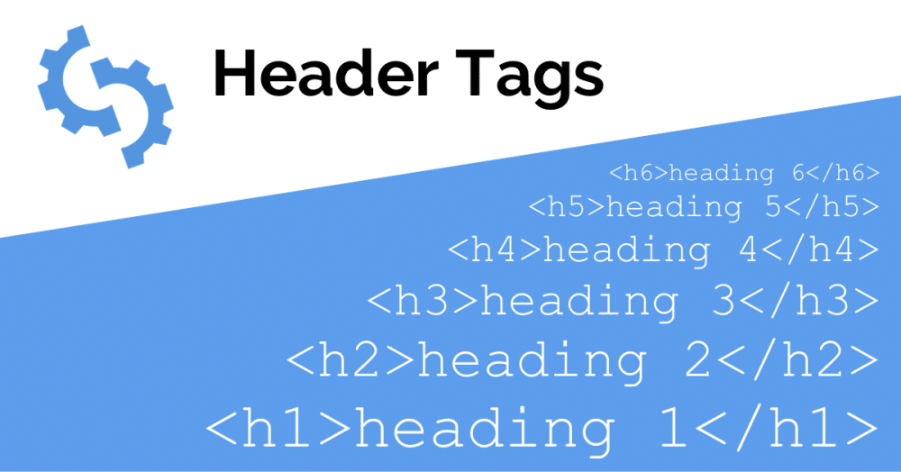
Header tags have equal importance as content and users because it works as a helping hand to the users for figuring out the relevant content. Heading tags are handy to the crawlers as they identify keywords, title tags, and heading tags to understand the content and index them, once a user enters the search query in the SERPs. For instance, H1 is considered to be the most critical piece of information on the web page by the crawlers. This is the reason they index the information based on the keywords and content in the H1 tag. It is followed by H1>H2>H3>H4>H5>H6 and so on, in the heading tag’s kingdom. It is advisable to have just one H1 on every web page to make it simple crawlers to avoid confusion.
4. SEPARATE THE BREADCRUMBS

It is one of the important ways to help users in understanding your website structure and information. A well-defined bread crumbs on the top of the page helps the users to understand their current position on your website. It serves as a menu to the users, and they can figure out their needs and purpose within the first few seconds of their journey on your website. If the bread crumbs are not appropriately segregated, then your users would miss out on certain important information on the website as well as would decide not to revisit a confound website and waste time. Proper usage of bread crumbs would not only help the users but would also help the crawlers understand the structure of your website at one single place.
5. GET IN TOUCH FASTER

Once the user enters your website and goes through all the sections and decide to move further, he would need the information to contact your business. Once the user connects through the contact information on your website, your user gets converted into a lead and has high chances of conversion. The purpose of ‘Contact us’ is to trigger the user to contact for more information, and that is the time where you get a chance to showcase your brand in the way you want it. The entire purpose of creating a website is because you want the users to contact your business through a new medium other than offline office space. It is advisable to showcase your contact information on the top of the page, footer as well as create a separate contact page to get the attention of the users. It should be one click away from every web page they tend to scroll as it serves like a ‘Call-to-action’ for your website.
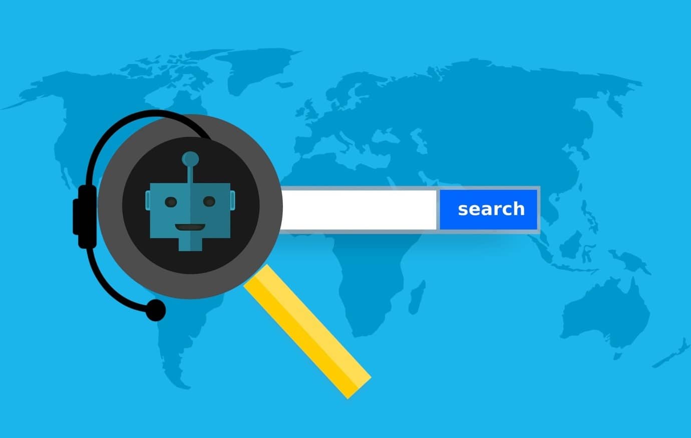
6. THINK ABOUT THE BOTS
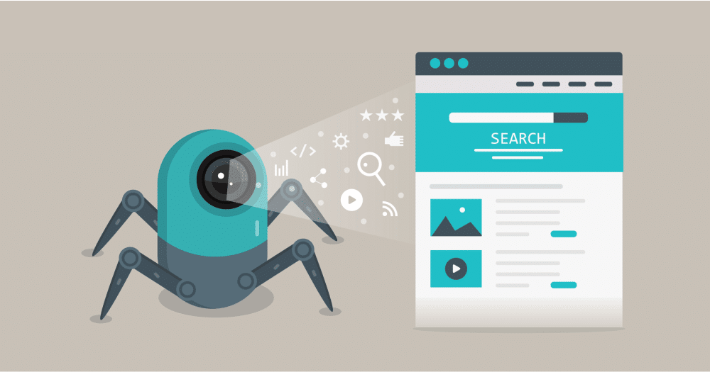
One of the reasons we consider Google, Bing, and other search engines as gods of the web. This is where our entire user base is located from every corner of the world. This is a place where we get every possible piece of information, under the sun, on our demand. Search engines are created by humans but involve several artificial intelligence features in the form of robots. The search engines take the help of the artificially created bots to track the information posted by every user in the world. It is developed through coding and different algorithms, which make them understand the content of the web in the best possible manner. Bots can identify all kinds of text on the internet in any form but are not compatible with the heavy graphics. Our website and business are solely dependent on the way the bots/crawlers index our website. This is the reason it is important to build a bot friendly website along with user-friendly website, as bots are the ones who would bring your users to your website. As soon as the user types any query in the search engine, the bots start to analyze the web pages and index certain important information as per their capability and display the results. They mainly analyse keywords in the content and figure out the important ones to show the users. It is advisable to avoid canonical URLs that show a different scenario of your website to the users and the bots. If this malpractice is tracked through search engines, then your website can be suspended for six months or even blocked forever, and your entire efforts would go futile.
7. SHAKE HANDS WITH SITEMAPS
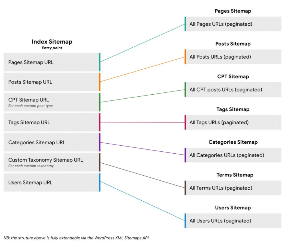
Sitemaps serve as navigation to your search engine crawlers. It is designed explicitly for the crawlers to give a quick solution to the user search queries, as the crawler can quickly skim through the entire website with the use of a sitemap. One of the famous sitemap structures is XML sitemap, which is made for the search engines. There is one more site map structure, HTML sitemap, which is made for the human users to navigate through the web pages. It would not make a difference to your user experience in case the site map is missing but would make a massive difference to the crawlers and searchability of your website. It also serves as a hindrance to the crawlers as they won’t be able to check your entire website due to time constraints, thus end up not indexing your website and showing up in the SERPs. A well-structured sitemap also saves your crawl budget spend and help the crawlers to crawl your relevant pages frequently.
8. INCLUDE A SEARCH BUTTON
It is one of the crucial icons on every website that should not be missed at any cost. It is specially designed for the users to search the required information on your website, without navigating through the entire web page or website. It is essential to include a search button on every page as it helps the users to find the information quickly without wasting much of their time. It is a boon for the users who access your website through small mobile screens. It is advisable to include it at the top of the page along with contact information or with the bread crumbs. It can also be separated with a search box and a search icon if the website design allows it. It is an add-on to the user experience journey on your website.
9. MAKE USE OF FOOTER
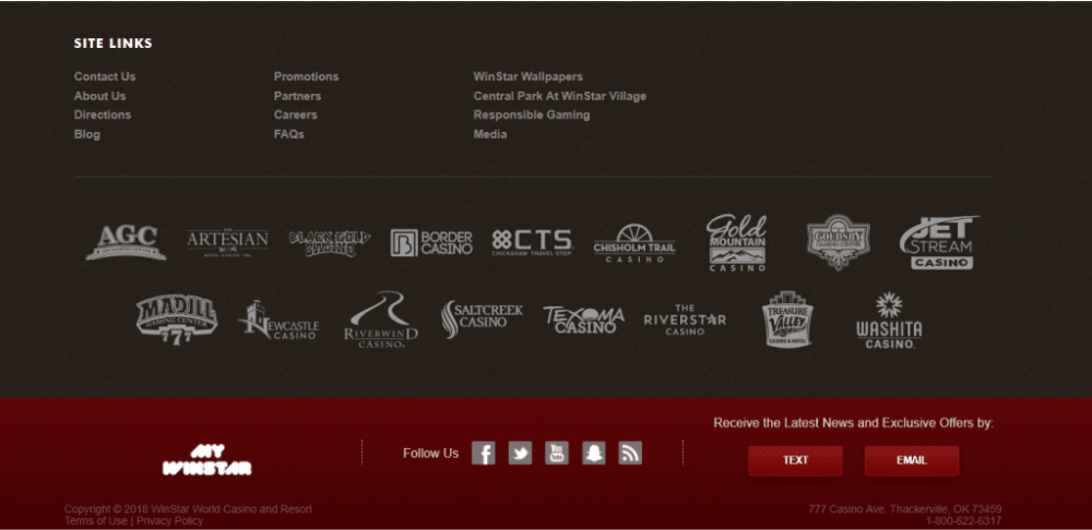
Footer is an amalgamation of all the services offered by your website. The user can come back to the original page and content without scrolling up and down by just a click in the footer. The footer contains all the information on the website, which allows the users to navigate quickly, in case lost between the web pages. It is vital for the long and multiple pages website. The footer should include the entire bread crumbs section, contact information, licenses, copyright statements, trademark statements, privacy policies, and other important disclaimers. At times, it also includes a subscription bar along with additional information, which serves as a call-to-action for the users and reminds them to connect with the community without quitting the website. It is advisable to hyperlink every mention in the footer to help the users. In case, the footer mentions are not linked, the users would again face the same problem of navigation.
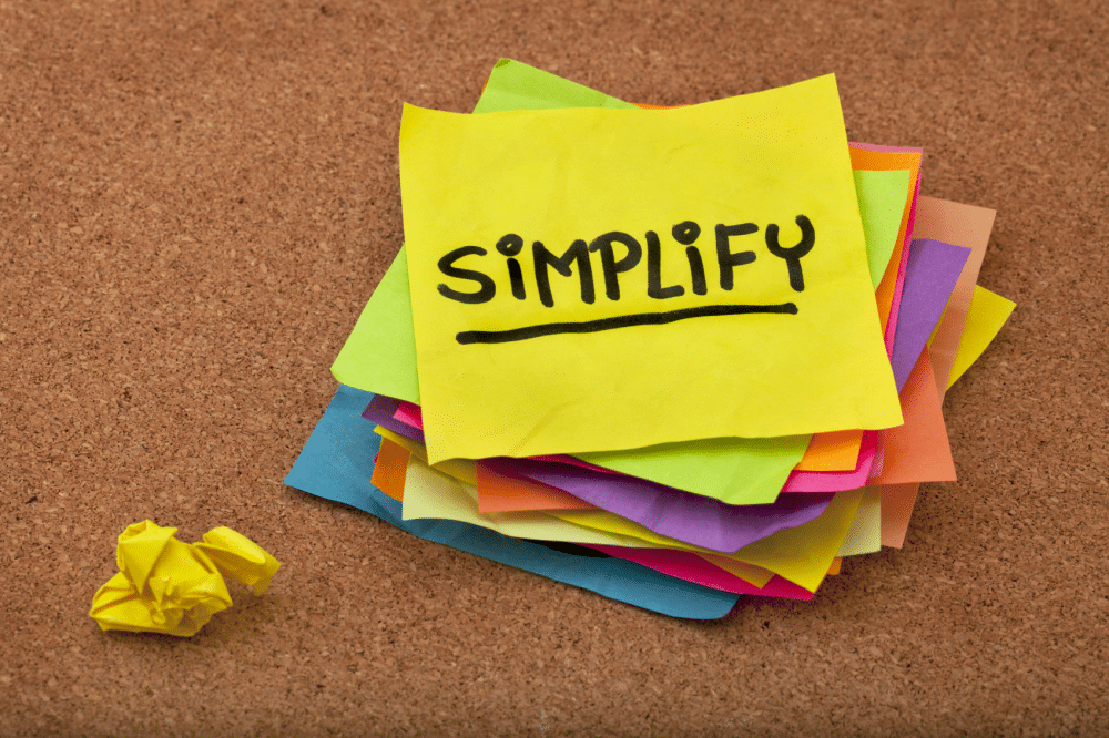
10. MERGE CREATIVITY WITH SIMPLICITY
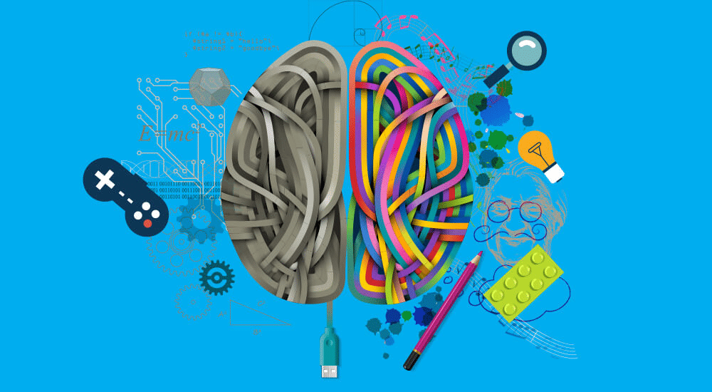
We often hear statements like creativity and simplicity doesn’t go hand a hand. It is a myth that has to be proved to be wrong while designing a website. Creativity is more about the artistic expression of the subject along with a twist for the users; to give them an ‘Aww-struck’ moment. On the other hand, simplicity is the way you present your product or services that can be understood by the layman users in the first go. In website designing, the work of a designer is to present the mission, vision, purpose, products, and services in front of the users, by simplifying the artistic expressions in the form of texts and graphics. Merging creativity and simplicity is again a matter of art, science, and mainly psychology. The creator needs to understand basic human psychology while designing the website, as it is entirely the game of the users. Bread crumbs and search icons are the inventions behind the attempt of merging creativity and simplicity. The amalgamation should attract the users as well as give them a hassle-free experience on your website.
Every website has its personality and identity, but there are some rules and regulations that are common for every website. If you abide by these pointers mentioned above, then it would not only help you create a good impression but would also turn out to be useful for your users along with web crawlers. Your entire motive behind creating an online presence will be served if these fundamental problems of the users are taken care of.
