It doesn’t really take to be a professional coder or an experienced graphic designer in order to build an excellent website.
Online, you can find a wide range of affordable resources and tools which will make users think that a professional is standing behind the masterpiece.
One of the tools that can certainly take you to the top is great website icons.
Icons can contribute significantly to the overall quality of your design.
Incredible, isn’t it? A few tiny and cute icons can transform the overall impact of your work. Icons in web design are gaining importance.
Their production is becoming a leading web industry that can really make difference in contemporary design.
Icons also have multiple functions. They decorate the heading with visual cues; perform button functions; separate the content in sections; and give some personal and professional touch to the website/application.
The significance of web icons

Icons are not a recent discovery. They’ve been around ever since design started developing. The first icons were Egyptian hieroglyphic drawings which developed to modern RSS icons that spread on the web nowadays.
Printed or digital, icons are always applied with the same purpose-to attract attention and to help customers focus on the most important parts of a website.
The first thing that attracts users when they ‘land’ on a website are visually engaging items. Impressive icons can help you promote the content you’ve chosen, and they will create a recognizable stamp for your brand.
You can also use icons to divide large content chapters and to make your pages look elegant and well-organized. Icons can secure a picturesque appearance for paragraphs and their impact is not directly connected to their size.
The definition of an icon
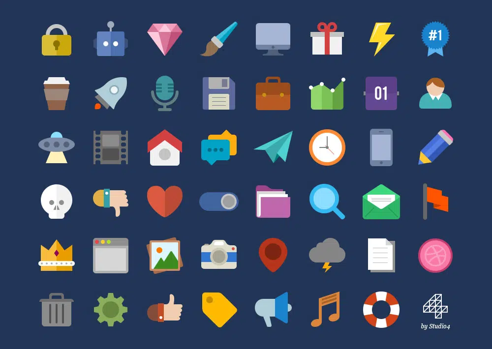
Icons are petite images and symbols which guide human intuition to different parts of the content of one website. They are adjustable and diverse, and they are the simplest tool for transmitting data in a pictorial form.
Their abbreviated nature makes transmission far more efficient than the one conducted through textual means.
The flat design tendency obviously benefits from the icon’s illustrative efficiency. A quality interface is almost entirely based on icon fonts and expandable SVG images.
The importance of icons in web design

Icons are essential tools of communication. A cool icon will grab your visitor’s attention and it will direct it towards the message you want to convey. Icons can easily be compared to traffic signs and direction boards, as they always tell you where/how to move.
Small, basic icons for your business’s information can be perfectly enough to enable your customers to contact you. Map icons can show them the exact location and they can enable them to find you.

Therefore, icons are crucial for effective communication with visitors, even before they have started to use your website. If satisfied with the initial experience, visitors will stay on spot and they will make use of your information.
No wonder that outstanding websites (in terms of functionality, readability, relevant content and advanced features) are also the ones that have the best spectrum of icons.
Let us summarize the benefits of applying icons:
Relevance. An icon should be easily ‘read’ so that even the new visitors will know what type of content it stands for.
Amazing looks. That’s quite obvious- catchy icons can improve the overall appearance of one website. They make pages interesting and cozy, which is exactly why users choose to spend time on those particular websites.
Universal application. Multilanguage websites are the leaders of common web perception, but images don’t stand too far behind them. In fact, it is much more recommendable to use visual language when trying to convey a universal message.
Icons in the service of better web design
Designing icons leaves a lot of space for creativity and innovation. However, there are certain rules that all designers should be aware of. Firstly, icons serve to convey a message or to provide a shortcut for certain actions.
Therefore, they should be clear, precise and user-orientated. On the other hand, different icons that are incompatible with your brand will make your website look unprofessional.
It is recommendable to make them interesting, without exaggerating with styling details.
Icons are the cornerstones of your content
When a certain website looks better than its counterparts that’s easy to recognize. The difficult part, however, is to explain why is it so. Big decisions are usually made on the basis of small incentives.
Translated in website content terms, this means that the visual appeal of the website is dependent on the readability of its content. Success depends on identification of important information and the ability of people to understand it.
Icons are as decisive for textual content as paragraphs are. They can divide information into sections and provide visual guidelines for the readers.
My advice is to use a combination of bold fonts and icons to concentrate the information in easier to digest segments.
As we know from personal experience, users scroll around before deciding what to read and we have to highlight the parts we consider should be opened and seen.
If not motivated enough, users will tap ‘back’ and all of our efforts to provide ‘killer content’ will be in vain. Quality is not what really matters. It is accessibility.
Icons are used to present your content:
- They organize content in a nutshell
- They grab users’ attention
- They influence readability
Tips on choosing the right icons
For instance, the magnify glass icon is perfect for searching filters.
House-like icons, on the other hand, clearly redirect people to your homepage. As you can see, it is quite simple-use tried icons with proven effect, rather than the ones you created for the purpose.
Additionally, be aware that you cannot find a matching icon for every piece of content on your website. In such cases, find an image that goes as close as possible to the content behind that icon.
We also recommend you to use it for textual content in order to avoid any uncertainty on whether your users will understand what it is about or not.
One thing should always be on your mind: icons are there to support content, not to take its place.
Finally, don’t underestimate the importance of relevancy. Make sure your icons represent content accurately, and they are updated enough to be understood by all audience groups (typewriters, walkmans, or tapes may not really ring a bell among the younger population).
This is a method that will guarantee usability and proper understanding of your posts.
How to avoid confusing icons
As we already mentioned, icons should be simple and consistent. If you have doubts about the meaning of an icon, it is very probable that your users will have it too.
Remember that among your audience, there will be people who don’t cope well with ‘reading between lines’ and metaphors, and you have the duty to provide them with clear guidelines.
Using images of objects that are not really existent may confuse users and can be misinterpreted, as they have a different meaning for every person.
Another method to avoid confusion is to attach short textual explanations to the icons. It is a way to make your page more interesting and significantly more functional.
The key features of functional icons are:
- Proper size;
- Attractive colors;
- Right placement;
Ending thoughts
Icons are the favorite tools of designers. They contribute to the way in which people navigate websites and they influence the way in which content is perceived.
Additionally, they make a website more attractive for the eye, as a welcoming environment where users like to spend their time.
Proper usage of icons means applying common metaphors instead of complex images so that users will know where to go and they will not be confused.
Finally, icons can help the perception of your brand (as long as they match your core values and they are consistent with your content).