How do you design a website that is beautiful, converts well and provides great value for users? Designing and developing a website takes time and effort. Working efficiently helps us to deliver a great website at a competitive price. A systematic approach to designing a web page is usually recommended to create a cohesive, consistent site that is scalable across all devices and platforms. In order to work efficiently, it may be useful to record steps that are repeated in every project. By doing this you are able to save time and have more freedom to explore other areas of design.
This article includes a web design checklist and suggests a few approaches designers can take to make their workflow as fast as possible. This will not help you save time but figure out new solutions to design problems and that can improve the overall design of the website.
1. Use visual hierarchy
Web designers should use visual hierarchy to guide the user through the web page. Visual hierarchy refers to the organization of different visual elements in a high to low visual prominence. This order not only brings visual clarity but also helps engage the user as he or she is on your web page.
Combining different aspects of this law can help keep the page interesting to look at and read. An effective web page should be able to engage the user as he navigates through a series of images, messages towards the call to action.
2. Use standard layouts
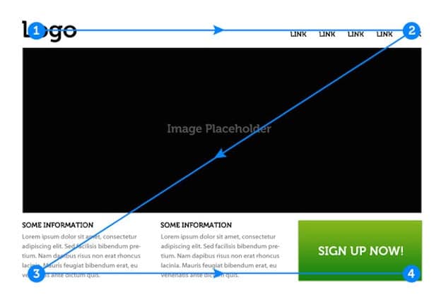
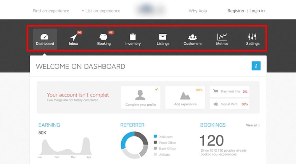
When designing a web page, designers have to design the layout around human behavioral patterns. We have been accustomed to using websites a certain way, if we don’t keep the layout and structure consistent to the usual standards, users are going to find it hard to navigate through your web page. So it is better to stick to low visual complexity in design to keep it usable, simple and attractive. It is good to be able to differentiate your brand in the marketplace but adding complexity in the layout will only make it harder for the user to use it. Here are some of the common web design standards to keep in mind when designing a webpage.
• Logo in the top left
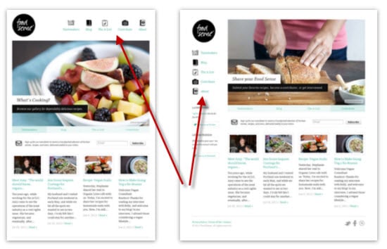
• Horizontal navigation in the header
• The search bar at the top
• Social icons at the bottom are f the page
• Use focused headline on top of every page
Having a descriptive headline about the company will help the user know if they are on the right page. Users spend about 80% of their time above the fold. So having a clear value proposition above the fold is as important as the content itself.
Just because users spend most of their time above the fold of the web page doesn’t mean that your call to action should be placed on the same section. For users to take action, you have to market the company and the product throughout the page. Persuading the user this way will often make them take action. This is why the call to action buttons are usually placed at the bottom of the page where the interest of the user tends to be high.
3. Clean, simple and tall layout
Designing web pages that are simple sans clutter can help the user really focus on the product and its value. Low visual complexity is often preferred because they cut the clutter out of the web page and make the site more readable.
Making use of space to create tall pages helps you add sections for frequently asked questions. By doing this, you are able to answer questions that a user might have about the business and the product. You want the user engaged while reading through the page so make sure to build a long page that answers all of their questions.
4. Avoid slideshows and tabs
Users only tend to look the very first image on the slide often without seeing the images and messages of the subsequent slides. So ‘call to action’ buttons placed here is unlikely to be clicked.
Avoiding tabs and expansively boxes will help your content be more visible to the user. Users prefer scrolling and usually don’t take the time to click on a button to learn more about a section. So it would make sense to have your content exposed without the need for you to click on a tab to reveal something.
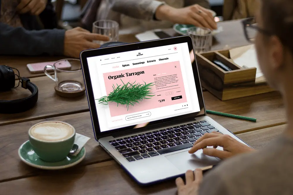
5. Use the right Images
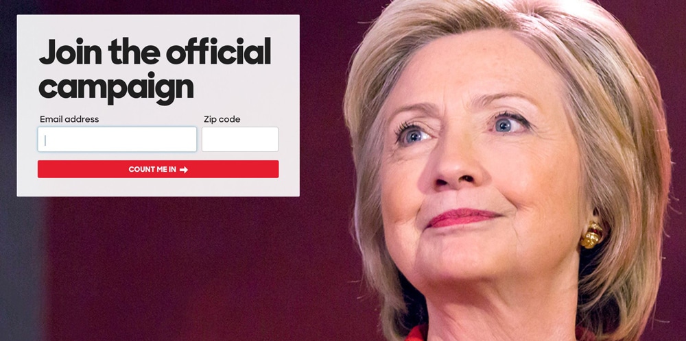
Using pictures of faces can help bring users attention to a specific content of the web page. Using face imagery can be useful in web design. Placing them in a specific way can guide them through different contents of the web page. For example, having an imagery of Hillary Clinton with her head turned towards the headline can help draw the user to the readable content on the left of the screen. Using visual cues like this can be beneficial to guide the visitors’ attention to statements or call to action buttons.
As web designers, you should be looking to build a web page that is capable of building a trust with the reader. So the imagery has to be picked carefully. Avoid using generic stock photos if possible. People prefer and want to see real people who actually work at the company.
6. Color and contrast
Color can be a powerful tool to draw the users attention. Colored call to action buttons designed in specific ways can impact the viewer in more ways than previously imagined. Having a colored call to action button with a contrasting text or a background can bring the visitors eye towards the buttons.
Using action colors that separate from the colors of the brand palette can be another way to guide the visitor towards all the links, buttons and rollover effects.
Visitors usually scan the web page from top left to right so anything placed on here is likely to be seen and used. To communicate your message with the menu, buttons and navigation link place them in areas where the eye is bound to travel. Be sure to use descriptive navigation links that are relevant to search engines and visitors. By doing so you will be able to leverage the web designs best practices. The most common area to place the home link is to the top left of the screen as visitors expect to find it here. The other items in the menu screen can be placed in any order you wish as they don’t directly affect the SEO rating and success of visitors.
8. Linking to other websites and blog posts
As a web designer, you want the visitors to spend time on your web page. So try to avoid using any distracting links that take their attention away from the service page. Exiting the page they are on to go to an external website is bound to lower your conversion rate. To be able to successfully convert them to a lead, the user should find the service page engaging and of high interest.
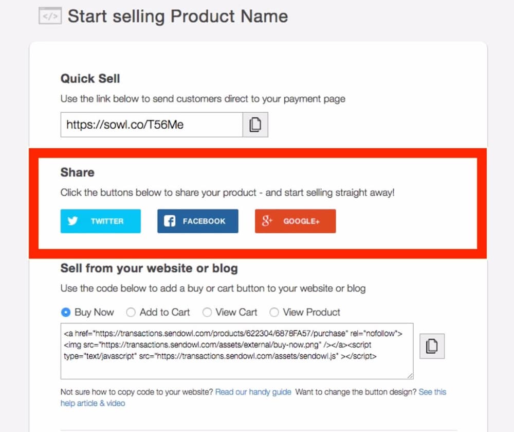
Having great content on your site is not enough, a good experience can only be created when users can interact with it. People like to share what they have just read or learned. Including social share buttons on the top of the screen will persuade them to take an action. If you don’t leverage this feature, you will be missing out on social media traffic.
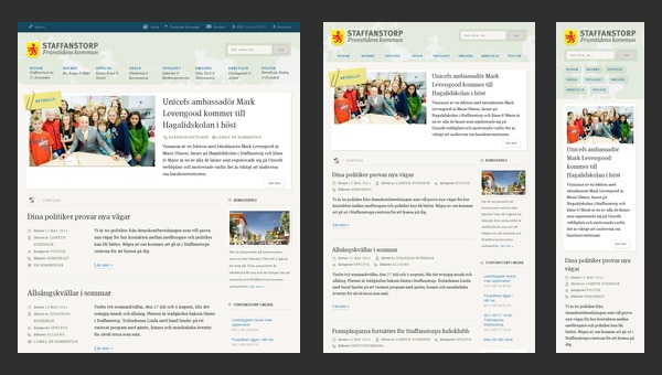
10. Optimizing for mobile
A vast majority of website users own mobile phones. If you are designing a website for a business, chances are they are going to need you to design mobile pages to reach a wider customer base. About 61% of the users don’t go back to using a mobile site if they have trouble accessing it. So make sure to use the best practices for developing a mobile site to create a seamless mobile experience for the user.

11. Build an online presence
To be able to have a solid online presence, your website has to get found. How do you do this? Having a great SEO strategy in place will help you design a website that converts well. This means that you have to create content that your users will search for.
12. Use meaningful Words
Writing meaningful subheads may help visitors find relevant content. Having vague subheads with useful text underneath will defeat its purpose. To make the content helpful to users it’s better to have descriptive subheading instead of a vague one. This is not only good for usability but is also considered a good SEO practice.
It’s always good to break up a long paragraph into smaller chunks. This will not only make the content easier to consume but also help the overall design more readable. Another way to make the content more readable is to use simple, common words that appeal to a wide array of people. The goal is to create an effortless reading experience for the user and keeping the text simple will help them process information without much effort.
List any content within your copy in order of importance. As visitors scan the copy the text they read in the beginning and end tends to stay in their short-term memory.
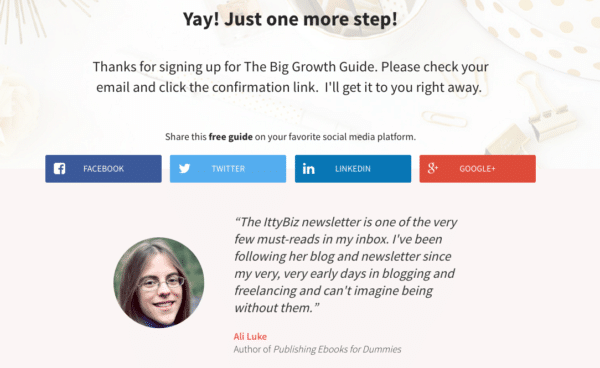
Add evidence as to why the user should choose your company’s service over the others. Adding testimonials and reviews will help them understand your offerings and will, in turn, be able to form a sense of trust.
Here are some types of social proof that can be added to the page
• Endorsements from clients
• Customer reviews of your product
• Trust signage and symbols of proof
• Media releases and as seen in editorial images
• Email sign up forms for subscribers
Email sign up form is usually placed at the very bottom of the web page. It should be able to stand out within the page so pay attention it’s representation when designing this section. It should also clearly indicate their value offering and have social proof so users can verify their data.
14. Understand what makes the site unique and valuable
Visitors are interested in useful information more than just a pretty site. Let us take a look a recent study done on some of the important factors that influence the design of a website:
• 76% of the visitors said that they want to find what they are looking for
• 10% cared about the appearance
• 9% were interested in cutting-edge interactive experiences
• 5% cared about other factors
Now let us take at the causes of failure:
• 60% find-ability
• 12% search
• 9% page design
• 9% information
• 5% task support
• 3% fancy design
• 2% other
Visitors are drawn to beautiful design but that by itself won’t keep the user interested in the page. For a website to be successful, it has to go beyond its visual representation, it has to give the visitor what they need. We hope that you found this 14-point web design checklist useful. If you’ve got anything to add to the list, please let us know!
