Dark website designs are appealing and are suitable only for certain, specific websites. Dark designs can work for any website that represents portfolio, art-related work, unique products or design studios. Dark websites are all about elegance and creative appeal. The dark theme conveys many themes when used in designs. When designing a website, a dark theme is often the preferred design as it represents authority and mystery. As an added bonus, a dark website design minimizes strain on the eyes in a dark environment.
Bright colored websites are eye-catchy, attractive, but also eye-straining. Especially in low light condition, bright websites are exhausting to look at. Many users prefer a dark theme, and so do the designers. Though dark website design is not ideal for every website, considering certain important elements could help you make the website elegant. Dark design fundamentals and specific best practices will help you attain the desired result.
In this article, we’ll discuss 10 things you can do to create the perfect dark website design. They are as follows:
1. Use More Space:
The dark website design must have space as much as possible. Space creates the needed effect for the dark website. If you create a dark website just like any other website, there are chances that it may look bulky and cluttered. The space in the dark website is specified as it needs a design with space compared to other websites. The designs used in the dark website would have prominence only it has enough space to breathe.
Moreover, in a dark website, the text and design must be chosen wisely, so it is the most highlighted element in the website. To make sure the elements in the website highlights, more space needs to be given on the website than the usual. The logo must have much space around it, as it is one of the first things that comes to notice.
Also, as the text used in the dark website needs to be visible properly, proper space is recommended. The space makes sure to drive the attention of the users to the essential elements. The dark website adds meaning and depth to the design, and it depends on space to make it exciting and appealing.
2. Contrast Text :
Dark website is the most sought-after website nowadays. Dark website minimizes eye strain, and so it is essential that while creating a perfect dark website, the kind of text we choose must be appropriate. Using contrast text doesn’t mean that the black background must have text in white as that can strain your eye.
If you must have noticed when you are in a dark room and suddenly come out in the light, it hurts your eyes. Similarly, if you have been in a less dark room and face less bright light, it doesn’t hurt much. The principle works on the dark website. When you create a dark website if its pure black and use white text to contrast it, that would result in too much contrast and end up hurting the eye.
So, we have to keep in mind that while creating a dark website, it is not necessary to have a pure black background but a bit lighter shade and not use pure white in text. To create a perfect balance, always remember the lighter shade of the background would always go with a lighter shade of text.
3. Textual White Space:
When it comes to dark websites, readability is one of the major concerns. The user usually dislikes dark websites due to readability issues, so one must pay extra attention to it. While creating a dark website, the placement of the text is important as it is one of the key elements.
To improve the readability on dark websites, one must increase the white space between the text, adjust paragraph size, leading and kerning. When you look at the best dark website, you could come to know that the space around the text matter a lot and put a different effect on the website and readability is better. To work on the readability issue, one thing that can help is increasing the size of the font, which means more white space.
More space would follow bigger fonts and would be easy to read. The background needs to be lighter, and with that, if proper spacing and text, it becomes easier to read. So, while selecting typography, make sure to keep the needed space in between the text.
4. Wise Selection of Fonts:
Readability is one of the most talked-about subjects when it comes to dark websites. The fonts selected for the dark websites must be perfect enough to make sure it is legible for reading. Generally, San serif fonts appear better on screen as it has better resolution than other fonts.
If elegance is what you need in your dark website, Serif font is what you must choose. The above fonts are just a suggestion, as choosing fonts would depend on the preference of the designer. The depth of the design and background of the website would help you to decide what kind of fonts to select. The fonts that is easily readable and would reflect the emotion of the website must be in use.
5. Minimal color schemes:
Unlike other websites which are bright and multi-colored, the dark website doesn’t work on the same principles. As dark theme represents more of elegance rather than trendiness. So, it is must that color used in dark websites must be minimum. When working on a dark website design, one must follow the minimalistic approach.
The dark website given that has a dark background, and there are only specific colors which would match with it. Using multicolor would take away the look and elegance of the dark website. Stick to one or two color when it comes to designing a dark website. There are many dark web designs which have used many colors, but it has specific techniques.
When you use multicolor it could make the website look heavy. A dark website has depth, and so color used in it must enhance it and not degrade the look.
6. Depth of Communication:
Designers use multicolors in other website and depth is easy to communicate through it. Proper display of hierarchy guides the users to interpret a particular idea the website wants to convey. Important elements are emphasized in the layout to show depth.
Whereas in a dark website, using multicolor would lessen the impact of the design. Using shadows in the design won’t help as it would be difficult to portray on dark background. To convey the depth of communication in the dark website, we could illuminate the surface of layers to show elevated surfaces. Using lighter shade to define elevation would help to convey the depth.
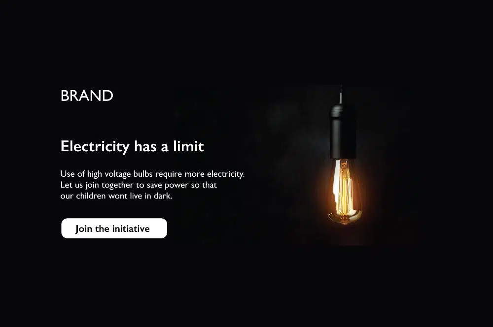
7. Appropriate atmosphere:
For a dark website, a theme must be there to create an atmosphere. Once you have decided that the project must have a dark website design, then the kind of feel it emotes must be decided. An artwork, portfolio, or business would have a dark website design, but the emotions must be displayed appropriately. Before you decide on the design, think about what the completed website should convey.
The contemplation would help you to decide the kind of design and atmosphere you want to create in the dark website. You can give a contemporary, professional or artistic approach to your website. The atmosphere you create for the business website would be different from the portfolio website. You must make sure the design, atmosphere you convey differs from the other categories.
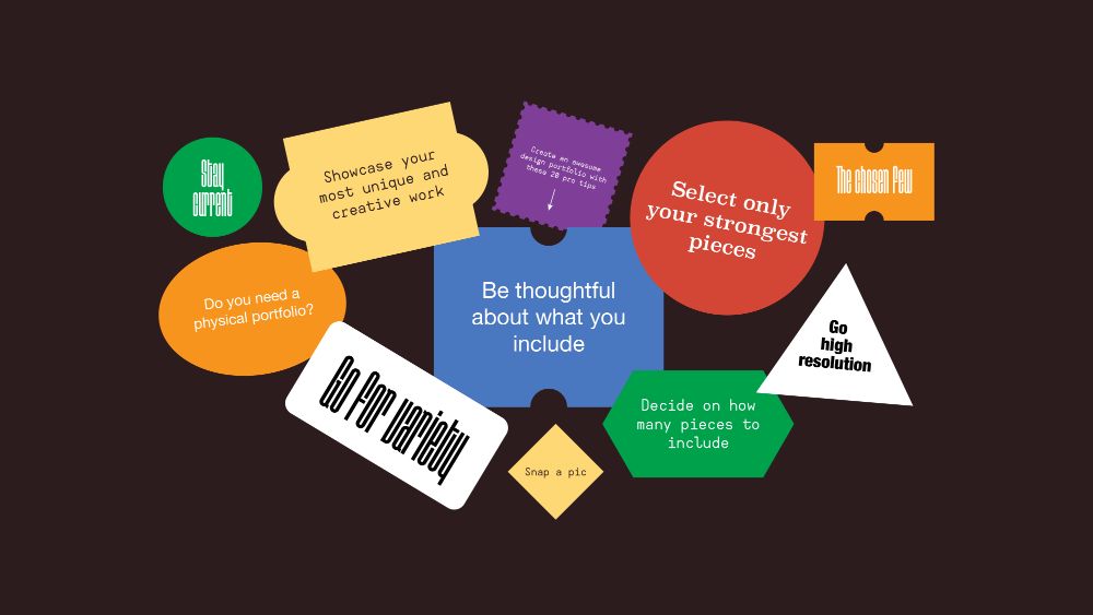
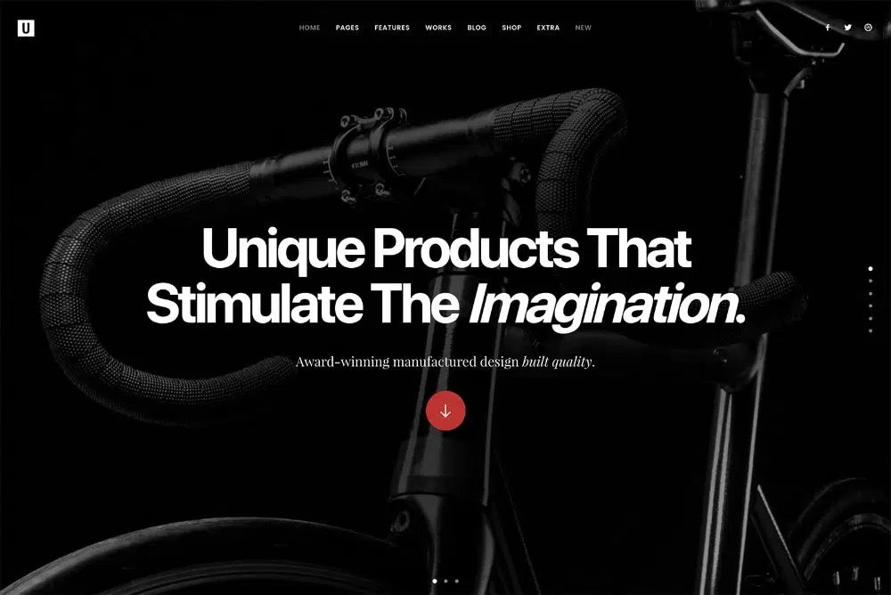
8. Showcase:
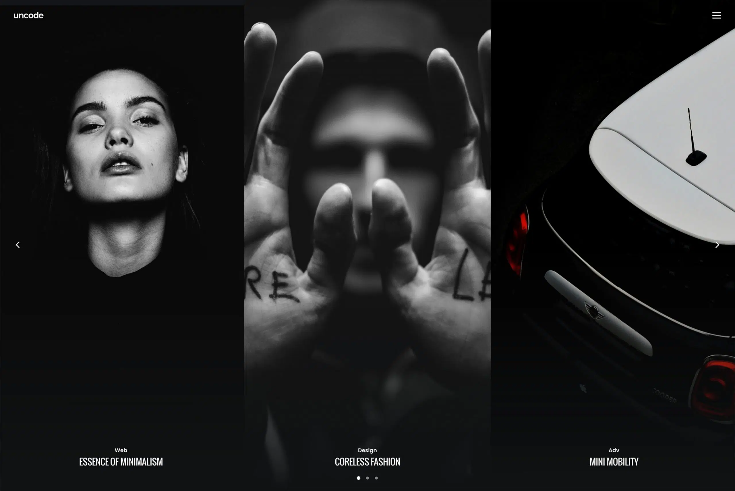
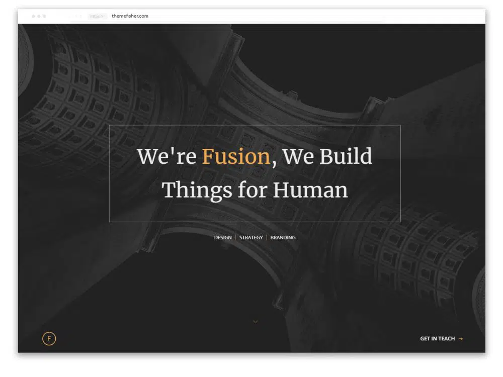
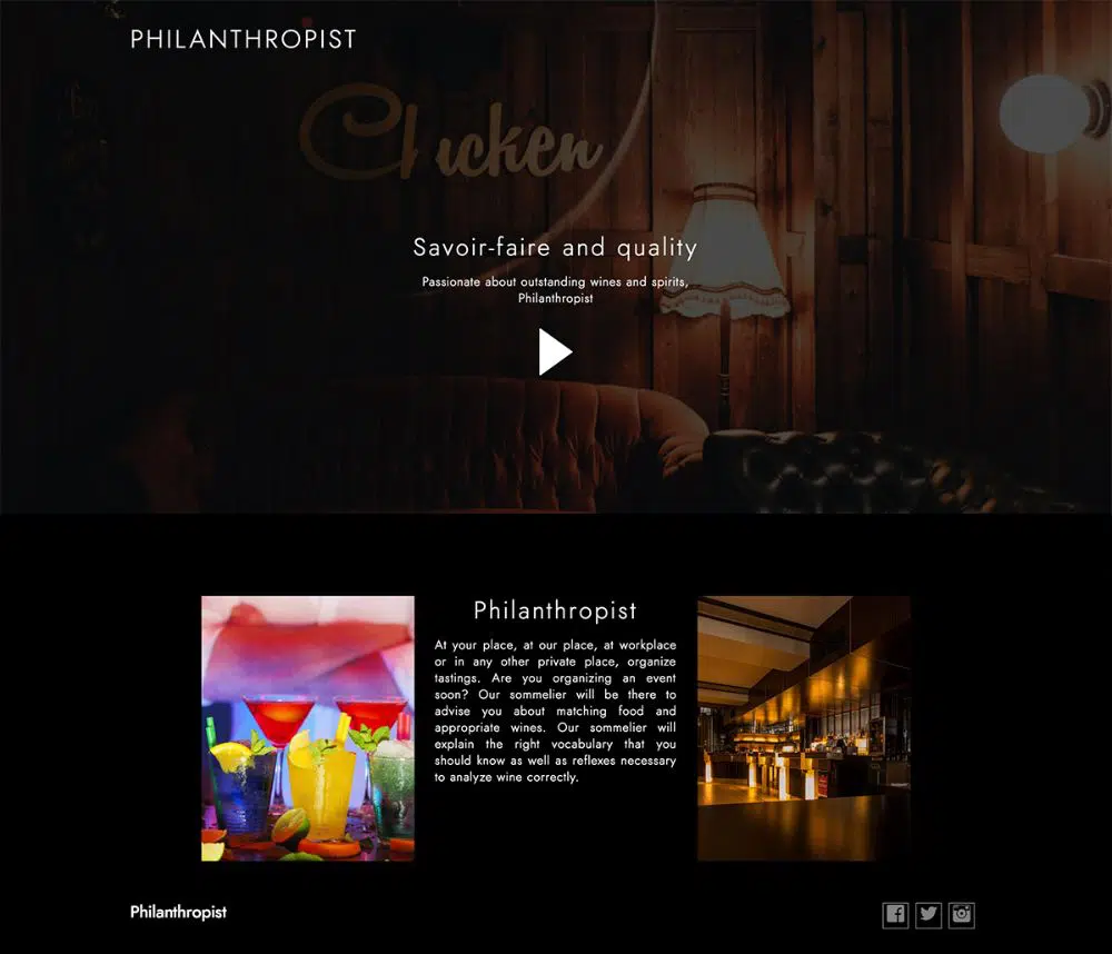
Dark websites showcase the images, video or content in the best possible way. When the dark background is in use, every element displayed on the website is bound to have prominence. Less use of colors helps the images get the highlight it needs against the dark background.
If artwork, portfolio or any unique products needs is what the website is about, then it is perfect. If you need to showcase a product or idea visually opt for the dark theme. There are no extra efforts for making the website look elegant, unlike the other website.
9. Dark Design:

Dark website design radiates elegance more than the other bright websites. The dark website is ideal for creative projects. Less content and more creative designs are what dark website is all about. Moreover, the dark website requires white space, so it enables the designer to use the space for getting creative.
Space is there to even out things so that it conveys minimalism. The white space does not appear due to other textures and makes the design look good. The dark design involves lighting effects look creative. Design that adds style and class along with the dark background suits better for any project.
10. Allow Switch:
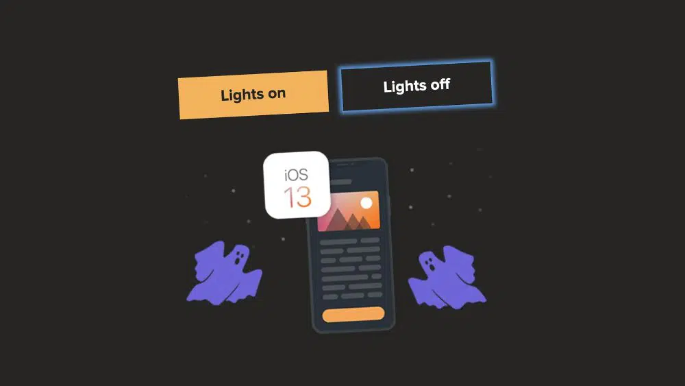
Whenever designers create a dark website design, they tend to satisfy their users. Always while creating a dark website make sure switch is available so that users have an option to view them on a light background too.
The first task would be to create two style sheets, one for dark layout and other for light layout. Two kinds of views would enable the user to prefer the website at any lighting condition. The system deciding whether to turn on or off the dark theme as per the lighting condition is way tempting.
Other than the tips mentioned above, certain things are worth considering while creating a dark website design. Always choose an image for the dark website design that blends in with the dark background. The image should not seem to appear to pop out from the dark theme. If you find the dark website design a bit monotonous try adding reflections. The dark background is not apt for shadow and to give a better feel; you must try giving reflection in the design. When working on typography in the dark website, use the sharp white typeface.
If you use dark fonts, you would have to give highlights to them so that they are visible. Always keep an eye on the trend that would help you to create designs accordingly for the dark website. Trends reveals the preference of users. Many users still don’t find the dark website suitable as they find readability issues. Some users prefer a dark website, so it is a must for a designer to keep up with the preferences of the users. One thing the designer must consider is that dark website design is not suitable for every other project. If any project that involves showcasing the images, videos then the dark website is apt for it. Projects related to portfolio, photography, artwork and studio would be suitable for the dark website design.
Dark website design is one of the most requested design for a long time. It minimizes the eye strain, which is high in light website design. Dark website design may seem easy to create, but many things are to be taken care of while designing one. Always incorporate elements that would be visible on the website. If you are looking forward to creating a dark website design, follow the tips as mentioned earlier to nail a perfect one.
