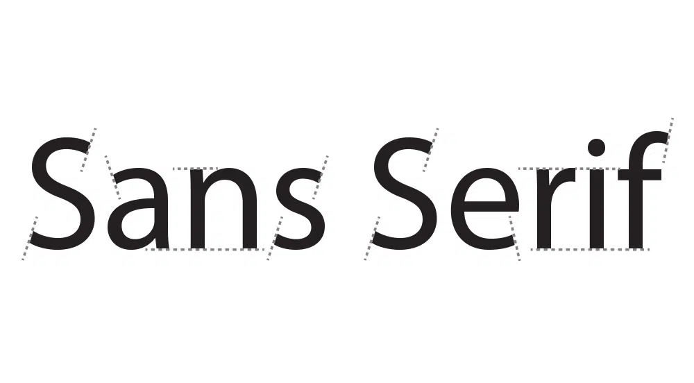
When it comes to website design, it is necessary to use awesome yet straightforward fonts. Every font has its personality – a characteristic that defines its usage as well as impression. Just as the appropriate use of typography can enhance the website’s look, the choice of right font becomes a primary concern to achieve great typography. In this article, we will be cruising through some of the best sans-serif fonts for websites. While sans-serif is a font-type that does not have extended features called ‘serifs’ on the edges, they are mostly used to convey a rather simple, modern and minimal image.
Just when the world was feeling a dip while choosing the right font without copyright issues, Google stepped up its game to fill the void with several free fonts for both commercial and personal usage. With more than 600 font families available to browse and choose from, the Google Fonts Library is a quick escape into the world of functional as well as aesthetic fonts.
Here are 20 best sans-serif fonts for websites:
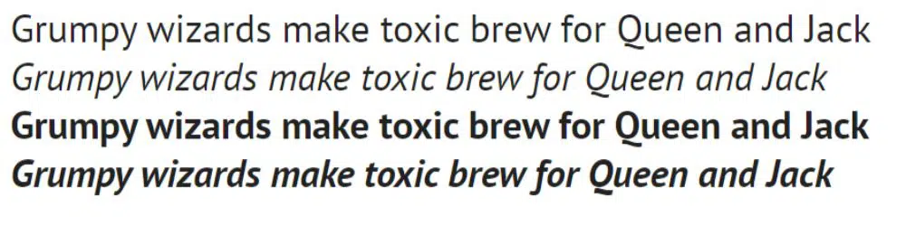
1. Open Sans:
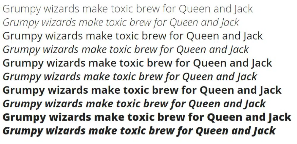
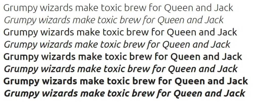
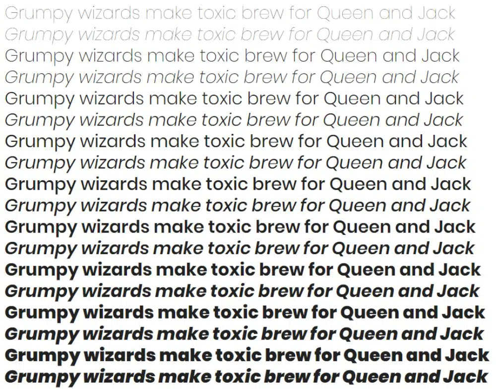
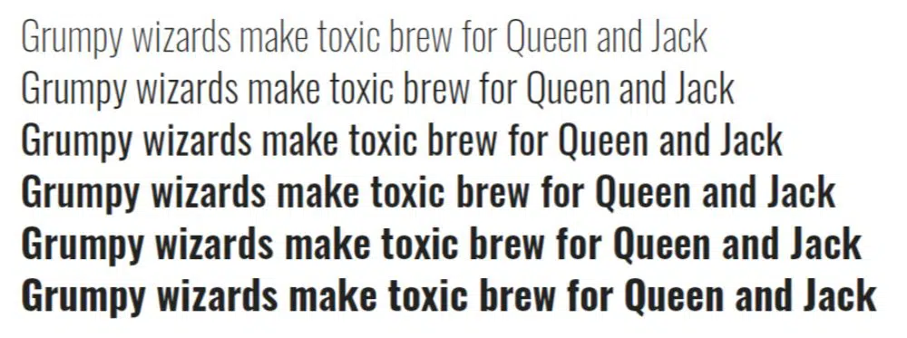
This font is initially designed by Steve Matteson, a typeface designer based in Louisville, Colorado. Open Sans comes with a full extension of 10 different styles from light to extra bold. It’s a cool, professional yet straightforward font, with a considerable amount of quirk. While the J descends below the baseline is a subtle characteristic, the bold italics are playful and super experimental in terms of typography.
Open Sans also comes with a condensed version with three styles, but it might not be advisable to use the same for smaller size text or body text. Although, in some cases, it might still be fine to go with a condensed sans-serif font for websites.
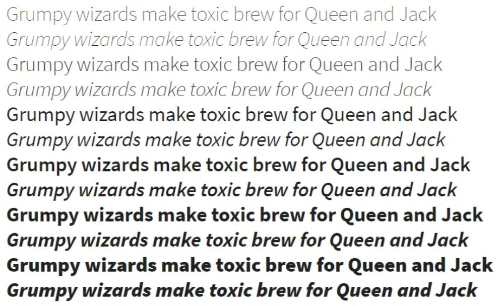
2. Roboto:
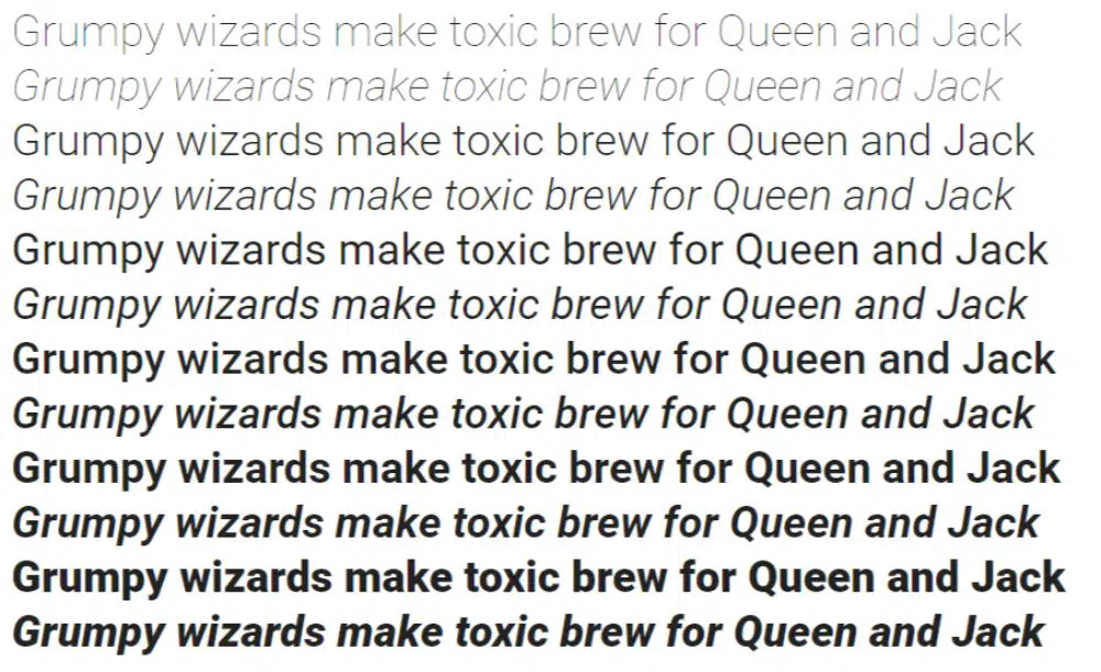
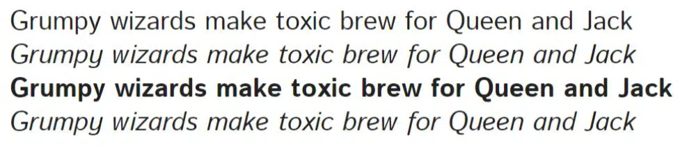
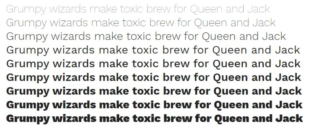
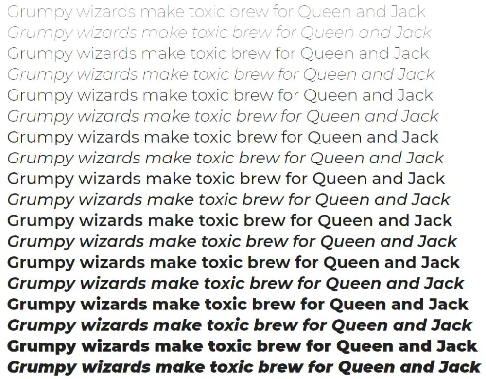
Roboto is the official font family for the Android operating system. It was designed by Christian Robertson, and comes with about 12 styles – a variety of weight range, starting from thin to ultra-bold. It is a very modern font that combines many features from classic fonts like Helvetica, Univers and Arial. Since the font is slightly condensed, it allows more characters per line, which makes it an ideal typeface for body text.
Apart from basic Roboto, this sans-serif font for websites has other two variations as well – Roboto condensed (comes with six styles) and Roboto Slab (comes with four methods).
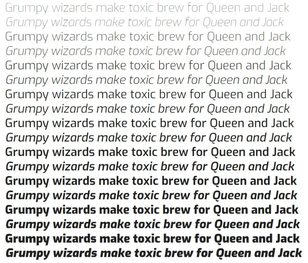
3. Lato:
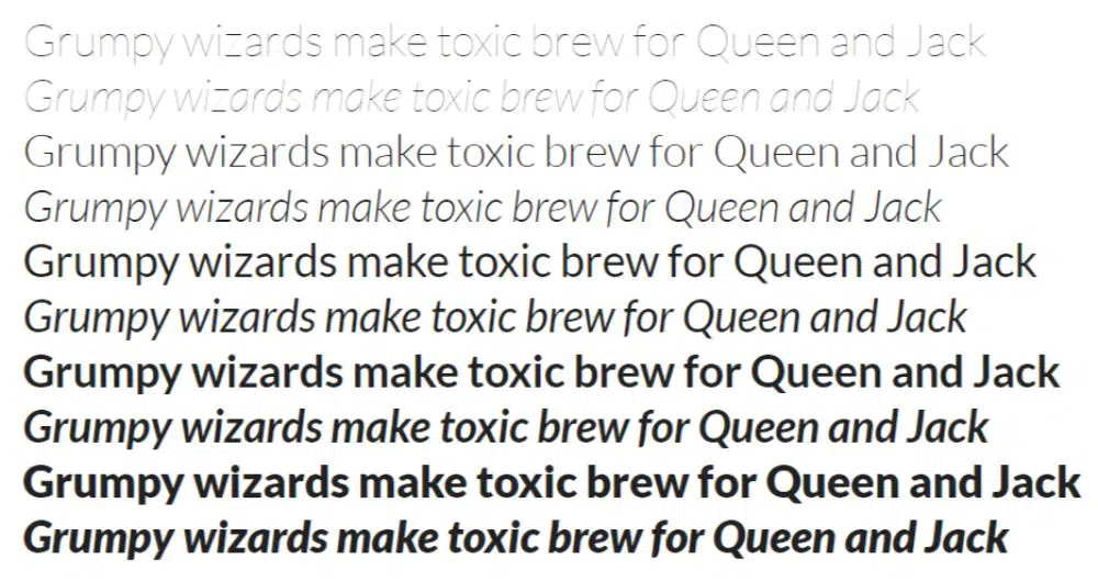
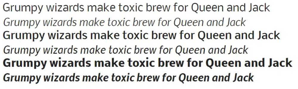
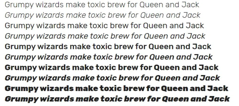
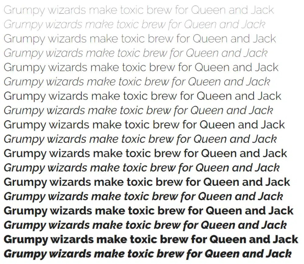
Lato is essentially one of the most quirky fonts on the list. It was designed by ?ukasz Dziedzic and included about ten different styles – all the way from a thin to an ultra-bold. While Lato is full of tiny details and curves, it becomes more sensible to use it for medium to heading sized lettering rather than body text as most of the features are lost if the font is sized to a tiny version.
This sans-serif font for websites was designed in a way that the softer, semi-rounded edges signified a warm feeling, while the firm structure gave it a more severe and stable over-look. To make the most out of the font, it is better to use it for highlights and stand-out texts.
4. PT Sans:
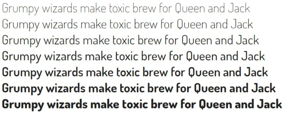
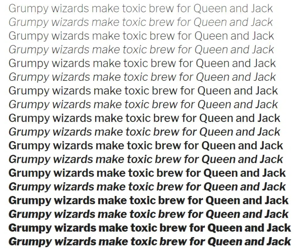
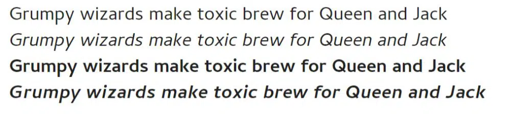
PT Sans was developed by ParaType and came with only four types – a normal, a bold and italics of each. While it is a cringe-worthy thought of just four types and weights, it is possible to design a website out of only these many fonts – In those regards, Helvetica Neue has been a high expectation ride for all of us.
Though, to compensate in the quantity regard, this font comes with quirky characters like the tail of Q sticks out to give it a more graphical and dynamic look. This sans-serif font for websites can be a suitable catalyst for a typography game.
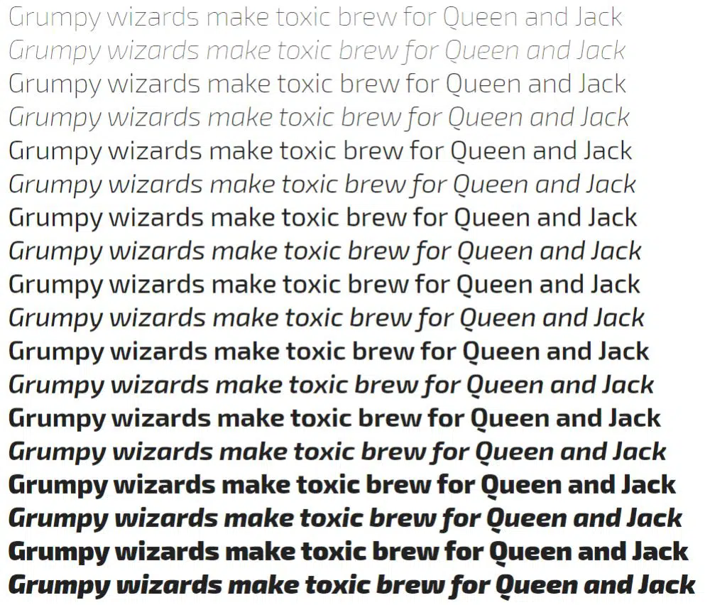
5. Source Sans Pro:
Source Sans Pro is a sans-serif font for websites designed by Paul D. Hunt, which also turned out to be Adobe’s first open-source typeface family font. It is a highly professional font to fit all kinds of UI/UX applications, along with formal documentation as well. It might not be one of the most exciting fonts, but it comes with 12 different faces right from extra-thin to a super ultra-bold, which makes it way more versatile and professional.
6. Exo:
Exo is a contemporary sans-serif font for websites with geometric sensibilities that was developed by the designer- Natanael Gama. The font is a treasure of weights and types – it has about nine different weights with italics of each – which potentially means that you’d never run out of ideas for this one! It is versatile and works perfectly suitable for a display face with no issues with sizing as well. The shapes and curves in letterforms add to the characteristics of the font that add an edge over other sans-serif fonts.
7. Exo-2:
As the name suggests, Exo-2 is the next version of Exo. It was designed keeping in mind a somewhat futuristic/technological approach. This version is much more advanced and organic in a sense it works better for tinier text sizes than the original Exo. It eliminates a lot of little curves and shapes from the original Exo, which makes it much more legible and convenient for web use.
8. Ubuntu:
Designed by Dalton Maag – and international font foundry – Ubuntu was primarily intended for use in the Ubuntu operating systems. So to say, it is a humanist style sans-serif font for websites with rounded corners that give it an element of quirk. The rounded edges meet the stem directly, which eliminate the need for a serif or an ear.
This font comes with eight styles and light to bold weights. Ubuntu also comes with a monospace font – Ubuntu Mono and a condensed version – Ubuntu Condensed.
9. Istok:
Istok Web was designed by Andrey V. Panov and included only normal to bold styles with italics of each. While this font may have a minimal number of styles, it works fantastic for professional documentation with a severe tone. It is readable in any size and retains legibility even so. So to say, it is a very versatile sans-serif font for websites if used wisely.
10. Nobile:
Nobile was designed by Vernon Adams and is one of the sans-serif fonts for websites that have only three weights- normal, medium and bold. It has a tall x-value that makes it more comfortable to use for tiny texts. This font was designed keeping in mind a digital screen, without losing the distinctive look that is found in print fonts. The base idea was to keep the font legible and straightforward in the way that it could be accessible on the eye if in the tiniest of the font size.
11. Dosis:
Designed by Impallari Type, Dosis is a very subtle sans-serif font for websites. It comes with a set of weights that are incredibly quirky and at the same time quite subtle on the eye. The Extra-Thin style can only be used at a font size of 36px or above due to its lightweight. Otherwise, the font is slightly condensed and one of the most iconic rounded sans-serif font family highlight. It is most suitable to be used in art design, advertising, films and creative sites which leave scope for an artistic touch, rather than just corporate themes.
12. Poppins:
Poppins is a geometric sans-serif font for websites designed by Indian Type Foundry who have done a remarkable job with this particular font. While it comes in an astonishing set of 9 weights and italics of each, it is not only versatile but also a visual delight. It comes with a Devnagari font as well. Every letterform is mono-linear with optical corrections on stroke joins to make it more readable and equally coloured throughout the letterform. This is the perfect font for print as well as digital media.
13. Work Sans:
Being one of the most structured sans-serif fonts for websites, Work Sans was designed by Wei Huang. Keeping in mind both digital and print media, it is widely useable for medium-sized text (14px-42px). It is more optimized for the use of on-screen rather than in printmaking it more legible to the eye. It can be used for both formal documents as well as for creating banners and likes of such. The thin and extra-light versions cannot be used for tiny text sizes (below 10px). As the text can get distorted and lose its readability.
14. Rubik:
Rubik is a sans-serif font for websites with slightly rounded corners. It was designed by Philip Hubert and Sebastian Fischer of Hubert and Fischer, and later on, redesigned by Meir Sadan. It is a five weight family with italics of each weight. This font is perfect for the tiniest of sizes, though the ultra-bold can be a great way to experiment with typography and creative website headings.
15. Libre Franklin:
The Impallari Type font foundry developed libre Franklin. It is an amalgam of 8 sets of weights with italics of each. While Libre Franklin is a more structured sans-serif font for websites, the ultra-bold form makes for the perfect emphasis and highlight at points wherever needed, to make it easier for the visual aesthetic. An entire site can be built with only this font family, given the variety of weights and styles!
16. Oswald:
Oswald, sans-serif fonts for websites are designed by Vernon Adams. This font is a reworking project on the classic gothic style sans-serif font family. Being a super versatile font, Oswald is slim, condensed and entirely graphical in appearance. It can be used for various set of documents like PPTs and word docs, prints as well as digital spaces to elevate a boring blob of text and make it look exciting and graphical.
17. Montserrat:
Montserrat is a sans-serif font for websites that were designed by Julieta Ulanovsky drawing inspiration from the first and oldest neighbourhood of Buenos Aires that goes by the same name. With a versatile set of 9 sets of weights and italics of each style, Montserrat has two more families – Alternates and Subrayada. Alternates has some distinctive letterforms inspired from the neighbourhood of Montserrat, while Subrayada (meaning ‘underlined’ in Spanish) is a font with underlined letterforms.
This font is super chic, slightly playful and at the same time, can be used for professional purposes. The bold version is authoritative and makes a statement.
18. Raleway:
A sans-serif fonts for websites, Raleway has been designed by multiple designers. However, apart from that, it has a versatile range of weights and styles. This sans serif typeface family is intended for headings and sizeable sized text articles. Initially, this font was designed as thin weight, by Matt McInerney. However, then it was expanded and made into a nine weight family by Rodrigo Fuenzalida and Pablo Impallari in 2012. In today’s world, Raleway has been featured in about 5M websites.
19. Fjalla:

Fjalla One is a sans-serif font for websites designed by Sorkin Type font foundry. It is a display sans serif font with medium contrast. The font is carefully manipulated to fit the restrictions of the screen. Despite having display features, Fjalla can be used for a broad range of sizes to make an impact. It has only one display style. Moreover, it can be easily played around with to explore new dynamic typography as well as website headers.
20. Cambay:
Cambay is a sans-serif font for websites designed by Pooja Saxena and is a libre Devnagari typeface family font. It was initially intended to match the Latin Cantarell. The font has two weights, Regular as well as Bold, with italics of each. It is a prominent feature of the font that the italics are slanted with only the necessary optical elements. It is designed to suit all the font sizes – right from headers to body texts, for both digital and print media.
These are the best sans-serif fonts for websites. They can be used to make the best layouts and graphics for the web pages. While designing a web page, it is necessary to select the right kind of font family. This ensures that the page is in synergy with the rest of the website. Moreover, to enhance the visual aesthetic of the page and leave a mark on the viewer’s mind.
With these lists of fonts, it is clear that sans-serif fonts can be used to give a minimal, structural and yet simplistic professional look. If you wish to make a statement with your page, it becomes vital to chose a serif font as the extra ‘serifs’ tend to look more robust and put together. However, it is absolutely up to you if you wish to combine more than one serifs, or mix them with sans – What matters is that the design must leave a mark!
