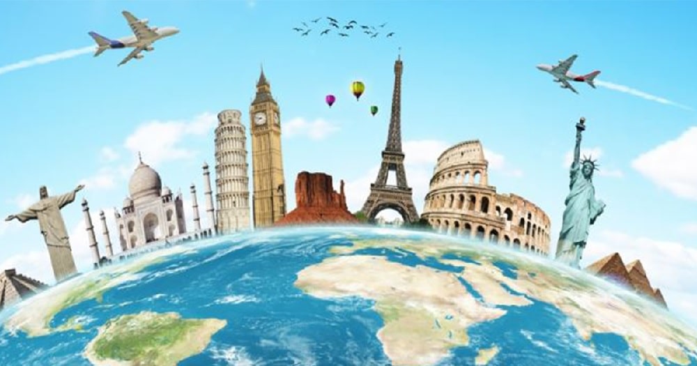
Though a travel website may seem straightforward, there are several elements to keep in mind while designing a website in the travel industry. In general, a travel agency website must include a high-quality hero image, hotel recommendations, information about local activities, and a summary of the area. To further create a helpful website, you can add packing tips, maps, and public transport information. All of this depends on the kind of website you want to design and the audience you want to target. The best way to start ideating is to list out the functions you want on your website. If you are stuck and want some inspiration, here are 12 fancy travel agency websites to help you get started:
1. Telluride Colorado:
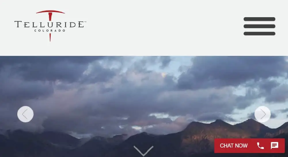
They have used a great high-quality image gallery on their homepage to attract users. Telluride Colorado has used a great navigation panel for providing the option to users to book their stay. Along with this, they have also offered an option to navigate and see the weather of the place they are about to visit. They have provided a chat room on their homepage so that their users can contact them via call or message anytime. As you scroll through the homepage, you will see an option to book your stay. To make their website more helpful to the visitors, they have mentioned activities and dining places that their visitors can experience. Instead of having a detailed website, they have used photos to demonstrate how their experience would look if they choose to book through their website. This approach works as it combines attention-grabbing visuals with a clear call to actions.
2. On the Grid:
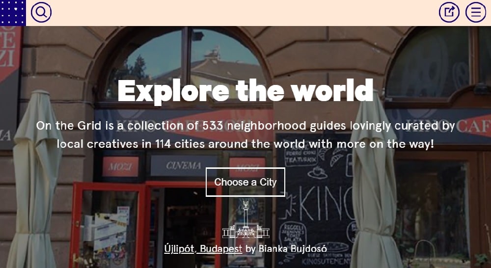
Unlike other travel websites, on the grid are based on Different cities. The welcome page offers a variety of high-quality images of different countries that looks attractive. The navigation bar is prominent as the color is contrasted with the changing images. Without wasting much time of their users, they have provided an organized grid view for users to choose the country they want to visit. The places are arranged in alphabetical order to make it easy for the user to find a place. The background color of the website is blue with typography in contrast to the base color. They have also used a famous monument to represent a particular place. The site is straightforward and does not leave any room for the user to get confused. However, they haven’t provided any contact information on their homepage, which is very necessary in a travel website as visitors tend to have doubts while booking a place.
3. Cookiesound:
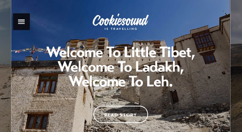
Cookiesound has used a unique way to attract visitors to explore their site by using eye-catching testimonials and beautiful images. Along with images, they have also spent time creating well-written, interesting content. They encourage their visitors to read stories of other people to build better trust in potential customers. They haven’t used much space for the navigation bar and placed it on the top right corner of the webpage. Once you click on the navigation button, you see a navigation panel that well highlighted. They have used white prominently to give their website a clean and organized look. As you scroll through the website, you will see a map that makes the site more helpful. They have also provided information about their social media and other contact information on their homepage. The website is mobile responsive, broadening its chance of getting more traffic.
4. Toucan Café & Tours:

Toucan café also maintains tours and language exchanges. They have a comprehensive site. They have different types of tours and information about the café along with necessary information for visitors. They have placed their call-to-action on the top right corner making it easy to catch attention. Below the CTA, they provide details about their ongoing discounts so that visitors are attracted to book via their site. If their visitors find any difficulty, they can simply contact them through chat support given in the bottom right corner. They have provided an option to change the language allowing people to book through their site and increase their potential customers. You can connect with them and read reviews on their social media. They also have a useful floating navigation panel contrasted well to highlight it on the homepage.
5. Visit Utah:
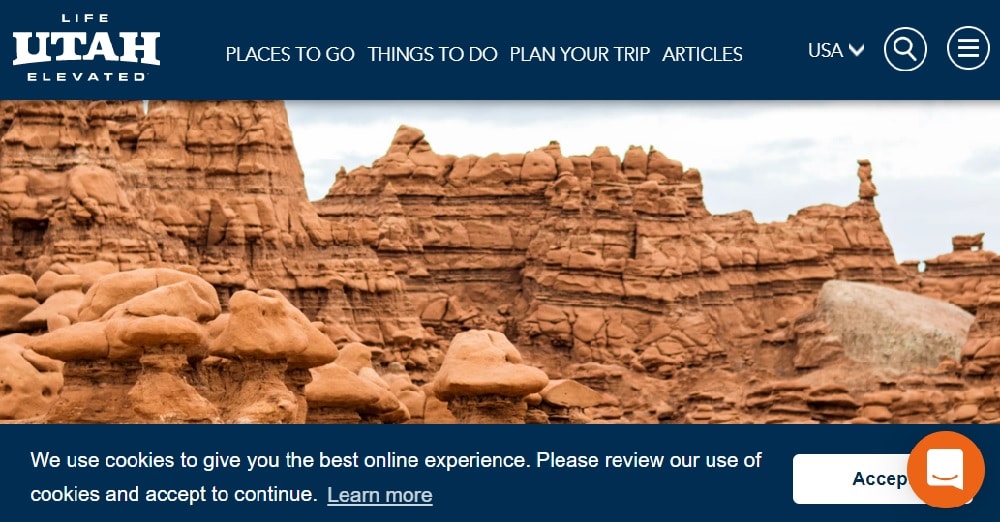
Visit Utah has used a great background image, but the focus is on the strong caption. Just like other travel agency websites, they also have chat support on their homepage, allowing visitors to clear their doubts. They have an excellent navigation panel that includes all important elements, including CTA. Visitors can click on the featured CTA on the welcome image to know more about the location in the photo. Visit Utah has also listed details about the experiences and events that could interest the visitors. The color scheme of the site features a basic combination of white and blue, making it look common. They also have blogs on their websites to describe different locations in detail. The other set of CTAs is present in the footer on the homepage. They have given their address and contact details at the end of the website, making it easier for people to visit or call them.
6. Travel Oregon:
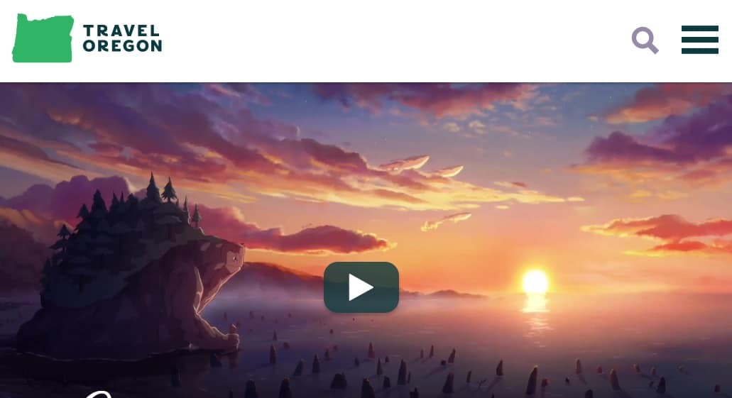
Travel Oregon has taken a different approach to attract their visitors by using a video on their welcome page. Once you click on the play button, it takes you to an animated video showing the beauty of the place. They have used a compelling message like “Oregon is magic” and “see the magic coast” to develop a curiosity in the visitors. The navigation bar is simple with all the necessary options to explore the site like “place to go,” “things to do” and “plan your trip.” As you scroll through the homepage, you will find interesting images that compels you to explore more. They have put a lot of effort to bring out the best about the place on their site and highlight it. The use of original photography builds trust in visitors, which allows them to make a decision in their favor.
7. Visit Australia:
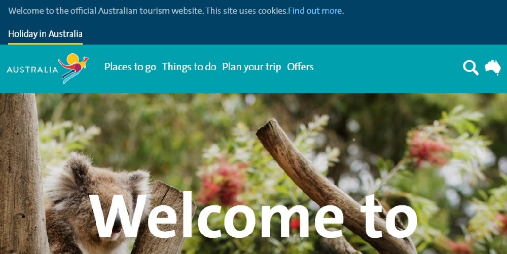
Visit Australia has an excellent photo of wildlife as their welcome image. This is the official website of Australian tourism. They have a comprehensive navigation bar that is highlighted with a light blue color. They have different sections on their homepage providing information about different cuisines and events happening in Australia and their details. They also have details about different popular places and their special attractions in Australia. The site also provides 360º videos to attract a wide audience. The more in-depth map and video allow visitors to choose a vacation spot that is convenient for their stay. They have also picked a few of their most interesting and visually appealing Instagram posts to feature on their site. They have also added a unique feature to changes language on their site targeting a broad audience. They have all the major languages to translate the website.
8. Live Africa:
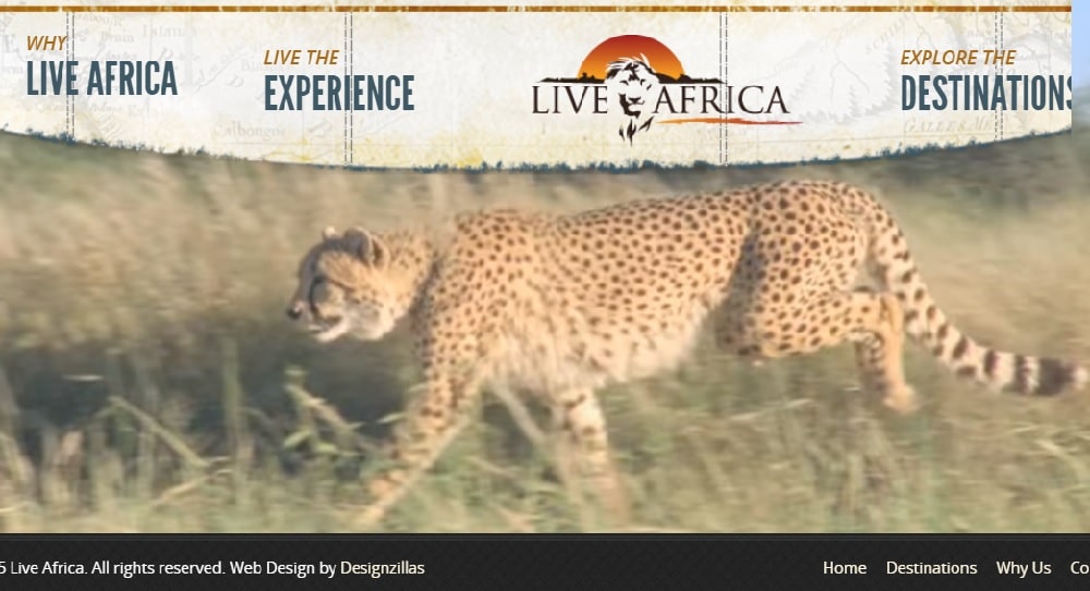
Live Africa has an excellent video of wildlife on their homepage to attract visitors. The video is shot beautifully to depict animals in their natural habitat and hence making people comfortable with the idea of visiting such a place. They have a double navigation bar on their website. The top navigation panel has an interesting base of an old map, along with different options to explore the site. The bottom navigation bar has more information about the designers of the website and contact details. The CTA is placed on the bottom of the page and highlighted with an orange color. The homepage doesn’t have much to explore. However, you can opt to know more by clicking on the options given in the navigation. The overall design of the site is consistent on every page, which makes the site look cohesive. The typography is simple yet noticeable.
9. Climbing Mount Kilimanjaro:
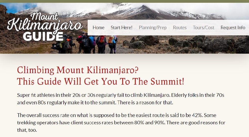
Climbing Mount Kilimanjaro has a simple and organized site with much focus on explaining the place. The navigation panel is simple with basic typography and dropdown menus with options like request info, planning/prep, and tours/cost. On the homepage, they have explained why you should choose to visit the place. They have made a point to provide statistics about climbing the mountain and how people should prepare for it. They have also mentioned some interesting facts about climbing Kilimanjaro to burst the common myths. The site also has other details about the weather, cost, tours, and altitude sickness. They have provided contact details at the end of the site. In the footer, they have mentioned all about their websites like a site map, privacy policy, and contact. The site has a solid background color with leading content in white.
10. Hawaii Travel:
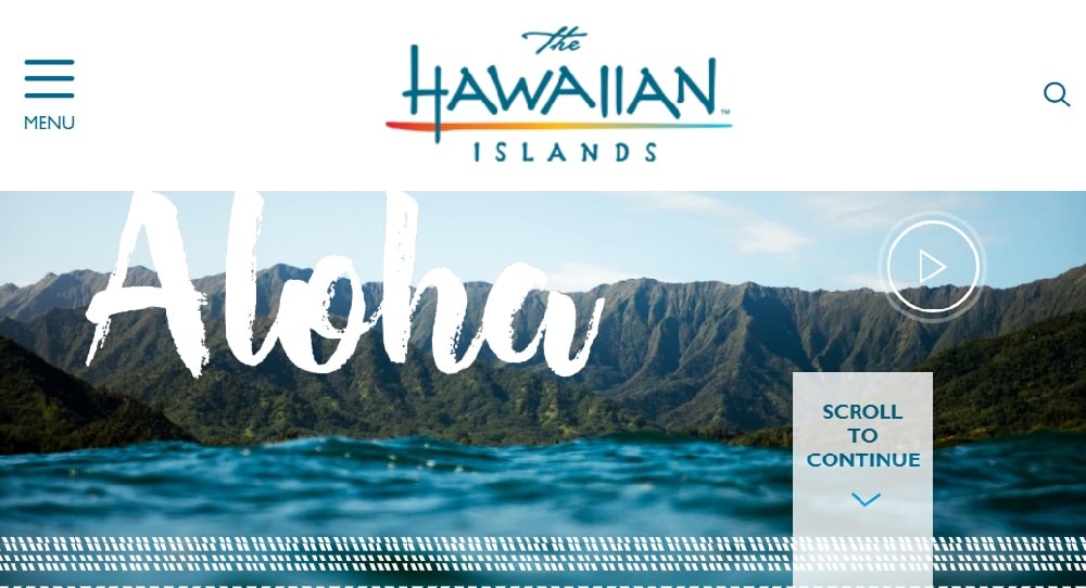
Hawaii travel has featured a high-quality video to welcome its visitors. The navigation bar is comprehensive and has simple typography. The site is available in 7 major languages to include a broad audience from different countries. As you scroll through the site, you will see graphics that represent diverse experiences in Hawaii. They have also used a map to depict different islands and also how much time a person needs to travel to reach the destination. Visitors can even visualize the place while watching the video of Hawaii islands. You can discover different events happening on the islands. The site also shows the current temperature of the various islands to help tourists plan and pack accordingly. They even have an app to get everything on the phone conveniently. You can explore more about the site in their footer and also subscribe to their newsletter.
11. Visit Idaho:
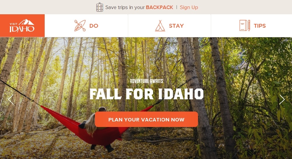
Visit Idaho has interesting, high-quality images that move when you hover over it. They have an excellent navigation bar that consists of attractive graphics to represent different options like travel tips, places to stay, and things to do. The CTA is placed in the center to grab visitor’s attention. As you scroll through the website, you get to know more about different adventures you can experience in Idaho. You can even find travel tips on the site to help tourists pack. You can follow their Instagram account to know more about other people’s experiences. They have also included 360° tours to give their visitors a better visual about the place. You can sign up for their newsletter present in the footer to know more about deals and new experiences. The footer consists of all options to explore the site.
12. Egyptian Tourism Authority:
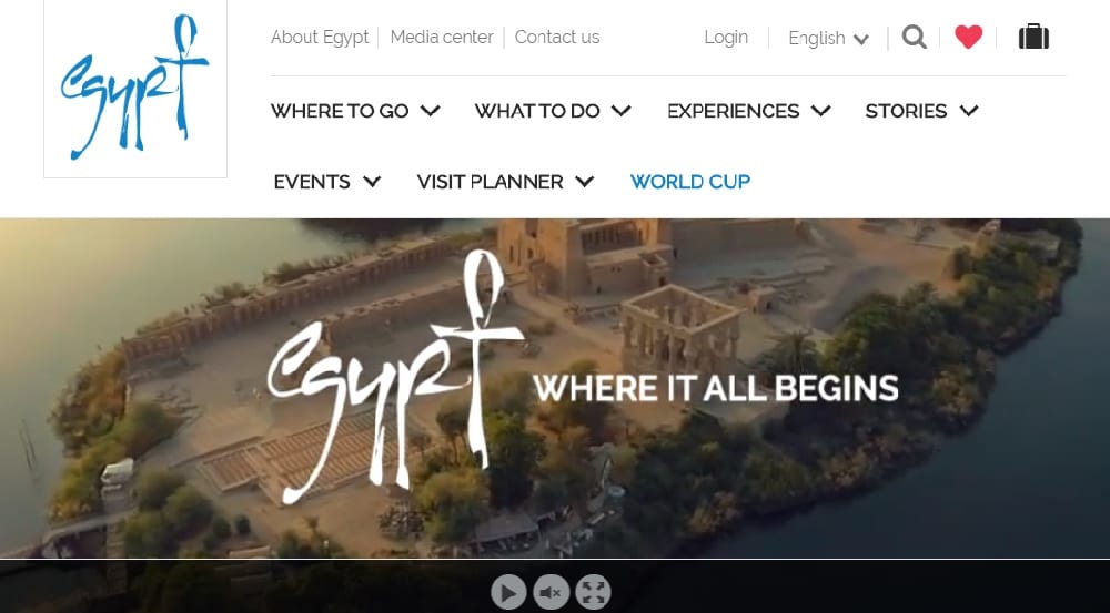
Egyptian Tourism Authority has featured a slideshow on their welcome page, starting with a visually appealing video showing various experiences offered in Egypt. They have used double navigation to provide various options to explore the site. The first panel consists of information about their site and different language options. They have 14 languages to choose from, so people from different places can access the site easily. The second navigation bar has all the options related to Egypt with a dropdown menu preview when you hover over an option. You can read more about the place on their homepages. They have included a map on their website to help visitors understand how to plan the trip effectively. They have three options to view the map, such as road, areal, or bird’s eye. If you want to know more about the upcoming events, you can find them in the footer of the website.
So, there is no fixed template to follow while designing a travel agency website, and hence you should design according to your requirements. However, some of the basic things to keep in mind while designing a travel website is to make sure the navigation bar is simple and helpful to the new visitors. Also, using high-quality images can boost the traffic on your website as people like to visually see the place before they make a decision to visit it. Along with high-quality photos, ensure that the loading time isn’t increased because most users don’t tend to wait for more than 3 sec for a website to load. Lastly, try to design a website that is unique and conveys the message you want with minimal elements.