Typography can seem to be one of the most straightforward and simple design elements. Theoretically, all you need to do is choose a typeface, play around with size and maybe change the color to better suit a project, right? Wrong. That is the common misperception about typography that is costing many designers and clients good projects that had potential. Typography can be considered as an unseen art form. If you do it right, with proper care and attention, the content will effortlessly capture the readers’ attention first and foremost when they visit your site. Typography is the medium through which you stay true to a website’s purpose – making it more about the content and information you have to offer rather than aesthetics and other design elements.
Your words need to shine through. However, perfect typography doesn’t necessarily gain as much attention or applause as using the right colors for a website or using the right animations would. Hence, typography is easy to be misunderstood and not paid much attention to. However, now that you know the value of typography, here are some common mistakes that you can and should avoid for your next projects:
1. Using excessive positive tracking:
![]()
Tracking is a typography concept that refers to spaces between two letters of a word or a phrase—the more tracking between two characters, the greater the space between those characters on either side. Tracking is mostly used for adjusting the type to fit it correctly in a line. When doing these minor changes here and then can help in such circumstances, adding too much can reduce the copy’s readability and legibility. Each font comes with default letter spacing to provide the best legibility of the font. If you need to change the tracking for aesthetic reasons, make sure it doesn’t take a toll on the legibility because it should prioritize visual appeal.
2. Being unclear about kerning and tracking:
![]()
Designers usually spend hours correcting, tracking, and kerning their typography. However, most of them often aren’t clear on the differences between the two. Some people take these concepts to be synonymous, which is not valid. Tracking, as discussed earlier, refers to the spacing between characters across a phrase or word. Kerning is more specific about the spacing adjustments of the specific space between two consecutive characters. Kerning helps bring characters with excessive whitespace closer to their neighboring characters. An ideal example is ‘W’ and ‘A’ that can easily sit closer together than most fonts naturally would keep them. This is because they have complementary angles.
3. Not using enough leading:
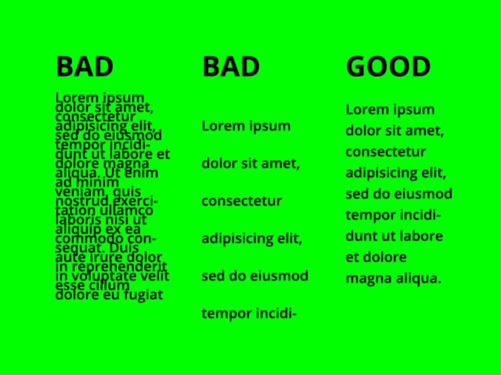
Now leading is the space between two lines of type. Software like MS Word and the web refers to this concept as line spacing. If you have too little line spacing, it will make the copy look crumpled and challenging to read. If you overdo leading, then there can appear to be discontinuation between the lines of the type. There is no fixed value of leading; however, you need to make a judgment to satisfy both aesthetic appeal and legibility as a designer.
4. Not using enough contrast:
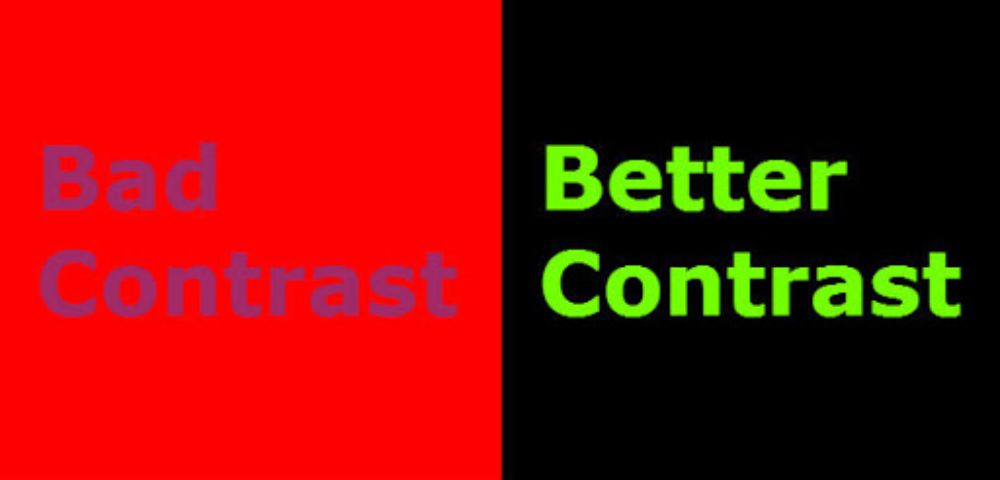
Modern software comes with many fancy features. However, only because they exist doesn’t mean you need to use them. Your copy may look dull after rendering. The primary reason behind this would be insufficient contrast between the text and the backdrop. This would lead to difficulties in reading and comprehending the text. When working on your copy, scrunch your eyes and see if the characters are still visible. This reduces color perception and helps you see past the underlying tonality of different colors.
5. Poor judgment of setting the right lengths:
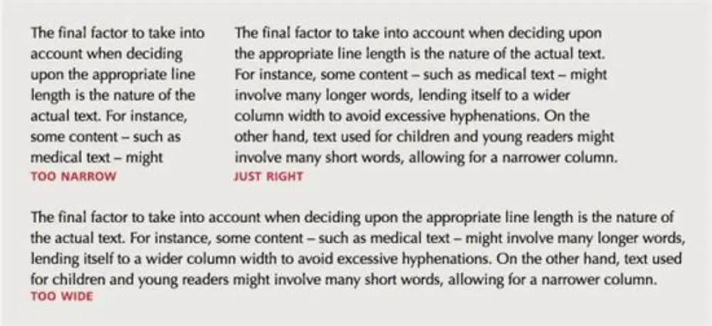
This is one of the most significant legibility issues that often gets overlooked. If a line length is excessively long, it will get difficult for the reader to follow through and find their place in the next line. This would affect their overall flow and understanding of the content. Newspaper and magazines restrict their line limit to 75 characters. That can be a good reference point to introduce some discipline in your line lengths. Though it might not be possible to adhere to it strictly, the more you try to and the closer you are to a decided range, the better your copy will be for following and understanding.
6. Making use of excessive weights and faces:
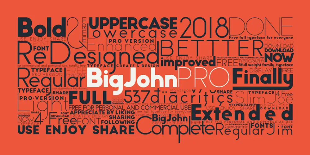
When you are relatively new in any field, you tend to experiment with as many tools as possible. Designers also make this rookie mistake and tend to use too many weights and fonts in one design. Generally, you should practice limiting one project work to have at most three different fonts. Once you have that down, you should also have a look into font pairing. Certain fonts complement certain fonts. There can be projects where you need more than three fonts or feel the need to have more. The problem with doing that is it makes the reader/viewer uneasy, and the design starts looking disjointed. Similarly, using too many weight variations of the same font can get hazy for the readers.
7. Assuming a false sense of balance by over-using center-align:
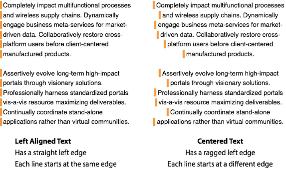
Most designers say that you should never center align. In design, there are no hard and fast rules and no alignments that serve no purpose. So the center can work wonders if you use it cautiously and in the right place and right use. As a beginner, however, designers have a rather vague idea about a sense of balance. They figure by center aligning their text, they would achieve a sense of balance. However, the center-aligned text’s symmetry is challenging to follow, especially when the content runs longer lengths.
8. Improper formatting of text:

Writing for the web requires a content writer to type the content using a keyboard and word processing software. When you have an abundance of work to be done, you would unknowingly leave extra spaces between two words or add repetitive words continuously. Such mistakes and errors are known as human errors. It is natural to happen. However, it is not acceptable. There are software and SaaS apps built to correct grammar and formatting if their eyes miss it. Still, as a designer, if you receive a copy where there is apparent spacing or other formatting issue, you should correct it as soon as you spot it. Improper formatting can off-set a reader and also bring your authenticity and commitment to the work in question. So you should be extra careful with presenting the content you have as responsibly as possible.
9. Solving uneven edges by justifying text:
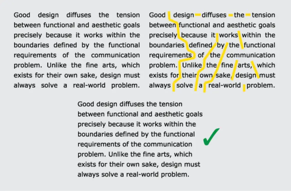
If your content looks like a sideways bar graph, it is suffering from ragged edges. These uneven line lengths can get unsightly. Many designers would turn to change the text’s alignment to ‘justified’ to solve this issue. Doing so would help you eliminate awkward edges; however, it could create unnatural spaces between words to achieve even edges. This is not the best way to go about it, as solving one problem would lead to another. Instead, you should manually insert break lines in inappropriate places. It won’t be textbook perfect, but it would be much better than the former alternative.
10. Overemphasizing:
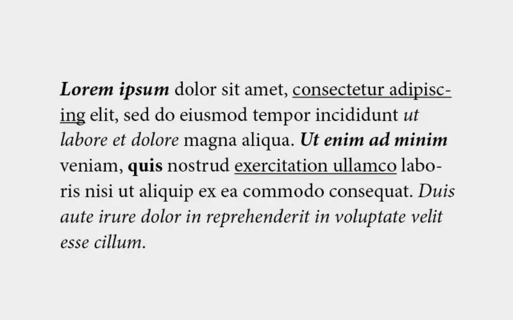
Content is the hero of your designing efforts. It is the designing element that is also an informative aspect of your project. It communicates what you want, the readers/viewers to see, feel, and observe. However, the content itself has different priority levels. You would want a certain part of your content to draw your consumer’s attention first and then want them to move on to secondary or subsequent content. Emphasizing correctly can help convert readers who would have otherwise not bothered with your content. People tend to overemphasize the problem by using italic fonts, underlines, boldfaces, quotations, and other content formatting options. When there are too many different styles or the same style used repetitively in confined space, it can create a confusing and unattractive piece of copy. It would also overwhelm the readers, leaving them more confused as to where to focus.
11. Forgetting what’s important:
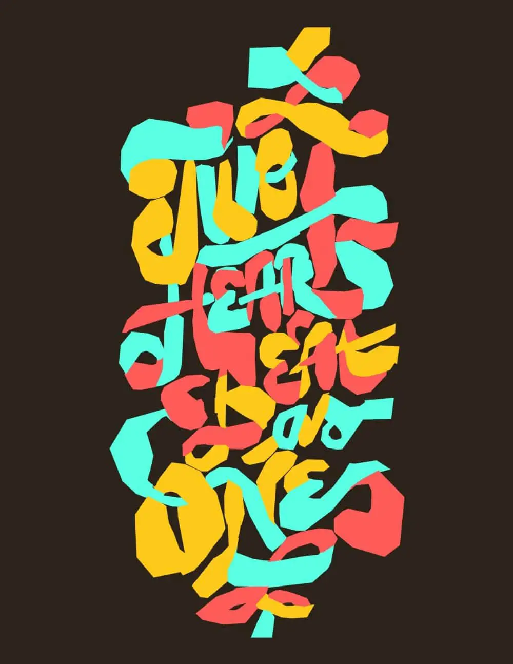
As a designer, it is straightforward to get mesmerized by the variety of beautiful typefaces available in the market. However, this should not overwhelm the professional in you. Most times artistic nature of fonts distracts designers from the purpose of using them in their project. If you have the remotest doubt about a font not being legible or partially confusing, have a second pair of eyes to judge the copy. Don’t assume it is okay to use a beautiful font at the expense of looking professional.
12.Not understanding the importance of negative spacing:
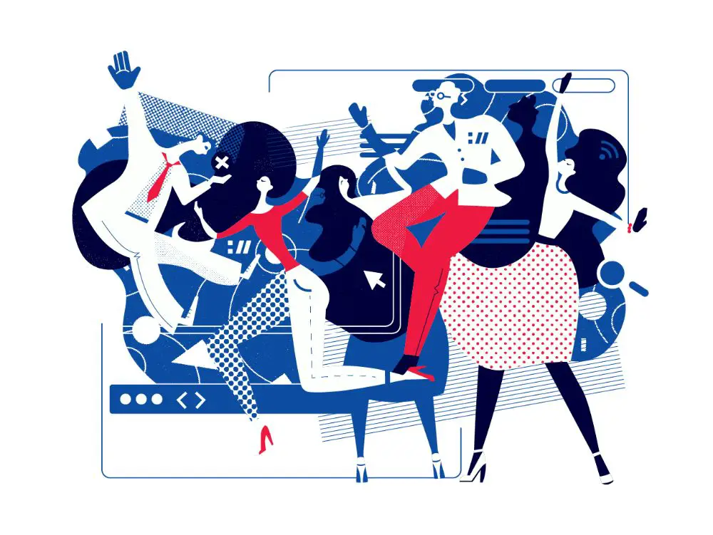
Novice designers don’t understand the concept of negative spacing. They think it is unwanted and bad. Hence, they feel the need to fill up their workspace to avoid chances of any negative space. Some designers theoretically understand the concept but fail to implement it practically. Most designers initially would fill up their workspace with design elements like pictures, graphics, and even type, for that matter. Always remember the importance of having some breathing space in your design.
13. Poor scaling:
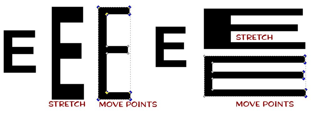
One of the most prominent mistakes designers make with typography is stretching or condensing words poorly for adjusting them in a confined space. This mistake can ruin the letters and deform them into weird-looking characters, away from their original look. You need to be aware of being consistent and efficient about scaling. When you scale a textbook up or down, always keep the proportions in mind.
14. Ignoring orphan and widows:

This is probably one of the most disguised typography mistakes that can miss any designer’s attention quickly. Orphan and widows are technical terms for words and short lines that appear on the bottom or the top of a column or page. Such words or phrases would stand alone from the rest of the copy. While typesetting your text-heavy copy, you need to pay extra attention to these problems hovering around corners. This needs to be rectified because it creates a lot of white space that interrupts the text flow. You can take care of this by manually changing lines at breakpoints.
15. Making incorrect use of shallow special effects:

Adding bells and whistles to your typography isn’t wrong. It adds value to your typography in many instances. The ‘Word Art’ tool in MS Word is also a convenient tool that helps a designer create attractive type designs. The problem is not being able to understand where not to use it. All designs aren’t best suited for special effects like drop shadow, 3d effect, or even embossing. At times, such effects can make a copy look gimmicky and cheap. So you need to know your audience and client before making a call on special effects.
16. Not focusing on hierarchy in your type:
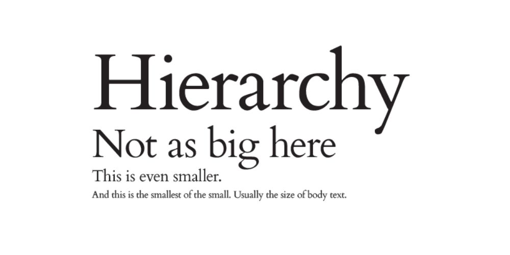
Hierarchy is essential in giving your readers a visual cue to focus on the most critical content and then shift their focus to following additional pillar content later on. Suppose a reader cannot understand where to focus first. In that case, chances are they would use up their attention span to read something that provides no clear information about the communication you intended to send across. By merely adding contrast to different priority content, you can make it easier for the readers and viewers to follow along. You could make use of the ABC approach. Consider ‘A’ as the largest and most prominent text blocks – ideally headings. You can set these in all caps or bold for additional impact. Take ‘B’ as a slightly smaller sub-heading that continues the heading’s idea by wording it out with more characters. To differentiate this, you can use italic or semi-bold weights for adding contrast. And finally, ‘C’ can be the body text that is not too small for being illegible but the right size and free of any formatting for easy viewing.
These are the 16 typography mistakes all designers should avoid when working on their designing projects. Typography plays a crucial role in bridging the brand’s message and the consumer’s perception of the same. If you do a bad job at it, the communication can be ineffective, and the message can get lost in the process. Make sure to revise these mistakes to continually be aware of them and avoid them as much as possible.
