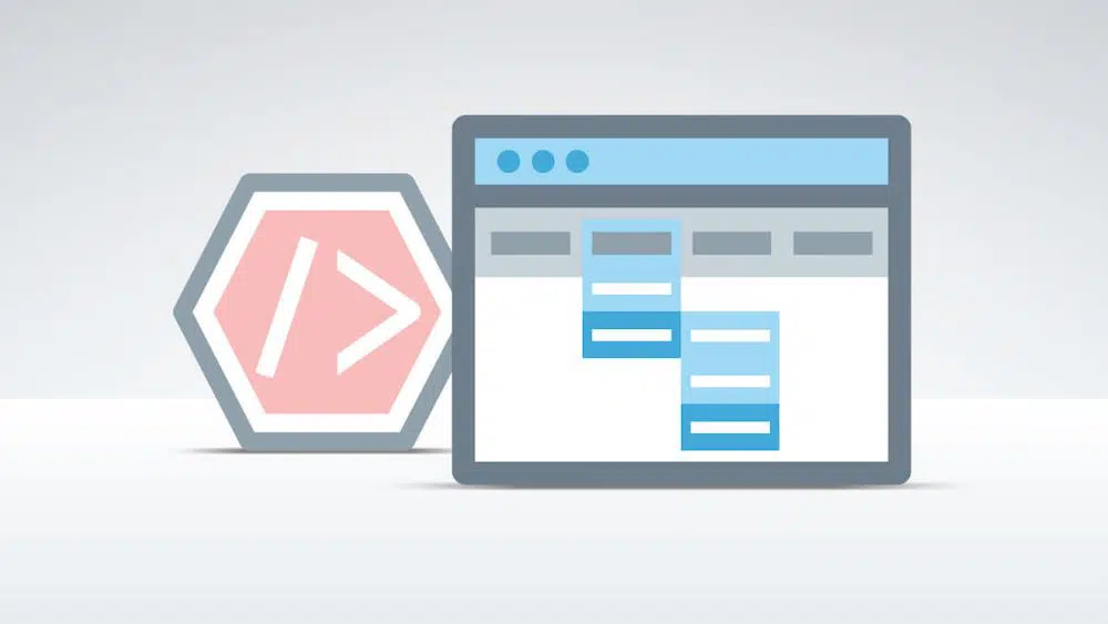
When your visitors visit your website for the first time, it is their first interaction with your website. As soon as they land on the website, they would first look at its design structure. The next important aspect of a good website is the ease of use. All the relevant information should be easy to reach out to and clearly defined. If it is a single page with no clear demarcations about different sections, visitors might get confused and annoyed. This would lead to an increase in bounce rate, as they would look for another website that provides similar services but is organized. This is why it is crucial to have sufficient website navigation in place.
Website navigation provides visitors with an ideal sitemap for them to access all parts of the website with ease. Moreover, it helps speed up their process of finding what they’re looking for. It also helps in increasing the visitor’s duration on the website. A website with good navigation ensures visitors about the site’s genuine and authentic. Moreover, website navigation also has the potential to make an impact on the traffic a website can attract. It affects the ranking of the website, hence has SEO benefits as well. Having effective navigation helps increase the chances of a potential visitor turning into a potential lead or customer.
To avail all the effective benefits navigation has to offer, we need to understand the top things to avoid while creating our website navigation –
1. Multiple options:

You don’t want your website to be a big chunk of navigation points. When there are excessive website navigation cues, it tends to beat the purpose. Since the entire website is filled with multiple navigation points, it confuses the visitor more than it helps them. It can feel overwhelming and cluttered. Website navigation is supposed to be comprehensive and easy to understand. If you have too many products, services or inner pages that you feel are important, shortlist the most important ones.
Or else, you could also club similar products or services in one group and put that group in the navigation bar. An average human can remember information regarding 7 items at once. This should be an excellent pointer for designing navigation. Keep the goal of providing all important information using seven or fewer items. For each additional navigation menu option that you remove, the ones that remain look catchier.
As a website designer, it is essential to be creative. However, the website navigation menu is not the best place to be overly creative. If you make use of some odd buttons, icons and shortcuts that are placed at unconventional places on a website, it would not only prove to be less functional and useful; it would also ruin the website’s aesthetics. There is a general cue that visitors follow when visiting tones of websites. The website navigation bar is one such stagnant design element that is expected to be at certain places of the website. If you move it anywhere else, you might break the synergy that the visitors should have while visiting your website. There are certain aspects of bikes that don’t change, no matter which bike it is. Similarly, in a website’s skeleton, the website navigation bar should not be moved around carelessly.
To use the position for website navigation effectively, select one of the predefined places where you want your navigation to be. For websites with multiple pages, it is generally preferred to have the website navigation at the top of the website. For one page websites, it is ideal to have a pinned navigation menu to one of the sides of the page. Since the single-page website is a scroll down website, it would be easier for the users to have the navigation menu pinned. Hence, understand the website design usability and create a navigation bar to suit that design style.
3. Compromise on the readability:
Any website design practice should always make sure that the content is readable. It is important to have website content optimization for your website to rank high, and be able to provide any value to the visitors that come on the site. For instance, using multiple fonts on a website that can the website look cluttered. Moreover, having large slabs of the content without proper demarcation can also ruin the visual aesthetics of the content. It would make it difficult for visitors to read or make sense of the written content. Visitors don’t read through each word; they skim through the content and absorb the essence of it.
Hence having a website design when visuals and information overwhelm the user would lead to higher bounce rates. Same goes for the navigation menu; if you use bright contrast backdrop colors and similar color for the text, it compromises the readability aspect. General users scroll through 50 to 60 percent of any website, hence having readability issue is something you want to avoid. Don’t use controversial color schemes, make use of two or fewer fonts is possible and ensure the navigation icons are clear.
4. Unresponsive website design:
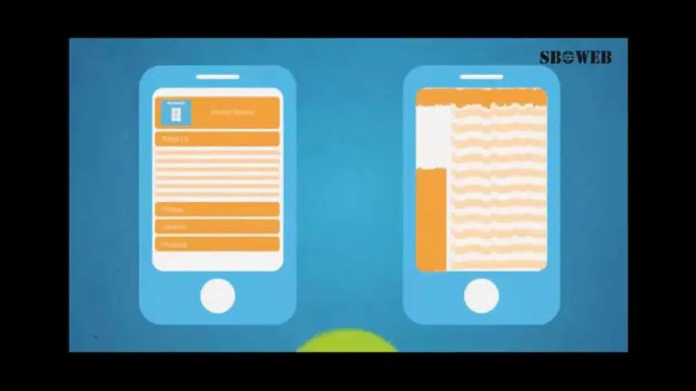
While website designing and designing elements are essential, the technicalities are just as important. To have a website that is unresponsive in today’s time is ensuring that you stay behind your competitors by ten folds. More than half of the internet users browse the internet through their smartphones today. These are potential customers and converts that you’d lose out on if your website is unresponsive. This is because unresponsive website design distorts the website’s appearance when viewed on mobiles or other smart devices. Texts often overlap, the images fuse search box gets challenging to be found. With such a clutter of information throwing itself over each other, the visitor would switch to a competitor where the content is more readily understandable.
To avoid this mistake, it is best to make your website responsive. Responsive websites are not costly to maintain and increases the website’s credibility among users. Google itself favors mobile-friendly websites. Provide your potential customers with the ease of choosing the device they want to use, for accessing your website.
So you understand the need to have minimum navigation menu items, 7 or less as per the normal person’s attention span. You make changes and cut down the unnecessary menu items, but the process doesn’t end there. It is crucial to arrange these remaining options in the right order. People who don’t get this right often create website navigation menus that look confusing and hasty to the visitors. The chronology or the sequencing of the navigation items can be done in terms of alphabetical order, relevance, priority and many other factors. Generally, priority should be the best way to design and arrange a website navigation menu. You wouldn’t feel right about a website where the home page button is fourth or fifth of then navigation menu bar.
It is ideal for keeping the sequence as tight as possible as a general user tends to remember the first and the last thing on the sequence more than the in-betweens. Hence, ensure you place all essential items at the front and the end of the navigation menu bar. The lesser important ones can go in the middle. However, if you have a CTA like register and login, such buttons have their traditional positioning in website design. Don’t change their places.

It might sound natural to have navigation options such as photos, videos and more to direct visitors to the photos videos and other such sections of the website. However, this is not the most ideal practice for website navigation design. These labels justify the format of the content visitors can expect to see when they click on those buttons. It doesn’t provide context and relevance of what the topic is. Visitors aren’t looking for videos or images when they visit your site. They want information regarding the topic that drew them to your website. Hence using labels that describe the format aren’t descriptive or helpful for the visitors.
Name your navigation menu items better. Keep it relevant to your products and services, and think from a visitor’s point of view. Understand if using a particular keyword to describe contents of that page seems natural and effective from a customer’s point of view or not. The navigation button content should be the first word anyone can relate the content of that page to.
7. Drop Down Menus:
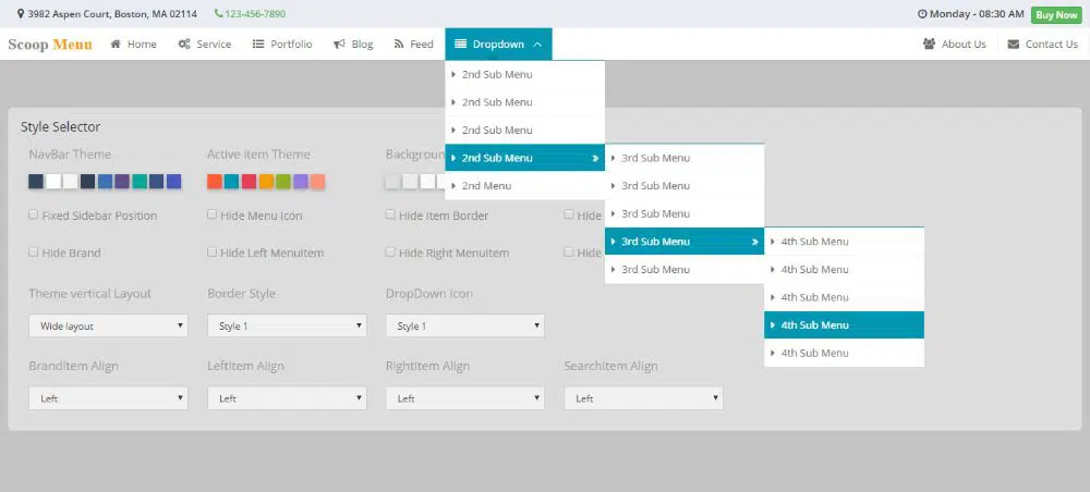
Dropdown menus look attractive and are a popular trend in website design. However, they aren’t the best option for website design for website ranking. Dropdown menus may make it difficult for the search engines to crawl. This could potentially affect your SEO ranking. Moreover, it is something that isn’t liked by visitors as well. Their eyes move faster than the mouse, and when the visitor decides to go on a menu option, they already have made up their mind to click it. When they hover their mouse over to perform the click, dropdown menus give them more options. This creates friction in the mind of the visitor, and it discourages them from navigating the additional options as well. However, if you have that many important pages that you need to include in your website navigation bar, try using the mega dropdown menus. They provide many options, which justify the friction.
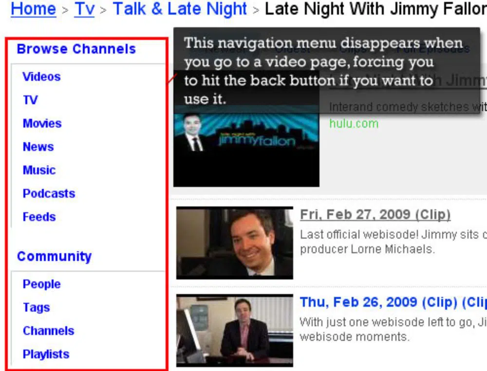
You may have designed an excellent navigation menu for the home page. The visitors might find it super useful and easy to navigate using your website navigation menu as well. Don’t change it for them in your other inner pages. Don’t try to include a horizontal navigation menu on the home page and change its position in the inner pages. A useful website would have the same navigation menu on the website. Each item, iteration the website navigation design should remain consistent. Websites that have inconsistency of navigation menu generally irritate the visitors, and this leads to them leaving the website without understanding what the website has to offer.
9. Mismatch in tone and website content:
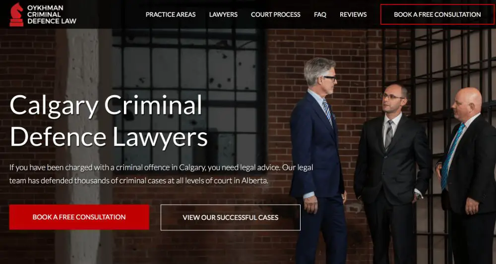
Each website has a different tone. Some websites cater to a formal and more severe topic, whereas some websites are friendly and casual. It is essential to understand that the content of the website would have a tone that would match the tone of the business it is reflecting. Moreover, the website navigation bar should also reflect and be in sync with the tone of the overall website. For a website that is casual and fun, having a button with the text “How can we help you” would look more attractive than “Services”. On the other hand a CTA like “Let’s begin our adventure” would look inappropriate in a formal website like a law-firm website. There the CTA should be something like “Inquire Now”.
10. Unnecessarily lengthy:

The text of the navigation bar’s labels is very important. It has to be short and concise. This is not to say that the length of the label needs to below a certain character count. It is to ensure that you put across what you want to say without the additional adjectives if they don’t provide much value. For instance, a button labelled “All about our company” is unnecessarily lengthy.
A better alternative is “Our company” which puts forth the same message but in concise and shorter characters. Removing even two to four characters might not seem significant, but could help the website navigation to look more precise and accurate. However, this is not to say that you should cut down on words in a way that the label doesn’t make sense. Don’t try to use words like No. of employees if for some reason that is one of your navigation menu items. Don’t use abbreviations to shorten the word count.
These were the 10 things to avoid when creating your website navigation. Website navigation is the compass of the website and the visitor’s guide. It helps them navigate through the content treasure of your website effectively and efficiently. Make sure you don’t make the same common mistakes while designing your navigation menu as it could hamper user experience and traffic to your website, amongst other things.