As a web designer, you always strive to make UX-optimized, functional, beautiful websites. At the same time, you try to avoid costly mistakes, including ones that could hurt a client’s business. Those mistakes are seldom caused by carelessness or laziness on your part. More than likely, they’re due to the difficulty in keeping up with and adhering to the new standards. These are sometimes unique to a given industry.
You could do a deep dive into learning all the different industry standards. You could also try to put yourself in the shoes of the end user. Yet, it would take an immense amount of time and effort to do so.
A far easier approach is to use pre-built websites, where all the heavy lifting has already been done for you. BeTheme offers over 340 of them. They cover approximately 30 industries and take the differing business standards into account.
That said, let’s take a look at 5 of the worst mistakes web designers can make.
Design Mistake Number 1 – Forgetting Why You’re Doing What You’re Doing
It’s easy to get caught up in the visual appeal of a website you’re creating. You can forget WHY you’ve been asked to create it in the first place.
Clients really dislike when you do this because it could ruin their business. They naturally want, and many expect a stunning website. But the number one priority in designing it should be its goal.
That goal may be to build brand awareness or sell products online. A client might want to position the business as the go-to place for certain products. Lose sight of that goal and you’ll be doing a disservice to your client and your client’s customers.
Consider using a pre-built website with its built-in industry standards and functionalities. It allows you to focus more on the creative side while giving your client what it needs.
Consider these two BeTheme examples:
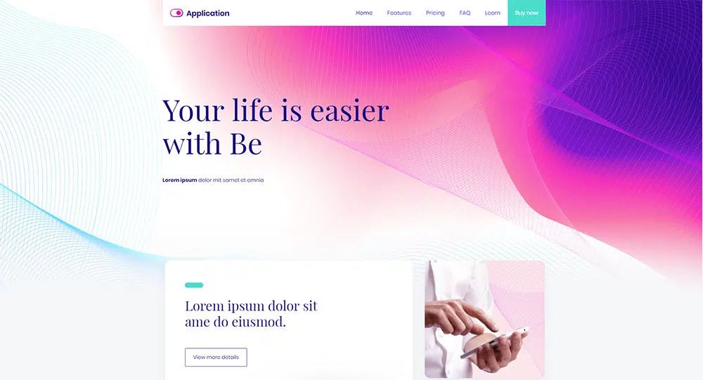
BeApp3 shadows a standard user journey for an app presentation. It centers around a product’s features and pricing plans.

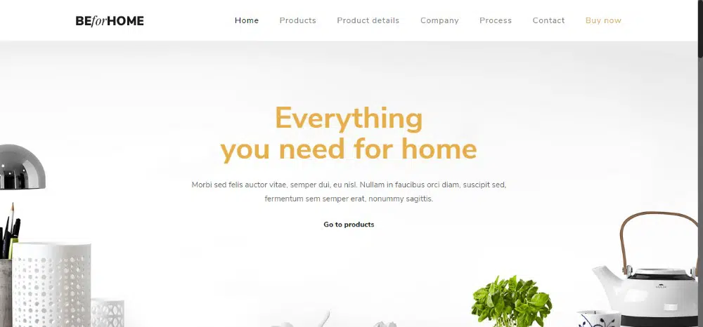
BeHome is a special creation designed to show what makes this business different from the competition. It also shows what makes their products truly special.
Design Mistake Number 2 – Ignoring or Underrating Content Hierarchy
As you are undoubtedly already aware, all content is NOT created equal. This is especially noticeable when you become frustrated looking for a specific information. Then, you find it hidden in a megamenu or buried somewhere in the nether regions of a home page.
You can visualize the content hierarchy that applies to any website for any industry. If that is so, you’re indeed worthy of being crowned master of UX designs. That’s a difficult goal to reach, however. Standards for content hierarchies can change.
Why not take a perfectly legitimate shortcut and let pre-built websites save the day?
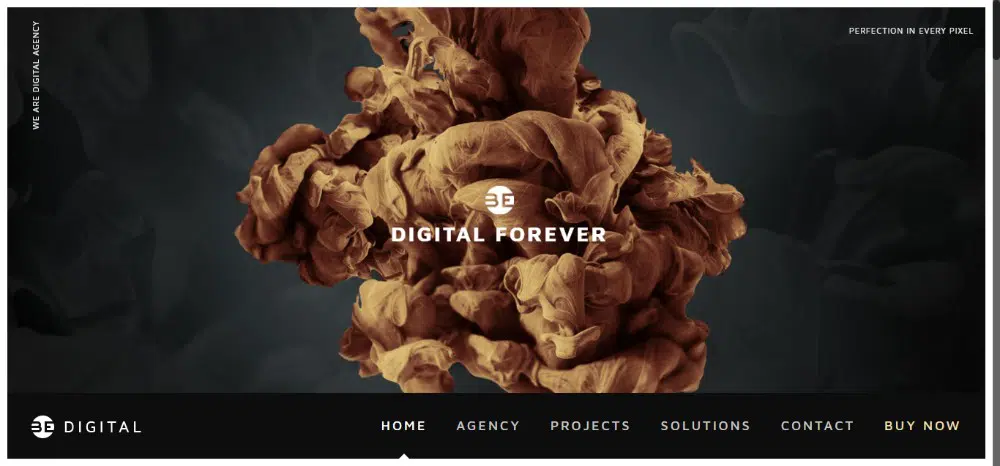
Consider BeDigital. Attention-getting visual content is an absolute must in the digital industry. This template uses huge, impressive visual content above the fold. The simple yet bold menu at the bottom is easily seen.
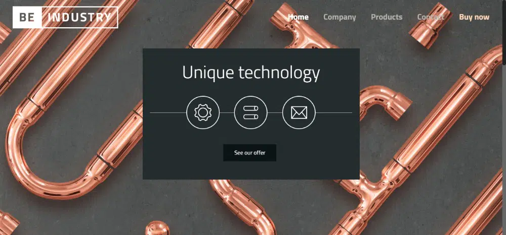
BeIndustry makes a clever use of eye-catching background visuals. However, the focus still remains on the main message located up front and in the center. Here, the background is eye-catching and appealing. Nevertheless, users are clearly directed to the call-to-action buttons.
Design Mistake Number 3 – Being Overly Familiar
Knowing too much isn’t nearly as bad as knowing too little, but it can still lead to problems. You can strictly adhere to every single industry design standard, rule, and regulation. But you and your client could easily be rewarded with a boring website.
It’s OK to be creative with a website’s menu or the position of a logo. You can surprise and delight users as long as you don’t go overboard and create distractions.
Applying just the right creative touch is easier said than done. This is where pre-built websites come into the picture. They allow you to get creative while sticking to a familiar navigation structure.

BeFantasy does an outstanding job of replicating the familiar feel of a video game. It also surprises users with eye-popping mixes of textures and colors. You can also find animations and the clever use of other design elements here.

BeChurch2 offers another thought-provoking example. Here, the vintage imagery and the cursive typography reinforce the church’s history. The modern logo and menu transport it smoothly into the 21st century.
Design Mistake Number 4 – Being Too Disruptive
Clients are sometimes partly to blame for this mistake. They tell us to create a “truly innovative” or “spectacular” website. We look at this as an opportunity to take our creative powers to the limit. We then flood our design with mind-bending features instead of controlling the flow.
In doing so, we might present website users with an unfamiliar navigation structure. This can take them out of their comfort zone.
To avoid this mistake, you need to try using a familiar structure. Build your innovative design on it.

BeEco has such a simple and familiar structure. It features a design that is definitely eye-catching. All the information users need is at their fingertips, while the website as a whole is clean and fresh.
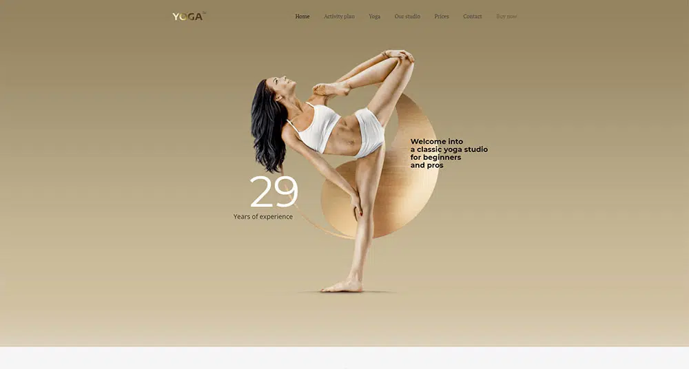
BeYoga2 is a simple design that uses metallic elements to give the website a glamorous look.
Design Mistake Number 5 – Not Meeting a Client’s Specific Expectations
Your client wants a website design that mimics those of its competitors. He/she requires it to strictly adhere to the applicable industry’s standards. The result is sometimes an “ugly – even brutal” website. You normally wouldn’t touch it with a 10-foot pole, but your client thinks it’s just right.
If that’s the standard, it’s your job to follow it. You have to make the best of what you consider to be an affront to your profession as a designer. Then, move on to assignments that are bound to be more pleasing.
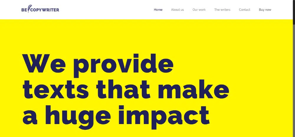
BeCopywriter is a good example of brutalism in web design. It has bold colors, huge font size, and crazy-simple structure. When the message gets to the right audience, they’ll greatly appreciate it (even if you don’t).
Summary
Remember to avoid these 5 mistakes and you should end up with a satisfied client. Better yet, make it easier on yourself. Do so by using pre-built websites where the necessary fixes are already in place.
- Don’t stray from the website’s goal
- Don’t de-emphasize or bury important content
- Don’t create a design that’s familiar to the point of being boring
- Don’t build a website that’s excessively disruptive
- Don’t ignore specific industry expectations – even if you don’t like them
Do use pre-built websites to create designs that match your clients’ business needs.
