A clever and high-quality logo design is essential for a company that wants to become a popular brand. Maintaining a professional image is paramount to almost any business. While things like corporate policy, public relations and the satisfaction of customers and employees play a huge role in this, there’s another side to a brand image that takes the phrasing a little more literally.
A big part of corporate identity is defined by the visual material which is used to represent the company, most notably colors and logos. Professional logo design is invaluable to achieving and maintaining a brand identity that your customers recognize and of which you can be proud.
With these important logo design rules being mentioned above, start browsing the logo design collection below and look for hidden messages, double meanings, fun word plays, and more! Bookmark these clever logo designs and save their ideas for later. You never know when you’ll need some extra inspiration!
Glass Works
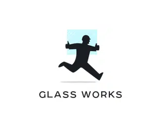
The first example of a clever logo design is Glass Works’ which uses a flat icon of a worker running with a tile of glass. It has a minimalist design that uses a light blue color for the glass tile which makes the worker stand out.
Arctiq
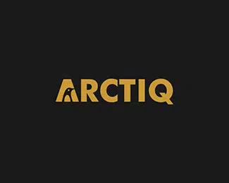
This example is much more different than the previous one because its main focus is on the company’s name. Arctiq uses an orange bold typography with a penguin illustrated inside de letter “A” to lay out a hidden message inside their logo.
wit-gele kruis
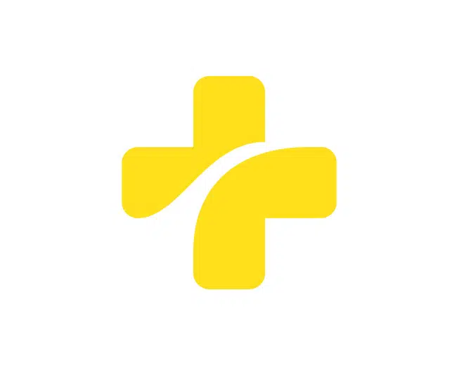
Wit-gele Kruis’ logo represents a cross that symbolises aid with a round cut through it that represents the road home. All in all, this logo has a neat, minimalist and meaningful design.
What makes a good logo design?
A good logo design can have a positive impact on your customers’ commitment to your brand—and not just because it’s a pretty picture or colored well. The perfect logo for your brand allows a company to appropriately communicate their vision, intent and services to current and prospective customers, thereby strengthening familiarity and improving relations. Having a professional image that your customers can recognize at a glance gives your business a stronger overall identity even outside your office, and that keeps customers coming back.
The Bulls Team
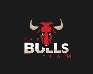
If you were looking for a logo that has a creative touch to its design then you might want to have a look at this example. This logo is for the Bulls team. It uses a flat icon and 2 different fonts to present the team this logo was made for.
Magic Rabbit
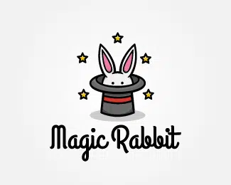
With a doodle appearance, this logo manages to keep its “magic” thanks to the friendly design that uses many colours and a typography that blends in well with the rest of the design.
Historical Windows
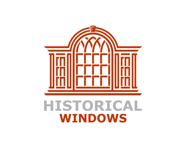
This example has a much more minimalist touch to its design. Historical Window’s logo contours an impressive window through a neat and eye-catching design.
Bird
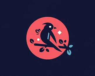
This logo has a creative touch to its design. It represents a cutout bird on a pink circle that could represent the moon and the dark blue background might be the sky at night.
What about branding?
Establishing brand recognition is one of the top reasons to have a custom logo, but this is a two-way street. Customers recognize your logo because of your company, while prospective customers may recognize your brand because of your logo.
The best logos, no matter where they come from, offer the opportunity to become a branding singularity. If your brand’s logo is truly and completely yours, you can strip away every word and even most of the color from your image, and still be recognized by consumers the world over. There’s no way to achieve this kind of recognition with an unprofessional logo.
LA
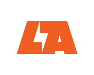
This logo uses a particular typography as a form of presentation and the colour orange. It is yet another example of a logo that focuses on the company name and presents it in a creative and original manner.
London
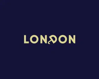
This logo also uses typography in its design to describe London. The letter “D” is shaped like an umbrella and it represents a hidden message that suggests London’s rainy days.
Burger Beer
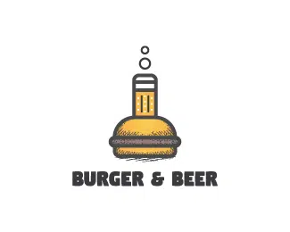
Who doesn’t like burgers and beer? This logo mixes both in a creative way to present a burger and beer laboratory. Check it out and get inspired for your next logo project.
Ahuizotl
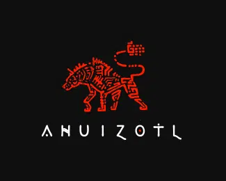
If you’re up for a unique design, then you’ll love this logo example. This logo uses Aztec and Mayan references in its design and a particular typography that mixes well with the red animal.
Melon Ship
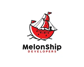
The next example also has a creative touch to its design and presents MelonShip developers in a fun way. Just as the name suggests, this logo uses melon slices into colouring a ship icon.
What is brand consistency and what is its purpose?
One of the biggest benefits of professional logo design is brand consistency. Broader than brand recognition, consistency assures that your corporate image is similar on all fronts, utilizing the same colors, imagery and ambiance no matter what the media or purpose. Brand consistency is key to maintaining accountability and trustworthiness among your clientele.
The only difference between a “brand” and a “company”, after all, is how they’re perceived by their customers. Your company is what you control, from policy to image, and your brand is how customers remember you. f your company image is inconsistent, even if it’s just changing logo colors and selling goods and services that don’t fit with your company vision, your brand image could suffer.
Econeer
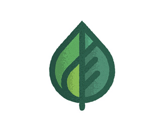
Econeer’s logo uses a simple logo of a leaf to present eco-friendly, sustainable, clean, renewable energy companies or organisations. It has a neat and eye-catching design.
Squared Monkey
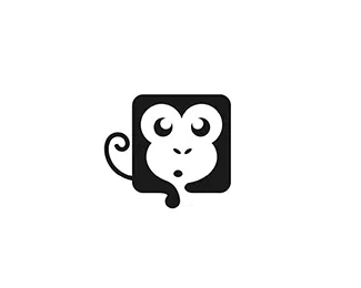
Squared Monkey’s logo, just as the name suggests uses a square icon of a monkey face. It has a minimalist design, it doesn’t use colours and yet it manages to have a friendly look.
Sahib
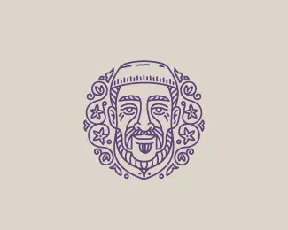
This is yet another example that could serve as good inspiration for your next logo project. Sahib is a logo that uses doodle to present a company a company, for example. It is meant to contour the face of a wise old Muslim.
Cederstrom
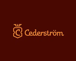
This logo uses a custom typography to present the name of a chocolate desserts bar. The icon next to the bar’s name has a similar design that looks like an emblem and has the letter “c” inside.
Little Cannon Entertainment
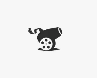
Designed by Dušan Roži?, Little Cannon Entertainment uses a simple dark grey flat icon of a cannon to present the company interest for movie making.
Greenphon
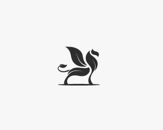
If you want to see more similar logos then you might also want to have a look at this example. With a similar design as the previous example, made by Dušan Roži?, this logo uses a dark grey flat icon of a pegasus to present a mythical creature.
Logos and the sense of ownership
Possibly the best thing that professional logo design offers is a clear sense of ownership; putting your logo on your and products and attaching it to invoices for services rendered lets everyone know that these things belong to your brand and your company. This can’t be something that you just “throw together” one day on a whim; it needs to be approached by an expert who can turn your vision into shapes and color, and it needs to be given time to bloom. A professional logo is something that your company can stand behind, a banner under which to declare your brand, and that means you need the best you can get.
MAIBIN DESIGN
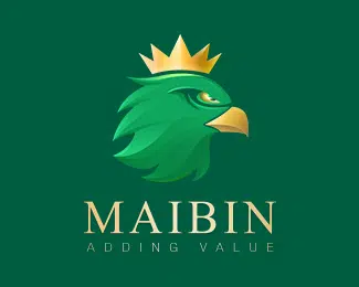
This logo uses 2 colours, gold for the typography and eagle’s crown and green as the main colour for the MAIBIN’s eagle.
Vincotte
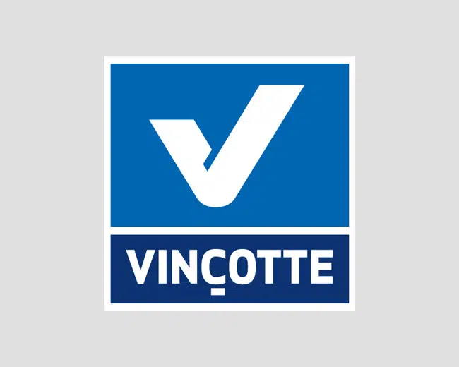
Last but not least, the Vincotte logo uses a minimalist design with a “v” symbol and typography underneath, both on a different kind of blue background.

Awesome logos but need some more work
With the pencil one, you suggested the pencil image was between the i and l, I thought the i and l were actually part of the pencil. If you follow the angle of the nib up it comes to the edge of the letters.
I also really like the forward pointing arrow in the FedEx logo.
http://images.fedex.com/images/ascend/shared/headers/nxgen/express_logo.gif
excellent compilation…love ‘eight’
These are great. I always enjoy a clean, clever logo.
channel four logos and branding are always so clever and well designed.
love the horror film one though. clever and a sense of humor!
Greats logos. Really inspirational
Very Creative… 🙂
‘Giraffe’ and ‘Eight are brilliantly thought out designs.
I have not seen The Doghouse logo before, really like that one. Thank you for sharing the great logo designs.
Hey really inspirational design indeed. I really appreciate the originality of designs in real creativity.
Great logo design. Must appreaciated and designers have to follow these logo’s for their websites. Really inspirational logos
Bravo! All are clean, simple and witty!! *clap-clap-clap!*
Some really clever and inspirational designs.
Thanks.
keep up the good work
Love these logos…the Food Writers is ace.
Nice and informative collection of logos are simply great keep it up
Very clever indeed. Thanks for sharing.
Woah… thanks for featuring my get wired logo!
Much appreciated!
Agreed. It is absolutely creative. What I can say is “simple & nice”
agree with above !! love these egs.
Good work Andy!
Nice designs…I haven’t got the talent, but I can see the effort and thought that’s gone into these.
Good design, just never gets boring to look at. Very creative collection. Thx
Great collection! I love clever designs.
Nice research! Those logos are very impressive and I can feel that the logo creators certainly would have spent a lot of time designing those.
great logos, thx
Great “BarCode” design, very creative!
Greetings,
The “Eight” logo is clever with all the different versions of the number 8.
Excellent logos, I especially liked Version2. I read it as just that, at first glance, without even noticing that the 2 was in the middle.
The ‘Families’ is cool design.
A great collection of logo designs here. All of them are good apart from the more4 logo which is definitely outdated. Thanks for sharing these.
Ooh, looks nice 🙂
amazing !
very good for my inspiration.
Thanks for including my ‘Umbrella Prints’ logo! Great collection, too!
I absolutely love the getwired logo!
Thumbs Up !
Great Work Dude.
For whatever reason, none of the logos load on IE8
Its an IE8 bug. I would strongly suggest using Firefox or Opera.
Brilliant designs.. very clever, yeah and i agree on the green on the more4 logo looking outdated… loved the food writing logo..
Very nice collection
Really cool logos. Thanks for sharing.
Amazing…
Really very nice creativity..
Thanks for including my pencil logo
Nice list man.
Nice. I have seen and previosly admired most of these.
Although, have to say that I am not too keen on the green for the more4 logo, kind of diminishes its relevance to the present as it looks outdated.
Totaly and utterly agree with you Mersi, it actually really bugs me (the colour that is) … Why the heck that well outdated 1968 green?
Yeh i see what you mean
You are very creative!
There are some very creative designs here. I had to look at the Ed’s Electric logo a couple of times before the E jumped out. Took me a moment on umbrella prints too. Great work.
I like the fact that you explained each logo… “The word look which looks like someone looking” classic!
very cool. makes me want to doodle some logo ideas for my business… suddenly, mine isn’t cool enough. lol
Very nice!
Nice collection! Keep up the great posts
Great logo roundup, thanks.