This article contains an excellent collection of responsive menu CSS snippets which will automatically adapt to any screen size, regardless if it’s a desktop or a mobile device. These responsive menus come with demos and some even have tutorials, that will show you how to use them properly.
These CSS menu snippets are highly customizable through a wide series of options, extensions, or add-ons. Experiment with each one until you create the final design you’re satisfied with.
All the navigation menus from this list have fully responsive layouts, which guarantees that, no matter what device you use, the content will be displayed perfectly.
Learn how to create awesome, responsive CSS menus, with these code snippets below!
Want more CSS snippets? Check out these CSS Animations and Effects.
CSS Menu Overlay
This is a responsive portfolio layout which includes a fully adaptable CSS menu. When it’s not used it converts into a toggle icon. See the demo!
CSS Mega Dropdown
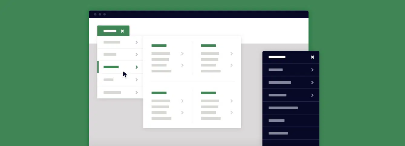
This is a 100% responsive CSS mega drop-down menu with many customizable features. Have a look at the demo and see if this menu is the right element for your website.
Off-Canvas Menu
This is a simple but stunning off-canvas menu with a fully responsive design. You can activate this menu by clicking the toggle icon and the menu is revealed.
Fullscreen Menu Type #1
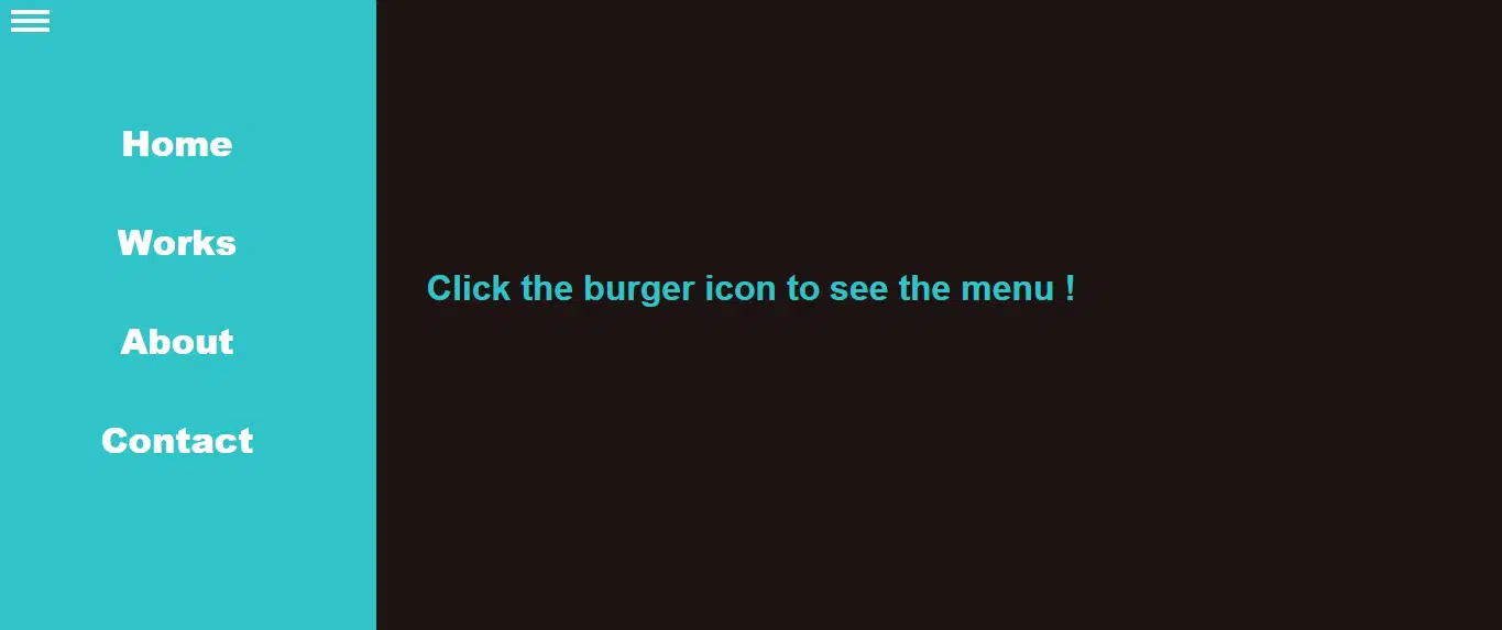
Here is an amazing CSS menu that you can download and use in your websites. This menu appears when you activate the burger icon and it generates a full-screen menu that overlays the web page content.
Gooey Menu
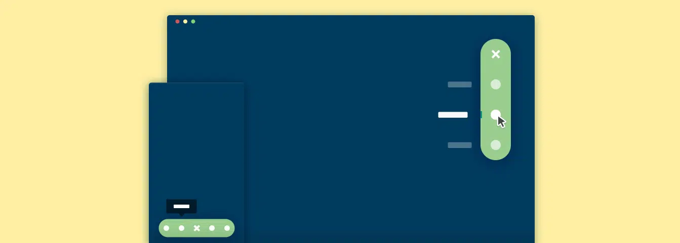
This is a lovely gooey CSS menu with a joyful design. After activating the menu button, a series of circles pop out of the main button. Thus the website’s structure is revealed and you can navigate through the pages.
Off-Canvas Menu with a Twist
This is an outstanding CSS menu with a twist, an actually twist! When touching the menu button, the content of the web page shifts making room for the off-canvas menu, that seems to be located underneath the layout.
Here you have a stunning CSS navigation that performs a beautiful 3D rotation when used. You can use this in multipurpose websites, to add a little movement.
Zoom Menu
This CSS menu design has a simple but compelling design. Have a look at the demo and decide if you can use it in your websites.
jQuery Menu
Insert the code snippet into your website to create this neat jQuery menu. This item activates when you press on it, the rest of the times it stays on the top left of your website, leaving the rest of the content fully visible.
Multi-Level CSS Push Only Menu
This is a great CSS multi-level push menu that you can add to your website projects. This type of menu can be a little more difficult to manage but, with a little exercise, it will work just fine.
Slide from Top Full-Screen Overlay
Here you have an unusual CSS menu design. This is an overlay menu design which you can manage with a scroll movement. See the demo and decide whether it is perfect for your websites.
This is a nice stretchy navigation that you can create from scratch by following the information the designer provides. A beautifully rounded trigger stretches to showcase the website’s structure.
Here you have a lovely responsive CSS menu. This item will adapt its layout to perfectly fit any screen size. See the demo!
A bold navigation that slides in when active, replacing the current content in a 3D space. Take a look at the demo file and use it in your future designs.
This is not your ordinary type of menu. You can use this CSS menu design in various creative websites. See the demo and decide whether it meets your requirements.
This is a sticky menu that is perfect for one-page websites. This is located on the left or right of your web page and you can use the icons to quickly navigate between the different sections of the site.
Full-Screen Burger Menu Overlay
Here you have another full-screen CSS menu that when triggered it overlays the content of your website. This menu has a transparent design which looks stunning.
Animated Menu
This beautiful CSS menu type is very effective and fits lots of multipurpose websites. You can see its full features on the demo page.
Simple YouTube Menu Effect
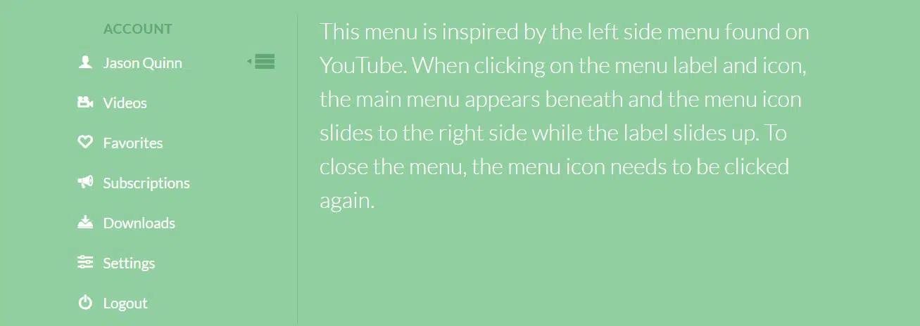
This is a YouTube-inspired menu with nice effects. Use it in your current or upcoming website to add a little more character to your projects.
Airbnb iOS 7 App Style Side Menu – Fly Side Menu
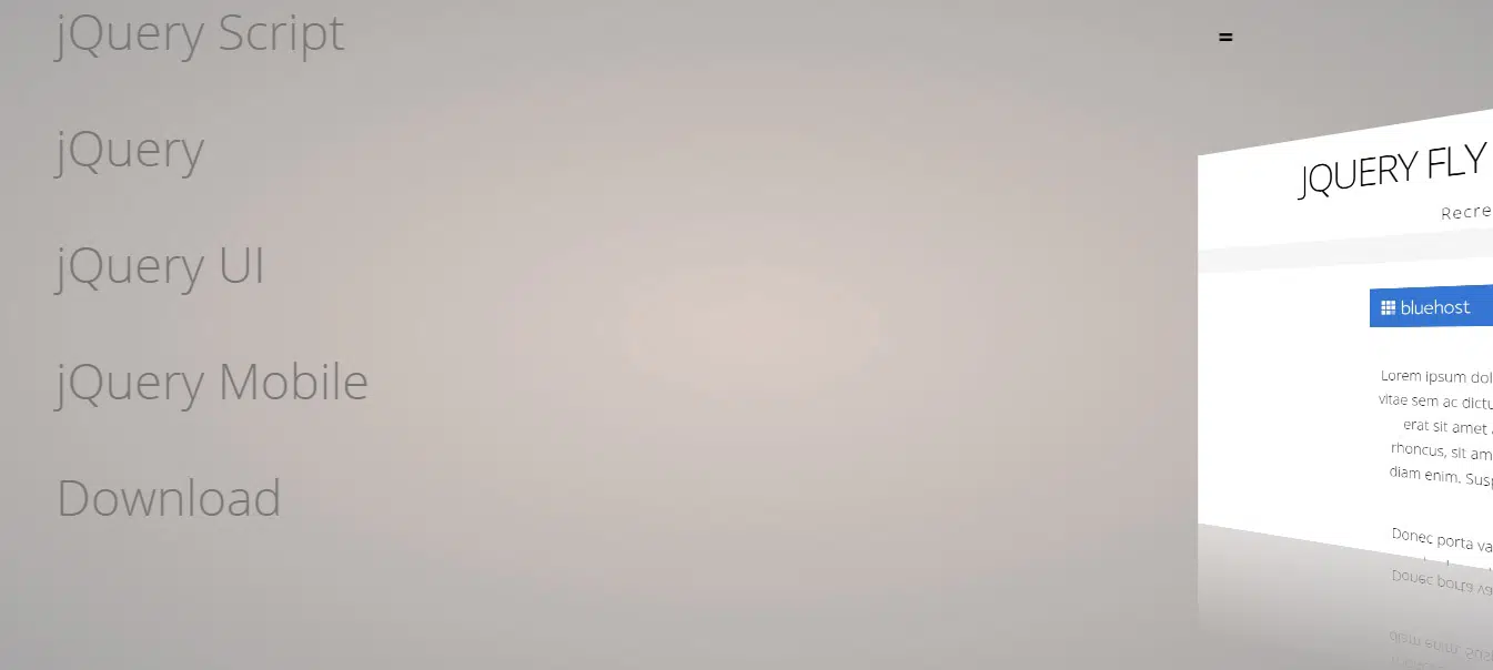
This is a unique CSS menu with a stunning 3d transition. Have a look at its transformation from a regular menu to the complete animation.





Nice informative post! Thanks for sharing the list of responsive menu CSS snippets with the demo; it’s really helpful for us. Good Job!