If you are a graphic designer, a web designer, or if you do visual work at all, then you probably have developed your process when creating a new document or product. Whether you refer to it this way or not, one of the essential tasks to starting a new project is to come up with a sort of visual hierarchy for the piece – a layout of all the elements or sections in your visual breakdown. Composing a new visual piece will always include considerations for layout and composition – where things go, how they line up, and in which order. You can think of the hierarchy as framing that list of essential elements in your design project in such a way that the most important things are presented at the top of the creation.
Creating a hierarchy is important since it helps you direct attention to the right thing at the right time. A hierarchy is a reasonable way to show a relative essence of elements by offering organization in their structure and helping a viewer to navigate. You will be able to know which information comes before the other; you will know precisely what should be read first. You will also know which part you should pay more attention to.
There should be a hierarchy to everything we create – even the essays we write in school or the reports we present to investors for our businesses. However, in design, the hierarchy is not reduced to text only. For example, when you go through a website that is designed correctly, you will find out that the hierarchy is applied to help structure the page. Right from the navigation banner size to the icons, blurbs and the hero image. So, while your content person or copywriter is busy telling the website’s story from its most important to least important elements, you – as the designer – should be creating a matching visual hierarchy.
Visual hierarchy builds a focal point making your viewers more comfortable and well-aligned, by going through your design and leading them to where the most important information will be located – and drawing their attention there. If you are looking forward to expanding your knowledge about visual hierarchy in order to build your designing career, you’re in the right place. This article will take you through some of the things to consider so that you can create a proper visual hierarchy.
Use Size to Your Advantage

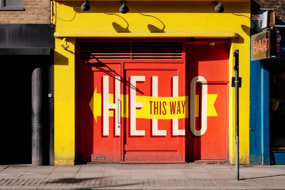
As a graphic designer, you can use size to your advantage by reducing or increasing various elements to enhance the visibility. A bigger design element gets a little more attention and so should be reserved for the most important, interesting, or introductory elements. Enlarging the dimensions of an object and the size in relation to other objects (the scale) is among the highly effective ways to give your design visual hierarchy and organization. Those design elements which are not of great importance or which don’t attach to the most important textual cues, can be reduced in terms of size so that they are not as visible as the ones that carry great significance. These types of design elements belong at a low point in the visual hierarchy.
Make Smart Color Choices

The other important thing to focus on in creating a hierarchy is the color and contrast. Humans are visually attracted to color, especially if the color is applied in a strategic way to display the important imagery or information. There are very high chances that a person will go through a website and read deeper when there is some color-related organization to this information. This is why data-driven graphs and charts are often color-coded for better visibility and readability. Colors like yellow and red convey importance and urgency while colors like blue and green convey stability and calm. However, you should be careful not to drench your design with all the colors of the rainbow since it may create a negative impact or distract from the message. Use the colors smartly and with a purpose, and you’ll find that they translate well for the overall visual impact of your product.
Consider Typography Wisely

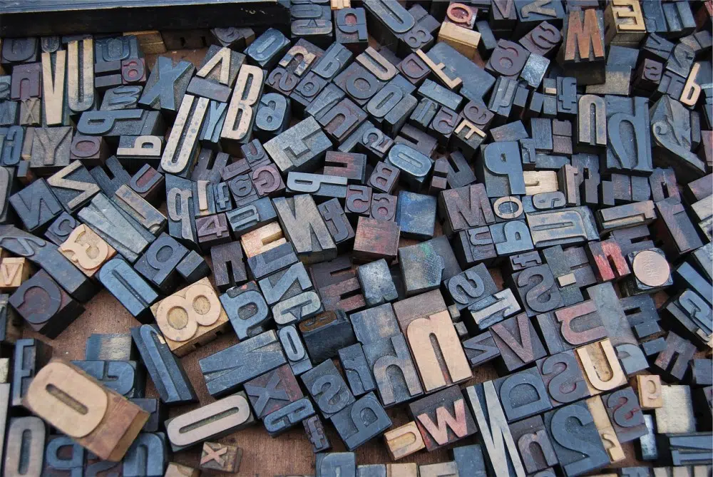
The other factor to consider is the type of font that you decide to use, and the sizes of each. There are multiple fonts to choose from, so it is your work to make sure that the ones you pick are the best and bring out the message of any product. Traditionally, it was said that headings and titles should use sans serif or display fonts, and that copy fonts should be relegated to serif fonts only. This is changing as the world transforms but as a general rule, the bigger the type face is, the more noticeable the copy will be. Generally still, copy is arranged in an outline format where the top title is the biggest, smaller sub-titles are medium-sized, and general body copy is the smallest. This is less about the trend or expectation of design and more about readability and the human tendency to scan.
The most important design elements should be written with fonts that call attention – but provide clarity, always. Attention is not useful if the reader cannot understand what’s being written. Too often, font choices are made without looking at what each letter manifests as. Sometimes this has even caused a faux pas for a brand who meant to write one word but whose font made the word look incorrect or worse, inappropriate.
Having gone through the tips given above you are now ready to create your visual hierarchy. Considering that this is a beginner’s guide, all the points made in this article were thoroughly researched to help you come up with the best visual hierarchy for the first time and have an easy time doing it. One easy way to know if your visual hierarchy was effective is to read all of the language in the piece out loud. Are there parts that call to you to change your voice or emphasize? Those are the ones that are pulling most of the attention-share. For projects that don’t have a lot of text, squint or look from afar and notice where your eyes are drawn – ideally, that area will be the focal point of your product. If you’re drawn to copy or visual elements that are of less importance, you may have built something to be too distracting and you can use this as a measurement to make changes to the project before its completion.


Thank you for such a wonderful article.