Remember the joy and happiness when you first got your hands on the magic iPad. Yeah, iPad has undoubtedly changed the way we used to browse the web. It is slim, sexy and simply irresistible and therefore, it is no wonder it is admired and adopted by millions of people around the world. Now, forget about the facts and figure; the reality as it stands is iPad is fast becoming the most powerful and popular platform and that means, your website has to be iPad friendly and the bad news, there is no two ways about it. Yeah, it is becoming all the more difficult for website designers to make a website render precisely in all platforms, be it a smartphone, iPad etc. Now, without an iota of doubt, it is a hard nut to crack. But to make your task easier, here we are going to come up with some tips that can help you greatly in the process of making your website iPad or tablet friendly:

Ditch The Mouse: Well mouse has got nothing to do with tablets. You are supposed to use finger to get things under control in a tablet device so that simply means, you should not make navigation small. Do not cramp up things as it will make it tough for general users while navigating and will lead to poor users’ experience. Since finger is a lot larger than the pointer of a mouse, you need to make sure that users would not have to zoom in and out just to access some areas of your website. Best solution for this problem is to stick with a middle ground. The size of the navigation button should be large enough for fingertips but they should not be ridiculously large.

Above The Fold: Since people are using seemingly endless number of platforms to access internet, web designers really do not have any clue where to put the above the fold thing and what to put in it without marring the whole usability thing. Now, if you are new in the game, let me tell you that above the fold is the most important section that usually has all the important elements of the website to draw maximum attention from your visitors. So, as a designer it is your religious responsibility to make a visitor see the above the fold section irrespective of the devices he is using, before he leaves the website. To ensure this, you need to scale the design to raise the fold to make sure that everyone sees it right away – otherwise your website may not fair very well in tablets.

Check the Contact Form: I think you do not want your targeted visitors facing troubles contacting you while they are browsing sites on tablets. You have to be double sure that everything is working fine in tablets. So, take some time out of your busy schedule and check your website in all possible tablet devices. Send some test mails and if they work fine, you are good.
 ( photo courtesy – http://www.kitguru.net/)
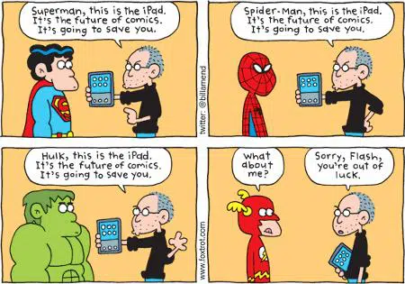
Do Not Use Flash: I remember a story where a designer is told to make a flash presentation work in iPad in an hour. I hope you get it why it is impossible to get the flash presentation fixed for iPad in one hour. Yes, iDevices do not support flash and that means, you will be better off if you design your website in standard HTML and CSS. Don’t use technologies that will require browsers to download additional plug-ins or software. Rather, try HTML5. It offers similar level of interactivity and that too without making the website heavy.
Portrait or landscape Mode: The greatness of tablets lies in the fact that you can see things either in portrait or landscape modes and sometimes, you can switch between the two. So, apart from making your website multi-screen sizes friendly, you need to make it a point that your website can be accessed when accessed in different modes. Make sure that the website does not get screwed up when switched between views and if you find any issues, just iron them out.
Keep Things Simple: Do not add elements that may look like gaudy. You should not forget the fact that a website may render precisely in a desktop but it can go horribly wrong when accessed on a tablet. As a tablet user, you will definitely hate the idea of zooming in and out to have a proper view and so, you need to remove all those elements that can lead to this nagging issue.
It is not a bitter pill: The truth is that tablets give you little scope to try your creativity. But at the same time, they teach you the importance of simplicity. So, do a review of your website and strip away anything that may cause trouble while accessing the website in platforms other than standard desktop.
Michael Evans is a passionate writer and he has been writing for Site2You, which is a simple website builder. He has written different article on web design, online marketing and SEO. He is equally enthusiastic about latest gadgets.