Signages refer to any sign or symbol that direct or inform people. Multiple types of signages could direct, inform, identify as well as a guide. The fanciest attribute of signage is that it has the sole power to help people in directions as well as come to use as a marketing tactic. You would be thrilled to know that signage design also depends on smart and creative ways of executing graphic design ideas. If done well, signages could quickly spark an excellent career for graphic designers.
A lot of designers struggle while working on signages due to the precision alongside creativity that the designs demand. However, it is quite fun to design these signages that could direct the herds of people. A fairly few things that come in handy while designing signages are proportion and the rule of one-thirds.
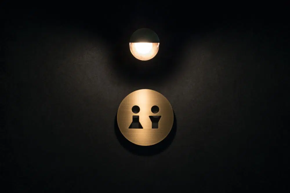
Most of the time, signages are graphical representations of 3D objects on 2D surfaces. For example, toilet signages usually showcase a man and woman, or cafe signage could often sport a big cup of coffee with wafting steam. Hence, proportion comes into play here when you derive forms from life-like objects. As far as the rule of one-thirds is concerned, it usually comes into play while designing huge signages over buildings or billboards or likes of these. The composition of the signage much is such that it attracts attention, but also looks good while doing so.
The best way to understand signages is by gathering some inspiration through the existing ones. Hence, in this blog, we have gathered some of the current design projects concerning smart and creative signage designs. We hope that these are truly useful to you –
1. Leeds Street Tree Gates:
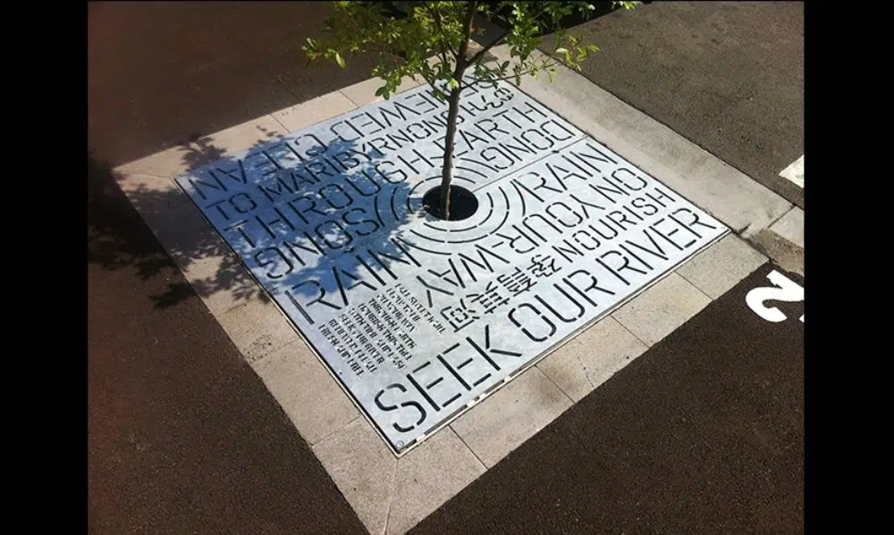
Located in Melbourne, Australia, and designed in 2011, this signage was created by the firm of Heine Jones. The primary function of this design was to educate people about the purpose and intent of the rain gardens installed during the redevelopment of Footscray. A total of 22 trees were planted around the walk, which collectively formed a rain garden. The main aim was to create a system that could use the rain to wash off the streets, water plants around and then filter and cleanse the water before it met with the river.
So this piece of signage is a small poem that has been etched and carved into steel plates of tree gates that educated people while taking a stroll through the garden, or walking or their dogs, and more.
2. Silent Sunday – Farm and Fable:
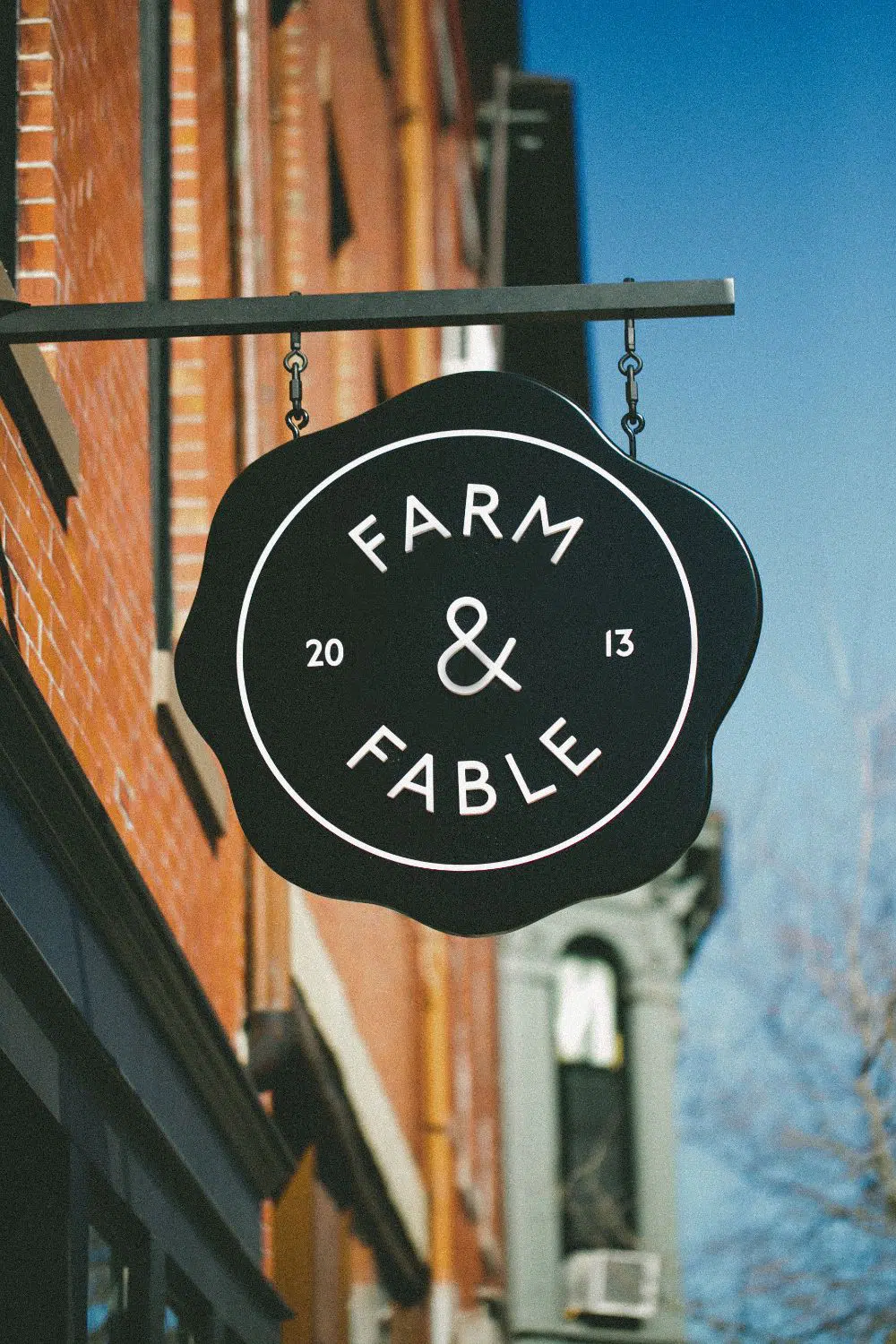
Situated in Boston, MA, Farm, and Fable are a little restaurant inspired by the farm aesthetics. This concept cafe offers multiple books along with food for thought, and the overall aesthetic of the place is very daunting. Right from the minimal design interior to the sophisticated signage board and the beautiful concept of book readings, this place serves fresh farm food inspired by country life.
3. 9h Capsule Hotel:
Situated in Kyoto, the concept of this hotel was to allow the customers to sleep for 9 hours straight – which must also be your average sleep time. The signage around the capsule hotel is minimal, linear form-like signs which lead you precisely into the tiny pods.
4. Blackhorse Lane Billboards:
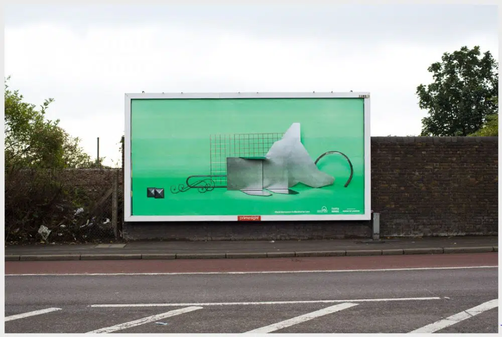
The billboards situated in the Blackhorse Lane in Walthamstow, London were made to document and celebrate the various businesses in the town. These include a prop maker, stone supplier, wooden bed maker, a comic bookseller, and a lot more! It is an excellent example of signages because of the way these businesses have portrayed them is unique.
5. Hotel Cycle:
UMA was assigned to redesign the branding and visual identity of U2, Onomichi, Japan – a cyclist-friendly retail and hospitality destination – that covered a variety of stores and spaces. This included redesigning packaging, retail, and signages too. Very much inspired by the minimal aesthetic of Japan, the interiors captured a contemporary utility encased in traditional warmth neatly portrayed by the Sans Serif font in brushed bronze material. The iconography is a mixture of reductionist aesthetic along with the class.
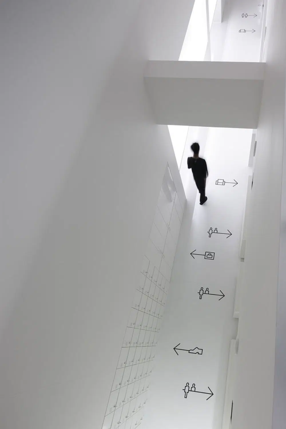
6. DESCENTE Tokyo by Rikako Nagashima:
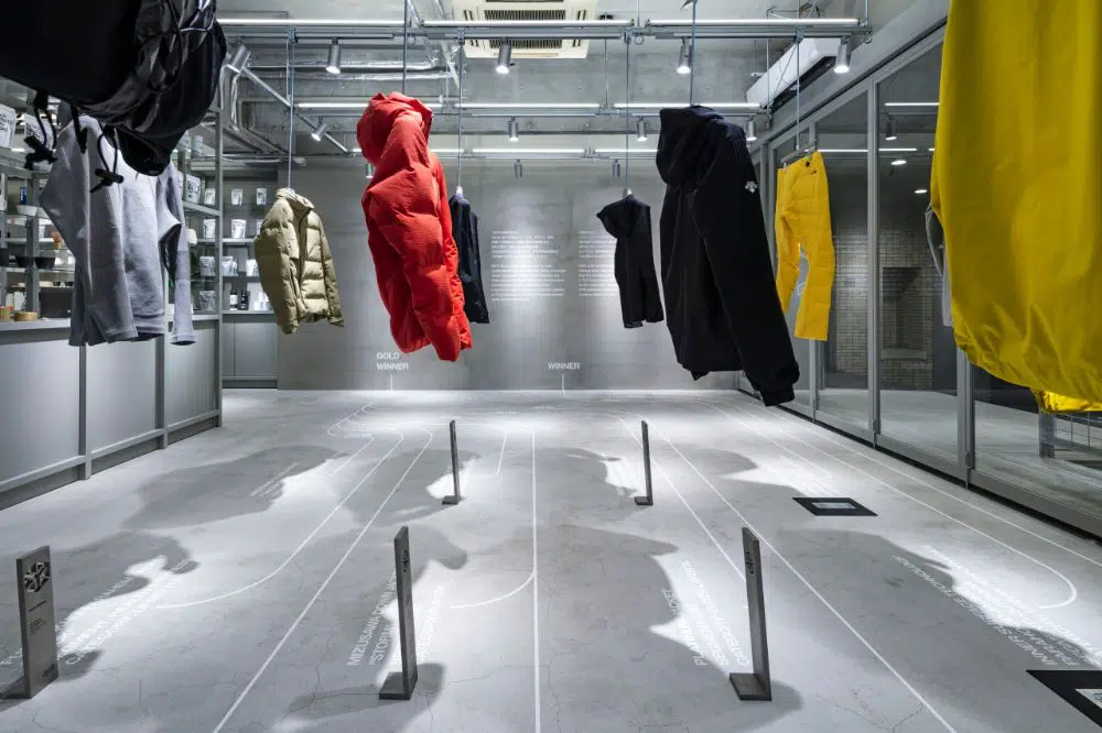
Rikako Nagashima is a Tokyo based graphic designer with a large body of work. Along with Hiroyuki Inada, he did the art direction and graphics for Descente’s store in Tokyo. A series of strips across the floor led to the various collections of the season across the store. It is one of the best use of directional signages that one could ever think of.
7. Sincerely Yours by Marwan Kaabour:
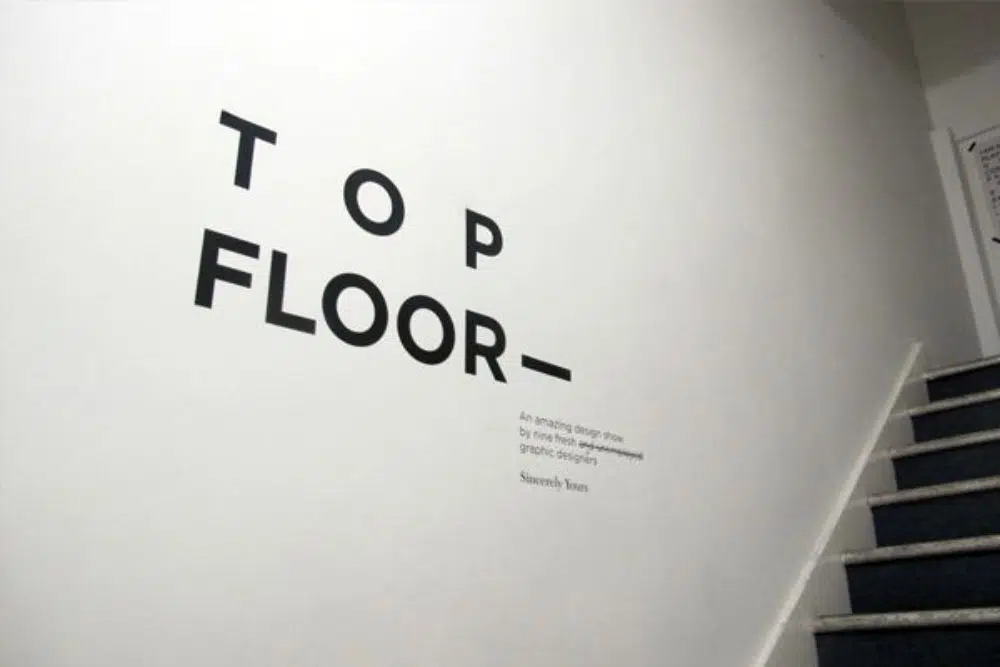
Sincerely Yours was a graphic design exhibition conducted by nine students from the London College of Communication. The display included lots of brochures, 3D presentations, and smart use of typography for the social and political issues. The exhibition was a success, and the best part was the signages.
8. Platform by Pentagram Design:
The Platform is a non-profit organization. Pentagram Design is the graphic design firm that developed the signages and logo for one of the summits conducted by Platform. It included working on a dynamic logo and a set of graphics that suited the company’s identity. Alongside prompt signages, the design also applied to all branding collaterals – right from the brochures, ID-cards, merchandise, and a lot more.
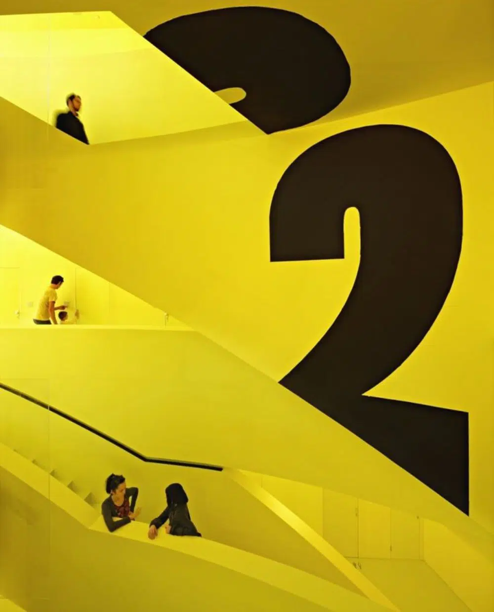
9. Hotel Voskresenskoe:
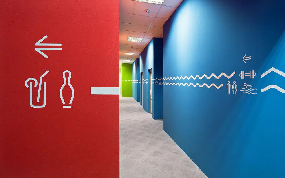
This project mainly targeted the wayfinding, which was also an identity for the new entertainment center at the club hotel Voskresenskoe. The project not only aimed to move around inside the hotel but building a character that attracted people even from the vicinity of the hotel area. Supergraphics in forms of huge wall signages were used to break the monotonous long passageways that came across as labyrinths. The colors also coded special zones of the hotel and overall uplifted the emotional background of the space too.
10. Aufbau Haus:
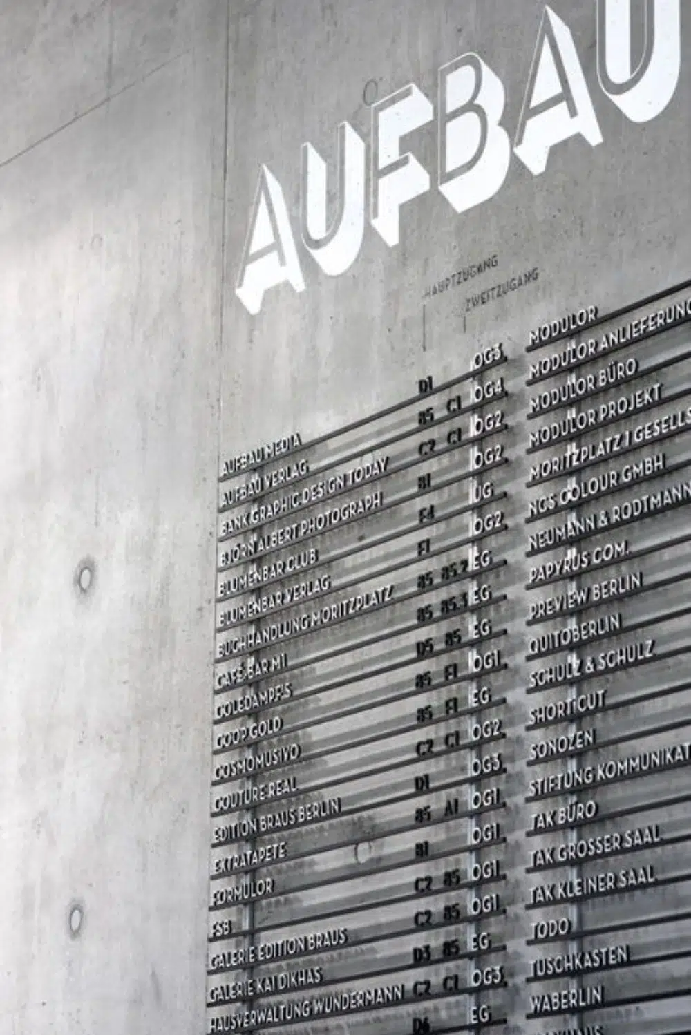
Famously known as Aufbau Haus 84, Barkow Leibinger designed the entry of the building. The entry meditates between a historic Elsnerhaus and the first and original Aufbau Haus 85. Moniteurs – a Danish company – redid the concept for Haus 85 so that an orientation system now connected both of these buildings. You can view the entire project and see how the signages played an essential role in the orientation project.
11. Wolverhampton Wanderers:
New super graphics were introduced around the stadium inspired by the team’s identity. A lot of quotes by the fans were also used to create a visual and emotional impact. Signages showcased characters wearing the full wolves’ kit sprawled around the stadium, carefully made in the colors of the club. The best part was that Raw (the agency assigned for the project) derived inspiration from everyone around the team, from the tea lady to the chairperson.
12. Hostel Golly+Bossy:
The ‘Savo’ building that is situated in the Split city center of Croatia was converted to a shopping mall at the beginning of the 2000s. However, after some guerrilla actions, it was changed into a hostel within a brief period of 100 days. All the spaces are neatly kept, and a large part of the construction is now covered in yellow – suiting the space’s identity. Supergraphics include the walls as directional as well as informative signages, but what makes these effective is the perfect choice of fonts.
13. Fortuna Sports Training Centre:
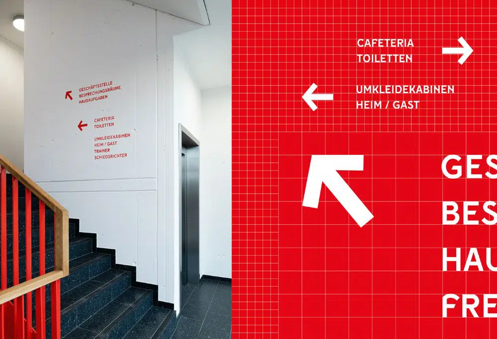
This club based in Dusseldorf was a project for the youngsters and their sports requirements. It is a vast space that not only captures the essence of the sports-enthusiasts of the city but also satisfies the priorities of motivational elements. The patchwork of stencils on the walls separates the home from guest areas, while some shapes and lines follow towards the office spaces. Overall, the club has a tremendous graphical grid going around.
14. Ala de Tres:
Ala de Tres is a casual spot for chicken wings, beer, and sports. The main attraction of the place is the chicken wings, which comprise a great recipe. The location is full of puns, and that is the most striking quality of the joint. Hence, while designing the signages, logo, and the menu for the restaurant, Firmalt Agency kept in mind the pun-ny nature of the brand and highlighted it as much as possible through word plays and graphics.
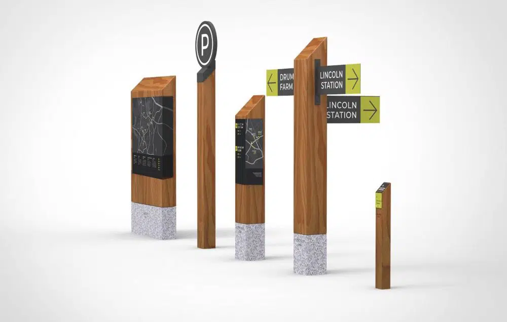
15. Six Senses Kaplankaya Resorts and Spa:
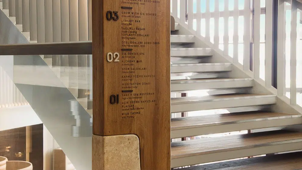
As different cultures influenced this Aegean resort, time periods, civilizations, and artifacts of historical importance, the Kemalcan Basaran, the designer, decided to create a new concept called ‘Meeting of Different Cultures.’ He and his team created a material language that suited the space well, and hence, most of the signages ended up being on wooden surfaces. Local territory and the natural landscape of property were kept in mind while designing the signage system in harmony with this concept and the idea behind Six Senses.
16. Segnaletica – Certosa e Museo di San Martino:
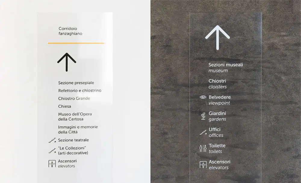
This project was commissioned by Certosa e Museo di San Martino in the city of Naples. It was a simple wayfinding redesign within the museum for maximum fruition of the itineraries and better visitor experience. The smartly designed fonts were laid down on transparent plexiglass and steel displays for a sophisticated look for easy readability, without breaking the visual flow of the Carthusian scenery at the back.
17. Museum of Troy:
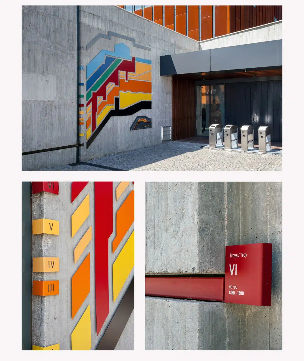
Studio Pompaa designed wayfinding and branding identity for the Museum of Troy in the Troas region in the year 2018. A beautiful amalgam of contemporary architecture and design style fused with the museum’s traditional artifacts and information. The signages were a high output of this combination too.
18. Anyoung Insadong:
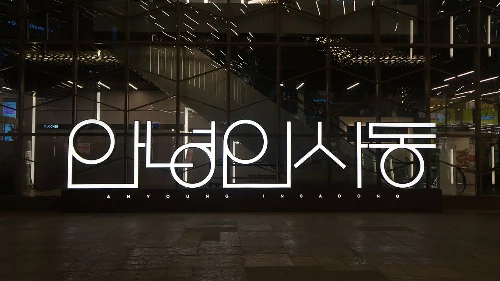
Insadong is an area in Seoul, Korea. It is a unique space where you could experience the traditional environment of the city. Anyounginsadong is a place in Insadong where one could live in the past as well as the present, relax and enjoy the various food available there. The Korean language simply inspires the logo and the graphics of this place, and at the same time, follow a philosophy of circles and straight lines.
19. OVO Wraclaw:
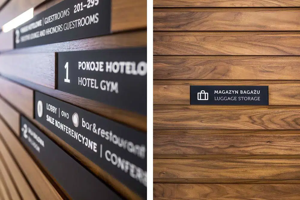
OVO Wraclaw is a multi-functional luxurious building with a whopping 170 residential apartments, offices, penthouses, a fitness club, a swimming pool, spas, and a lot more. It also houses a 5-star hotel like DoubleTree. Kolektyf designed the wayfinding around the building and also developed a few sets of pictograms and icons to make it easier. Following a minimal and easy graphic style inspired by the Museu typeface, the icons and signages are simple yet luxurious.
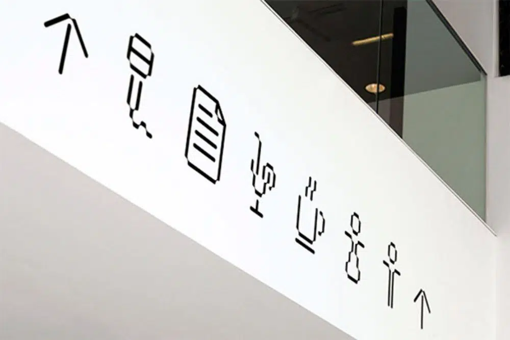
20. Rutes Saludables Carlet, Valencia:
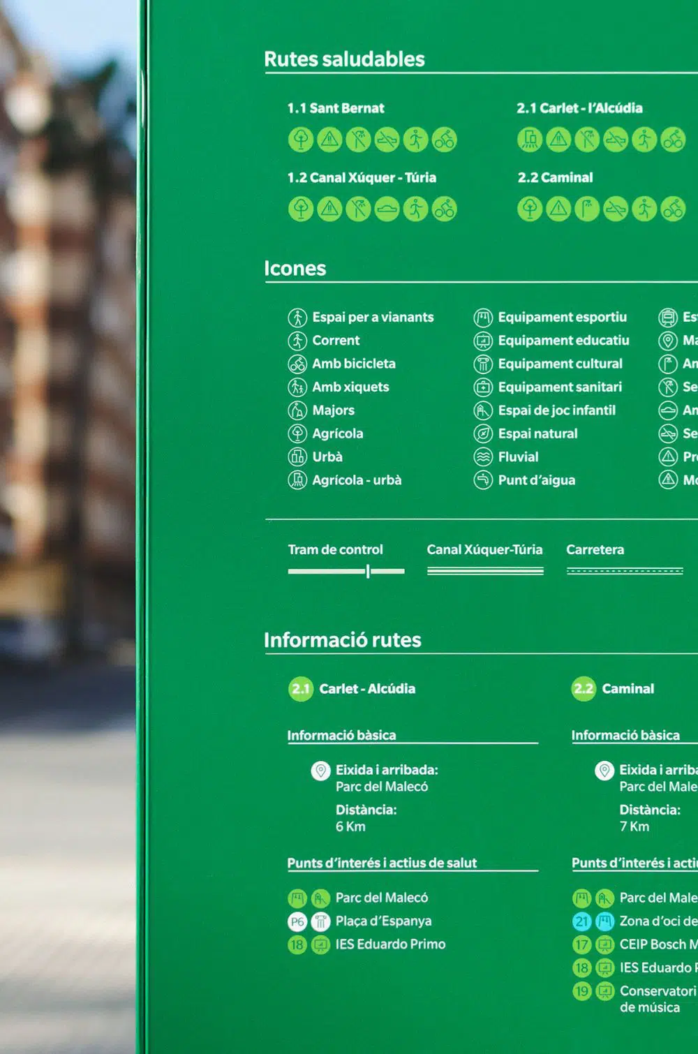
This system of signages was developed for people to travel around the city. It includes a wide range of icons that are mindfully designed and placed into the signages carefully. It was a great exercise as it made the way of finding easier and places more accessible around the city of Valencia.
Signages are essential when it comes to wayfinding, as well as informative guidance. They inform you about what is around, but they also add to the visual identity of space/brand. While designing signages, one much always keep in mind the brand’s essence, the concept as well as the motive of the signage. Once all these three criteria are sorted, one much focus on the visual language that runs throughout the space and designs your icons/logos/pictograms accordingly. Signage design is a tough job as it requires a lot of technical as well as graphical knowledge.
However, one can quickly develop their signage system using the various applications and imagery available online. Whenever necessary, you can always take influence from these existing signage and typography projects and create your own set of designs. However, in the process, make sure you do not forget the primary purpose of your signage designs!

Beautiful and Creative Signs Collection. I am also running a sign company and always follow your blog for new inspirations and trends. Keep sharing the Good Stuff.
PLS SEND PHOTOS UPDATED IN SIGNAGES
Stunning signage projects. Anyone can choose the design as an example to work for their own. I love the #26. Creative one.