I was talking to a friend earlier today who works for a large design firm and he admitted to me that he’d never make it as a freelancer. His reason was based solely on the amount of time it took him to find the perfect font for everything. That lead to a rather interesting conversation about important fonts are to a site, the most creative layout backed by some amazing imagery could all be lost on a standard Times New Roman font if it didn’t work with the rest of the design. Let’s take a look at some examples of sites that derive the majority of their design elements from the typography.
There are several ways to implement typography in a site and really make it have an impact on the site. Whether it’s a different font, increased size, or different color, implementing words on your site shouldn’t come across as a chore, or something that you have to tuck away and hide somewhere so that it doesn’t obstruct the look of all the other images and visual elements. It should be viewed more as another layer of the design tree, and something to help emphasize other aspects of the site.
Here’s a showcase of websites that use huge typography. Using large fonts on your website can attract attention, and can provide a simple and easy to use interface. Plus you don’t have to worry about the text being readable (unless its in a completely crazy font). Please click on each image to view the website.
Earth Hour
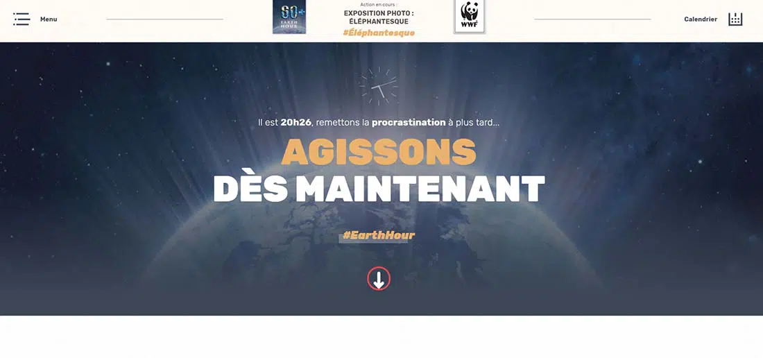
Earth Hour has a nice balance of typography and imagery. The overall design elements of the site are drawn from the oversized text, the images just help balance it out, as to not overwhelm the first time viewer of the site. You’ll notice they also don’t overdo it with the number of different fonts that they used, just as the fonts don’t drastically clash with each other.
Janne Koivistoinen
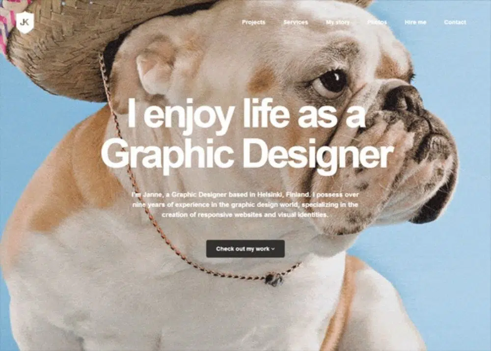
Janne Koivistoinen’s website is a great responsive website with huge typography. The different background colors also help liven up the site as well. The designer did a great job of blending the fonts, as you will notice there are quite a few, but they all work together. A great site and very well thought out.
Get Finch
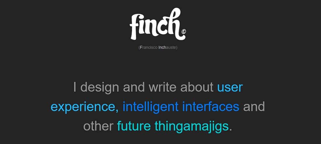
Get Finch is a business card website that not only uses big typography in its logo but also to present details about Francisco Inchauste.
Stuff & Nonsense
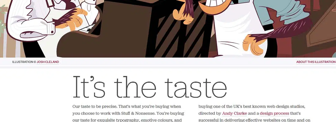
Besides the huge illustration that gives a playful touch to the interface, Stuff & Nonsense also uses huge typography to a lay out a motto. The fact that the fonts are easy to read also takes the strain off your eyes, not to mention brain, when trying to decipher what the text says.
Sibling Rivalry
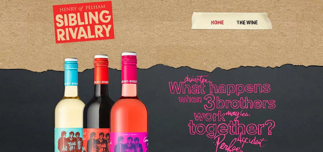
Sibling Rivalry is loaded with all sorts of fun fonts. Again, not a ton of images on the homepage, but a lot of fonts and they’re in a wide variety of colors. All of these things work together nicely to make up a perfect blend, not something you’d expect from three brothers. But if you read some of the text on the homepage you’ll understand how fitting it is and how well the designer was able to capture their philosophy and attitude, then portray it in this design.
Typographica
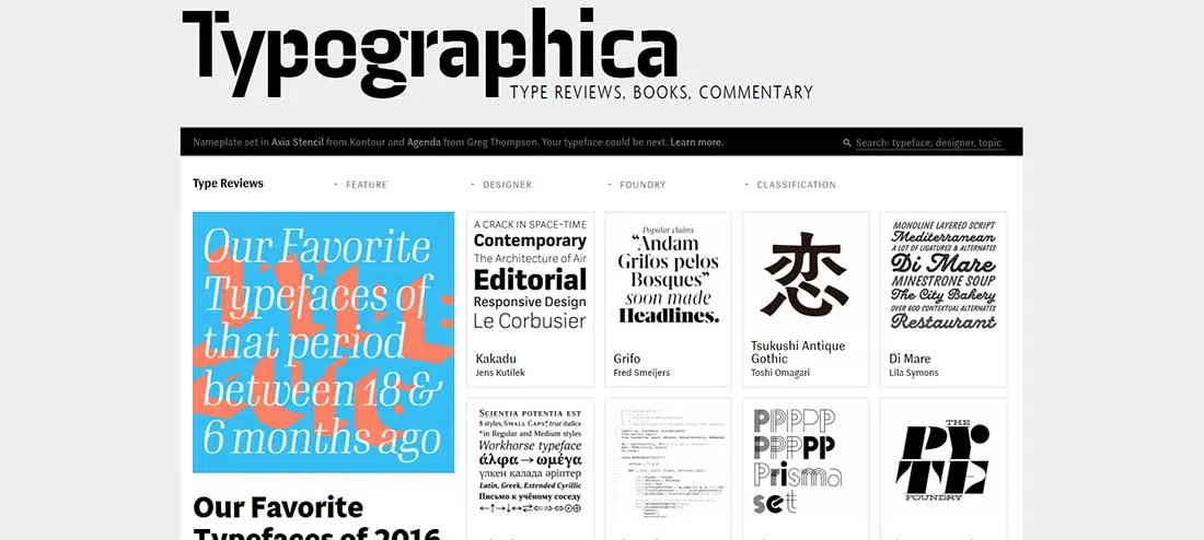
With a name like Typographica one would think that it would be oozing with all sorts of cool fonts. It certainly doesn’t disappoint, that’s for sure. I think one of my most favorite elements of this site is the somewhat subtle and almost hidden nature of their top level, main navigation. At first glance, I thought that “Typographica. Type Reviews, Books, Commentary,” was simply the company name and tag line. But all it takes is a simple hover to realize those are all links.
Aiga
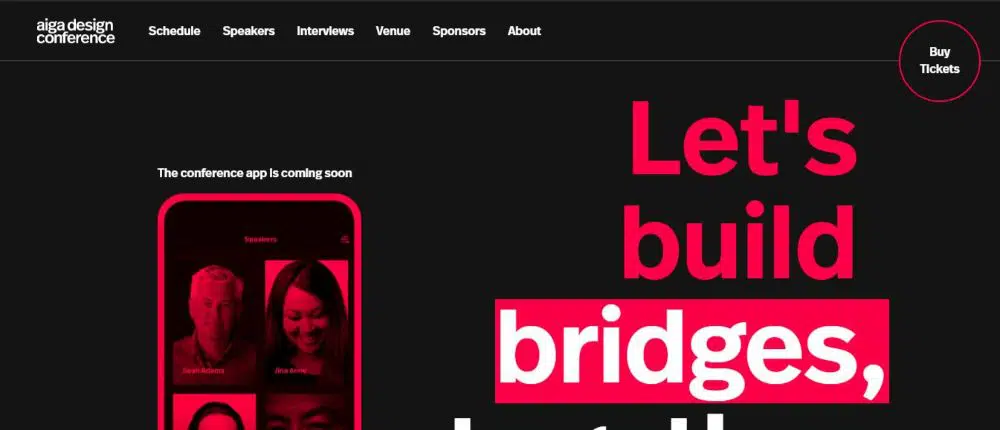
Aiga is excellent for creating headlines. This way the visitor will know right from the start what the article is talking about. Large blocks of text dominate the site with similar toned images to complement the overall look. You’ll also notice that the fonts aren’t anything crazy, just clean, simple, and pleasing to look at.
What A Lovely Name
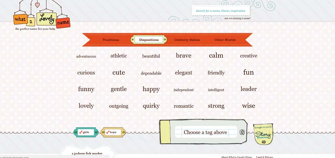
What A Lovely Name is a fun site featuring good use of typography. It carries the fun, a baby theme that surely gets expecting parents excited as they begin the quest of coming up with the perfect name for their child. You’ll notice that rather than relying on several different fonts to add character to the site they simply relied on various sizes, very clever.
We Shoot Bottles
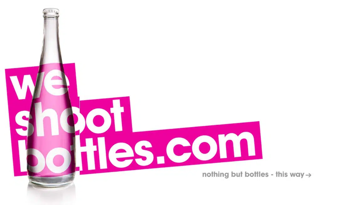
I think you’ve seen this website plenty of times now. It has a unique, simple design with huge typography and nice, pink accents. Their choice of fonts works nicely. It’s a great balance of fun and professional, giving them the upper hand over other media service sites that look just like all of the others.
Huge Inc
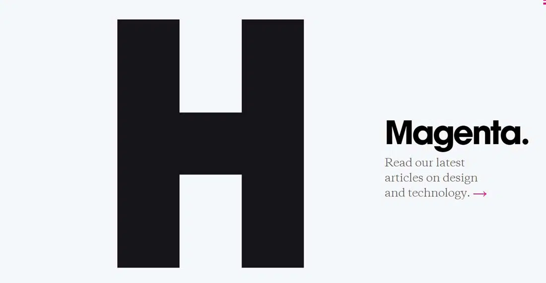
Huge Inc uses HUGE typography for its homepage. The text is nicely positioned and the overall website has a great design. And you really can’t missed the enormous letter H on the home page.
Blindbarber
Simple yet very appealing, this full-screen website uses large, bold typography to spread its message. Want more large typography websites? Read this Great Typography in Web Design post.
Big Youth
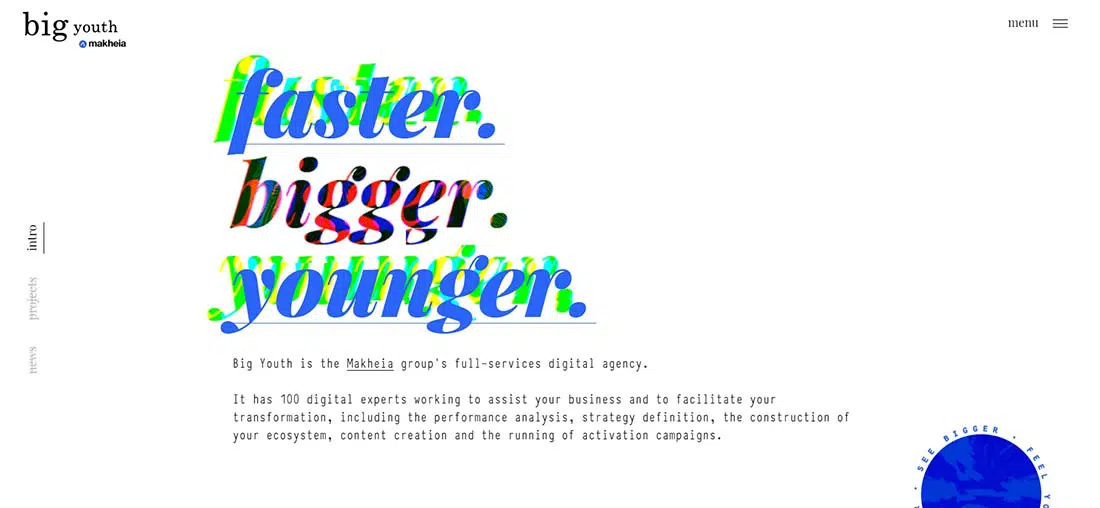
Big Youth is yet another good example of using huge typography in your web design. It also has a friendly interface and presents content in a creative way through animations, collage illustrations, and thumbnail galleries.
Aftershock
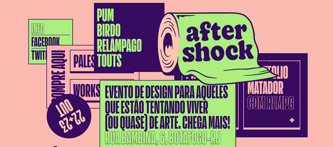
Aftershock has a very creative interface design that uses typography and illustrations in an interactive way. Their choice of fonts works nicely with the doodle drawings in the background.
June Cloud
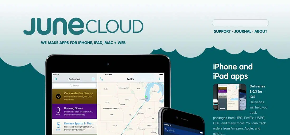
June Cloud’s website uses large typography on header texts. The website is pastel colored and has some really nice illustrations. You’ll notice that rather than relying on several different fonts to add character to the site they simply relied on various sizes, very clever.
Gradshow
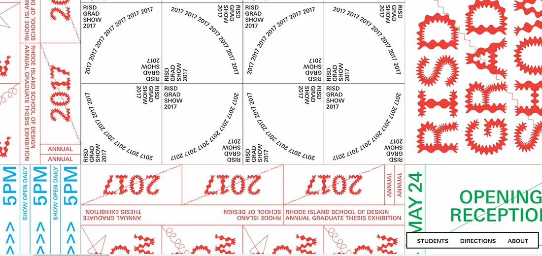
If you’re a fan of Rhode Island School of Design then you might want to have a look at their awesome website. This website uses typography in all shapes and sizes and focuses on presenting 2017’s graduate thesis exhibition.
Chris Biron
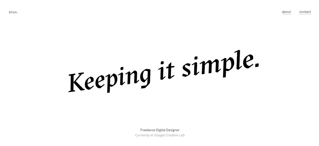
This example is Chris Biron’s portfolio exhibition that keeps things simple, as his motto suggests, and presents all the work he’s done until now. It uses typography at the beginning of the presentation to make readers curious, followed by huge thumbnail gallery and ends as it started, with typography.
Languagemedia
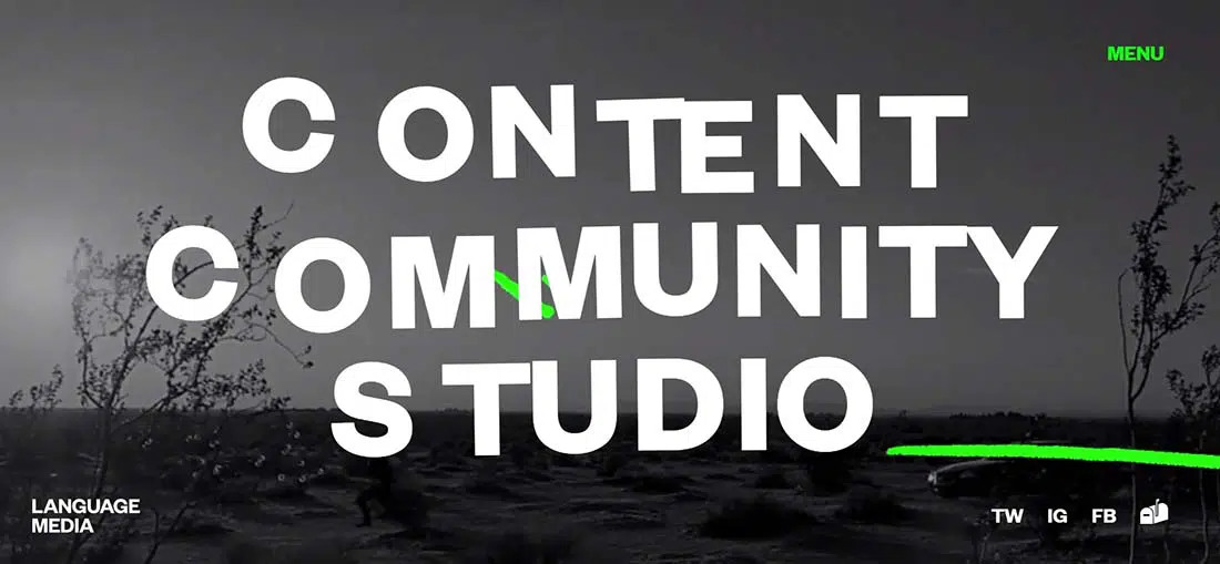
This company focuses on language media and they have a really cool website that uses huge white typography on a horizontal band of animated clips.
One Design Company
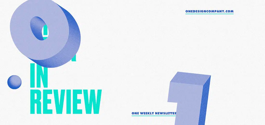
This example could serve as good source of inspiration for future projects thanks to the hard work and creativity that was put into this web design. They use bold colors for their huge typography and animated illustrations which give this website a friendly vibe.
Salford Stories
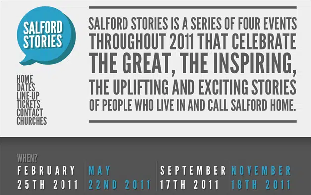
This website is a great example of how typography can help you spread your message in a very creative and original way. With just 3 basic colors, this website is very attractive and has really nice graphics.
Vermont
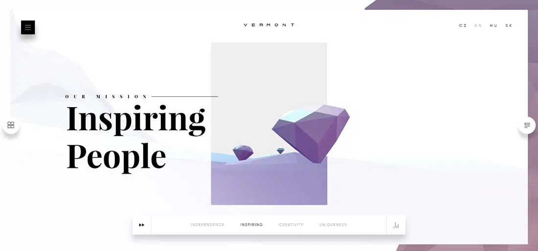
With a neat and elegant design, Vermont’s website can be a great source of inspiration. They represent premium fashion brands and their aim is to inspire and offer confidence to their clients, but not only!
CWR Solutions
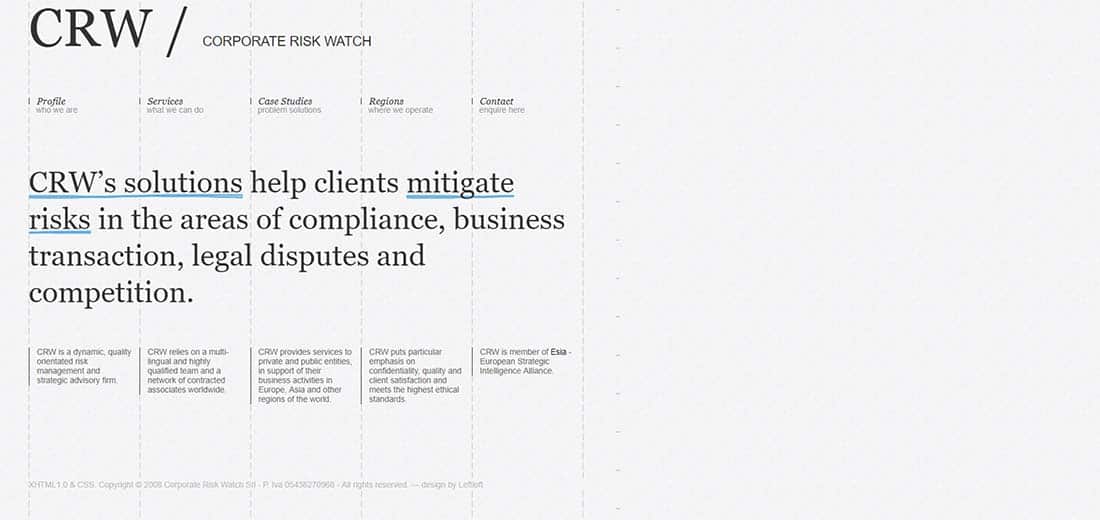
With a light gray background and both huge and regular typography, this company’s website presents content in a neat and classy way. This is a great site and very well thought out.
Polargold
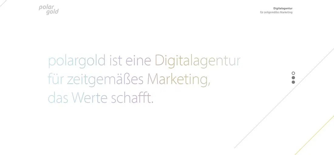
Polargold mixes minimalist design with huge light-colored typography to present content to their followers.
Galpin
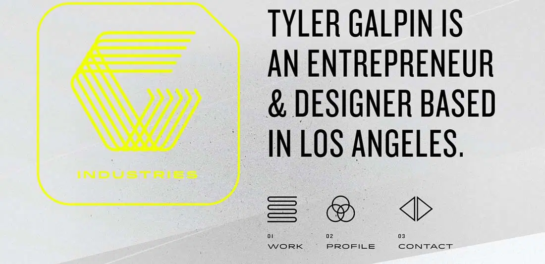
Galpin has a vintage feel because of its graphics and typography. It is mostly monochromatic with just a small insertion of color, placed just perfect in order to emphasize important elements.
Artless
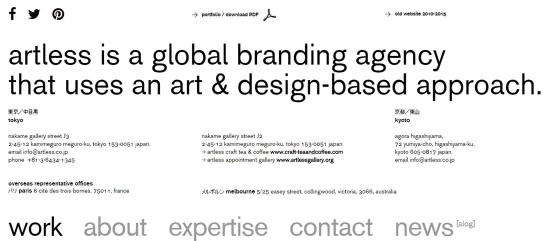
This unique, huge font is a great, unique detail element for this website. The overall layout is very simple and clean.

lovely resource of design.
Love Ben Lind’s design.
These are fantastic! If my next book sells…i might go with one of these designers
Fat, fresh and funky – just the way we like it at 1980×1020
very nice and interesting! i’ll take some ideas for my future sites!
Great post. I have gone through a bad partnership a few years ago and it is nice to hear that I am not alone.
Love this… thnx for sharing!
SUPER HUMUNGOUS
One other thing that is just a wee bit too large for my tiny mac laptop screen…. that popup, which is very difficult to push the ‘close’ button
Tweak it. Blessings, Debby
fantastic works!!
these are really nice works..thanks for sharing
I love typography and web design so seeing them used together is great! This is a good collection!
great collection
thanks
Nice list ..
ben lind is very nice.
Love the list.. great source of inspiration.
Thanks for sharing!!!
I love Francesco Mungai’s site for sure 🙂
Yeah it looks like they stole it from you.
Love this post, so creative!
Thanks for the feature! Nice list, glad to be part of it!
Love the typography used on Francesco Mugnai
nice stuff love big type
I just like large Fonts, it makes every thing nice and simple
Wicked! I love type.
The email newsletter of MyFonts always impresses me when I open it.
Thanks for the mention! You have a great list here.
Very cool idea. Firefox does also i think…
Thats’ an awesome post! Love scarlet bits by the way 🙂
very nice 😉
Ben Lind is top idea
thank you….
I am a big fan of huge typography in web design.
And this post inspired me to include this kind of type in my next WP theme…
Thanks!
what a strange designs !!!