Minimalism is now a well-established trend among designers and it is perfect for portfolios. Minimalist portfolio websites are great for showcasing your work. Here are 10 minimalist portfolio websites to inspire you.
Tim Brack
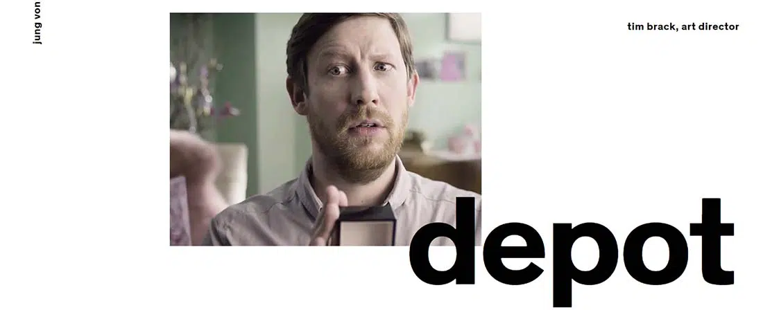
Check out Tim Brack’s website. He is an art director and this is his portfolio website. His website is a good example of minimalist design. It has a white background and huge black typography. If we take a look at how he presents written content, we can notice that some keywords about him have a light gray color. This makes the important aspects of his life and work stand out and represents a good manner of presenting content to followers. If you’ll keep scrolling you’ll start seeing his portfolio. Each work has its own huge thumbnail representative image and huge typography for its title. This way he continues the design idea he used at the beginning of the page. The gallery thumbnails follow the same vertical line and it ends with a horizontal dark band with white huge typography and light gray keywords. This is an example worth following and a good source of design inspiration for future projects. This is a really great idea of using your portfolio website to attract new clients by showing them only the strong and important aspects of your work. This specific design requires a great taste in typography and simple yet convincing images.
Bekka Reese
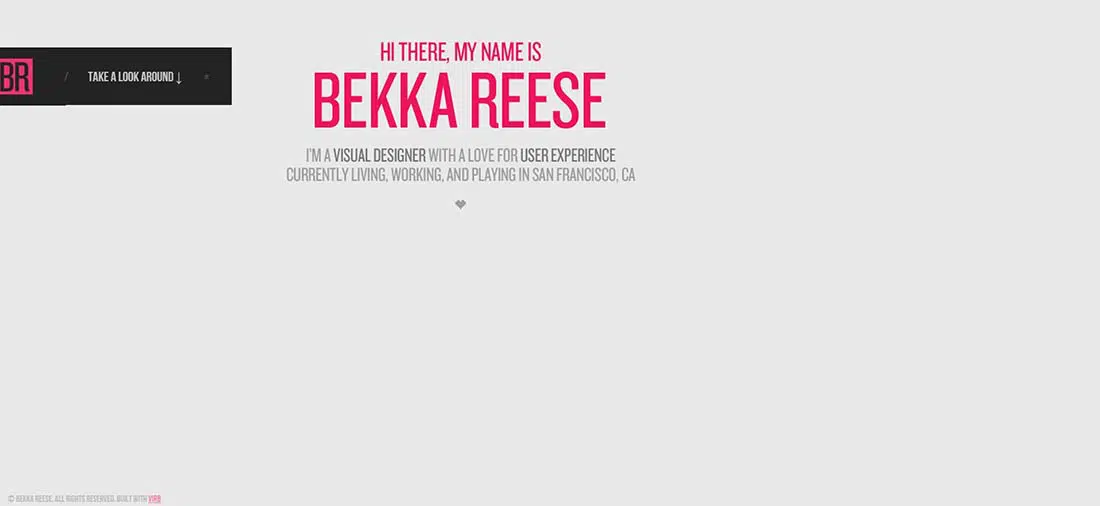
The next example might look at first as a personal business card website that presents Bekka Reese. It uses a light gray background and huge pink typography for her name. She starts with saying ‘hello’ and presenting herself, making the interface friendly and establishing an indirect connection to her followers. This website’s way to navigate through her portfolio is what seems to be a menu bar but is, in fact, a button. Click on ‘take a look around’ to see her works presented through huge thumbnails. This is yet another example you might want to follow and which can serve as good inspiration for future projects. The main idea of this portfolio website is to keep things simple and pick only one, specific color that can successfully represent you and your website. By keeping the background simple, the photos can stand out and make a huge impact on the viewer, especially for clients that might search for the kind of work that you create.
The Touch Agency
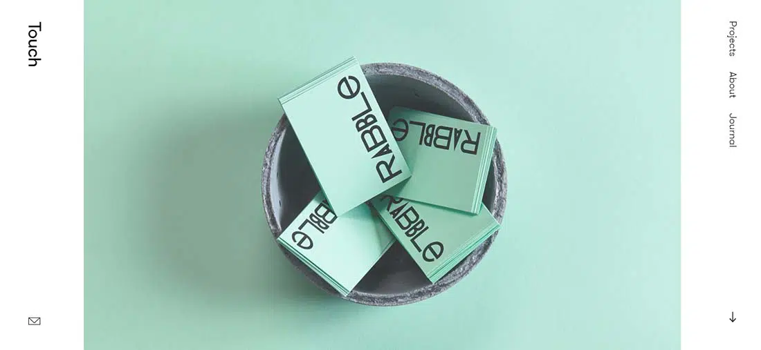
The Touch Agency is a multi-disciplinary creative agency based in Edinburgh, Scotland. They have a horizontal slideshow band with bold blue images. Scroll down to start seeing their portfolio that also uses huge thumbnails and follows the same vertical line. The background is simple and white making all those good-looking projects stand out. The main idea when you create this kind of minimalist portfolio website is to keep the images as simple as possible. This way, you’ll create a strong effect on the viewer that will focus mainly on your work and won’t get distracted by other details. Touch Agency’s website is a great example for this. Their website and their works prove the vast experience in this line of work.
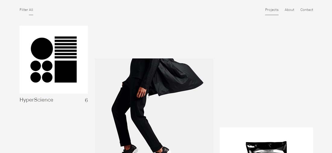
Manual
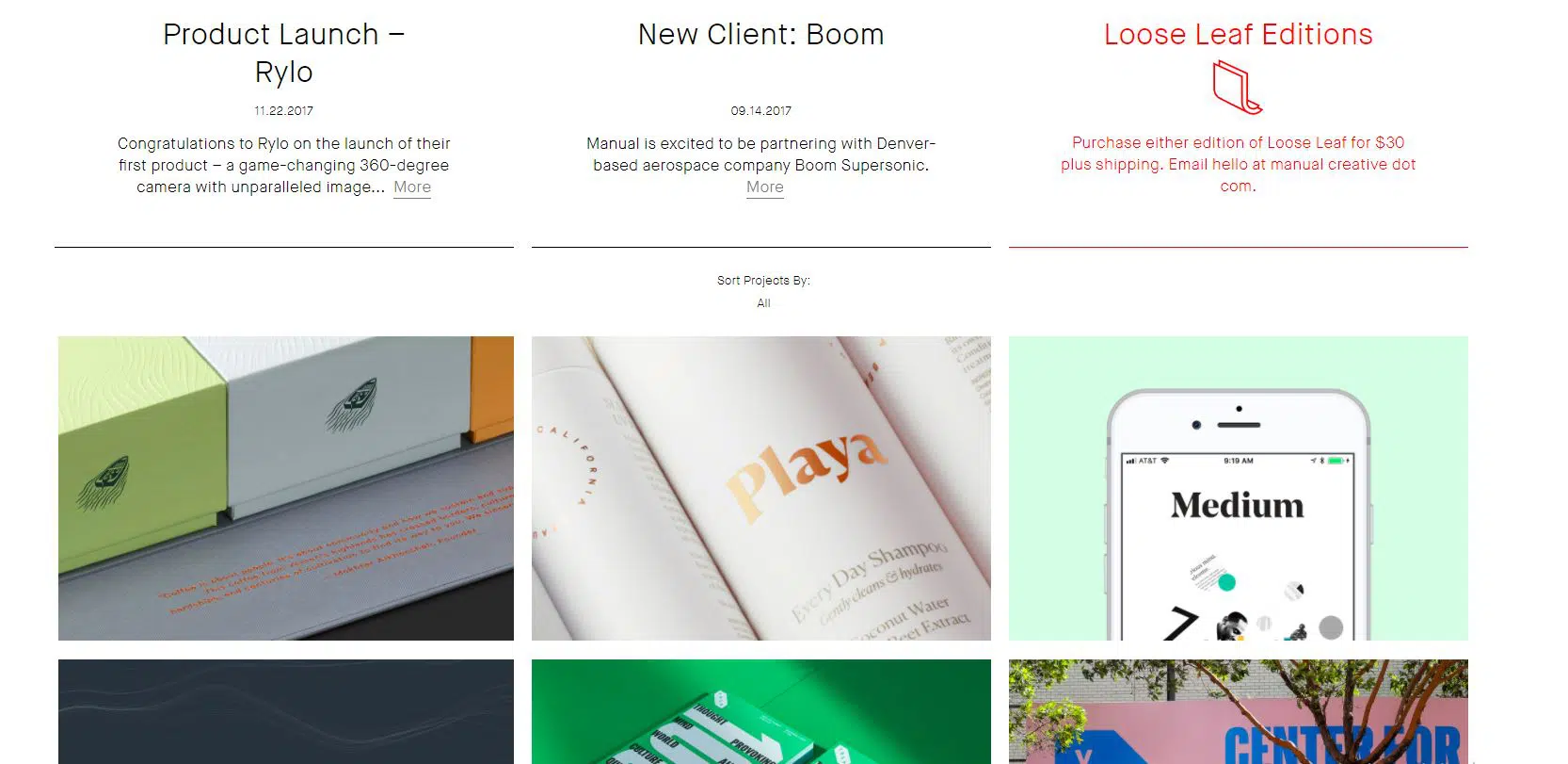
Manual is design and visual communication studio in San Francisco. They specialize in brand identity, art direction, packaging, print, and interactive design. They have a simple grid-based layout for their presentation website and a white background with a very minimalist and clean design. They also use big thumbnails but they are smaller than the previous examples we have seen. This minimalist website also makes great use of simple, thin lines that separate the text from the images. The main page starts off with the possibility to click on their reel video, but if you scroll down you’ll start seeing the actual portfolio images which you can also sory by category. Once again, the images are clean and simple and they have bold colors and compositions that make this website stand out from the crowd.
Sam Dallyn
Sam Dallyn has quite an eye-catching portfolio, designed in a minimalist way. His website has a light gray background that works perfectly with all the projects he has done over the years. Sam Dallyn works in art direction and design – crafting experiences and seeking to make the complex clear and beautiful. This is yet another example that uses large thumbnails but in this case, they do not follow the usual vertical line we have seen in previous examples. They follow the same diagonal repeated over and over again giving its web design layout a much more dynamic touch. Every image has a simple text near it in order to make everything clear and simple for the viewer. What makes everything even more minimalistic and amazing about this website is the limited color palette used for the photographs. This website features mostly black and white photos. If you click on any project, a turquoise screen will appear until the page is ready. This makes for a great chromatic impact.
Kyle Thacker
This is the design portfolio of work done by interaction designer Kyle Thacker. He works to synthesize and develop designs through research and prototyping. He has a unique website design with an interesting, user-friendly layout. His website can be a great source of inspiration for future projects because it has such a clean, minimalist look. The first thing we see when we access his website is a short description of his current interests and past work and CV. Then we can see the services this designer has to offer. A very nice detail of this website are the small, flat illustrations placed on the pages that perfectly match the colorway of the text and background. The client can click on any of the services and will be taken to see the actual portfolio.
Ignacio Macri
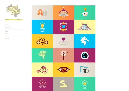
Ignacio Macri is a graphic designer and illustrator from Mar del Plata, Argentina, He has a very colorful website with a minimalist design. He uses a grid-based structure to showcase his most recent works. The best part of his portfolio website is the striking illustrations that use simple shapes but bold colors that catch your eye immediately. The playful aspect of this website matches the designer’s style of working. When you click on any of the illusrations, a simple page will open with the full logo or project. This is an excellent example of how a website can be minimalist and also use lots of colors.
Mickaël Larchevêque

Mickaël Larchevêque (aka dotmick) is a French Interactive Designer. He has a simple, minimalist portfolio website with a round shaped grid-based layout and a light gray background. His website might seem all black and white but try hovering your mouse on those circle thumbnails and watch them get colored. This little detail creates a really strong impact on the viewer. When you move your mouse around the main page you can also see some subtle animations that connect the main dots. This aspect says a lot about the fact that the owner of the website is an interactive designer. This is a great example of how to use simple interaction and movement on your portfolio website.
DB Works
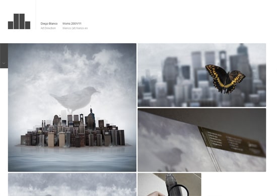
Diego Blanco Art Direction is a portfolio website with a minimalist design. It’s a one-page website which presents some really impressive works. You have to scroll down to see all his beautiful works. This example can serve as a good source of inspiration for minimalist projects but not only. You might also want to take a look at his works that prove his creativity and vast experience in his field. The best part of this website is that it features a great amount of work so that everytime a client enters his website, he will be sure to find at least one item that he likes. His work is flawlessly presented with simple images and is separated with the help of some white lines. The white background makes it simple to focus on his projects.
Jessica Caldwell

Jessica Caldwell is a freelance consultant living in Portland, OR. She specializes in front-end web development, specifically HTML5, CSS, jQuery and more. She has a super simple and clean website design for her online portfolio. She also uses angled shapes and graphics in the design of her landing page. Her work is divided into categories to make everything easier for the clients who enter her website. When you click on any of the categories, a vertical scrolling page appears with nice and simple images that illustrate her work. The social icons on her main page are also very noticeable and they stand out because it’s important to make it easier for your clients to contact you any platform they might like.

Minimalism is really fantastic, I’m sure this would be the future and it happened, it will be a revolution. I love it.
Mickaël Larchevêque web looks so nice…
These are really cool if the objective is for a portfolio driven site as you stated. Good crisp designs that showcase talent
Some Great sites there ! Kyle Thacker and DB Works would be on the top of my own list.
Feel Free to let me know what you think of my own site :
designby-dan.com
Critiques are always welcome.