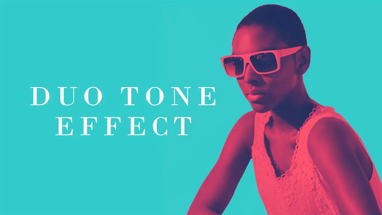
Gone are the days when images were used exactly as they were minus some minor retouching. The good amalgamation of digital art and perfectly clicked images is Duotone. Using two colors, good efforts are put behind to tone the image and create beautiful duotones.
Duotone finds a lot of application in websites also. A website without images is like a body without a soul. Presently, web designers use a blend of images and content to craft bespoke website design. The website looks amazing and lives with the use of photography and typography. The designers use a mix of images and content to decorate and enhance brand identity.
Creation of web design is a long process and it becomes fun with these designing tools. You can enjoy the process of designing with a number of design tools available in your design armory. The Duotone effect is one of the most important designing tools for creating the best website designs.
Duotone Effect – What it is:
As the name itself suggests, Duotone is the use of two colors in contrasts for designing. It is used to recolor the grayscale images with two colors in contrasts to separate the darkness and lightness in the image.
If you are in the search of something to kickstart your designs, then duotone effect is a great way to start. It is important to understand the history regarding the origin of duotone effects. Knowing about the background of this design tool will allow you to use it in the best possible way.
Let’s begin with the History of Duotone:
The history of duotone effects begins from late back in the nineteenth century. Duotone effects came into existence with the use of cameras. It first appeared with the use of sepia photographs. Sepia photographs were created using the different shades of brown colors partially to preserve and warm-up the undecorated appearance of the humans in the grayscale industrial era. It was one of the most commonly used tones to provide an antique look in the photographs.
Duotone effects emerged as a good cost-effective solution for colorized printing. Rather using the full-fledged CMYK range of four color tones, they were using duotones for the bulk printing of materials at a very low rate. The poster designers of ’60s and ’70s were using the duotone effects and created peculiar high-contrast designs to highlight the mind-blowing effects.
Apart from the lower costs, the duotone effect adds an artistic element to the image. Graphic Designers were using this effect as a cheaper printing option due to the use of only two colors of ink. Today, duotone has reached to the new heights with its increasing use for website designs.
Duotone is the New Trend for the Digital Platform:

Nowadays, Duotone effects have gained popularity in the digital design world. The reason behind the popularity is not the low printing costs, but their ability to create bold and aesthetic designs for different digital platforms.
There are many reasons behind the rise of duotone effects in the digital era. One of the most important reasons is the use of duotone effects for online promotional campaigns. Duotone effect is on the list of trending design tools due to the idea of using it to design images for promotional campaigns.
But even before that, Facebook and Instagram had already given us the taste of duotone effects with the image filters. While we were busy with the image filters, designers came up with some exciting ways of image toning.
Applications of Duotone Effects:
Duotones are an amazing way of re-toning the images for versatile designing projects. It is used in different ways to enhance the design. Here are some of the most commonly used methods for the implementation of duotone effects.
1. Duotone for Background Images:
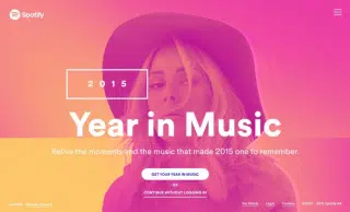
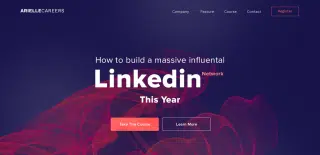
Mostly, designers use the duotone effects for the background images to enhance the visual attraction. With the addition of duotone in the background, the image attracts the attention of the audience towards the header. Rather using a multi-tone image, designers prefer duotone to highlight the pop-up buttons and textual content with a reduced color scheme.
Graphic Designers use duotone effects for designing logo and mock-ups. They mute the background image by toning it with appropriate color and overlay the logo on the image for a better impactful look.
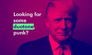
2. Focal Point of the Design:
With the use of duotone effects as a focal point in the image, it gets slightly different. Duotone is perfectly compatible as the focal point of the image because it highlights the key elements of the images. You can use the duotone effects to attract the attention of your audience.
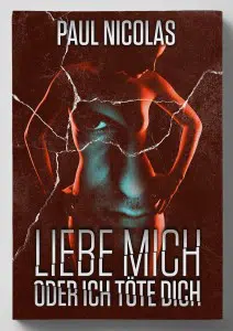
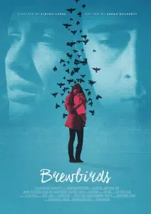
The duotone effect gives a striking look to the images with the use of two colors. It becomes easy to highlight the important feature of the image with duotone effects. Mostly, duotone is best suitable for book covers and posters.
3. Slice it with Duotone:

Sometimes duotone effects don’t result in the design that you want. So to avoid that risk, use the stripe of duotone colors for perfect image colorization. It also creates a follow through guide in the image by adding a diagonal stripe. These designs can look highly attractive once printed right.
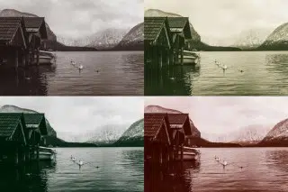
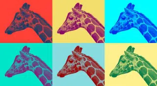
4. Attractive Split Tonal Images:

Photoshop has improved the use of duotone effects in contrast to the outdated ways of designing. Designers can apply the duotone effects in a much more creative way. The split tonal images portray the images in a much better way with the use of dual shades of contrast colors. You can break the visual ice of traditional duotone designing.
Getting the Effect Right:
Though there a hundred of mobile applications which offer the filters for duotone, getting a perfect design needs to be done in a more disciplined manner in Photoshop. Follow the simple steps and use your brain to get the perfect color adjustment for your design –
- Select the right images. Though duotone can be applied on all images, all images may not look good with this effect. So choose the right image to apply this effect based on the colors, light, and shadows in it.
- Convert the image into grayscale. This can be easily done using the Black & White tool of Photoshop. Adjust this effect right based on your image.
- You need to create a good difference between the parts of images you want in different colors, so work on increasing the contrast. This again can be done by simply using the Brightness & Contract filter. The Level & Curves adjustment filter is a more powerful way to achieve this. Try and eliminate midtone grays and make your highlights high while keeping the shadows low.
- Select the perfect colors. This is the most tricky part of this effect. Choose the right set of colors to apply this effect using the gradient map adjustment filter in Photoshop. Generally, you should opt for a contrasting set of colors. Experiment a bit with the colors until you think you have got the effect pixel perfect.
Wrapping it up with the Right Design:
Duotone effects are a remarkable designing technique which can be used for any kind of designing. The most important feature of duotone effects is creating bespoke contrasting designs for better attraction. It reduces the number of colors to two and adds a striking factor into the image. Even with the contrast of two colors, the designs look good with image background. You can create legible image designs with duotone effects.
Duotones are the all-time favorite designing tool for graphic designers. They are going to experiment designing with duotone effects for a long time. So if you are looking for a strong design technique to create attractive designs, then use the charm of duotone effects.
