A website’s design breathes life into a website. There are so many websites with different kinds of layouts. And a website layout is made up of colors, images, content, and videos. These things can be qualified as website content. A website layout is the bones and the skeleton of the website that decides the location of the website material. It is responsible for arranging the elements of the site on a webpage.
A well-defined website layout can enhance the browsing experience for a user. It can lead to intuitive navigation to the website and encourages user engagement.
Moreover, a good website layout determines and controls for how long the user stays on the page. It also affects the number of pages they visit and how often would they visit the website. A website layout divides a website into headers, menu, content, and the footer of the webpage. There are many different types of layouts available for designing the website structure. But, we will follow the given structure in the image and write the code accordingly.
1. Header:
A header defines the topmost part of a web page with the company logo and navigation menu. It is a strip across a webpage that also maintains contact information and other information about the website. A good header makes your website easy to navigate along with the brand establishment. It also focuses on creating a good browsing experience throughout the entire site.
There are two types of headers: Fixed and Floating. A fixed header stays on top of the webpage, while you are reading something at the bottom. A floating header follows you around the screen as you scroll up or down the page.
The regular feature of the header contains the logo of the company, navigation, and title of the page. In some cases, the header may also feature a search bar, shopping cart, login/logout button, user profile, user notifications.
Below is the code for designing a simple header:
<!DOCTYPE html>
<html lang=”en”>
<head>
<title>CSS Website Layout</title>
<meta charset=”utf-8″>
<meta name=”viewport” content=”width=device-width, initial-scale=1″>
<style>
body {
margin: 0;
}
/* Style the header – this creates a style for header*/
.header {
background-color: #f1f1f1;
padding: 20px;
text-align: center;
}
</style>
</head>
<body>
<div class=”header”>
<h1>Header</h1>
</div>
</body>
</html>
A navigation bar is a collection of structured links that help your website users reach the pages of the website and navigate through them. The navigation menu is an element of a user interface that connects the pages of the website. A navigation menu is generally available on website pages. It means that a navigation menu displays on either all the web pages or only on the selected ones.
Usually, the navigation bar is horizontally placed just below the web page’s header, before the content of the webpage begins. In specific designs, the navigation bar is vertically set on the left or right side of the webpage. Here, the navigation bar is known as a sidebar as it appears on the “side” of the main content.
Being the most important part of the website, navigation through the website becomes difficult in the absence of a navigation bar. You have to click the back button to reach a certain page. But, thankfully, the website navigation has been standardized in recent years. Nowadays, it is difficult to find a website without a navigation bar. Let us look at the CSS code behind designing a simple navigation bar:
/* The navigation bar container – this is the strip that contains the navigation*/
.topnav {
overflow: hidden;
background-color: #333;
}
/* Navigation bar links – Links to the different pages of the website*/
.topnav a {
float: left;
display: block;
color: #f2f2f2;
text-align: center;
padding: 14px 16px;
text-decoration: none;
}
/* Links – Links change color on mouse hover */
.topnav a:hover {
background-color: #ddd;
color: black;
}
A navigation bar container is a box that contains the navigation of the website. Links of the navigation are available in the navigation bar links. These links, when clicked, take you to the selected webpage in the website. There is also a code where you can make the link color change when the mouse moves over the link.
3. Webpage Content:
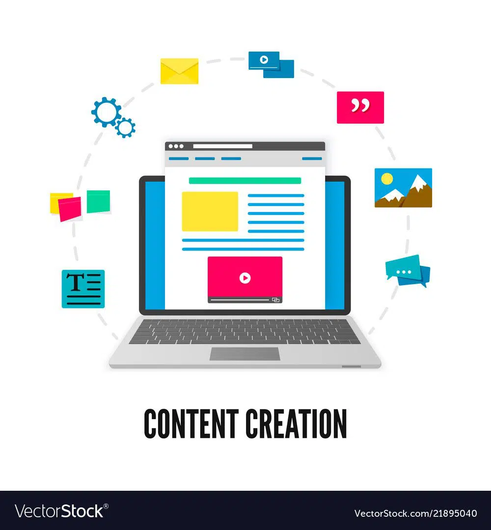
Content is the group of things that you see on any web page, which is between the navigation bar and the footer of the website. The layout of the content is often dependent upon the user for whom the site or a web page is on target. Mobile browsers use 1-column web content. The 2-column content layout is on target for the websites on tablets and laptops. And a 3-column website layout is used by the sites that are on target for the desktop computers.
Webpage content is not limited to only text content. Webpage content can be anything ranging from videos, audios, images, and graphics, including the text. These days, web content can also include posts from social media platforms like Instagram and Facebook. Blogs also qualify as the webpage content.
Let us take a look at the code to create the webpage content layout.
/* This creates three equal sized columns that is placed besides each other */
.column {
float: left;
width: 33.33%;
}
/* Clear floats after the columns */
.row:after {
content: “”;
display: table;
clear: both;
}
/* Responsive layout – makes the three columns stack on top of each other instead of next to each other on smaller screens (600px wide or less) */
@media screen and (max-width: 600px) {
.column {
width: 100%;
}
}
If you want to create a 2-column layout, you have to change the width to 50%. It means that the screen space divides into two halves. To create a 4-column layout, you have to set the width to 25%. Hence, if you have only one column to create, for mobile devices, you have to specify the width to 100%.
Unequal columns:
It is not necessary to have equal-sized columns for your webpage content. You can have different sized columns on a webpage where the main content is in the more massive column. And the small column can contain other content like ads, images, social media buttons, or sidebar navigation. The enormous column is there to specify the main content on any webpage. Of course, it is not necessary to follow this exact pattern. Some web design buffs have changed the layout, and the results have been tremendous.
You can edit the column width to any number. But the only thing you remember is that the column widths’ total should be 100%. We will look at the CSS code to create a more substantial column in the middle with two smaller columns on each side of the middle content.
.column {
float: left;
}
/* Code for the Left and right column */
.column.side {
width: 25%;
}
/* Code for the Middle column */
.column.middle {
width: 50%;
}
/* Responsive layout – three columns are stacked on top of each other instead of next to each other. A different type of website layout design */
@media screen and (max-width: 600px) {
.column.side, .column.middle {
width: 100%;
}
}
Footer is the bottom-most section of the webpage that contains fine print, copyright information, quick links, and contact information. Like the website header, it uses footer to place standard information, which is not very critical to the website. Footers are known to maintain the consistency of the site as it features some of the links that you can find in the header of the website. Because the user behavior keeps evolving, it is essential to create consistency in the website functions.
To keep footer interesting, you can include a call-to-action, a contact form, a map, images, social media buttons, or the latest blog posts. These days, it has been a trend to strategically place call to action on the footer of the website. In addition to this, maps, latest blog posts, social media buttons appear on the footer. These things help a user to look at the other parts of the website as well.
Let us look at the simple footer code defined in CSS:
.footer {
background-color: #F1F1F1;
text-align: center;
padding: 10px;
}
5. Responsive Website Layout:
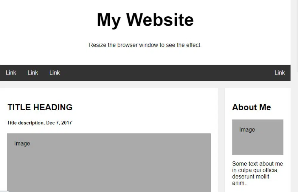
We saw the code for every element of a webpage, namely – website header, navigation bar, content, and website footer. Below is the code for a responsive website layout that changes between the two columns and full-width columns. The column width depends on the size of the screen’s width.
<!DOCTYPE html>
<html>
<head>
<style>
* {
box-sizing: border-box;
}
body {
font-family: Arial;
padding: 10px;
background: #f1f1f1;
}
/* Header/Blog Title – You define the title to your header or the blog */
.header {
padding: 30px;
text-align: center;
background: white;
}
.header h1 {
font-size: 50px;
}
/* Style the top navigation bar */
.topnav {
overflow: hidden;
background-color: #333;
}
/* Style the top navigation links for the navigation bar*/
.topnav a {
float: left;
display: block;
color: #f2f2f2;
text-align: center;
padding: 14px 16px;
text-decoration: none;
}
/* Change color on hover – Links change color when you move the mouse cursor on the links*/
.topnav a:hover {
background-color: #ddd;
color: black;
}
/* This generates two unequal columns that are located next to each other */
/* Left column */
.leftcolumn {
float: left;
width: 75%;
}
/* Right column */
.rightcolumn {
float: left;
width: 25%;
background-color: #f1f1f1;
padding-left: 20px;
}
/* This adds a fake image */
.fakeimg {
background-color: #aaa;
width: 100%;
padding: 20px;
}
/* Add a card effect for articles */
.card {
background-color: white;
padding: 20px;
margin-top: 20px;
}
/* Clear floats after the columns */
.row:after {
content: “”;
display: table;
clear: both;
}
/* Footer – This defines the footer section of the website */
.footer {
padding: 20px;
text-align: center;
background: #ddd;
margin-top: 20px;
}
/* Responsive layout – when the screen has less than 800px width, this makes the two columns be placed on top of each other*/
@media screen and (max-width: 800px) {
.leftcolumn, .rightcolumn {
width: 100%;
padding: 0;
}
}
/* Responsive layout – when the screen is less than 400px wide, make the navigation links stack on top of each other instead of next to each other */
@media screen and (max-width: 400px) {
.topnav a {
float: none;
width: 100%;
}
}
</style>
</head>
<body>
<div class=”header”>
<h1>My Website</h1>
<p>Resize the browser window to see the effect.</p>
</div>
<div class=”topnav”>
<a href=”#”>Link</a>
<a href=”#”>Link</a>
<a href=”#”>Link</a>
<a href=”#” style=”float:right”>Link</a>
</div>
<div class=”row”>
<div class=”leftcolumn”>
<div class=”card”>
<h2>TITLE HEADING</h2>
<h5>Title description, Dec 7, 2017</h5>
<div class=”fakeimg” style=”height:200px;”>Image</div>
<p>Some text..</p>
<p>Sunt in culpa qui officia deserunt mollit anim id est laborum consectetur adipiscing elit, sed do eiusmod tempor incididunt ut labore et dolore magna aliqua. Ut enim ad minim veniam, quis nostrud exercitation ullamco.</p>
</div>
<div class=”card”>
<h2>TITLE HEADING</h2>
<h5>Title description, Sep 2, 2017</h5>
<div class=”fakeimg” style=”height:200px;”>Image</div>
<p>Some text..</p>
<p>Sunt in culpa qui officia deserunt mollit anim id est laborum consectetur adipiscing elit, sed do eiusmod tempor incididunt ut labore et dolore magna aliqua. Ut enim ad minim veniam, quis nostrud exercitation ullamco.</p>
</div>
</div>
<div class=”rightcolumn”>
<div class=”card”>
<h2>About Me</h2>
<div class=”fakeimg” style=”height:100px;”>Image</div>
<p>Some text about me in culpa qui officia deserunt mollit anim..</p>
</div>
<div class=”card”>
<h3>Popular Post</h3>
<div class=”fakeimg”><p>Image</p></div>
<div class=”fakeimg”><p>Image</p></div>
<div class=”fakeimg”><p>Image</p></div>
</div>
<div class=”card”>
<h3>Follow Me</h3>
<p>Some text..</p>
</div>
</div>
</div>
<div class=”footer”>
<h2>Footer</h2>
</div>
</body>
</html>
You have to write the above code in a notepad or any other available text editor, and save the file should as an HTML file with .html file extension. When you want to place the images in the webpage design, you should save all the photos in the same folder as the HTML file folder. To use the image, you should use the complete location of the image in your stylesheet or CSS file.
Conclusion:
Now that we have talked about website layout in detail, along with the code, you can define what kind of appearance your website should have. A lousy layout is bound to frustrate the user of your website and can quickly leave your site. It results in a high bounce rate, which can affect your rank on the search engine results page. Coming to this, you can conclude that you should invest a reasonable amount of time in deciding upon your website layout. Once you have decided about it, you need to determine what content belongs to which column. Moreover, a good layout helps create an emotional bond between the user and the company.

its awesome thanks
thank you this will help alot
Glad it’s helpful and thanks for visiting!