How does your website stand out from your competitors in the web space? What will further define design next year? These are questions designers ask themselves to keep up with the ever-changing world of web design. While strong search engine optimization will draw in customers, if the users don’t find the content interesting, they will not stay. What looked good to users a year ago wouldn’t work for the audiences today. These subtle changes in design that happen each year have contributed to defining the visual culture of the web we see today. Let’s dive into some trends, techniques, and tools that are being used to deliver user-friendly, impactful and meaningful web experiences.
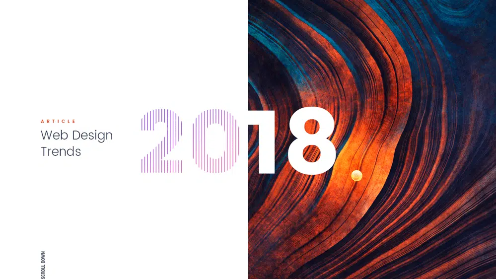
Big, Bold typography
Big bold fonts can draw in a customer with their strong presence and emotive qualities. Choosing a font with personality can help make your website stand out more in a space cluttered with generic typefaces and ordinarily used layouts. Playing with size and style and using it to enhance important words on your page is a good way to draw attention and invite visitors to read the content and in effect use other interactive elements that may be present on the page.
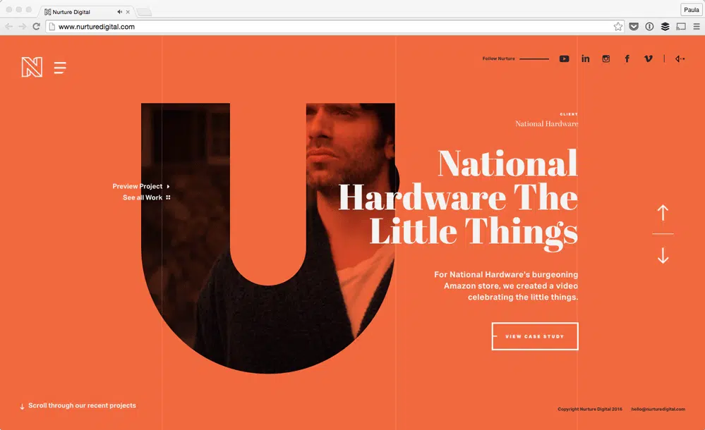
With having big, bold and variable fonts take center stage, we are able to invoke emotion from the user while setting the tone of a website. The trend of sticking to sans serif fonts in your web interfaces have made sense recently. If you look the example below, you’d be able to see how the typeface sans serif steals the scene. The trend of using contrasting typefaces on a clean background can help invoke interest and keeps the user reading your site.
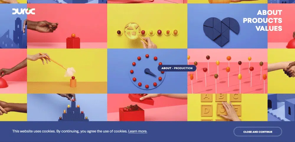
Illustrations take center stage
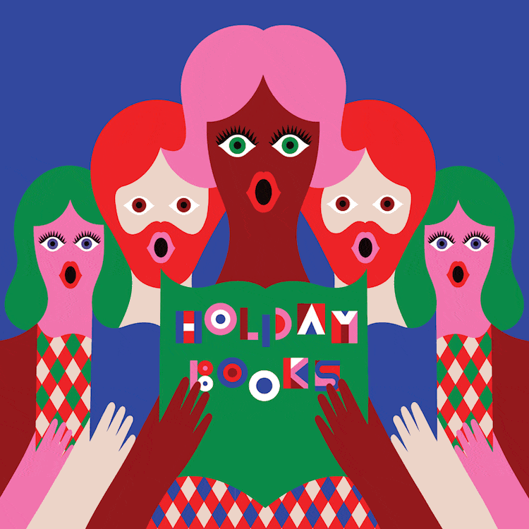
Another sure shot way to add personality and originality to your website is to apply custom illustrations in place of a photo-realistic imagery. The artwork usually comes with the power to transform the style and create an entirely unique experience for the user. Illustrations can convey an idea playfully while still communicating the story of the brand and the product. When compared to editorial/lifestyle photography, illustrations are able to reach a wider array of human beings as they are not limited by the photorealistic nature of an image. As we continue to build products for a staggeringly diverse array of human beings, it would make sense to understand the impact and usefulness of illustrations in both marketing and product design.
Broken grid layout and asymmetry
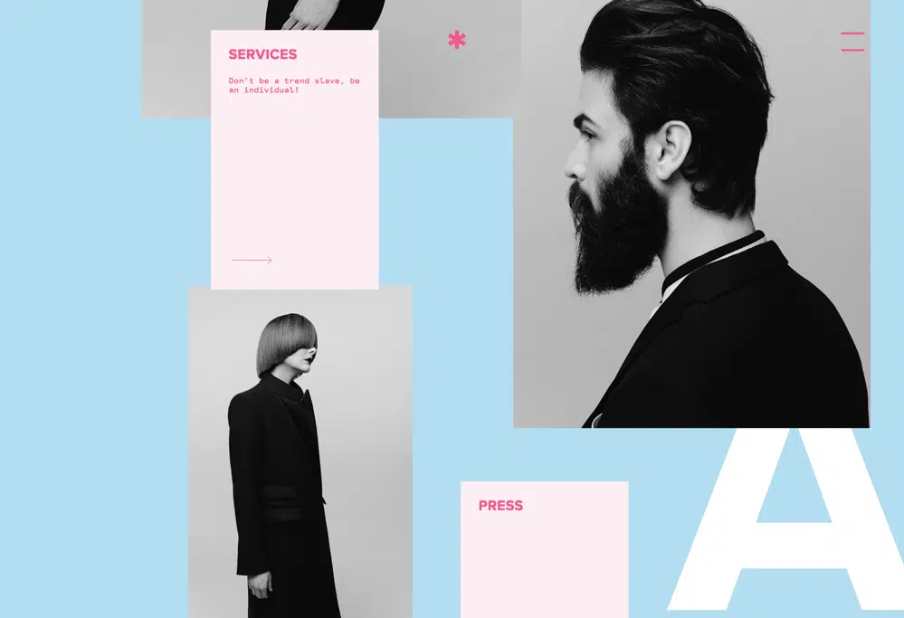
This uncommon layout option may seem less intuitive to the user but it enables a unique and unexpected user experience. The appeal of the broken grid layouts is that they can create unique, distinctive experience while giving the ability for brands to set themselves apart. This layout is an uncommon choice among traditional companies but in designers quest to create more creative and engaging layouts, the grid we’ve always relied on has become a constraint.
Micro-interactions and animations
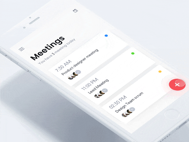
Micro-interactions are animations that get triggered by scrolling down or when the mouse is moved over a particular spot. These create a good user experience as they enable the user to interact with the site and its content. The ability to shape the design in front of you keeps the user engaged while stroking their curiosity to learn more about the website. Smaller animations can direct the user‘s attention to the right content at the right time. When done right, this means they don’t miss vital lines of a copy. Animations are a great way for users to be a part of the story of a website and are becoming more common in use around the web.
Vibrant color schemes
Bold hues, saturated tones, and vibrant shades have made their way into our mobile screens. This scheme can be useful for newer Brands as they can instantly attract the user‘s attention. While sticking with web-safe colors might work well for most brands, by being courageous with color designers can re-imagine the web space and set themselves apart. This makes a less interesting image or interface look intriguing.
Organic shapes and rounded edges
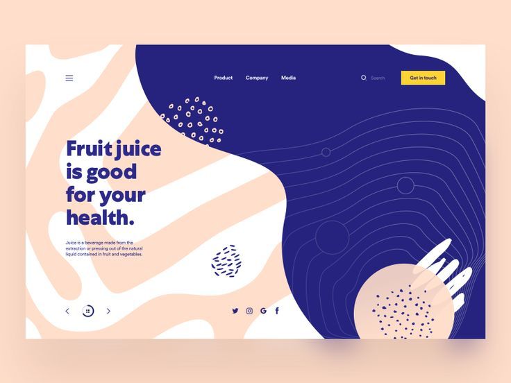
Sharp-edged and right-angled corners, exposing their underlying modernist geometry has dominated UI design for several years now. That changed this year. The emphasis of rounded corners in cards, input boxes, and profile avatars have created a shift big enough that most apps including Google, Twitter and LinkedIn have adopted this change. These subtle deviations in form have not only brought forth changes in these primary design elements but also variations in background shapes, lines, and icons.
Shadows and extra depth
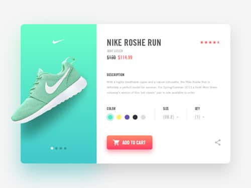
Designers are finding new ways to showcase the versatility of this simple effect. If you stick to less is more approach, the subtle use of this effect can produce dramatic results as it adds qualities like depth, dimension, perception and visual interest to your design. We have seen some exciting variations with shadows in the web space this year. With grids and unique layouts, designers are now playing with shadows, now more than ever to enhance UI interactions and digital experiences.
What do you think will shape web design trends in 2019?
As we wrap up this post with all the subtle changes in design we saw this year, we can‘t help wonder if the trends that emerged in 2018 will stay on for the coming year. If you think we have missed something and know of a design trend that will continue to evolve and make an impact the following year, leave a comment below and tell us why. We would love to hear from you!
