
Every year without fail, Awwwards.com picks the very best websites to hand out a Site of the Month award, based on design, usability, creativity, content, and mobile-friendliness. While it’s true that many website owners prefer the ease and accessibility of CMS software – particularly when they can have a review of the best platforms – many more hold the desire to push the envelope regarding what’s possible on the World Wide Web.
To celebrate the website owners who wish to create beautiful, useful, and innovative online pages, we’ll take a look at some of the best Site of the Month winners from 2018 according to Awwwards.com.
Oat The Goat – June 2018

Using WebGL, this is a gorgeous little animated storybook that was created by New Zealand’s Ministry of Education to combat bullying. Though the story is short and sweet, the interactive options, sound effects, and decision-based elements are a real delight. The animated website doesn’t exactly allow for freedom of choice, as you’re told what to pick in terms of Oat The Goat’s path, and any decision you make when meeting other characters will only allow for progression when the correct answer is chosen. In short, it’s an easy 5-minute story which you can’t get wrong, but does look fantastic and will be hugely engaging for kids.
Nike React – May 2018
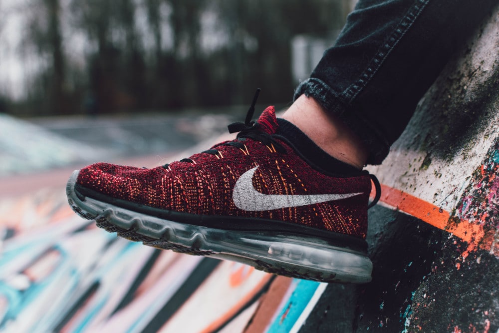
For a website promoting a new type of running shoe from Nike, we have to be honest… we expected better than this. The Nike React shoes are supposedly made using foam that is lighter, more durable, and spreads the impact more evenly than any of the company’s previous shoes. That’s all well and good, but the website? Perhaps designed for the younger audiences or bored office workers, the site starts out with good intentions, allowing the user to design a runner.
As the sound is more annoying than anything else, it’s best to switch it off and focus on the visual elements. We’re given only three options for design, which is to choose two soft items, a running style, and then the color of your Nike React shoes. Once compiled, you’re given an odd human-shaped thing to look at, one that’s made from teddy bears and bouncing balls. The site’s look is somewhat amusing, yet hardly worthy of a second go or a recommendation to a friend. More design options would have been preferable and with less of a childish look to it all.
2018 Foosball World Cup – July 2018
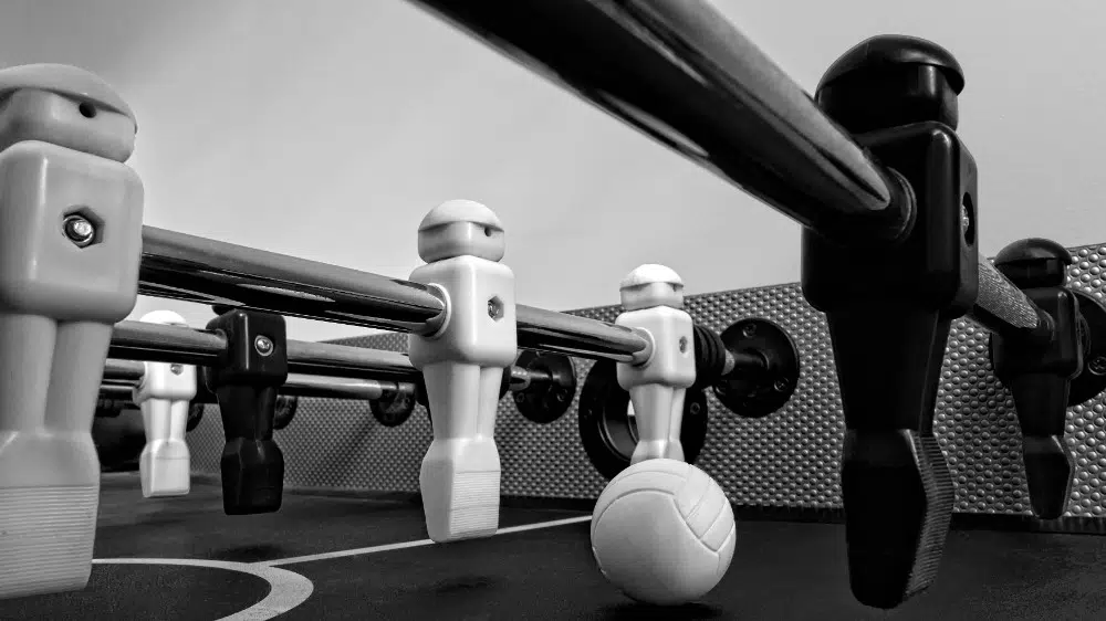
The FIFA 2018 World Cup was obviously a great time for die-hard and casual sports fans alike, because even if you didn’t know your Messis from your Ronaldos, it was hard not to be caught up in the fervor of it all. Clearly then, the Foosball World Cup website was set up to celebrate the event, and whether or not it deepens your love of football is hard to say, but it’s an awful lot of fun. Designed with rudimentary polygons and a minimalist electronic soundtrack, the site does “simple and effective” perfectly. The controls are easy to master (just move the mouse around and click) and the game does a good job of not making it too difficult to score, yet not a walk in the park, either.
There’s not much in the way of information on the teams or players in the World Cup, but the opportunity to pick a country you support and have an amusing, 3-minute match in your coffee break is hard to pass up. All the menus pop and whirl around really successfully, with the designers clearly more focused on giving the user a fun experience, rather than a profound one.
Twenty One Pilots – December 2018
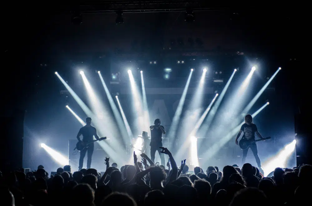
Certainly one of the weirder entries on the list by Awwwards, and one that we’re still trying to figure out. Dubbed as an “immersive experience,” the site feels anything but. Music group Twenty One Pilots have clearly gone all in with the promotion of their new single, ‘Bandito,’ as the website is sort of a point-and-click adventure, like the popular game, Myst. The site looks decent enough and the animations are smooth, yet the issue lies with the “immersive experience” tag, as you never really feel like you have much control over what’s going on. The camera essentially goes where it wants and you can click about on symbols and move your POV around slightly, but that’s about all you’re given to do.
The group’s track plays in the background while all this digital mayhem is happening, but unless you’re a huge fan of the band, then it’s safe to say that you won’t have much of a reason to check out the site. A VR element could have perhaps saved this site, but it would also open up the possibility of experiencing heavy motion sickness.
Play-Doh: The Gallery of Emerging Species – March 2018
Finally, another site putting WebGL to great effect, the promotional site for Play-Doh is purely a place for kids to have a bit of fun for 20-30 minutes. The website essentially displays a mythical zoo of sorts, with a strong message of conservation heavily underlined within the pages. The user can click on the animal and receive a tiny animation while a British man (almost sounding like Sir David Attenborough) reads a small description about the species. The site is easy to navigate and looks incredibly eye-catching, with bright colors, fun designs, and no doubt a lot of replayability for younger audiences.
We hope those sites have motivated you! Be sure to look here for more inspiration on how to gain more clients as a web designer.
