
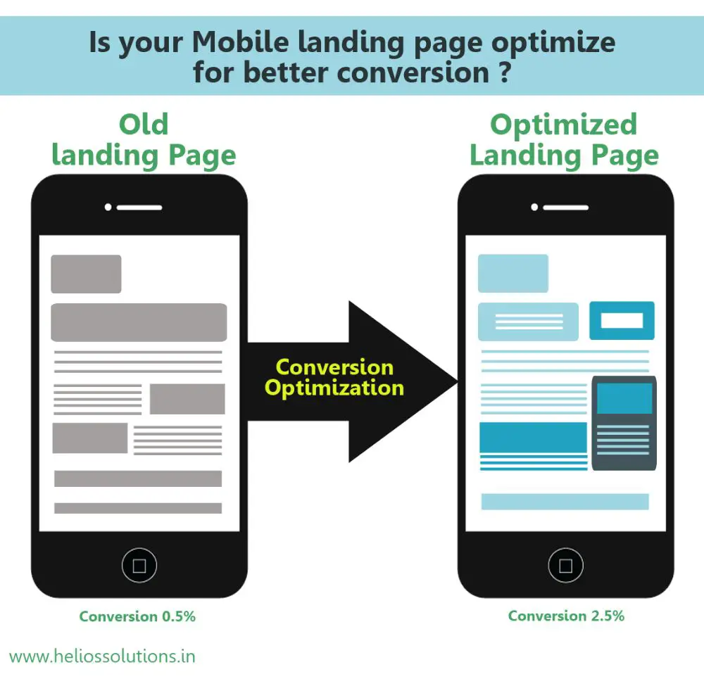
Landing pages are an essential aspect of a website. They are known as lead capture pages, as they are specifically designed in a way that appears after clicking on a search engine optimized search result. Almost 44 percent of B2B business clicks are targeted to their home pages and not a dedicated landing page. This is troublesome, as the landing page is very relevant, and its performance helps boost your results on search engines. When you send paid traffic to unoptimized pages, you lose out all value for that paid traffic as it gives you no return on investment. Hence, it is very important to make optimized landing pages. However, there are certain landing page mistake you should avoid. We have listed the 15 things not to do while designing your landing page:
1. Have slow page speed:

Believe it or not, slow page speed is the number one mistake to avoid while designing a landing page. Speed is known to have the biggest impact on a landing page’s performance. Almost 74 percent of people bounce from a landing page if it takes more than 5 seconds to load. For e-commerce websites, these stats get worse.
For any e-commerce website, the threshold for loading time reduces to three seconds. If your website is delayed by three seconds compared to others, you lose half of your potential traffic.
Yes, the content and the layout of the landing page matters, but it’s of no use if half of the traffic you are expecting to cater to, doing even get to see the page in the first place.
2. Having a cluttered design:
The cluttered design doesn’t work anywhere as it is. When your landing page offers multiple offers and is filled with navigation bars, the visitor can get overwhelmed, looking at chunks of content. It would make it difficult for them to keep their focus on a single aspect of the website.
Any landing page that doesn’t make use of the navigation bar tends to perform much better than those who do. Landing pages need to be clean, organized and structured. Generally landing page should only be focused on one action.
This helps avoid confusion and appeals to people to click on that action button since they have a better understanding of what the page is about. The idea is not to make the process complicated for the user to comprehend. They should feel at ease and enjoy the user experience of a clutter-free organized content.
3. Poor Headlines:
Headlines are the crucial part of copy when it comes to landing pages. Headlines differentiate one group of content form another. A compelling headline also provides the value preposition the page has to offer using the least amount of effective words. However, most of the headline copies are poor and not written to good standards.
It creates the first impression on the visitor when they scan through your landing page. If the headline seems faulty or confusing, they would not bother reading the inner content or even bother learning more about the services. This is very similar to how a newspaper headline needs to be effective and appealing.
The landing page headings need to be sharp and concise. Most of the times, people don’t even understand the potential of title and heading tags from SEO purpose. It is much better to have a heading that reads ‘We are an SEO company ‘ rather than ‘Hello, good morning’.
The search engines crawlers prioritize content on the headings for pushing webpages with relevant content on the top pages of their search engines. If you have a normal greeting as mentioned above, it is missing an opportunity, whereas specifying the keyword in the heading would help you rank better.
4. Filling the page with irrelevant visuals:
Many people make this mistake. Just adding visuals for the sake of having visuals on your landing page would do more harm than good to your landing page. Most of the users either use irrelevant images for their landing pages or make use of stock photos.
Stock photos are the worst way to go about it, as they are ridiculously overpriced and lack connection with the visitors. Images have the strength to attract visitors’ attention instantly.
It has the capability to create an emotional connect with the visitor. Stock images don’t have this ability as they are very easy to distinguish. They are also clicked to be suitable for a wide variety of topics. Hence there is no sense of personalization or connect with them. Using real photos in place of stock images can increase landing page conversion by 35 percent.
5. Not focusing on layout:
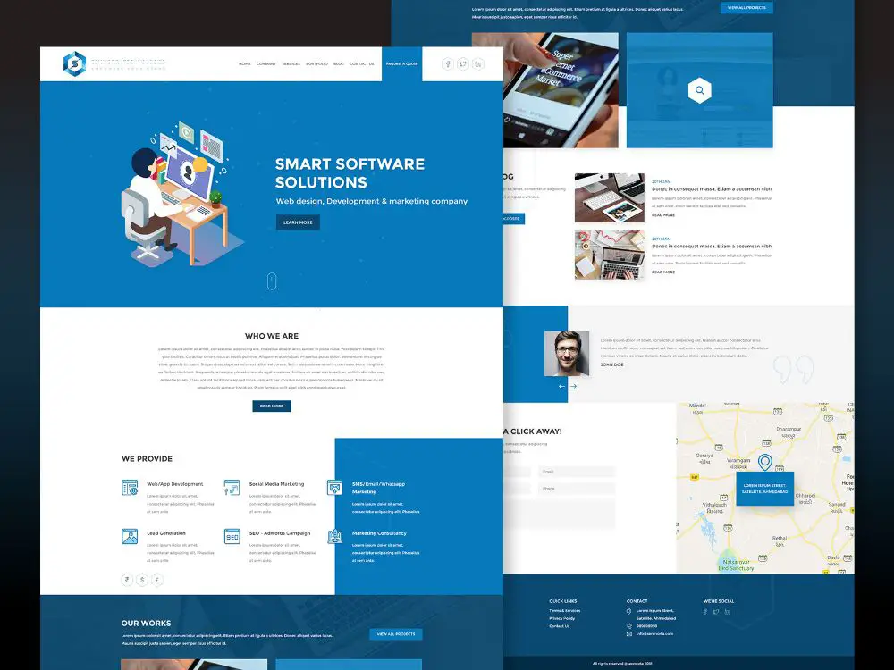
Let us consider that your landing page loads within seconds, without any issues every time. That’s great, but if all the content that loads as soon as the visitor is exposed to your content is in a bizarre layout, it makes no sense to the visitor.
The page can have no headlines, which are the visual cues for visitors to understand where they are. There might not be a flow of content as per priority, which would lead to customers reading the irrelevant information with attention but losing interest as they reach the main meat of the content.
6. Not focusing on the web forms:
Your web forms are as important as all the other content on the landing page. In fact, web forms are more important as they are the source through which you’d acquire customer-related information.
In order to appeal to the visitors to fill out the form, the form has to be attractive and easy to fill. However, most landing pages have too complicated web forms which confuse the visitor, and they eventually give up and don’t fill it.
7. More priority to the features than the benefits:
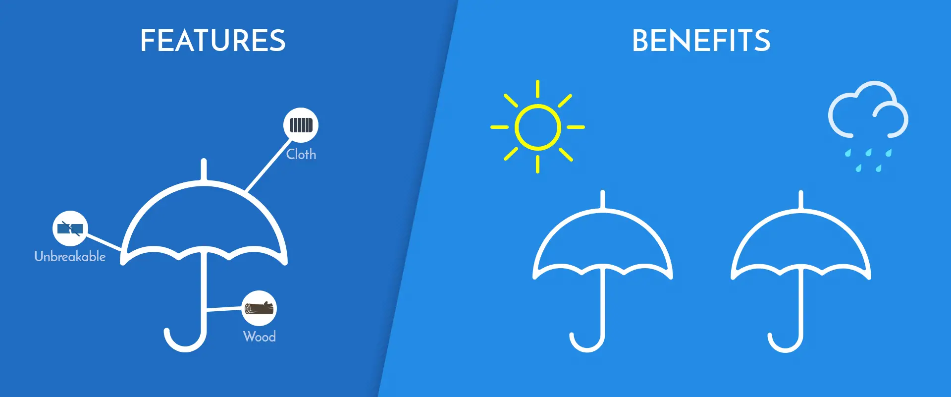
Yes, it is great that your company has so many features and services to provide. However, it is not the features that attract visitors to become customers; it is the benefits they’ll get because of those features. Most landing pages just focus on highlighting the features without explaining the benefits associated with them. Suppose there is a smartphone that makes use of 48 MP camera at a budget price point.
If the website only mentions 48 MP camera as a feature, people who have no idea about photography would understand nothing from this piece of information. Instead, if the copy read click high definition crystal clear images with the 48 MP camera, the visitors would understand the benefit and the impact of having a 48 MP camera.
If you keep focusing on what you have to offer instead of how it would benefit the customer, you are unlikely to get many conversions. This would be a heavy landing page mistake you should avoid at all costs.
8. Not matching the content with the intention:
This is a landing page mistake that many websites end up comitting. If your landing page is built specifically to provide an offer to your visitors, you cannot have content that only talks about your company. This is a heavy mismatch in what you are offering and what you’re talking about. It would throw readers off, as they would want content that helps them better understand the offers rather than hearing about your success stories.
They are interested in availing the offer and knowing the parameters to avail it. Hence the content on the landing page needs to market to the offers talked about on the landing page. Otherwise, people would not even read your content, nor think much about your offer.
9. Having readability issues with layout:

Most websites focus so much on designing a trendy and impressive landing page that they overdo it without paying any attention to the impact their design has on the content of the landing page.
Using big background images or hero images are a trend that should be followed. However, the process of choosing these backgrounds should be carefully carried out. The color of the background could be very close to the text color, which would make the text illegible.
10. Forgetting optimizing the content for mobile:
This is one of the absolute landing page mistake you should avoid. In today’s time, you cannot afford to have a landing page that is not optimized for mobile. The content would start overlapping and the cool parallax effects and auto-play video you added, stop working.
They might look cool on the desktop, but as soon as you reach out to a phone, the images would start buffering. This is because you didn’t test the websites for mobile view. Most of the visitors might visit your site from mobiles, and it would undermine all your efforts you spent on optimizing the website just for desktop.
11. Having outbound links:
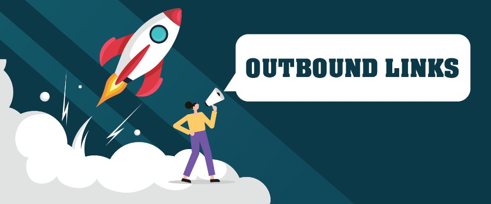
Having outbound links on a webpage might sound like a great idea. It helps with SEO. However, one place where outbound links are an absolute no is the landing page.
Don’t link to anyone else’s landing page or even your site or social media handles. The landing page exists just for one primary goal – for you to capture leads. Any additional meat or distractions would just contribute to losing the lead and that would be a landing page mistake.
12. Generic CTAs:

You can incorporate all the points discussed so far, and the visitor won’t bounce and read the content of your landing page too. However, after all these efforts if you have a generic CTA button which is placed incorrectly, they would not know how to move further even if they want to.
If you consider the AIDA model, which refers to a systematic process of capturing attention, interest, decision and action, it is important to have an appealing CTA for people to transition from decision to action. Otherwise, all your efforts so far would go to waste. Hence avoid using generic CTAs like ‘Click Here’. ‘Let’s get started’ would better motivate the visitors to go forth. You should avoud making this landing page mistake.
Since all your webpages have the same footer, it only makes sense to have it on your landing page, right? Wrong. Footers are an unnecessary distraction on a landing page.
There are so many pieces of information that the visitor might waste time reading. It would divert their mind from the purpose of the landing page, that is to focus on the call to action. Avoid making this landing page mistake.
14. Not saying “Thank You”:
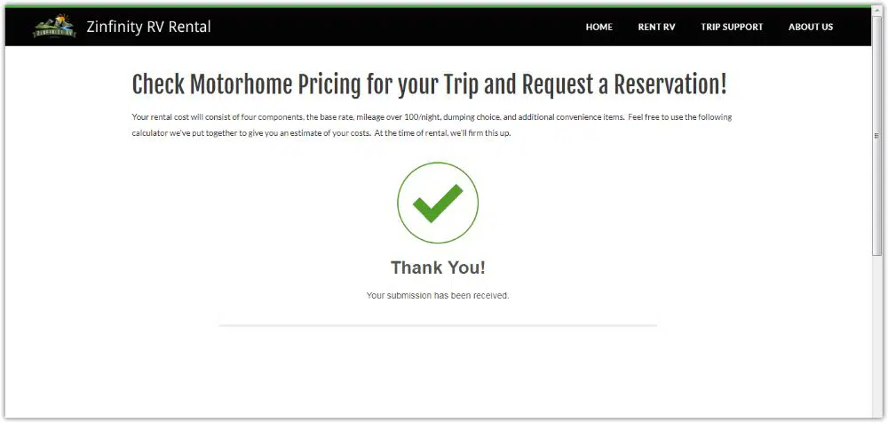
A total stranger came to your page, read about your company, understood your products. They then filled out your web form, gave their personal details and got done with the entire process. In return, they don’t even get a thank you? This might sound trivial, but it can have a significant impact on how the customer feels about you or your product. Theoretically, the purpose is solved, right?
The visitor came, read the content, pressed the CTA, filled the web form, and now we have a generated lead. Why bother about how he felt at the end right? Well, it is because the same person technically is a lead, but if they feel bad about not being appreciated, they might not act upon the mails you send them or any notifications from your end. What good is that lead then? Hence you should avoid missing out on showing gratitude to people who convert to a lead, to make them feel special and important.
15. Using fake testimonials:
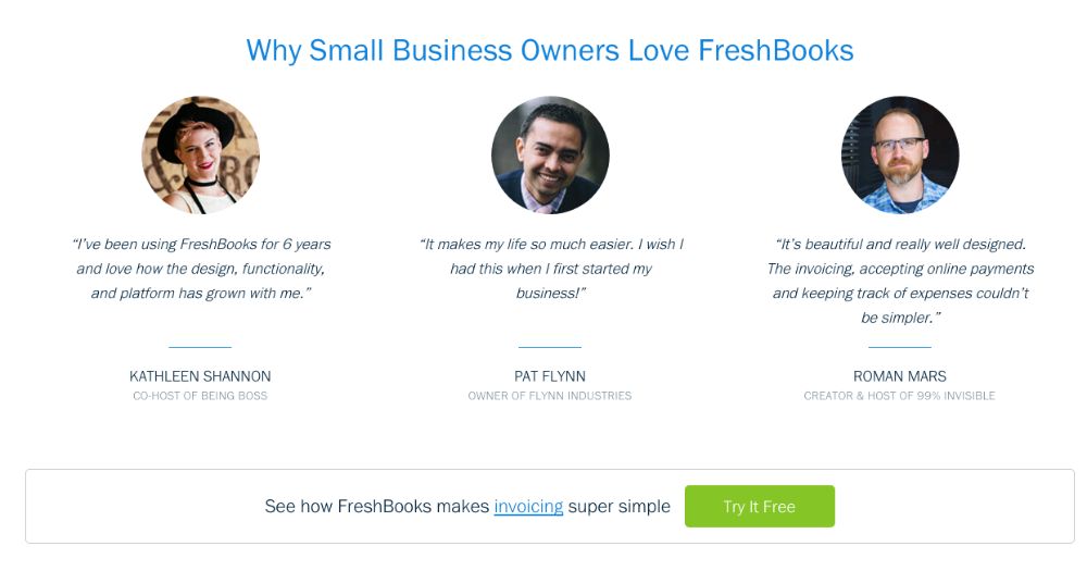
Not only is this not going to work, but it is also unethical and wrong to have wrong testimonials on your landing page. If you are using stock headshots, or a testimonial without a name, the readers are not stupid to not understand what you’re trying to do.
Fake testimonials would not only increase your bounce rates, but it would also affect your brand’s reputation. They are one of the landing page mistakes you should avoid.
These were the 15 Things NOT to do while designing a landing page, to avoid damaging your landing page’s ranking and appeal to the audience. By making sure to avoid these mistakes, you would stand a chance to be better than most of the landing pages out there. Most of the websites don’t realize these mistakes and hence don’t make the necessary revisions. You should keep revising your content and layout, again and again, to ensure you aren’t falling for any of these mistakes.
