With mobile being the device for majority and desktop continuing to be a minority, it can safely be said the mobile designing is the future for most developers.
Design no longer just demands to be eye catchy it needs create optimum app usefulness to deliver business results. Mobile app development and design today work hand in hand to deliver better user experience and to boost marketing output.
Looking for ideas on how to design a beautiful web app? Look no further! We selected 25 interesting app designs for your inspiration.
From fitness, health, to banking, emails and others, we have gathered here a wide array of web apps, all with different features but beautiful and user-friendly designs!
Some of these app designs even come as free PSDs which you can edit and customize.
Here they are! Which one of these app designs do you like most and why? Let us know in the comment section below.
Want more? Check out these free app templates!
Medium Profile Concept
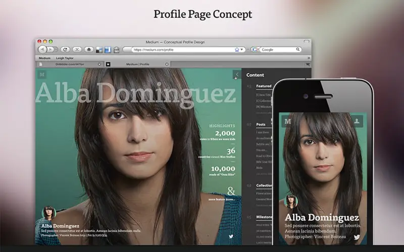
In the expanding world of mobile apps innovative and useful interactions seems to be the key in offering better user experience. Animation is seen to facilitate easy interaction and quick understanding in the design scheme. Moreover, in the relatively smaller screens they take less space but quickly deliver message to the users. This first example is a good source of inspiration. This is a medium profile page design concept which uses a full-screen image and a menu bar aligned to the right side of the page.
Speedcam App Animation by Jakub Antalík for Sygic.com

Animation in app design is not just about creating stunning app views, but with contextual use of animated elements it can offer user smart ways of interactions. The functional role of animation in app design has been taken few leaps ahead by an array of apps to facilitate a better user experience. This is also an example worth following in future projects. It has a dark design layout we love!
Fitness Web App Round 2
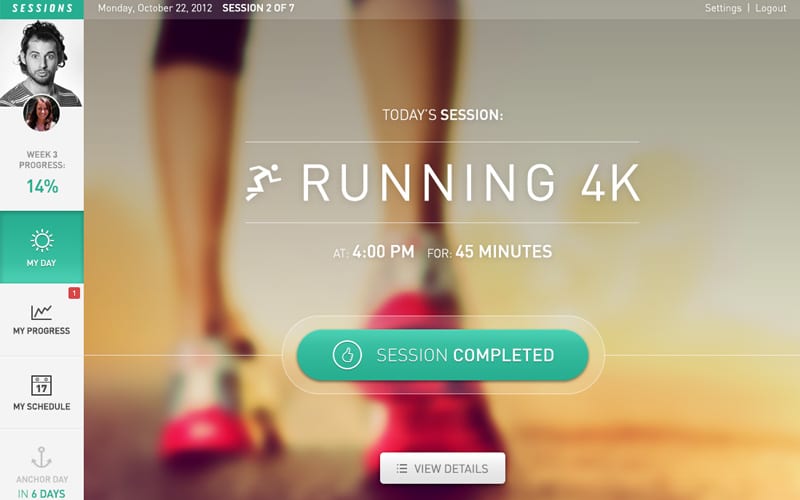
This is a fitness app design concept. You can easily check sessions, how your day went, your progress and schedule with this app. It uses a blurry image with huge and small white thin typography. The light blue details and buttons also blend in nice. This is a great source of inspiration for UI and UX as well.
Eurobank – Bank Account Page by Mateusz Jakobsze
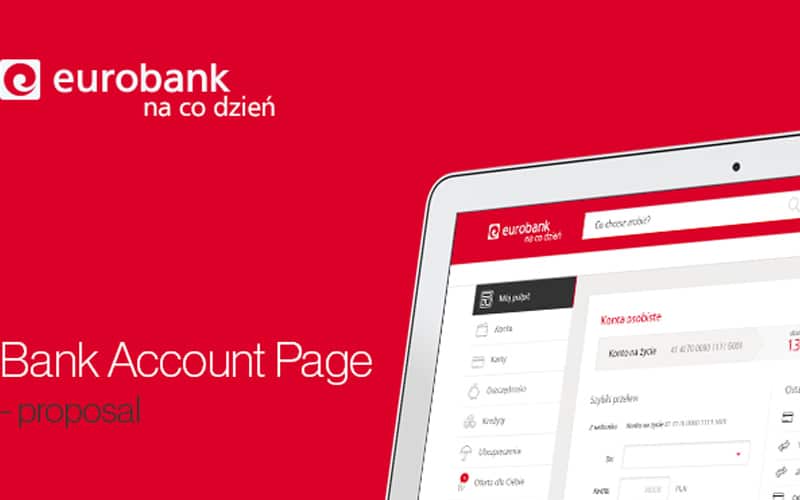
Jakobsze is a bank account page design proposal. It has a clean design and everything looks functional and organized.
Life Minimal App by Budi Tanrim
Presently designers are more focused in contributing to the interactive and engagement score of the app with design inputs and in this respect a fluid storytelling interface can play a really crucial role. This is a great example for this app design trend!
Weather by BeardChicken
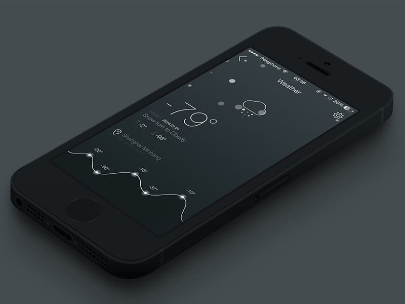
In recent times blurred background effect has become a popular app design practice for countless apps. In one hand such effect creates a smooth and pleasing design for the eyes, on the other hand the relative blurring of background helps creating more focus on certain texts and elements as and when needed. Here’s a great design that uses the blur effect in a subtle way.
Weather Rebound by Chris Slowik
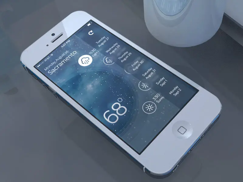
With blurring effect the designer can easily make readable text prominent or can make call to action buttons stand out. So, besides the so-called visual appeal, it also serves an important practical purpose in drawing attention and engaging users contextually with the content. Check out this design, for example!
Crash Guard Accidental protection App
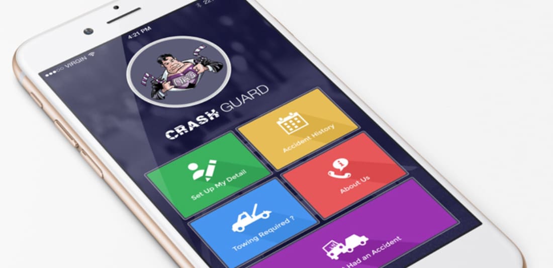
This app is called Crash Guard and it has a friendly interface design. It has its inspiration in flat design, which is quite trendy nowadays and uses a large variety of colors.
AutoHaus – Interface
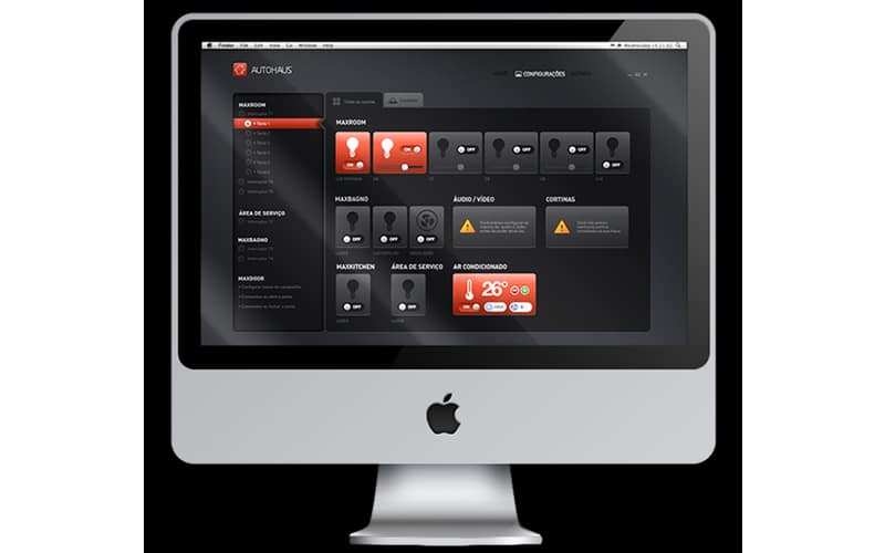
This is an interface design concept with a dark layout. This example is perfect if you’re working on a user interface design and you are looking for a good source of inspiration.
School Web App

This is a school web app design concept which can be a great source of inspiration thanks to its simple and minimalist design concept.
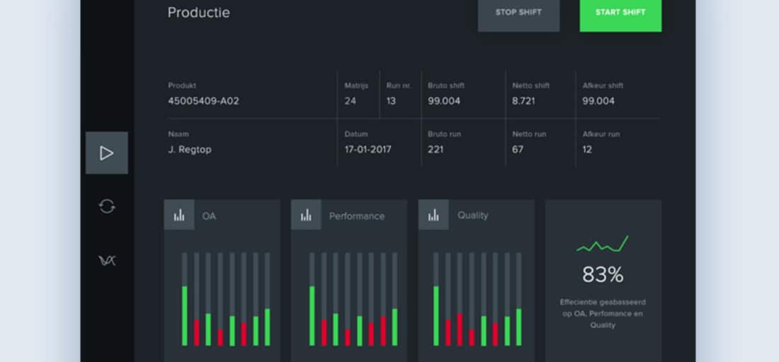
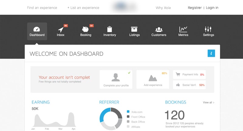
Dashboard
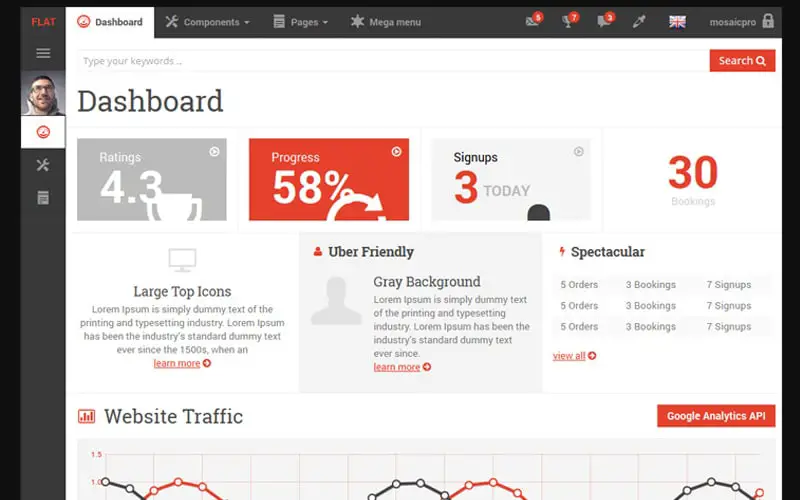
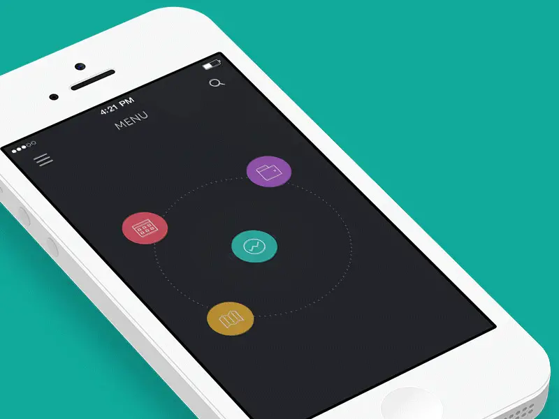
Beating the so-called well grounded and commonly practiced rules of app interface design hidden menus have become a mainstay in countless apps. In spite of the mobile screens getting bigger in size, still they offer less workable space for the users compared to other traditional computing devices. Hiding menu and functionalities and only displaying them when needed is a smart solution to this space constraint. Creating sliding navigation drawers in the top right corner has been a great way to implement this design attribute. This dashboard example is a perfect example for that. It uses a hidden menu, flat design and many graphic elements such as charts, graphs, and icons.
Gmail Redesign Concept by Ruslan Aliev
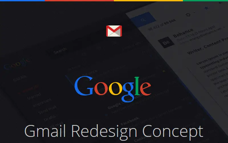
This is a redesign concept by Ruslan Aliev. It even uses the golden ratio. In this example, you’ll find all the schemes and design stages this project went through.
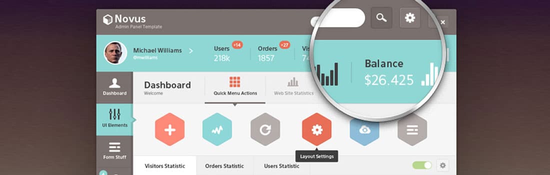
Novus Psd Admin Panel Template
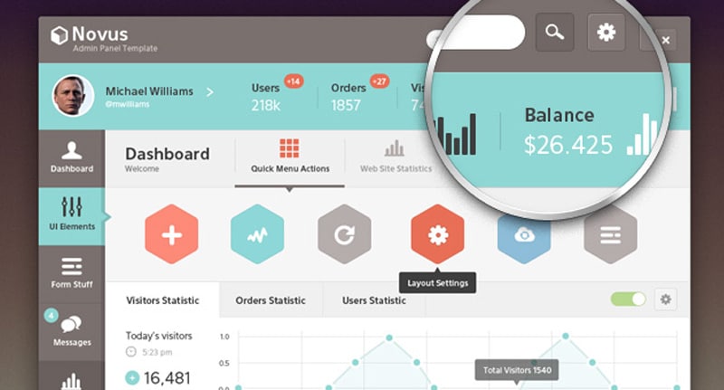
Novus is PSD admin panel template with a friendly interface design. It uses a large palette of colors and many graphic elements. This is definitely an example worth following and having in mind when designing admin pages.
Account by Barthelemy Chalvet for AgenceMe
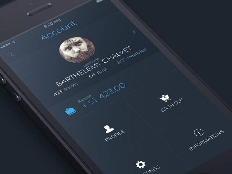
With background blurring effect, users have clear idea of what to do next and this makes it a least time consuming as well as guided user experience. Make sure the blurring effect is utilized contextually to make things prominent. and do not forget that blurred background should also make a visual harmony and should not be too striking for the user’s eyes, like in this example!
User Dashboard

There are other types of hidden navigation buttons that contextually reveal the menu or functionality just with a swipe. A top right corner arrow with a hidden drop down menu is another popular hidden menu design. Hiding menu offers a more clutter free app look and feel and offers a purpose-oriented approach to open menu only when needed. Moreover, as users continue to be adapted to state of the art conventions of gesture input utilizing such smart design maneuvers became even easier now. This example proves that. Everything is well organized in a neat design. The icons are good touch to this dashboard’s design concept.
Dark dashboard
In complete contrast to the typical focus on bold and solid colors in blogs and websites, for mobile apps designers use subtle color shades. As mobile app design is more challenging in respect of addressing the constraints of screen space, using color shades intelligently for different things is a sure way to create hierarchy and context. This is a dark dashboard design concept. It uses a modular grid layout, many charts and graphs and has a user friendly interface design.
Clinical Dashboard – Patient Record by Andrew Lucas
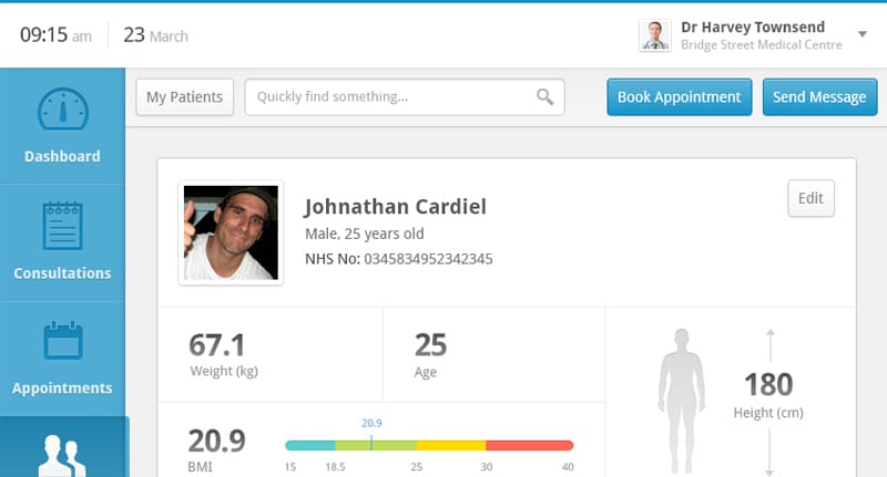
If you’re looking for some more dashboard examples then you might want to have a look at Andrew Lucas’ patient record dashboard design concept. You’ll see that everything is fully-organized making this example worth following for similar projects.
Premise – Home
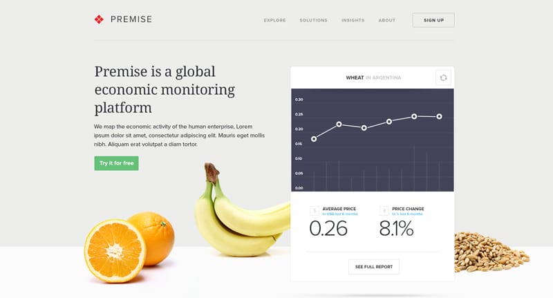
The app design today is more dominated by minimal design which is based on the philosophy of creating maximum effect with minimum design maneuvers and in this respect using subtle colors is naturally a smart way to deliver message and hierarchical order for the users. Moreover, often bright and flashy colors create a distraction for the users, while delicate use of color pallet offer a sophisticated look and let users concentrate on what they need. This example focuses on presenting a global economic monitoring platform. It has a modern and elegant design that presents content in an effective way.
Work Page by Barthelemy Chalvet for AgenceMe
Here’s a great app design example in which the color scheme and use of subtle shades contribute to the user experience. The icon for the hidden menu is conventional in order to avoid confusion and the navigation is pretty straightforward.
Soccer Analytics by Monterosa
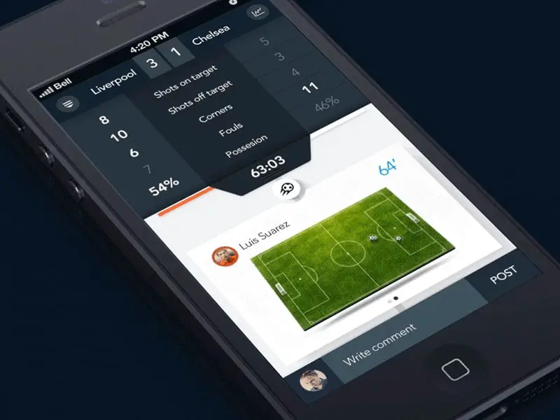
When designing an app make sure the color scheme does not look too weird and inharmonious in relation to the color scheme adopted for your brand across diverse media. Opt for subtle color schemes instead of vibrant ones, like in this example!
Tour by Mark Geyer for Salesforce UX D
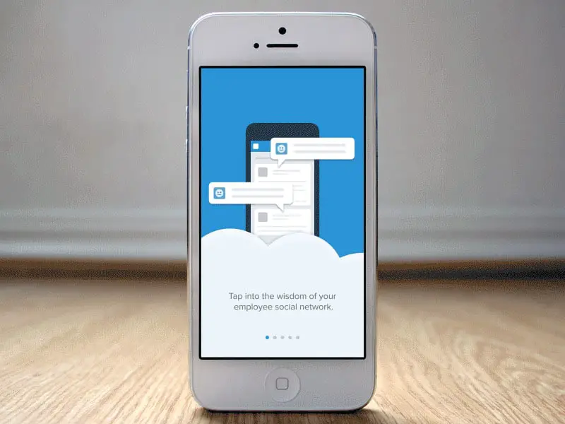
Storytelling in all regards became the single most important element in the mobile app design space. Naturally a story in the user interface that addresses users directly is more effective and fruit bearing than all other call to action features. Designer can use large high resolution images with interactive text, animated characters in sliding visuals or an interactive video to tell a story to the user and engage him instantly. Here’s a good example for that!
Dashboard Page 2/2
If you’re up for more dashboard pages design this is a really nice one. Everything is neat and clean and it can be a great source of inspiration for future projects.
PhotoLytics Dashboard UI
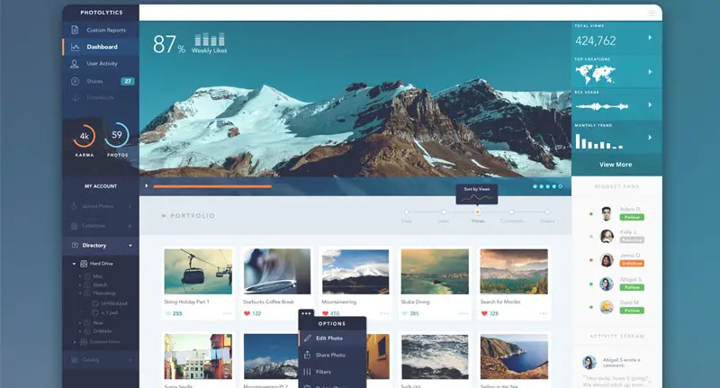
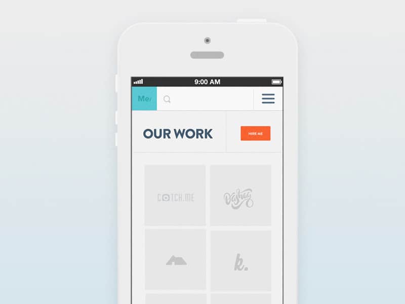
Infinite scrolling is also being embraced in mobile apps to add fluidity and create a sense of depth and this design is a good example. This dashboard has an elegant design. It was designed for a portfolio website and uses a large horizontal image in its header, thumbnail photos for each project, a vertical menu bar, and many other graphic elements.
Flatpanel
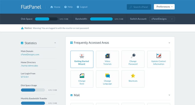
This is a FlatPanel design concept which might become your next source of inspiration. If you’re a fan of clean design then this template is exactly what you’re looking for.
SJQHUB™ // B&I Dashboard

Last but not least, this is the B&I dashboard. It has a unique and colorful design based on a modular grid layout.

I have a question. Could you please tell me that these designs are available in WordPress version? If yes, them I would like to have 1 of them.