If you were asked to picture an invoice, how would it look? The first image that pops into your head is probably a plain and boring, white sheet of paper with some numbers on it. Sadly, this is what most invoices look like, but they shouldn’t have to!
An invoice doesn’t have to be ordinary. On the contrary, an invoice can have a beautiful design. It can be brought to life by simply adding color, illustrations, borders, patterns, or changing its standard outline altogether. This article will show you how experimenting with colors, using flat graphics, using monochrome, using hand-drawn illustrations, paying close attention to details, using new fonts and clean, minimalist designs will make invoices infinitely more beautiful and interesting than a plain white sheet of paper with black writing on it.
Among many sources, we used Dribbble, Behance and Creative Market to feature some of the best invoice designs we could find. The aforementioned websites are fantastic sources for finding any web/design related project or source of inspiration, and if they aren’t already, they should become your go-to place for finding a great variety of beautiful designs.
We gathered 22 beautiful invoice designs for you to browse through, to inspire you to create something out of the ordinary the next time that you’re planning to make an invoice. Think about what you’d like your end result to be. What feelings do you want to transmit to the one who receives your invoice? You can communicate so much through the use of various design elements and techniques, and you can use something as simple as an invoice to show gratitude for a customer’s business or simply send good vibes to someone. Browse through and let us know which one is your favorite in the comment section below!
Use clean colors and flat graphics
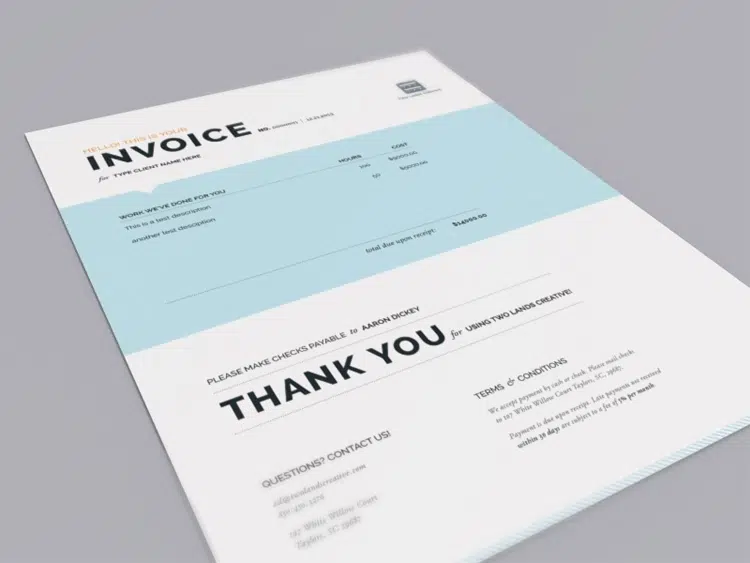
This Invoice design looks really nice and has a clean design that uses black typography and a simple light blue horizontal band. It’s perfect for creatives, artsy people, agencies and more.
Invoice Sherpa – Accounts Payable
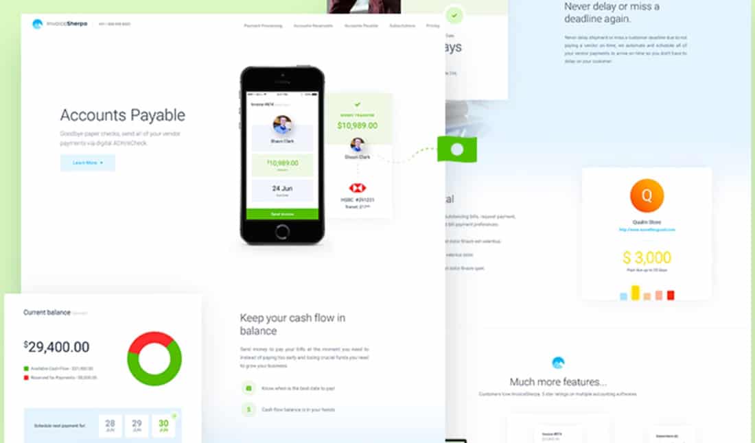
Invoice Sherpa has a simple and effective design. In this example, you’ll see a creative way to explain how the payment and accounting process works to your clients.
Paper-friendly
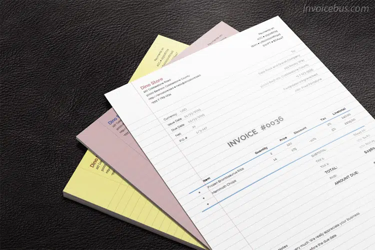
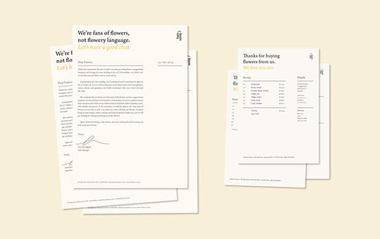
Paper friendly, as the name suggests, has a simple design on note pages. It may be to the liking of minimalist lovers, but it surely looks interesting! You can definitely get inspired by this invoice design with a realistic touch!
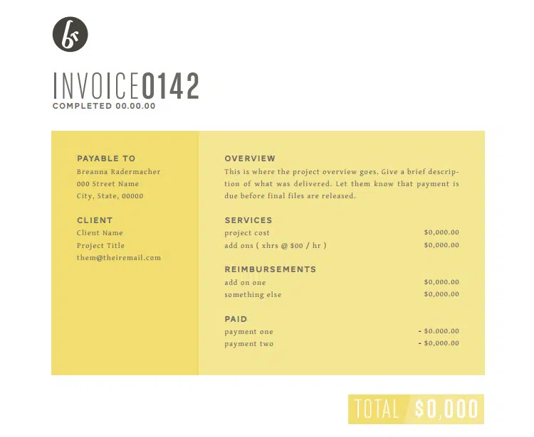
Use awesome colors
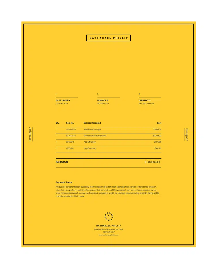
This invoice design concept has its inspiration in flat design. It uses a simple orange background and black typography. You may end up consuming your printer toner faster, if you don’t buy already orange paper, but it definitely looks interesting and clients will remember to pay you on time!
Make it monochrome but sharp
This invoice has a clean and monochrome design based on horizontal lines. It is definitely an example worth following in future projects. It’s quite simple, yet has a unique layout that will be remembered.
Use textures and graphics
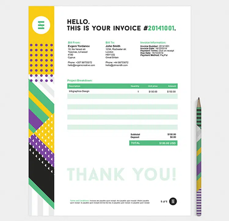
This example uses a large palette of colors and patterns into creating a unique invoice design. This example is joyful and worth following.
Retro is the way to go
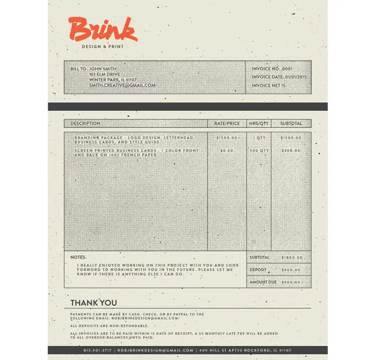
Retro is the way to go, and that’s exactly what this invoice suggests through its design concept. It has a unique and textured design which can definitely inspire you to make an awesome project.
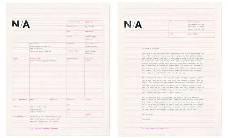
Simple and friendly
These invoices are simple and friendly and they’ll definitely inspire you. These examples can be a great starting point for future awesome projects, not only invoices.
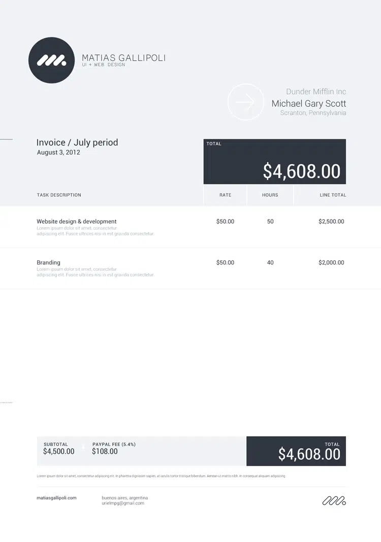
Add just a little bit of color
This example is really nice. It uses a simple light grey background, dark typography and just a tiny bit of color. Make sure you print this kind of colored-background invoice template on a colored paper.
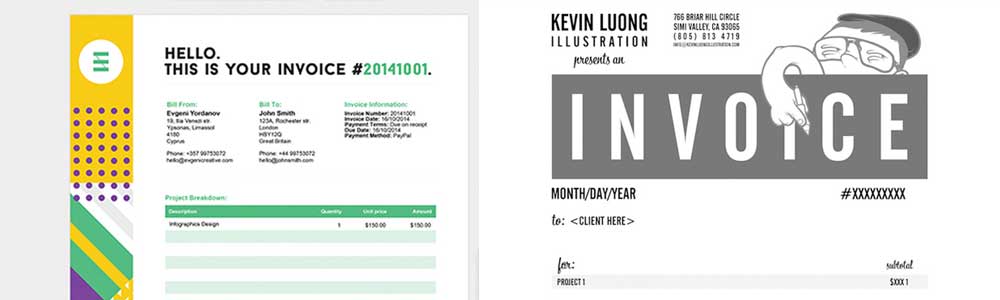
Make it stand out with your illustrations
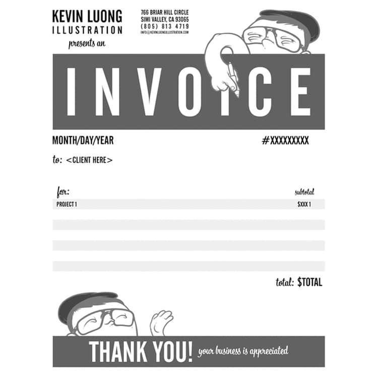
This invoice definitely stands out. It has a black and white design and mixes illustrations in both its header and footer. How fun is this?! Perfect for illustrators and other creatives!
Invoice Sherpa – Pricing
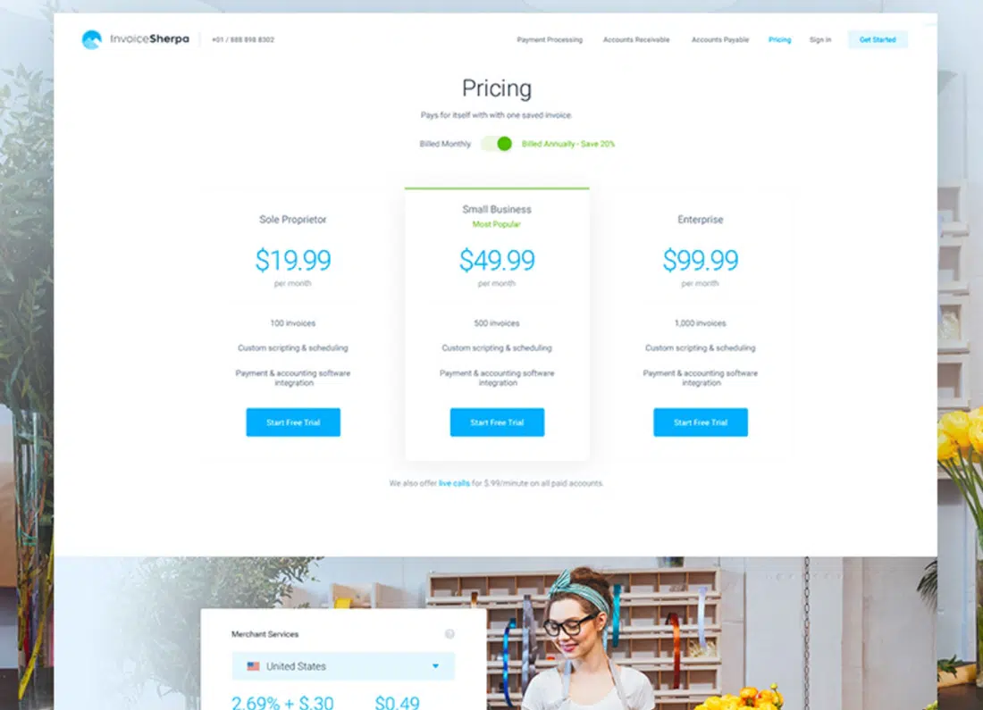
This invoice is colorful and presents Sherpa’s pricing tables in a creative way. It has a clean design with blue details and buttons.
Make it pop!
This invoice uses flat design. It mixes 2 tones of pale oranges and light grey typography and has a simple layout.
Use large fonts
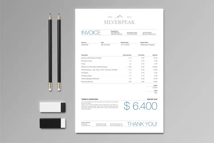
This example is can also be a great source of inspiration. It looks simple and clean and it uses thin typography, especially for the total price.
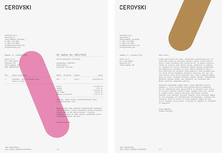
Make it look natural
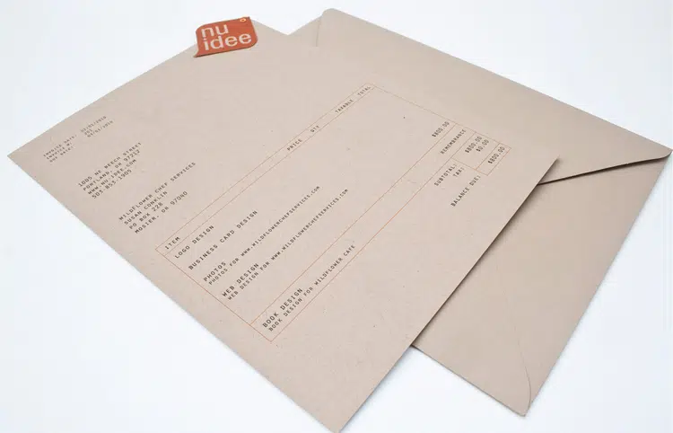
This invoice looks great on a textured and earthly colored paper. It keeps it simple yet manages to make this invoice look natural. This is definitely an example worth following and it can inspire you to try out different textures for your projects.
Use a strong color
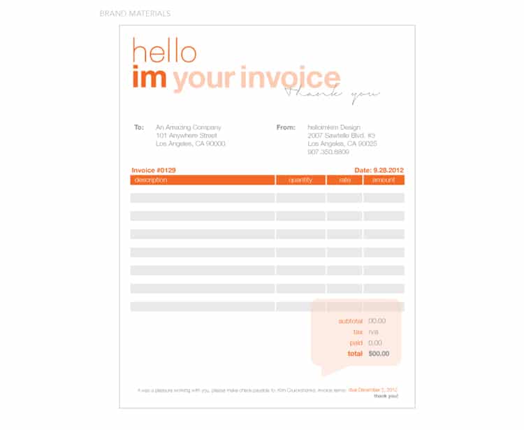
This example also keeps it simple yet manages to make things looks brighter thanks to the user of the orange color for certain details.
Add your watermarks
This example focuses on a simple design and a light gray background in which the designer integrated some colorful angled graphics.
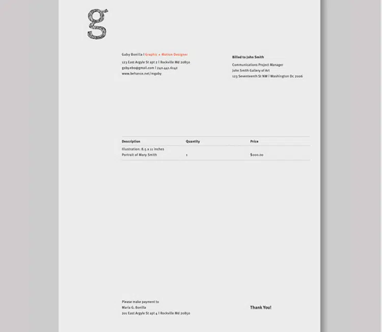
Just a hint of red
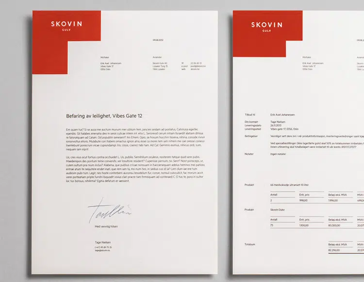
5% red is probably this invoice’s motto. It looks modern and elegant and it can definitely be a great source of inspiration.
Clean and minimalist
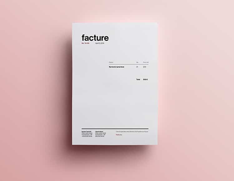
This is a clean and minimalist invoice template. It presents all the necessary information to clients and uses a simple white background.
Modular
You’ll definitely like this example. It uses a simple notebook paper texture and a modular grid layout to present content.
Minimalist
If you’re up for even more minimalist invoices then you might want to check out this one as well. This example keeps it simple and presents only the necessary information.
Center it
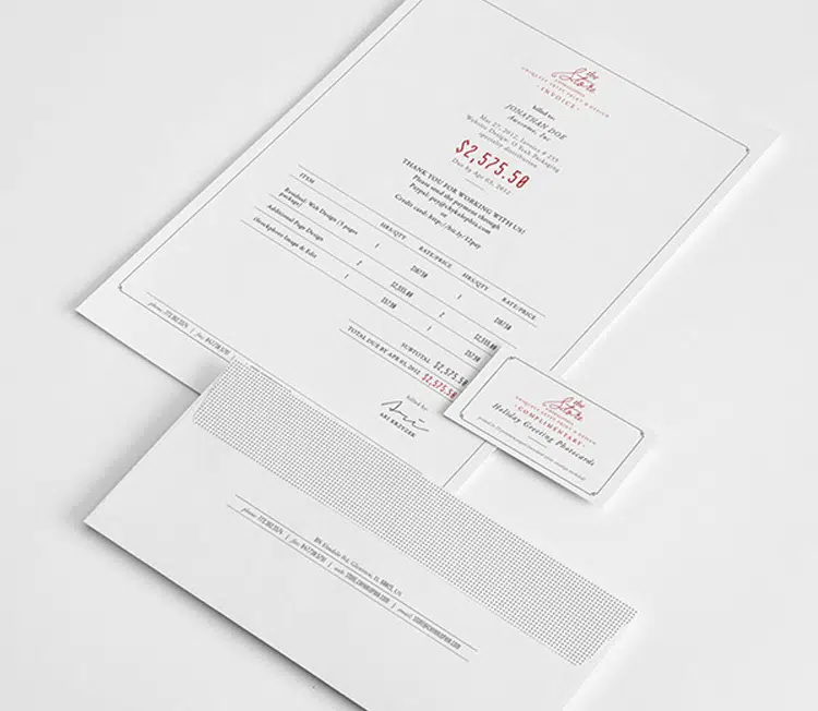
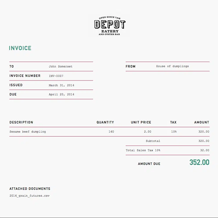
This example has content centered. This invoice has a neat and elegant design which uses a white background and small red elements.
Choose lovely fonts

Last but not least, this template uses lovely fonts in its design. It looks elegant and it is an example worth following in future projects.

Iggy, what is the purpose of your web site ??? Most of the time you fail to check for broken and fraud download links !!!
Marvin, which ones are the broken/fraud? I checked the links, yes some of them have more than just that specific 1 image that I used in the article, but if you do just a little bit of work and scroll down the page you will find the exact image I used in that case. What is the issue? 🙂 This is an inspirational piece, this isn’t a freebie, I could have not even linked to anything as I have large screen shots, and what would you say then? 🙂