
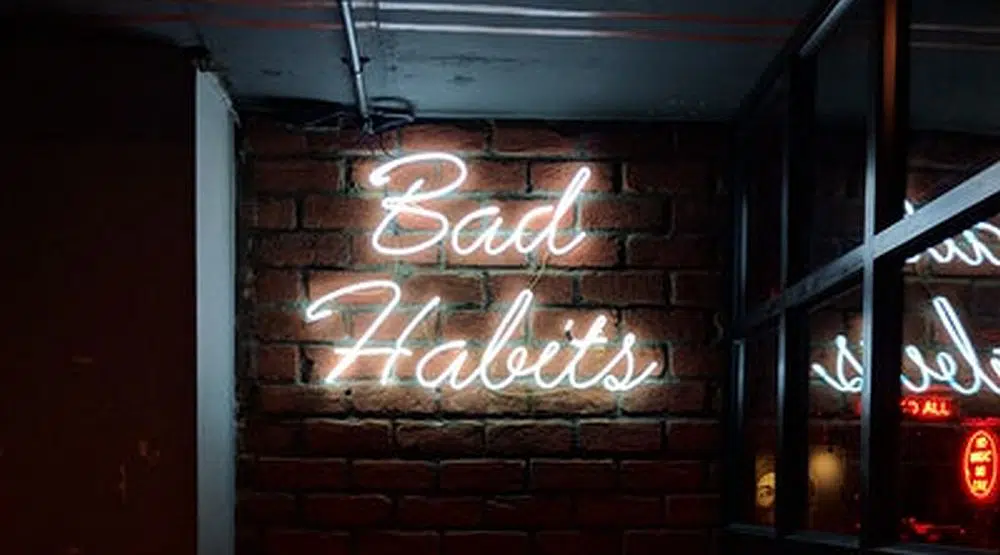
Although graphic design has many principles and guidelines, some designers stick too closely to the rules. By limiting yourself to hard and fast rules of design, you could be limiting the expression of your work. Outdated design rules have no place in a graphic designer’s toolbox and today’s clients are looking for savvy and a chance to be bold. The ability to push boundaries is a respected quality. These are a few of the design rules you should break this year:
1. “Use the Grid System for Every Design”

The grid system is a popular method that’s taught in almost every basic graphic design class. After the second World War, graphic designers began to rethink page layout and used a flexible layout instead. The grid system recommends that all of the elements of a page align through a system of vertical and horizontal lines.
The grid system is a great starting point but this principle isn’t a hard and fast rule. Some of the more adventurous designers have ignored grid systems entirely. David Carson is a great example and he developed the “grunge” movement which set him apart from the competition. He showed that breaking the rules can fuel creativity so don’t be afraid to step away from the grid. Move things around in a more radial or fluid way. Let your image rest on being asymmetrical or imbalanced and see what happens. If you don’t like it, you can always go back to coloring inside the lines.
2. “Form Must Follow Function”

This “form follows function” principle began in the Bauhaus movement and with good reason. The idea that function was the key driver of design made a distinction between design and fine art. Commercials are a great example as poorly designed commercials often draw people in but they don’t remember the product being advertised.
Function by itself is going to leave a designer in the dust. Plenty of functional designs are terrible. They communicate the needs but avoid the aesthetics of the piece. This is a paradox since your job as a designer is to drive aesthetic forward. Instead of elevating one over the others, think about form and function as a scale. They have to be balanced and seen as not being more important than the other. The first priority is maximizing the message which sets the tone. Always ask if the final product attracts and informs – this is a design that will have the appropriate balance.
3. “Don’t Overuse White Space”

White or negative space is an area that is not occupied by text, images, or drawings. Designers use it strategically to separate or group items. While it doesn’t have to be space that is literally white, it’s simply empty space. Most instructors recommend limiting white space and using it to divide information. However, any empty space is going to draw attention to what it surrounds. This is how minimalism became a key trend in design for the last few years.
If the goal of an advertisement is to bring attention to a product, then an excessive amount of white space may just be the right solution. The “Think Small” campaign for Volkswagen made a great use of white space that broke the design rules. The advertisement for the Beetle featured a small image of the Beetle on the left corner of the ad and then had a small block of text at the bottom. This showed the simplicity of the vehicle and was remarkably effective for consumers. Don’t be afraid of excessive white or blank space if the choice is strategic or appropriate for your design brief.
4. “Don’t Make Everything 1:1 Symmetrical”

A composition that has a perfectly centered image or design is considered to have symmetrical balance. Most designers learn that they should avoid symmetric alignment in a layout. Certainly looking at examples of symmetrical alignment, it’s easy for these designs to look boring and flat. However, there are many instances when this can be effective in design.
David Goines is a designer who has become known for using symmetrical designs on his posters. He’s been hugely successful in his field mostly due to center-aligned layouts. They are not perfectly symmetrical but are hyper-balanced and center-aligned. Looking at some of his designs, they stand out and draw in your attention. Although they may not be effective in all designs, don’t be afraid to rely on symmetry if it makes sense for your composition. For example, Goine’s design for Ravenswood Winery works well and breaks this common design rule.
5. “Don’t Use More than Two Fonts”
It’s true, numerous fonts can easily crowd a piece and make it unpleasant to view. The effectiveness of typeface comes from its relationship to another. This means that when more than two are used, it can detract from the success of the entire piece. Unbalanced typography can also detract from brand clarity. However, if you understand the principle behind this rule, then there isn’t a problem of ignoring it.
One example of using multiple fonts successfully can be viewed from 19th-century posters and playbills. They were known for having multiple typefaces all in the same composition. Many of these posters were successful because the designers were especially careful how each font interacted with each other. Using similar portions helped to create unity in the design. The key here is being purposeful when using multiple fonts.
6. “Never Script in All-Caps”
Designers learn to avoid capitalizing an entire line of text. Since the cap height of all these letters is the same, it’s harder for the reader to decipher between letters. This means that the viewer may be less likely to read the text entirely. This is not a bad rule for long lines or an entire block of text. However, capitalization can be effective with short blocks of text.
The original Jurassic Park book covers made strategic use of uppercase letters. Uppercase words tend to slow down reading and can be used for visual emphasis meaning a designer can use them to their advantage. In the case of the title and author, using all caps is appropriate and even advisable. A memorable book should have a memorable title after all. Short lines of text can actually lend themselves to the all-caps aesthetic, for emphasis.
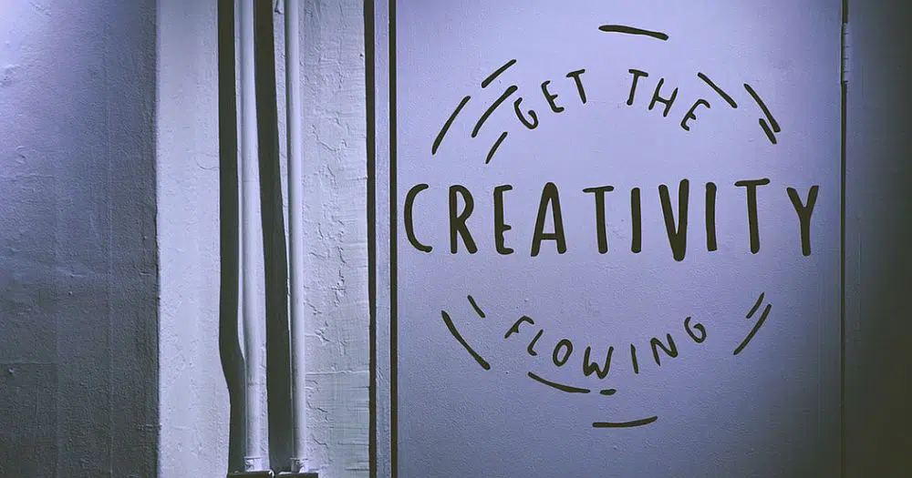
Always remember that the fundamental rules of graphic design are built on solid foundations. Budding designers should follow the guidelines until they learn the reasoning behind the rules. However, just because they are rules doesn’t mean that they have to be followed blindly. Every design problem is different so don’t be afraid to think outside of the rules. Good designers experiment so think outside the box when the design just isn’t working.