If you’re wondering how to Overlap Multiple Images Using CSS, then you’ve landed in the right place. CSS stands for Cascaded Style Sheet. It is a style sheet language that defines the document’s presentation in a markup language like HTML.
A cascaded style sheet differentiates the content and other visual presentation like colors, layout, fonts, and themes. This differentiation enhances access to the content and controls the specification of presentations.
CSS defines a common theme for the selected web pages and is visible throughout the entire website. The details of the CSS file are kept separate to reduce the complex issues and redundant content structure.
CSS is available to overlap multiple images, that is, putting an image on top of the other image. There are three methods for doing this. Let us take a look at each of them one by one.
1. Using CSS Grid

A CSS Grid is the most potent, two-dimensional CSS feature that handles rows and columns and the content in it. You get to work with both parent elements and child elements by working with CSS rules.
The grid in CSS has fundamentally changed the way you layout the webpage and its content. To work with the grid, you should know about the grid container, grid item, grid line, and grid cell. It also includes other terms like grid track and grid area. Child elements of a grid container can situate themselves as if they appear to be overlapping others.
You can create fixed and flexible track sizes in a grid using pixels. Specifying a certain number of pixels can set the grid to fit the desired layout. To specify a flexible grid track, you can mention the values in terms of percentage.
The most important feature of CSS Grid is it can overlap images by changing z-indices without interrupting the regular document flow. By using a CSS grid, you can work with any height and width of the said element. Moreover, the top image is always placed down, which aligns with the left bottom corner. The image is going to align itself with the left edge of the container element.
The HTML code for it:
<div class=”image-stack”>
<div class=”image-stack__item image-stack__item—top”>
<img src=”Https://sourceoftheimage.com/s.cdpn.io.110238/image1.jpeg” alt=”The first image”>
</div>
<div class=”image-stack__item image-stack__item—bottom”>
<img src=https://another-source.com/s.cdpn.io/110238/portrait-1-secondImage.jpg alt=”second image”>
</div></div>
Now we have to specify the width of the columns in the grid taken into consideration. Here, there are several ways to do it, but we are going to create a 12-column grid because the 12-column grid is generally used.
For this, we are going to specify the following in our CSS file in the parent element, which contains other elements also.
Here is the code:
.image-stack
{
Display: grid;
Grid-template-columns: repeat(12, 1fr);
Position: relative;
}
Grid-template-columns are characteristic to specify the number of columns a grid is going to have. Whereas, 1fr specifies the browser to calculate the amount of space available. These things are useful when you have gaps within columns and rows.
Position: relative is of significance here. It enables the z-index for images to function according to our requirements and specification.
Once you have a functional grid available, you have to look at the width of the images. To add width to the images, the ideal specification is to specify the width in percentages.
Now, you should begin with the total width of the component related to the image. The width of the image is 844 px, which means it is 100%. The width of the image on the top is 521 px. Here, we can divide 521px by 844px. Now the resultant value has to be multiplied by 100, which roughly equals 61.7%.
If you round up 61.7% to 62%, you see that you get a value in the middle of 58% and 66%. Hence, we are going to take up 66%.
For the image on top, we have the following code that goes into CSS:
.image-stack__item—top
{
Grid-column: 1/span 8;
Grid-row: 1; // it must be on the same row as the second image
Padding-top: 20% // this places the picture down and keeps it proportional.
z-index: 1; //this renders the image on the top of the bottom photo.
}
For the second image, we are going to calculate:
645 px/844 px and the value has to multiply by 100, which yields 76.4%. We are going to round it up to 75%, which perfectly fits into our 12-column grid in the CSS.
You have to make sure that the bottom image takes up nine columns and begins rendering through the 4th grid line. With this, the image should take up the rest of the grid.
The CSS code for the image on the bottom is as follows:
.image-stack__item—bottom
{
grid-column: 4
grid-row: 1; //this makes the image appear on the same row
}
With a CSS grid, every type of overlapping is possible. The overlapping may include images over images, text over images, or even text overlapping the text. It offers as many possibilities as you can imagine.
The final code appears as below:
<div class=”container”> <p>CSS Grid Method</p> <div class=”image-stack”> <div class=”image-stack__item image-stack__item–top”>
<Img src=”Https//sourceoftheimage.com/s.cdpn.io.110238/image1.jpeg” alt=The first image”></div>
<div class=”image-stack__item image-stack__item–bottom”>
<img src=https://another-source.com/s.cdpn.io/110238/portrait-1-secondImage.jpg alt=”second image”></div>
</div> <p>The textual content goes here.</p> </div>
2. Floating with negative margins
Float property of CSS puts the web page element on the left or right-hand side of its container. It allows the text and inline elements to wrap the element. Even though a float element is a part of the page, it still is brought out of the normal flow. With float property, the element shifts right or left, to touch the border of its container element.
The float property makes the elements around it, float. This property renders the elements and content that appear similar to print design. Such a concept is called text wrap. It means the text wraps itself around the elements.
In print design, the component could be images where the text floats around them. Ignoring the text wrap makes the text overlap the image as if the image is not present. You can use floats to design the layout of an entire web page or website. It is not merely limited to wrapping the text around the web page elements.
The code here is going to support every browser, including Internet Explorer. This method focuses on taking the elements out of the document and rendering them using float.
The best part of this coding syntax is that the structure remains similar to the previously mentioned structure. For the parent element in the image stack, we use “clear,” as we float its child elements. Here, the content renders below the image.
The syntax is as below:
.image-stack::after
{
Content: ‘ ‘;
Display: table;
Clear: both;
}
The above code is for the image placed at the bottom. Hence, the second image is going to go above this image.
Now, for the image placed on the top, the following is the code:
.image-stack__item—top
{
Float: left;
Width: 66%;
Margin-right: -100%;
Padding-top: 15%;
Position: relative;
z-index: 1;
}
Here, we have applied the negative right margin on the floating left element that allows the image’s overlapping. -100% is the width of the image container. This value puts on the left and lets the image on the bottom render beneath it like it is not in the document object model.
Hence, the final code appears like this:
{
box-sizing: border-box;
}
p {
font-size: 20px;
font-family: sans-serif;
color: #6439a9;
}
.container {
padding: 100px 30px;
width: 100%;
margin: 0 auto;
max-width: 900px;
}
// clearfix
.image-stack::after {
content: ‘ ‘;
display: table;
clear: both;
}
.image-stack__item–top {
float: left;
width: 66%;
margin-right: -100%;
padding-top: 15%; // arbitrary
position: relative;
z-index: 1;
}
.image-stack__item–bottom
{
float: right;
width: 75%;
}
img
{
width: 100%;
}
3. CSS grid and float methods combined
The codes in this method support working on all browsers. It also specifies the code where it works perfectly on specific browsers that are old and obsolete. Here, we use the “@supports” feature, which is an essential part of this method. It is to check whether the browser in consideration supports the “display: grid” value. We are going to use the code that supports the Internet Explorer browser before we use the “@supports” facility of the code.
In the “@supports” feature, we are going to reset the width to 100%. Now, the float property has no significance if it is set to 100%. ing to add IE browser into consideration. And they behave in a different way if the negative m. It is not going to affect the elements in use.
The final code for it looks like the one below:
<div class=”container”> <p>Cross Browser method</p> <div class=”image-stack”> <div class=”image-stack__item image-stack__item–top”> <img src=”https://firstimagesource.com/s.cdpn.io/110238/image1.jpeg” alt=””> </div> <div class=”image-stack__item image-stack__item–bottom”> <img src=”https://secondimagesource.com/s.cdpn.io/110238/secondImage.jpg” alt=””> </div> </div> <p>The textual content goes here.</p> </div>
The Advantages of Using Grids
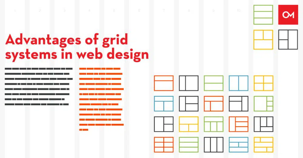
The reduction of coding is the essential advantage of using CSS grids. Instead of generating extra HTML elements to base your grid, you use a stylesheet to create a grid.
Grid frameworks don’t always make use of semantically sound names of the class. Because a CSS grid is native in nature, you don’t have to include large libraries in your project to support it. CSS-based web development is faster because learning the syntax is easy. Moreover, prototyping with CSS is rapid and effective.
With growing browser support, you can use the grid practically everywhere. The tutorials for the grid are available everywhere; everyone from beginner to advanced developers can use it.
A grid allows easy implementation of the user interface of a web page across different contexts. You can create a responsive, structured layout without endless text-wrapping and have three-column layouts.
The grid offers easy maintenance and flexibility for the design of the webpage. Moreover, you can work with rows and columns simultaneously to generate complicated yet flexible plans. As most browsers support the grid system, you don’t need a fallback code for it to work.
Grids enable a designer to generate a website layout that is creative and stunning. Moreover, the designers have the choice to turn it into a responsive design without compromising on the overall appearance and visual aesthetics of the design. CSS combines both grid and the designer’s design ideas to generate an out-of-the-box design. This design is both stunning in appearance as well as responsive to today’s tech-savvy user.
Conclusion
The overlapping of images is an exciting concept in the world of design. When a developer has to handle the overlap of the photos, you can go about the mentioned ways. If you are well-versed in CSS, as a developer, you know that it is practically possible to accomplish whatever you choose.
But beginners can take a look at this tutorial and make the image overlap happen with a very less amount of time and should know which code goes in which file.
Also, don’t forget about the use of z-index in your stylesheets. Using z-index you can change the order of which index in on top and which one to send to the back This is a great feature when combined with Javascript to create rotating image decks for hero sections on your web sites.
http://www.w3schools.com/cssref/pr_pos_z-index.asp
Thanks.