If you need to create a unique and completely customized dashboard for a website or a web app, these 24 modern UI dashboards designs will surely help you a lot!
But first, what is UI design and is it the same with UX design?
While in many ways intertwined, UX and UI are quite different in their respective design approaches. It could be said that UI is how a website visually presents itself to the world, while the UX is what gives it life.
UX design is making a website as usable as possible, while providing the utmost satisfaction to the user. The design process is more closely attuned to market research. And is primarily a non-digital approach. An exception would be that a tool dedicated to assist in the design of a website’s UX might include the digital features necessary to build a prototype to conduct user testing. Such a tool would also support team collaboration and feedback.
UI design, on the other hand, is strictly digital. It typically does not involve coding – unless the boundary between design and development becomes blurred. UI design is multi-faceted and akin to graphic design where front-end tools assisting layout, element positioning, and content editing play the major role
So now that we cleared things a little bit, get inspired and create functional, user-friendly dashboards for your projects. These dashboards have different design styles, from flat, to subtle shadows and even 3D, but all of them are clean and have very nice layouts.
Some of these great UI dashboards are even available for download for free!
Here they are!
Dashboard Design!
This is a really nice and creative dashboard design concept. It uses a simple light grey background and a modular grid layout. It has a friendly interface design.
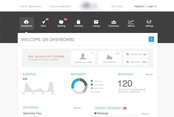
Webapp Dashboard
This example has a unique flat design. It looks great and has a friendly interface design. It uses many charts, graphs and graphic elements to make everything much easier.
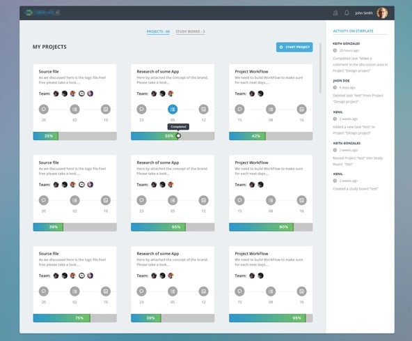
Projects View
This is a project view example that also uses a simple design based on a modular grid layout on a light grey layout.
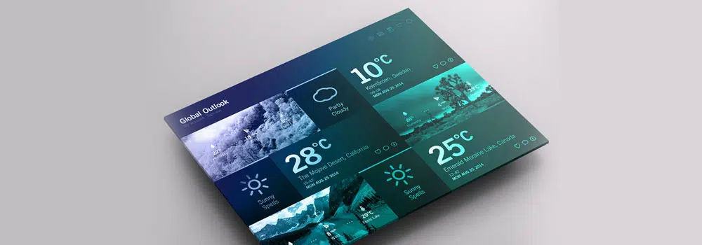
Weather Dashboard // Global Outlook UI/UX
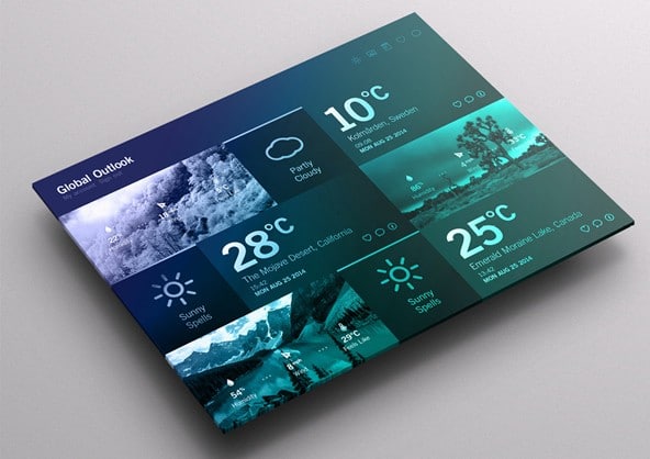
This is a weather dashboard UI/UX design which uses a blue gradient color overlay, thumbnail images, and flat design.
Dashboard Web App Product UI Design
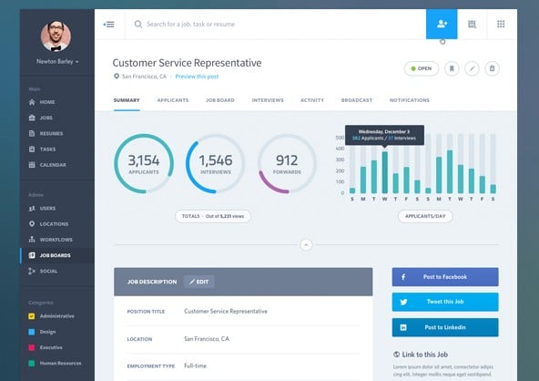
This dashboard can be a great source of inspiration. Everything is clean and well-organized and creates a nice user interface design.
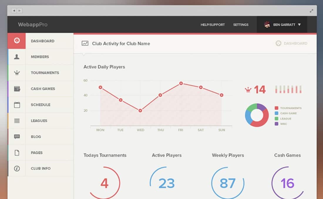
Bracket Responsive Bootstrap 3 Admin Template
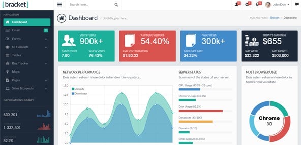
This dashboard has uses flat design and a large variety of colors. It has a friendly interface design and you’ll never get bored of working on your backend with this example.
Analytics Dark Dashboard
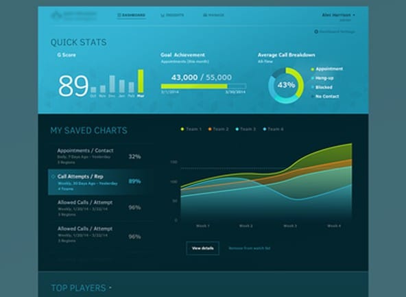
This Analytics Dark dashboard has a unique design based on several horizontal bands. Each band uses a different tone of blue. The details are also either blue or green and orange.
Swiss style dark/white dashboard
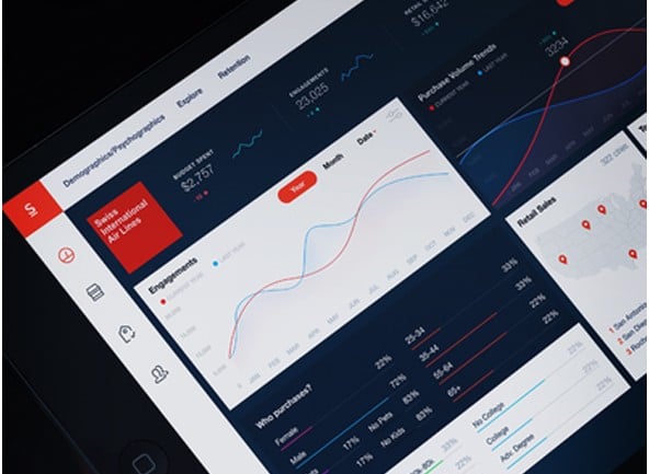
This is definitely an example worth following. It is called Swiss style and has a modern and functional design concept. The graphic elements have their inspiration in flat and minimalist design and they blend in perfectly in this dashboard example.
Shutterstock Contributor Dashboard 2
This is a ShutterShock Contributor dashboard which looks great and it might become your next source of inspiration. It has a dark layout and with clean details and buttons.
NatWest Banking Concept
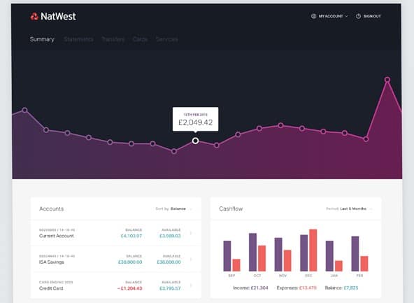
This is a banking concept which uses a large horizontal graph as the first thing a user sees. This example has a clean minimalist design based on a flat and similar palette of colors. The colors stand out on this light grey background.
Universities and Students
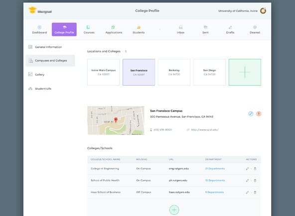
This is a dashboard design project for a university app. It has all the information organized and the user interface is quite easy to use and understand. This example also has a clean and functional design and it is definitely an example worth following.
Tackkle Dashboard New
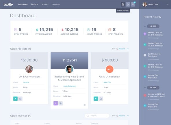
The Tackkle dashboard has a friendly interface design thanks to the flat color palette that it uses. It looks bright and it will definitely make you forget about those dull dashboards.
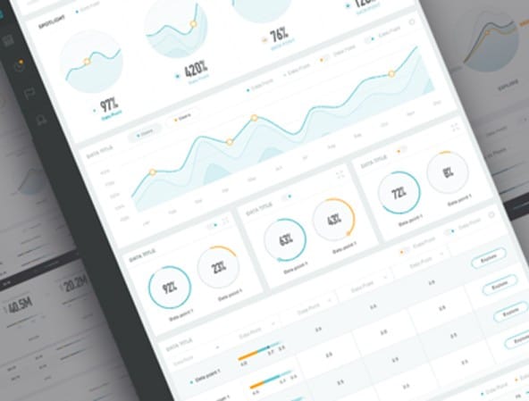
15 Innovative Dashboard Concepts
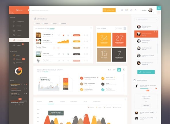
This example uses many warm earthly colors. Each graphic element has its inspiration in flat design and blends in perfectly with one another.
Dashboard
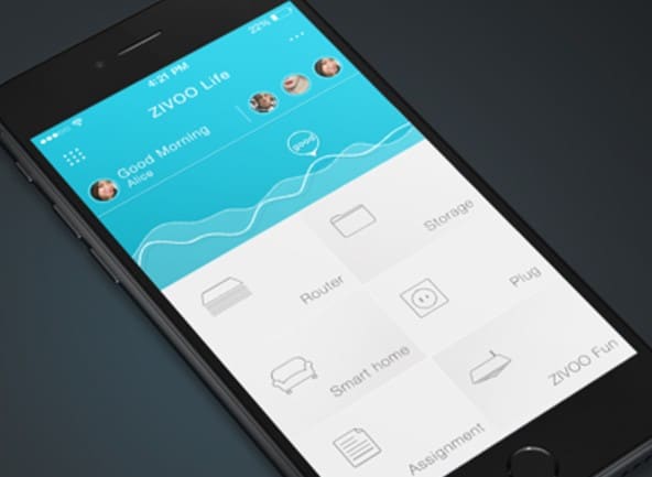
The Zivoo life app dashboard is simple and clean. It uses a simple light blue graph followed by a modular grid layout with a light grey background and flat icons.
Inventory Statistics
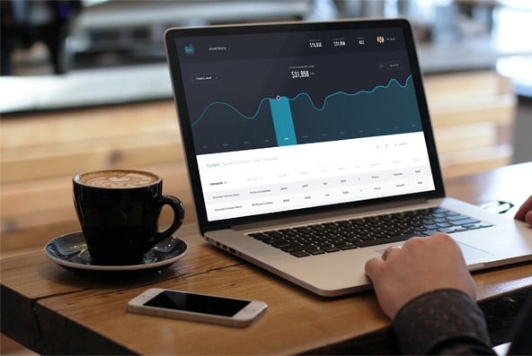
The Inventory Statistics is definitely a great example of a modern and functional design.
Energy Company Dashboard
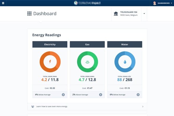
This example was specially created for an energy company. It has a simple and clean design with a light grey background on which the content stands out.
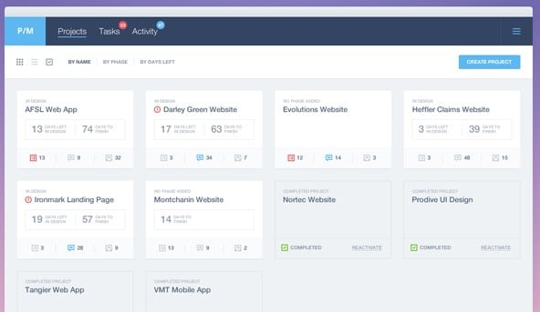
Dashboard Page 2/2
If you liked the previous example then you will definitely want to have a look at this one too as it might become your next source of inspiration. This example uses a horizontal menu bar and it is followed by really organized content and useful information.
Dashboard Admin UI/UX
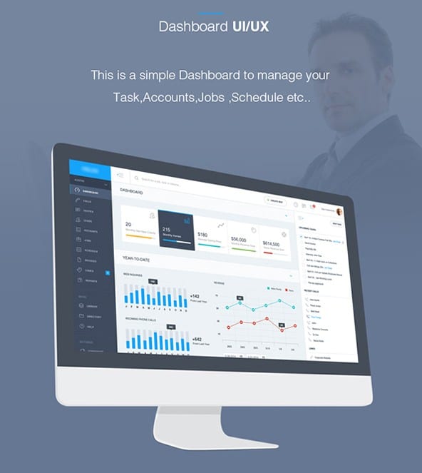
With this example, you can find your inspiration to create a clean dashboard to manage your tasks, accounts, jobs and much more.
Dashboard Direction
This dashboard has a light and minimalist design with small colored details. It has a friendly interface design and it can be a great starting point for awesome projects.
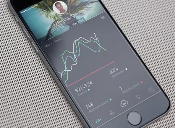
Datapoint Phone version
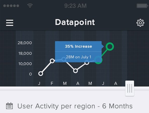
This is a phone version of a datapoint dashboard. This example is definitely worth following thanks to its simple and clean design layout. You definitely have to have a closer look at this example and find your inspiration.
Eurobank – Bank Account Page
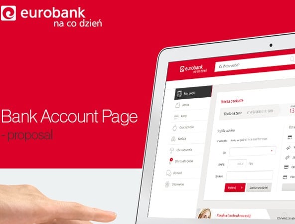
The Eurobank proposes a bank account page. This proposal has a neat and functional design which makes it an example worth following in similar projects.
Sush.io mobile App
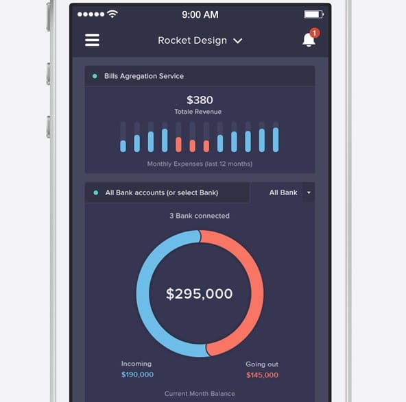
Do not miss the chance to check out this amazing Sush.io dashboard concept. It uses a dark background and flat design.
Olyfe dashboard
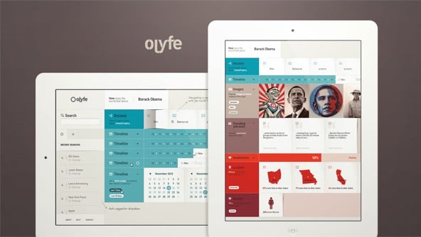
The Olyfe dashboard uses a modular green layout and a large variety of colors, both warm and cold. This dashboard uses flat design. The information is well-organized and provides a friendly user interface.
Youknow
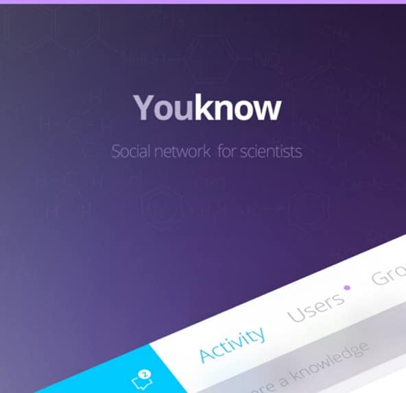
Last but not least, this example was specially created for a scientists’ social network. It has friendly and flat interface design.
Hi webdesigndev!
Is there any way to get those UI templates? Free or paid, I don’t mind, they’re awesome.
Thanks!
Hi webdesigndev, how can I download these dashboard templates?
I clicked the images but it’s just an image, not a template.